5 UX Lessons From Digg's Content Feed UI - Digg UI Breakdown

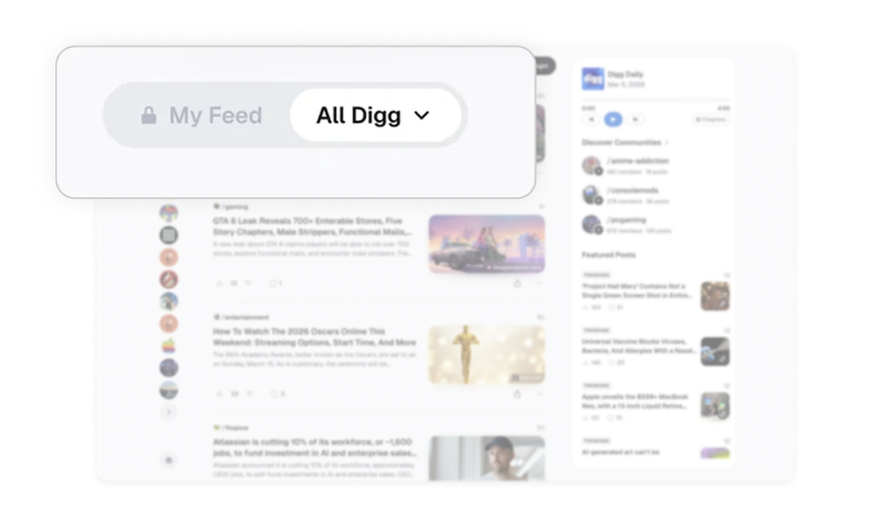
My Feed and All Digg tabs let users toggle scope, not topic
The top tabs do not filter by category, they switch between personalized and global feeds. Users decide whether they want a curated experience or a wider discovery view at any moment. This scope-toggle pattern beats category filters because it respects two distinct user moods: focused consumption versus open exploration. Any content product should consider scope tabs before topic tabs.
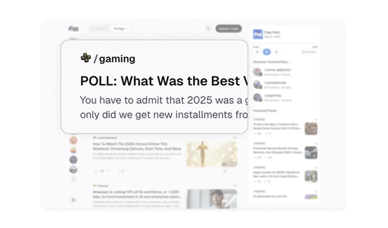
Community tag on every post turns interest into membership
Each post is prefixed with its community tag (gaming, entertainment, finance) styled as a small button. Users discover communities through content they already like, not through a separate browse-communities page. This embedded discovery is far more effective than a list of communities because it surfaces them at the exact moment of interest, when a user just enjoyed something.
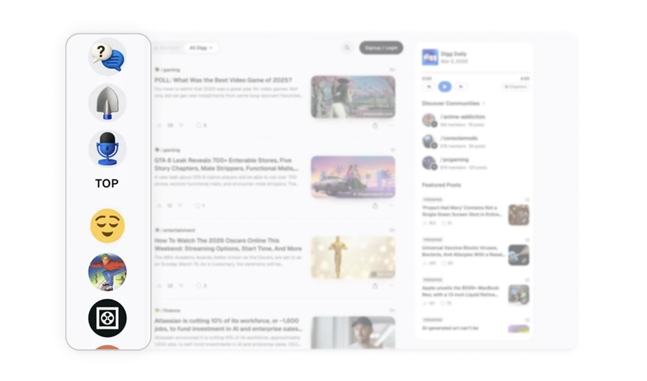
Icon-only sidebar trades labels for vertical density
The left sidebar shows followed communities as small circular avatars stacked vertically, with no text labels. Most platforms use long labeled lists that take up significant horizontal space. Digg trusts that users recognize their own communities visually after a few visits and trades labels for density. The result is more communities visible without scrolling, which encourages deeper exploration.
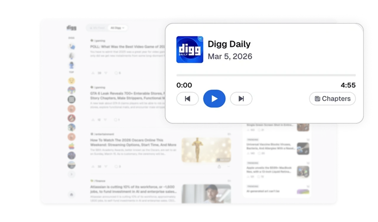
Daily podcast player lets users consume while they browse
Digg Daily lives at the top of the right panel with a play button, scrub bar, and chapter markers. Users can listen to the daily summary while scrolling the feed below. This dual-mode consumption (audio plus visual) respects how people actually use content platforms, often in the background while doing something else. Embedded audio that does not require leaving the page is a rare and powerful retention feature.
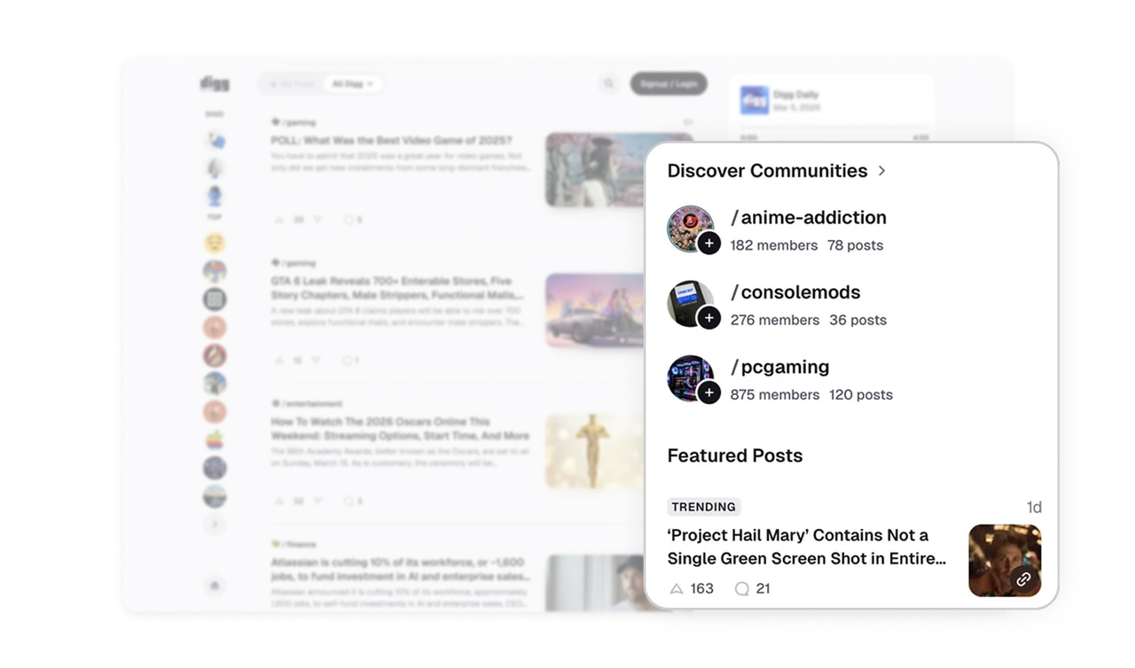
Featured Posts and Discover Communities live in one rail
The right panel stacks Discover Communities and Featured Posts in one scrollable column. Users see both new communities to join and trending content without ever switching tabs. Sidebars in content platforms often default to one purpose. Stacking discovery (people) and trending (content) in one rail gives passive users two distinct entry points while keeping the main feed completely focused.
Similar Breakdown Lessons