Lovable UI UX Breakdown for AI Coding Tools - Lovable UI Breakdown
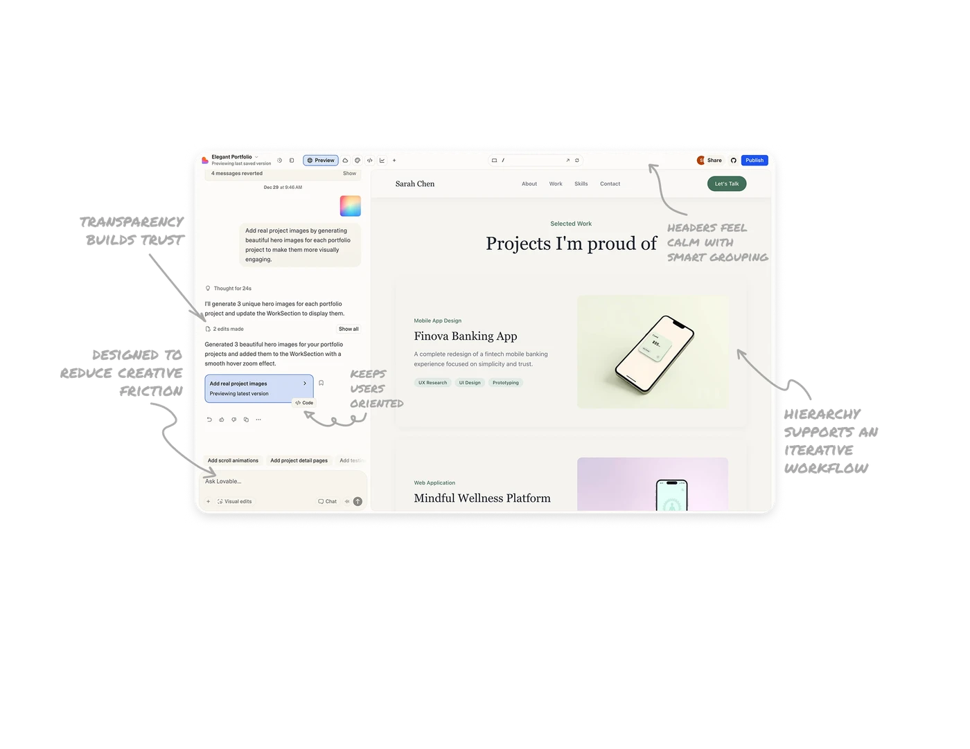
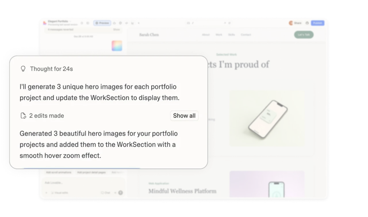
System transparency builds trust without overwhelming
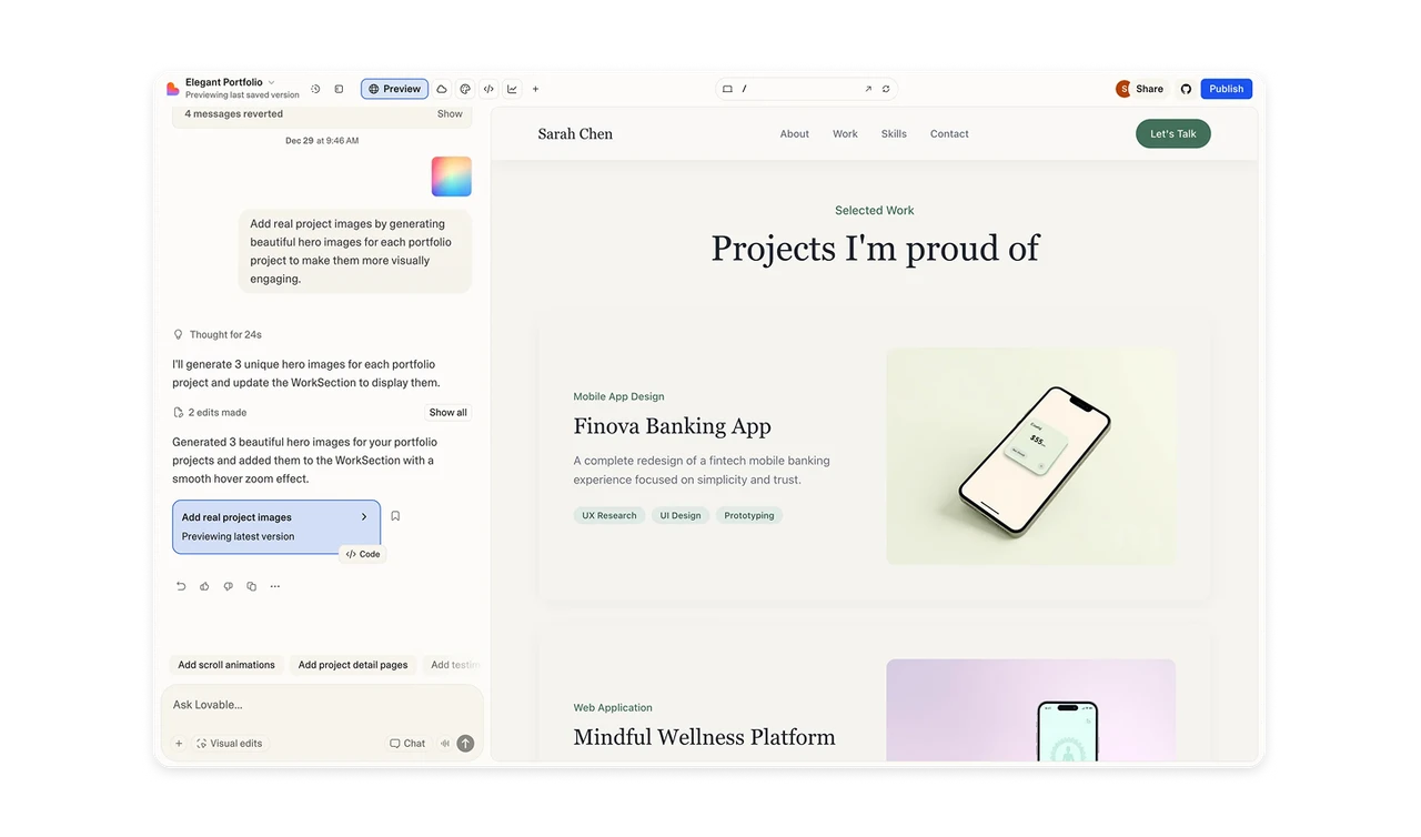
The chat does more than reply with text. It explains what the system is doing, what actions it took, and where edits were made. This turns invisible processing into a visible story, which helps users feel in control. At the same time, details are progressively disclosed. Users see enough to trust the system, but not so much that the interface feels technical or heavy.
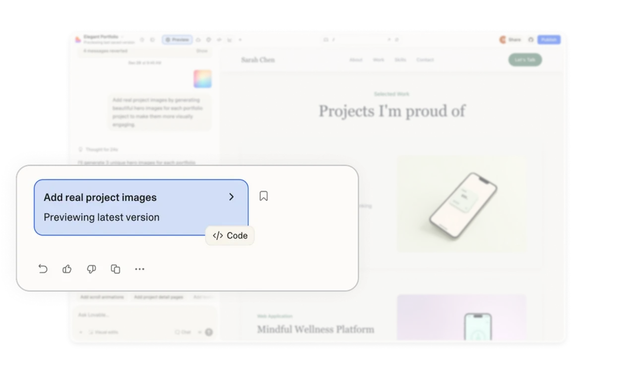
Inline system status keeps users oriented
A highlighted status card inside the chat shows what changed and which version is active. Key actions like view code, bookmark, and feedback are grouped nearby with low visual weight. This keeps users aware of the system state without pulling them out of the conversation.
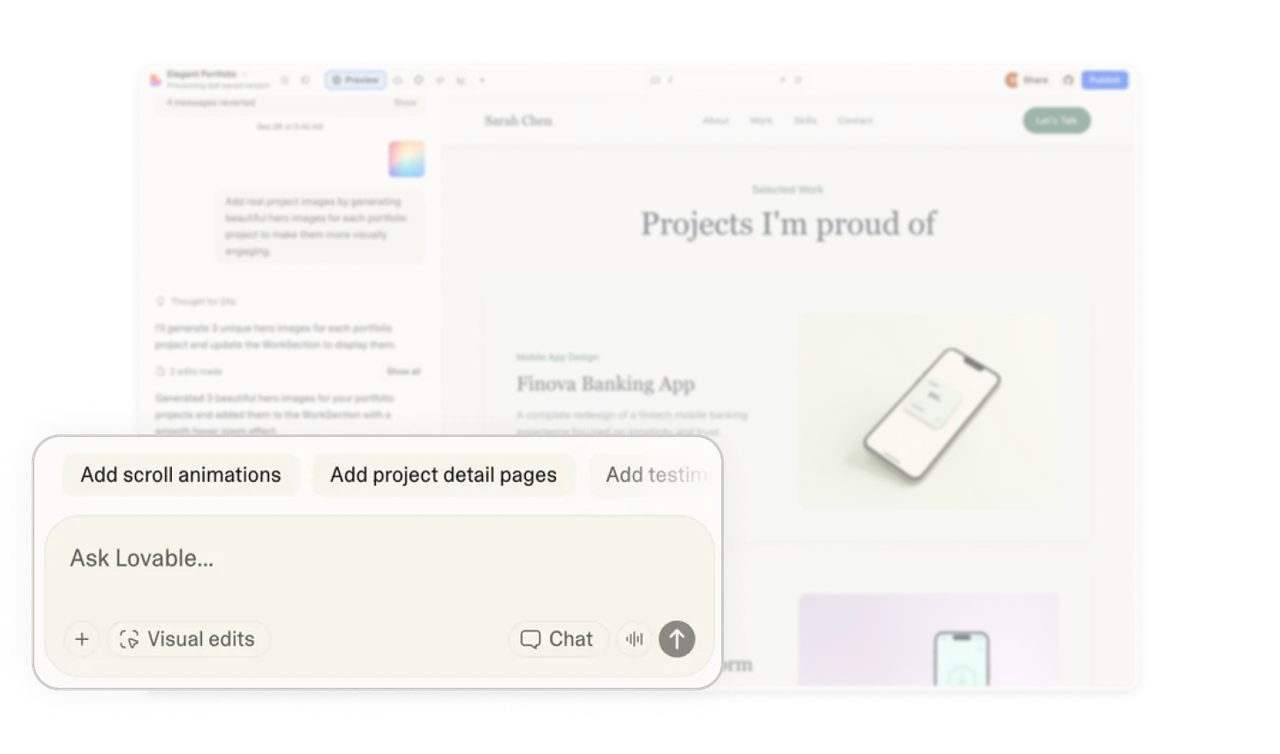
The input area is designed to reduce creative friction
The prompt field does not feel like a blank box. It includes contextual suggestions that relate to the current task, helping users move forward when they are unsure what to ask next. At the same time, multiple input modes like visual edits, chat, and other quick actions are available nearby. They are discoverable but not crowded, which keeps the focus on creation instead of controls.
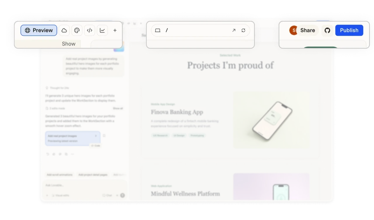
Action-heavy headers feel calm with smart grouping
The top bar contains many powerful actions, but they are organized by intent. Creation and editing tools sit together, while sharing and publishing live on the opposite side. The centered project search and navigation keep orientation clear. This structure allows a high feature count without visual overload.
Layout hierarchy supports an iterative workflow
The interface gives more space to the output and preview area, while the chat panel stays narrower on the side. This reinforces the mental model that conversation drives creation, but the result is the main focus. This balance encourages a loop of prompt, result, and refine, which is the core behavior in AI-assisted building tools.
Similar Breakdown Lessons


