5 UX Lessons From Linktree's Link Management UI - Linktree UI Breakdown
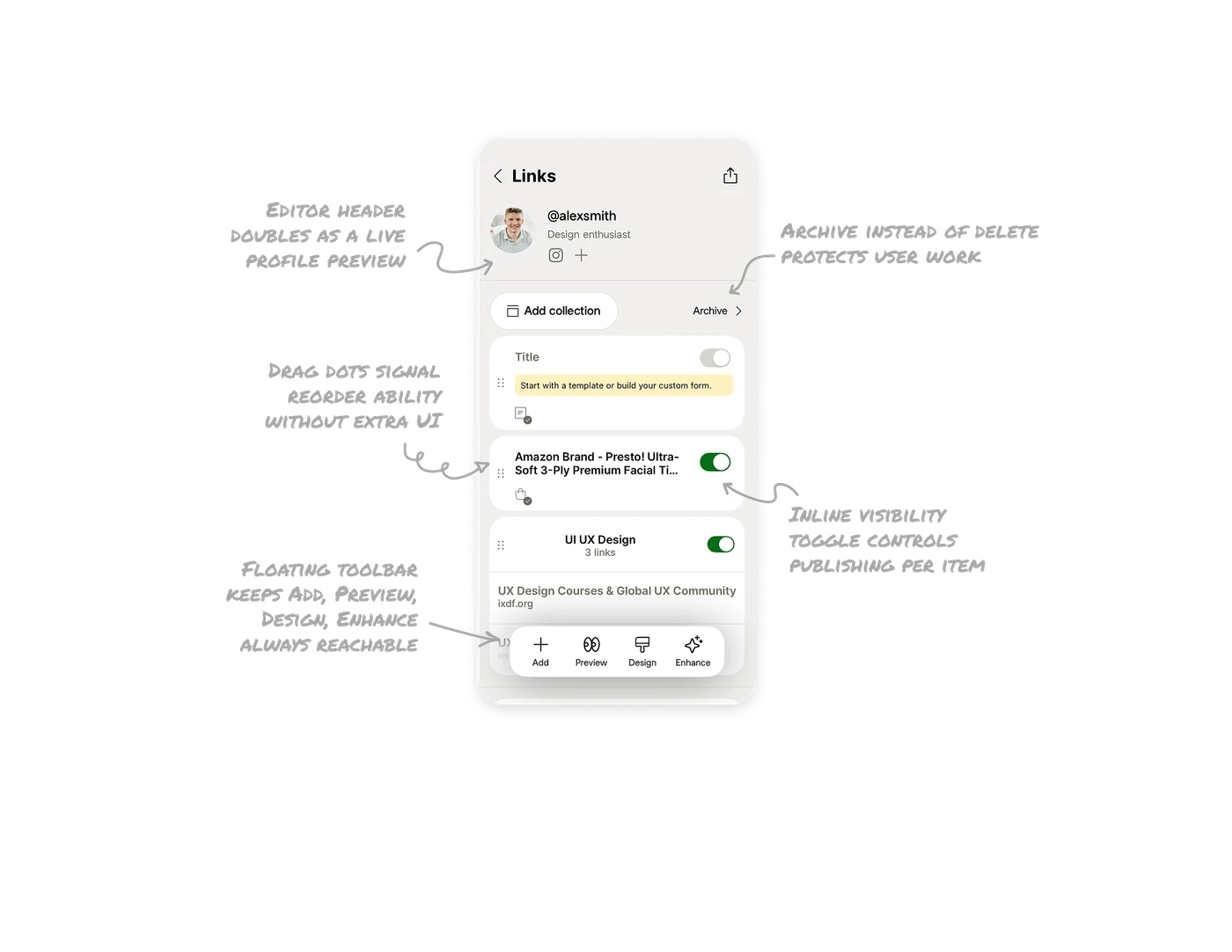
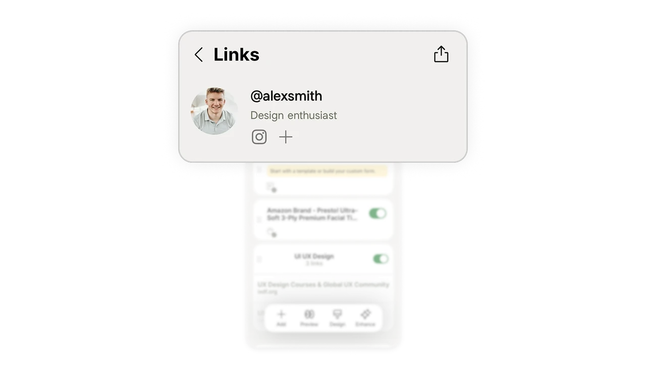
Editor header doubles as a live profile preview
The top of the editing screen shows the exact profile picture, @username, subtitle, and social icons as they will appear publicly. Users edit and see the result in the same view. Separating the editor from the preview forces constant context switching. Letting the edit screen show the real output means users always know what their audience sees, which reduces publish anxiety and errors.
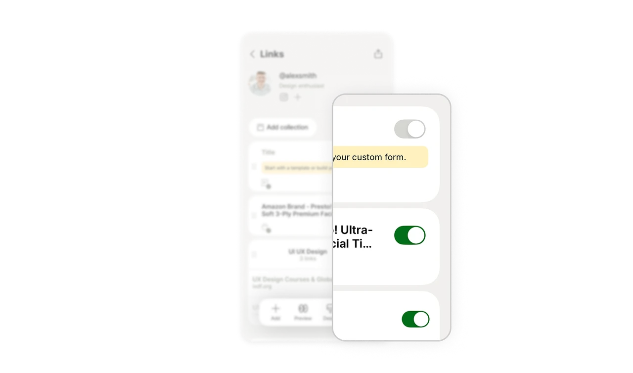
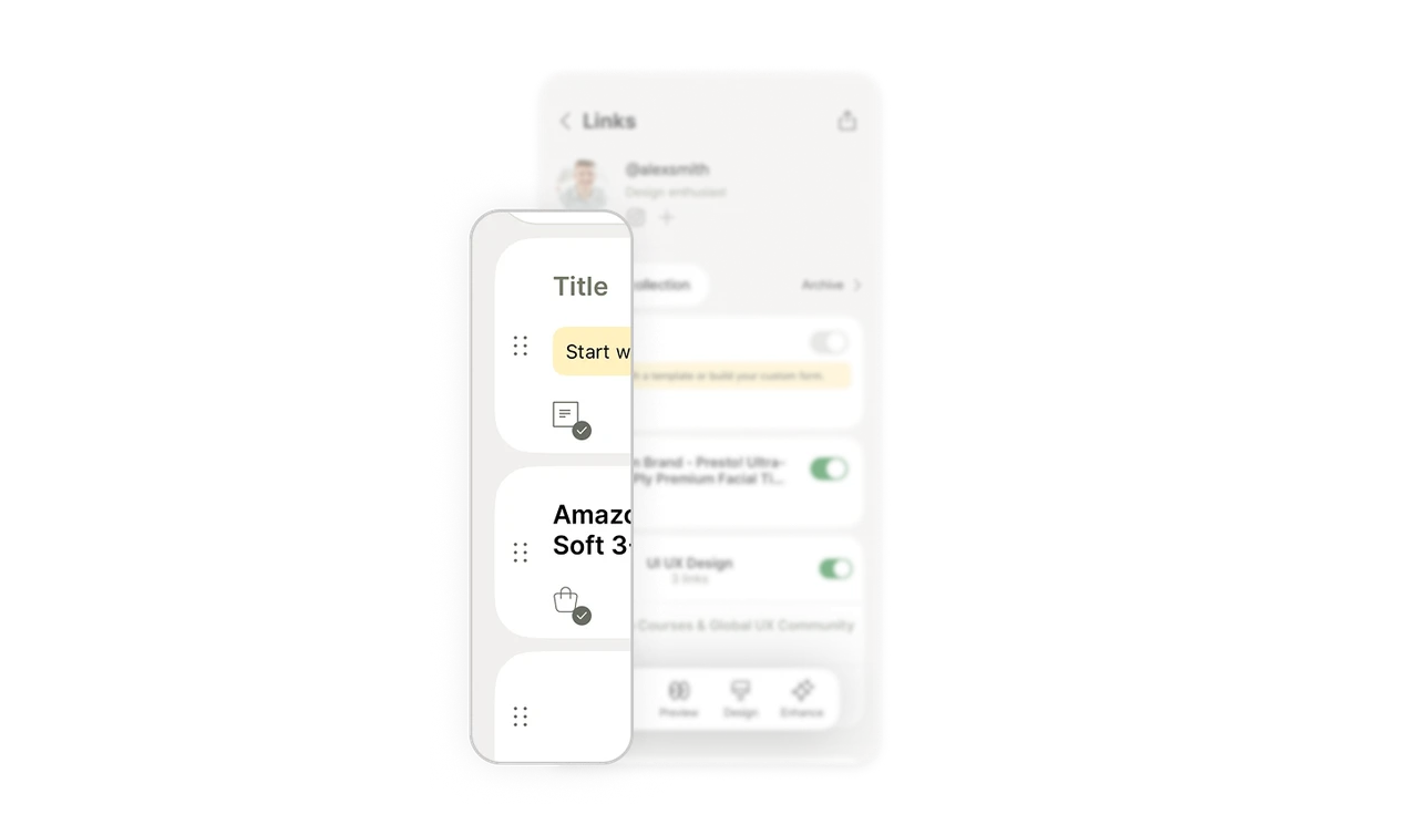
Inline visibility toggle controls publishing per item
Each collection has a green on-off toggle on the right. Users hide or show any link with one tap, no need to delete and re-add. This separates "exists" from "visible," which is a powerful distinction. Users can keep a seasonal link dormant and flip it live when needed. Per-item visibility toggles give creators control over their public face without destroying their work.
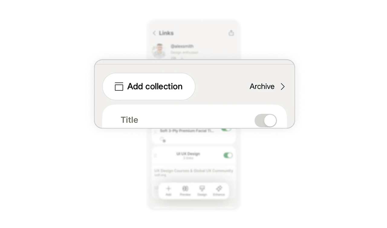
Archive instead of delete protects user work
"Archive" sits next to "Add collection" at the top, giving users a place to store collections instead of removing them. Deletion is permanent and scary. Archiving is reversible and calm. Offering archive as the default storage action respects that users often want to set something aside, not destroy it. Reversible actions reduce the anxiety that makes users hesitate to organize at all.
Drag dots signal reorder ability without extra UI
The six-dot grip icon on the left of each collection tells users the item can be dragged to reorder. No "edit order" mode, no separate screen, no instructions. The affordance is universally recognized, so users reorder intuitively. Using a standard drag handle instead of building a custom reordering flow respects the muscle memory users already have from dozens of other apps.
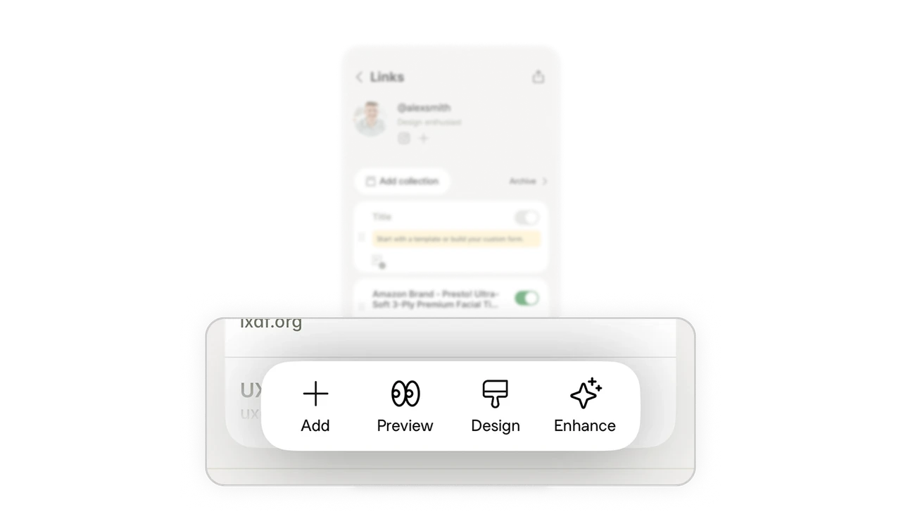
Floating toolbar keeps Add, Preview, Design, Enhance always reachable
Add, Preview, Design, and Enhance sit in a floating pill at the bottom, thumb-reachable from anywhere in the list. The four actions cover the complete editing workflow: create, check, style, improve. Anchoring the core actions in one persistent zone means users never scroll to find a button. Grouping the full workflow into one floating bar turns a multi-step editing process into a single reachable surface.
Similar Breakdown Lessons


