5 UX Lessons From Google Photos Collections UI - Google Photos UI Breakdown
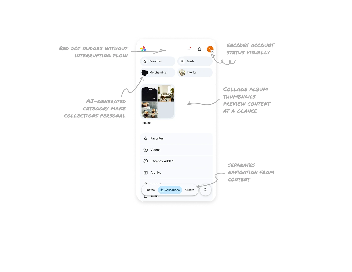
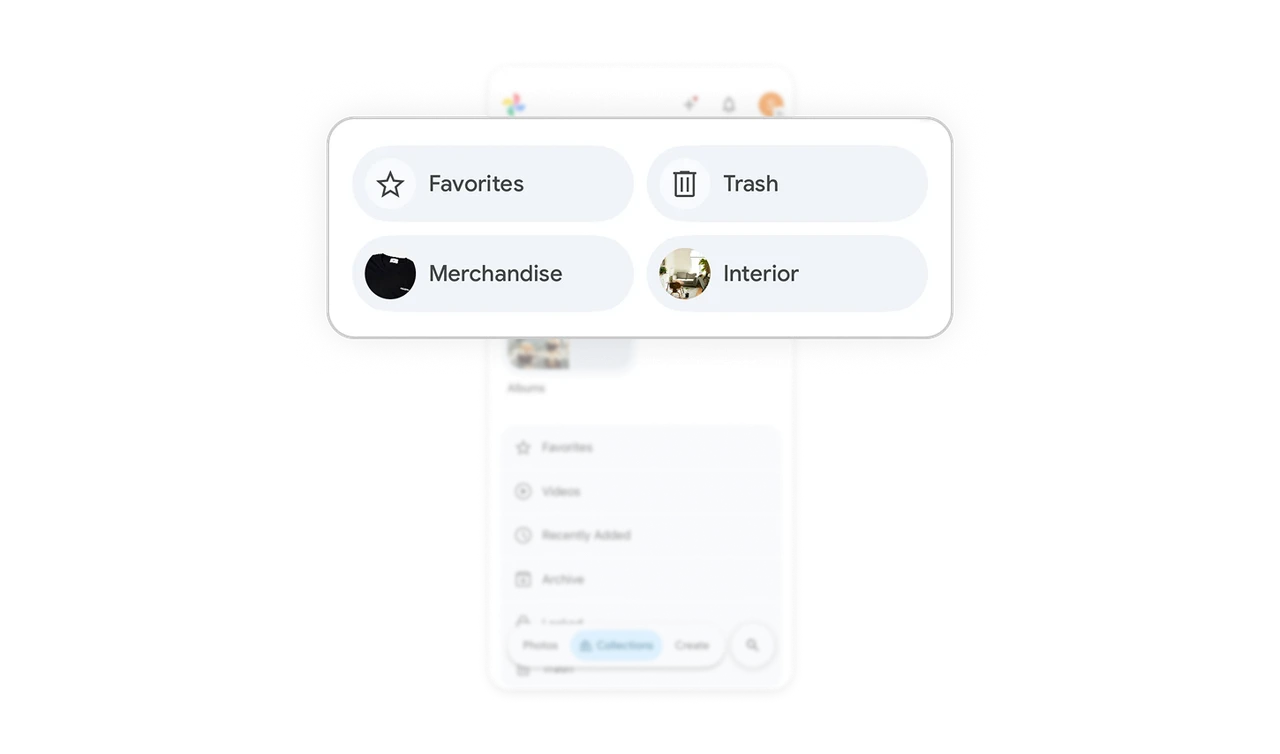
AI-generated category pills with thumbnails make collections personal
Favorites, Trash, Merchandise, and Interior sit as top-level pills, each paired with a small image pulled from inside that collection. The first two are system defaults, the last two are AI-generated from the user's own photos. Users see categories that feel uniquely theirs without doing any tagging work. AI doing organization invisibly is the highest form of personalization, the user gets value without realizing they were just labeled.
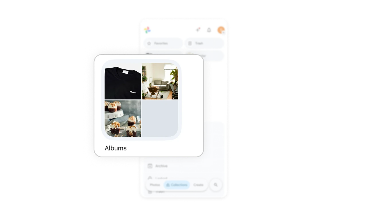
Collage album thumbnails preview content at a glance
The Albums tile shows four sample photos in a 2x2 grid instead of a single cover image. Users instantly understand what kind of photos live inside without opening the album. A single cover image can mislead. A collage communicates content variety honestly and is far more useful for memory retrieval, which is the core job of any photo app.
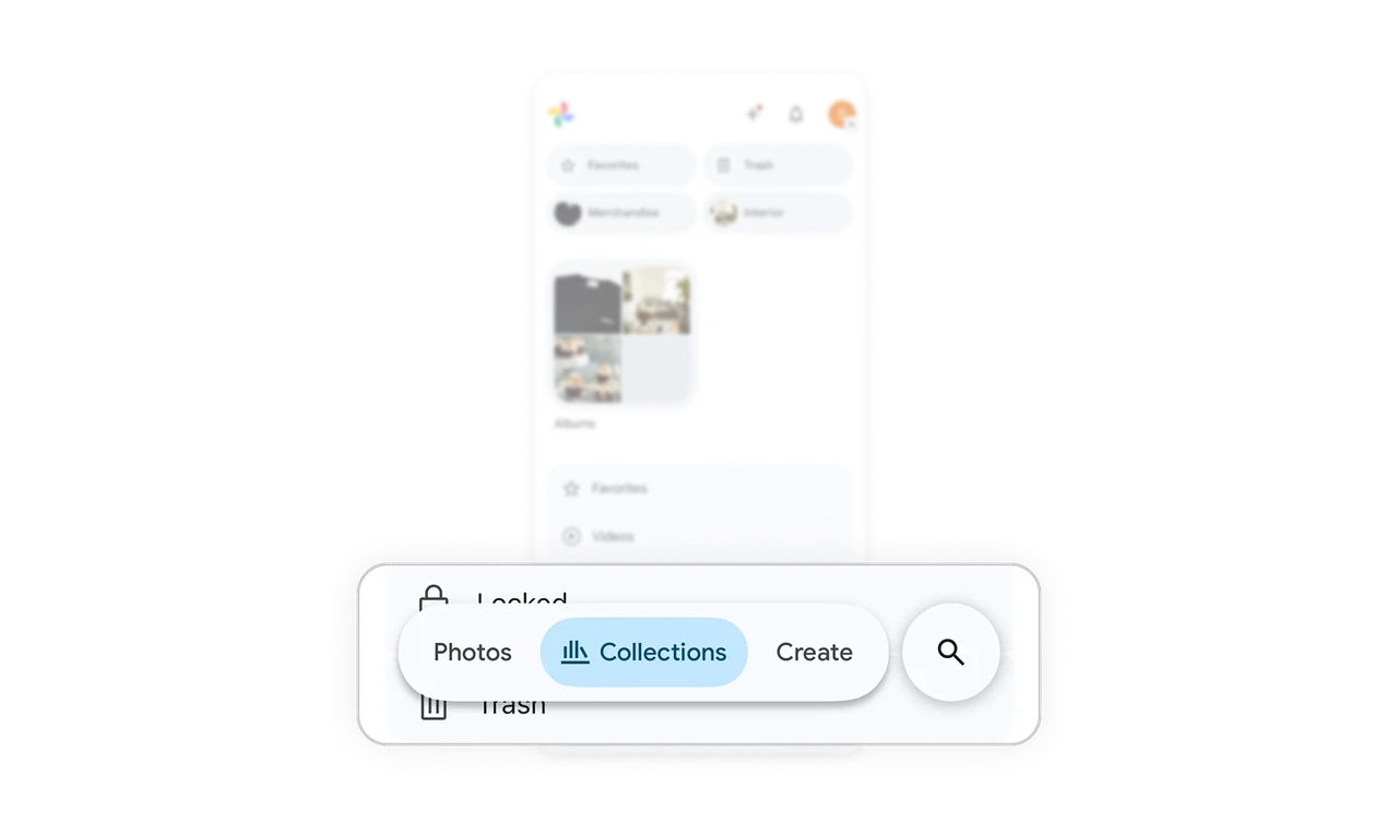
Floating bottom bar separates navigation from content
Photos, Collections, Create, and Search live in a floating pill at the bottom rather than a docked tab bar. The pill rests above content with rounded edges, signaling that it can move with the user. This pattern lifts navigation off the page so the content underneath gets full visual weight, while keeping every primary action thumb-reachable.
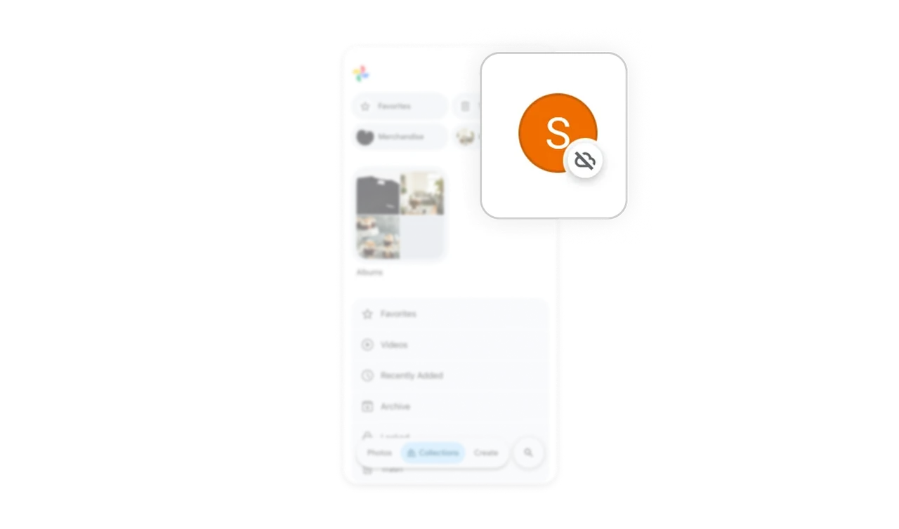
Avatar with cloud icon encodes account status visually
The profile avatar has a small cloud-with-slash icon in the bottom corner, indicating offline or sync-paused status. Most apps would surface this through a banner or settings warning. Google Photos overlays it onto the existing avatar, turning the profile button into a live status indicator. Encoding state into something users already look at saves screen space and creates effortless awareness.
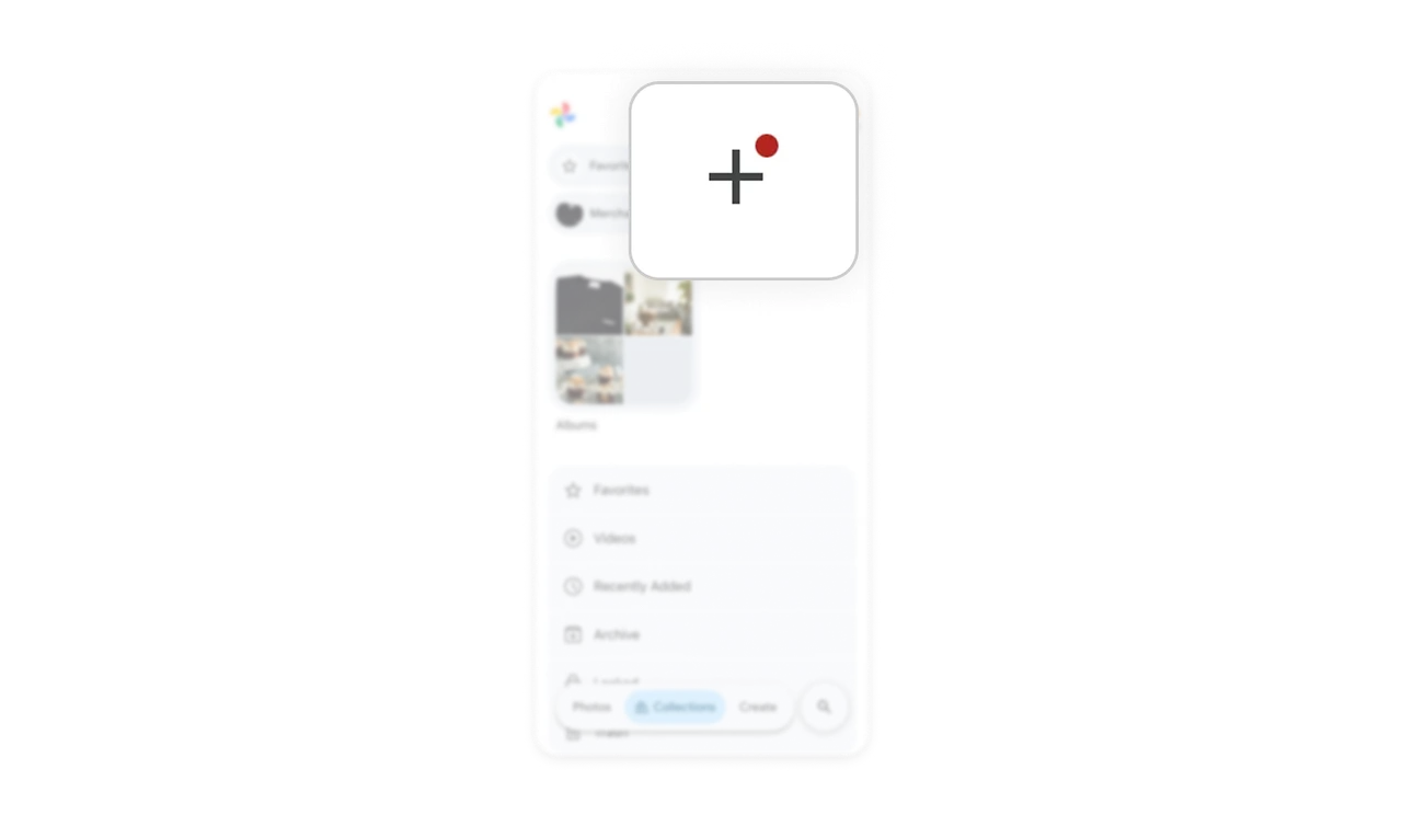
Red dot on plus icon nudges without interrupting flow
A small red dot sits on the plus button in the top bar, signaling something new is available. No modal, no banner, no full-screen prompt. Users notice it in their peripheral vision and tap when curious. Notification dots are the gentlest possible nudge because they respect the user's current task while still surfacing new options. Most apps overuse popups when a dot would do the job better.
Similar Breakdown Lessons


