Shopping Cart

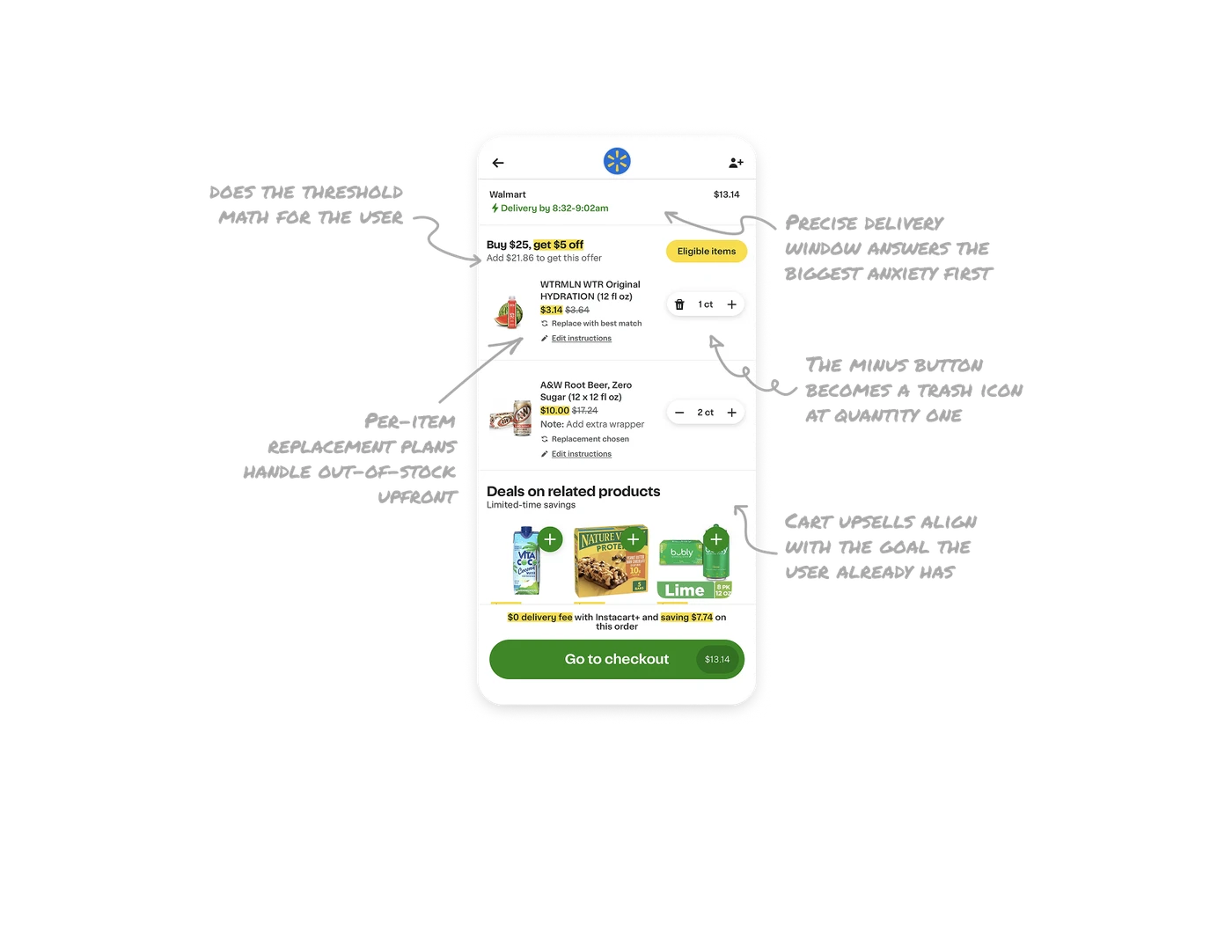
Precise delivery window answers the biggest anxiety first
"Delivery by 8:32-9:02am" sits in green at the top of the cart, before a single item. The biggest anxiety in grocery delivery, when will it come, is answered at the top of the funnel step, not at confirmation. A 30-minute window builds far more confidence than a vague "arrives today" because precision itself signals operational competence. Vagueness reads as a company that does not know its own logistics.
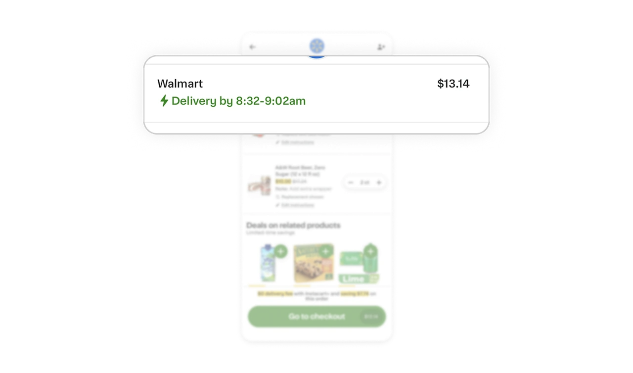
"Add $21.86" does the threshold math for the user
"Buy $25, get $5 off" comes with the exact gap calculated: "Add $21.86 to get this offer," plus a yellow Eligible items shortcut to qualifying products. Never make users do the math on threshold offers. The concrete number turns an abstract rule into a specific next step, and the shortcut removes the final friction of finding what counts. Computed gaps convert where static rules stall.
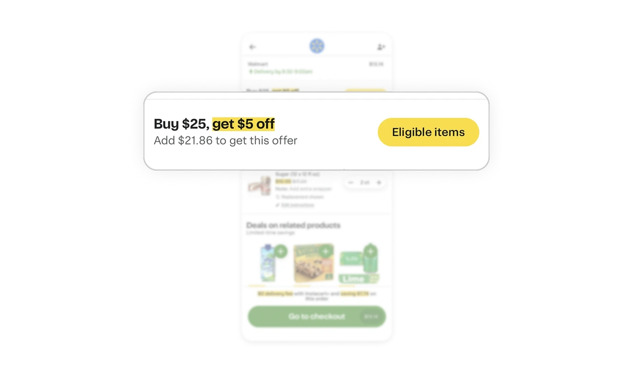
Per-item replacement plans handle out-of-stock upfront
Each item shows its contingency: "Replace with best match" on one, "Replacement chosen" on another, editable before checkout. Grocery inventory is unreliable, and Instacart surfaces the backup plan at the item level. When fulfillment is uncertain, let users pre-decide the fallback per item and show that choice in the cart. It prevents the worst delivery outcome: a shopper making a substitution you would never want.
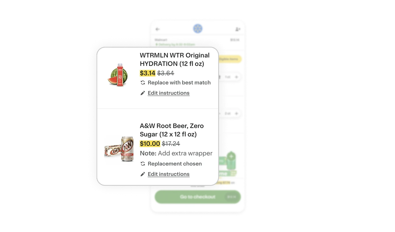
The minus button becomes a trash icon at quantity one
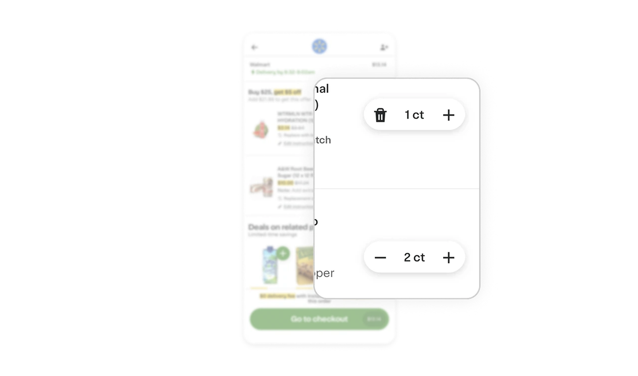
Each item has a minus, count, plus stepper, and at quantity one the minus morphs into a trash icon. The next tap removes, not reduces, and the icon says so honestly before you commit. This tiny state change prevents surprise deletions and communicates exactly what happens next. It is microcopy through iconography, and it costs nothing while removing an entire category of accidental-removal frustration.
Cart upsells align with the goal the user already has
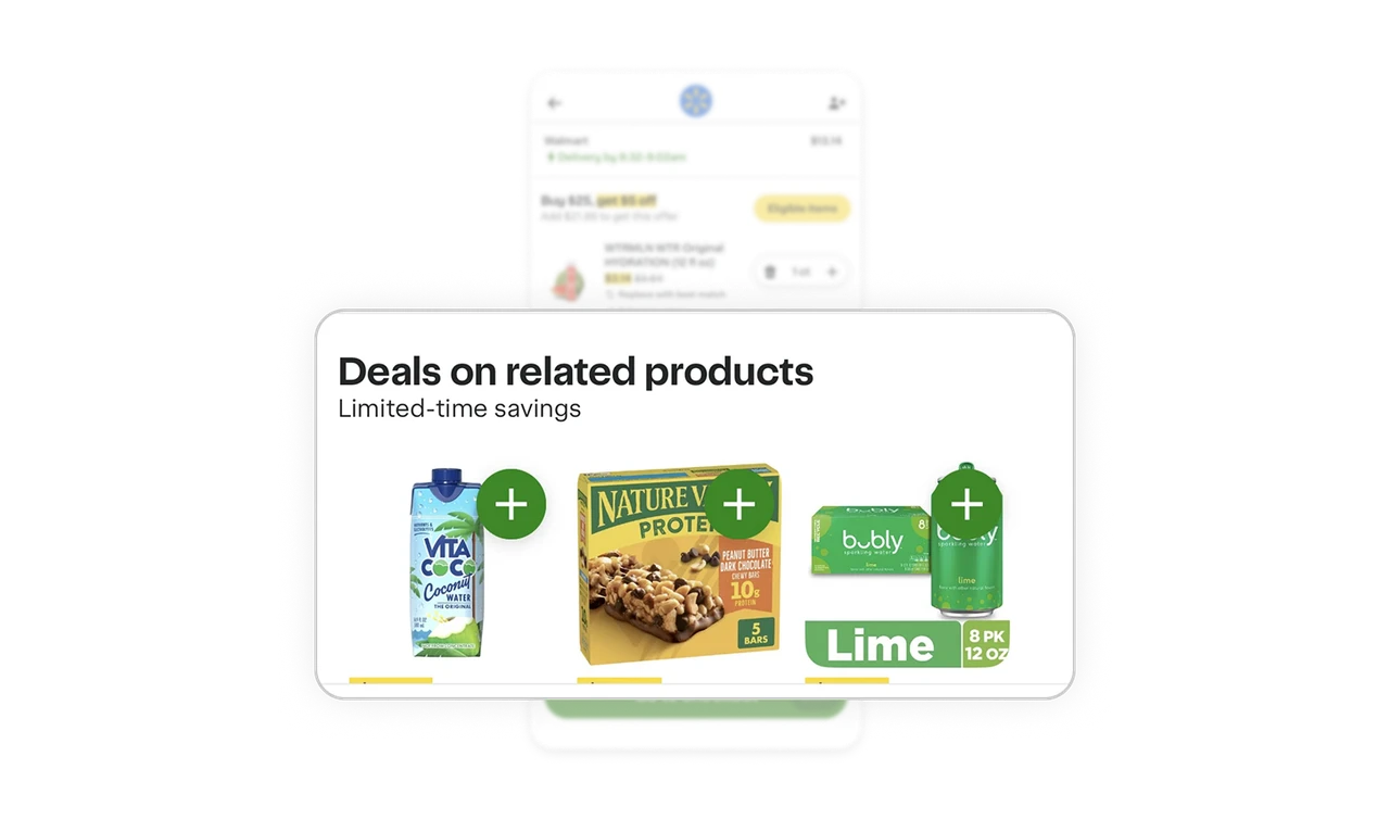
"Deals on related products" sits between cart and checkout with one-tap add buttons, and each discounted item helps close the $21.86 gap toward the $5-off threshold above. These are not random ads. Aligning the upsell with an incentive the user is already chasing makes it feel like help, not selling. The best cart upsell serves the user's active goal, which is why this one converts without breeding resentment.
Similar Breakdown Lessons