AI Automation Builder

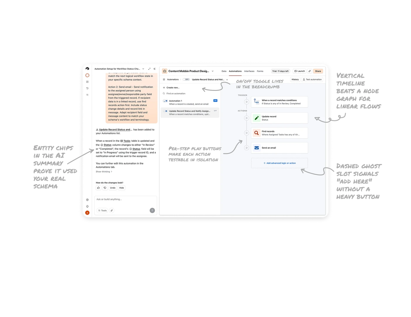
Entity chips in the AI summary prove it used your real schema
The AI's confirmation renders actual field references as chips: "When a record in the Tasks table is updated and the Status column changes." The entities look exactly like they do in the product, visually distinct from prose. This proves the AI connected to your actual tables, not generic placeholders, and makes the summary verifiable at a glance. In AI configuration tools, styled entity references are the difference between a claim and evidence.
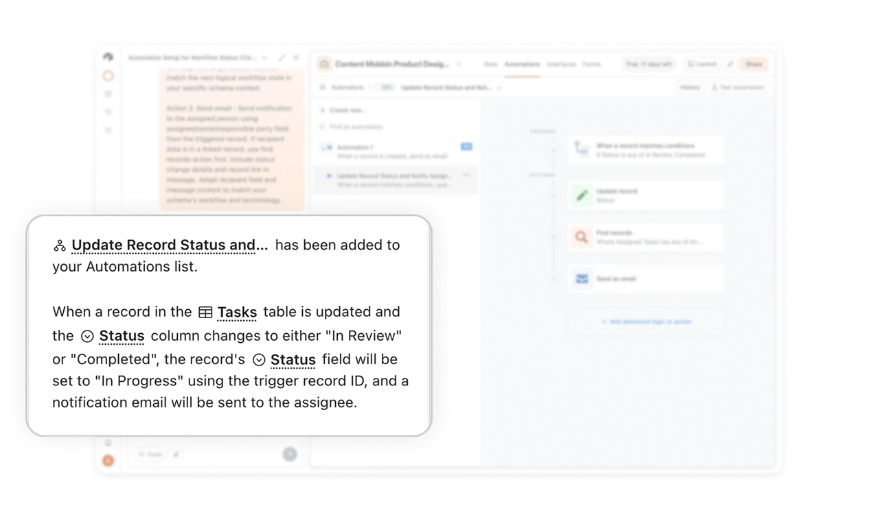
Vertical timeline beats a node graph for linear flows
The automation reads as a labeled top-down rail: TRIGGER, then ACTIONS connected by a line. Condition, update, find, email, in story order. When flow is strictly sequential, a vertical timeline with section labels is instantly readable. Canvas-style node graphs should be reserved for genuinely branching logic. Choosing the representation that matches the logic's actual shape is a design decision most builder tools get wrong by defaulting to canvases.
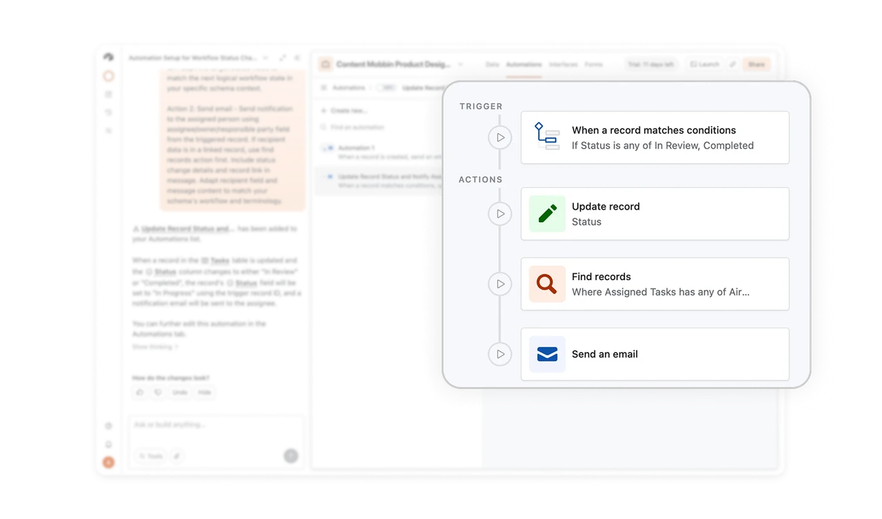
Per-step play buttons make each action testable in isolation
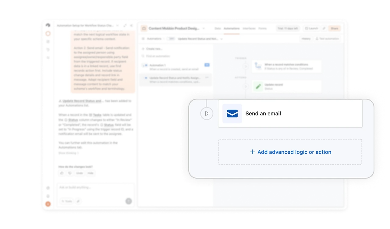
Every node on the timeline has its own play button. Users test a single step without running the whole automation end to end. Debugging a four-step workflow by re-running all of it every time is painful, and per-step execution isolates failures fast. Granular testability is what separates builder tools people trust from ones they fight, because confidence in automation comes from verifying the pieces, not hoping about the whole.
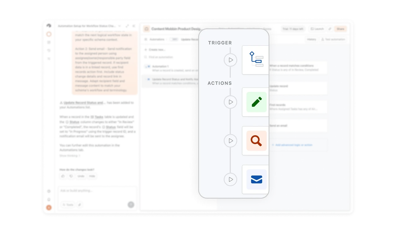
Dashed ghost slot signals "add here" without a heavy button
"Add advanced logic or action" sits at the bottom of the chain in a dashed-border placeholder. The dashed treatment universally signals an empty slot waiting to be filled, communicating through convention alone. Ghost elements keep the growth path visible without adding visual weight to the completed flow. The finished steps look solid and real, the possibility space looks light and optional, and the contrast does the explaining.
The on/off toggle lives in the breadcrumb, not in settings
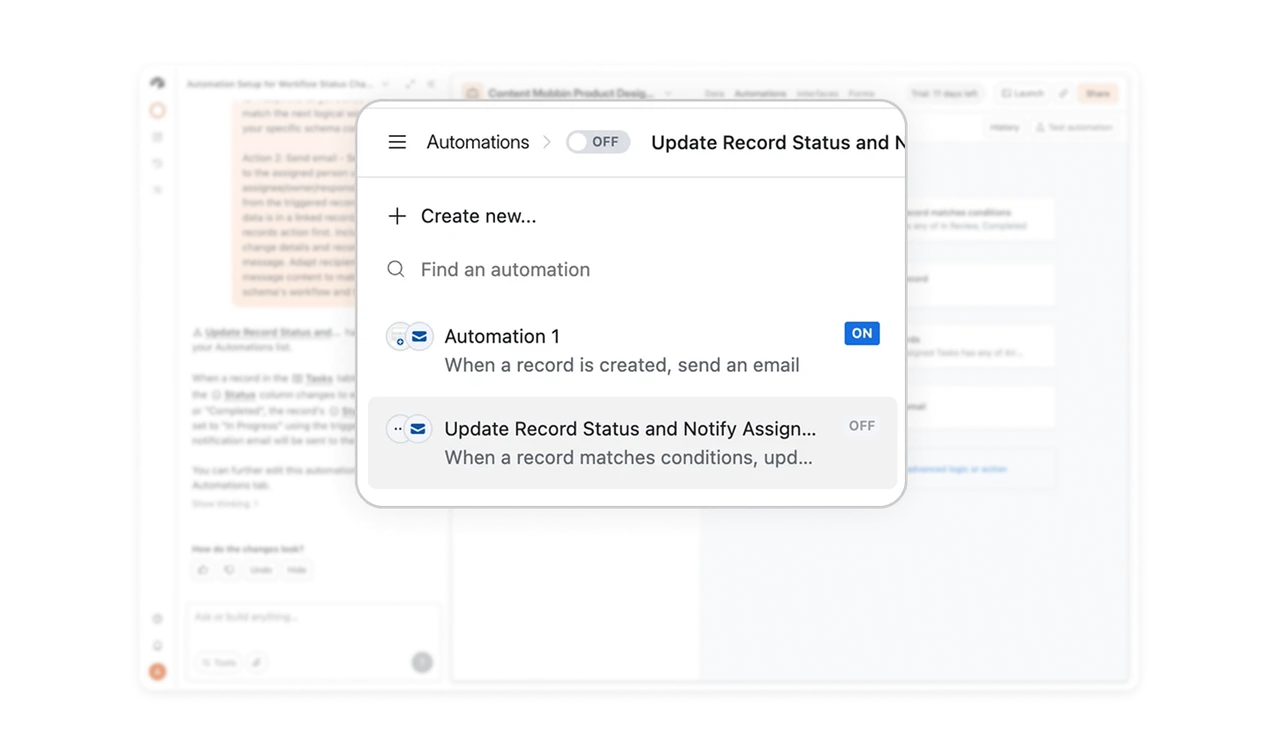
The breadcrumb row reads Automations, then an OFF toggle, then the automation's name. Context and control fused in one line. The on/off switch is the automation's single most important property, and surfacing it at the navigation level means users always know whether this thing is live and can change it instantly. Put an object's most critical state control in its header, burying it in settings hides the answer to "is this running?"
Similar Breakdown Lessons