Learning Dashboard

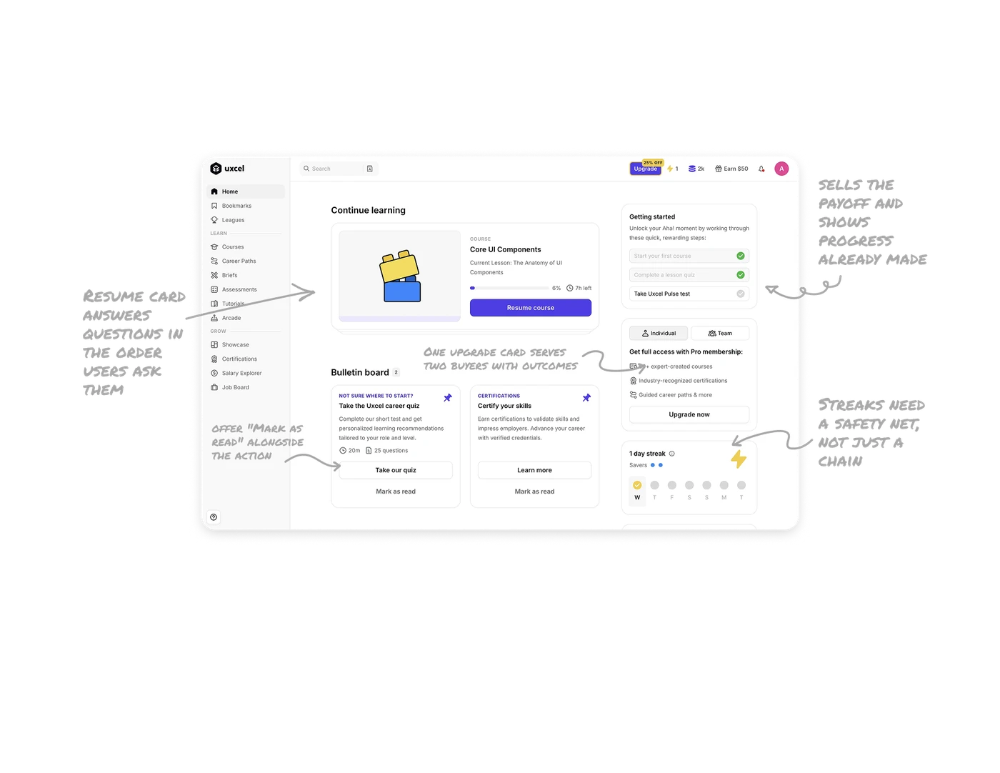
Resume card answers questions in the order users ask them
The Continue Learning card layers COURSE label, title, current lesson, progress (6%, 7h left), then one purple Resume button. Each layer answers the next natural question: what is this, where am I, how much is left, what do I do. A second card edge peeks from underneath, hinting more courses sit behind without showing them. Clean hierarchy ends in exactly one action, and the stacked-deck effect signals depth without adding noise.
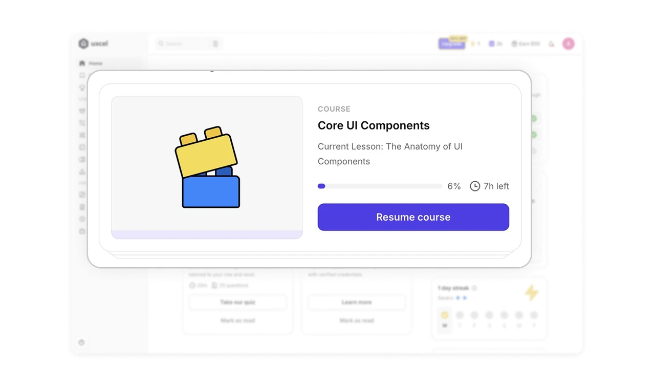
Onboarding sells the payoff and shows progress already made
"Unlock your Aha! moment by working through these quick, rewarding steps" frames setup around the user's payoff, not the product's requirements. Two of three steps already show green checks, only the Pulse test remains. Incomplete tasks nag at us (the Zeigarnik effect), and progress already banked is the strongest motivator to finish. Onboarding converts when it promises a feeling and proves the user is most of the way there.
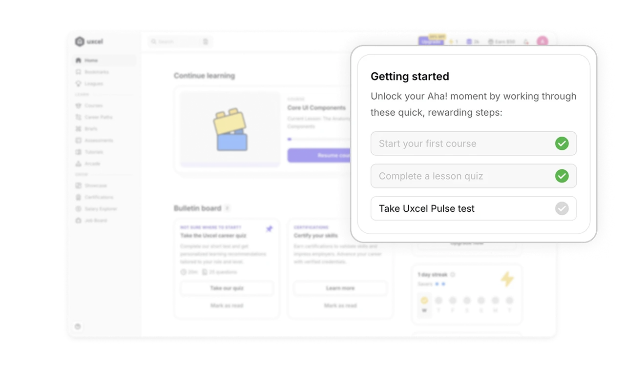
Streaks need a safety net, not just a chain
The 1-day streak card shows the count, a 7-day week row with today checked, and two "Savers" dots, streak freezes that protect the chain on a missed day. Streak UI needs all three: current count, a visual week, and a forgiveness mechanic. Punishing a single break kills the streak permanently and the motivation with it. Forgiving one miss is what sustains engagement for months instead of weeks.
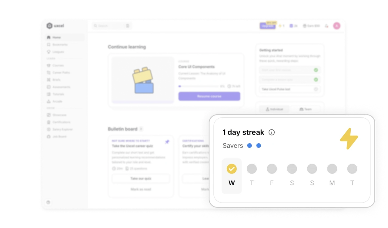
Announcements offer "Mark as read" alongside the action
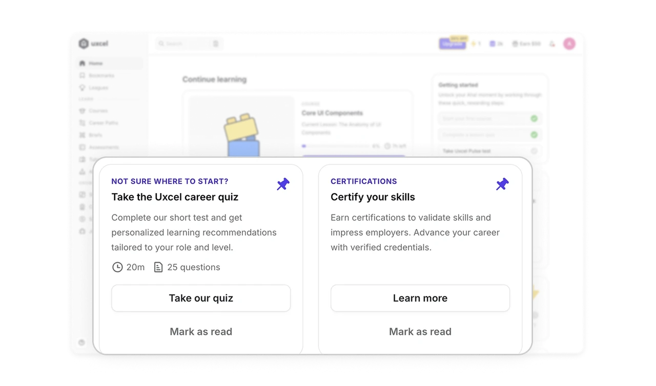
Bulletin board cards carry pin icons, a counter badge, a primary action, and a "Mark as read" dismiss. Users control their own bulletin, act on it or clear it. Respecting the right to say "seen it, not interested" is what keeps an announcements area trustworthy. A bulletin that never clears becomes invisible noise, and once users learn to ignore the space, every future announcement dies there too.
One upgrade card serves two buyers with outcomes, not features
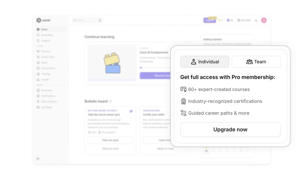
The Pro card leads with an Individual/Team toggle, one surface serving B2C and B2B buyers without duplicate pages. Below, three benefit lines: expert courses, recognized certifications, guided career paths. Outcomes the learner wants, not feature specs. Three benefit lines beat ten bullets, and one adaptive card beats two static pages because the viewer knows which buyer they are better than you do.
Similar Breakdown Lessons