5 UX Lessons From Telescope's Product Discovery Feed - Telescope UI Breakdown
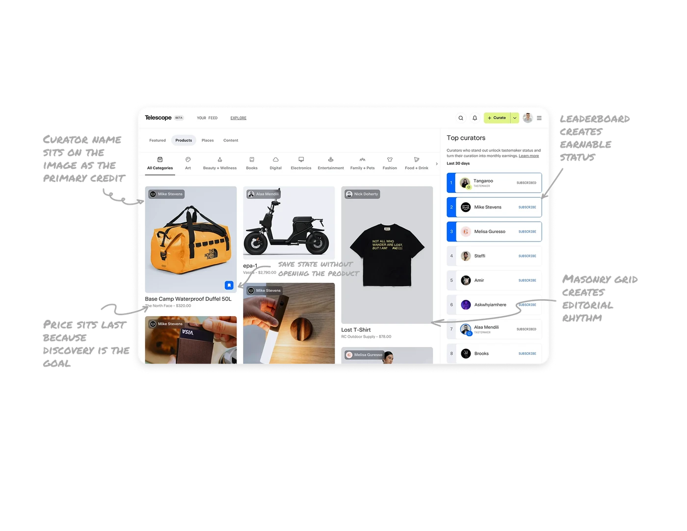
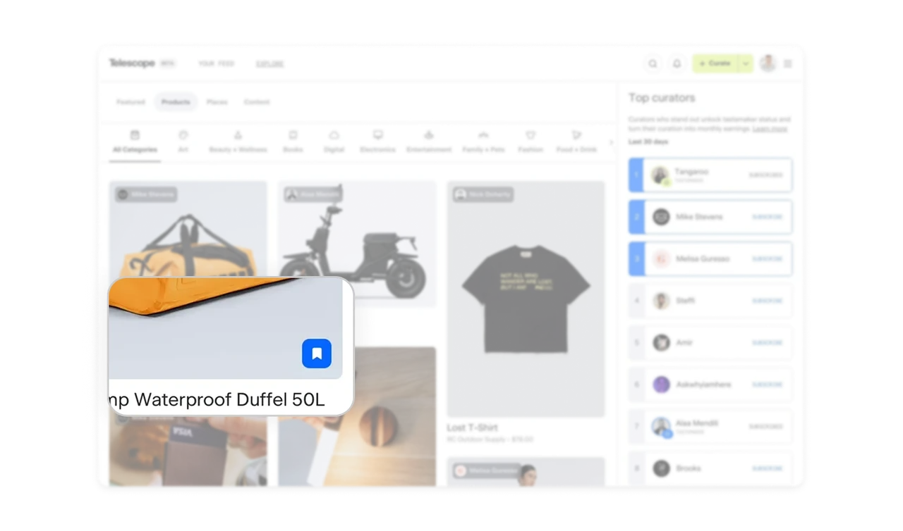
Masonry grid creates editorial rhythm, not catalogue feel
Card heights vary based on each product's natural image aspect ratio. The result is an irregular grid with visual rhythm that pulls users to keep scrolling. Uniform grids feel like a catalogue. Masonry feels like a magazine. For discovery-driven products where browsing pleasure drives retention, the layout itself communicates "this is curated content," not "this is inventory."
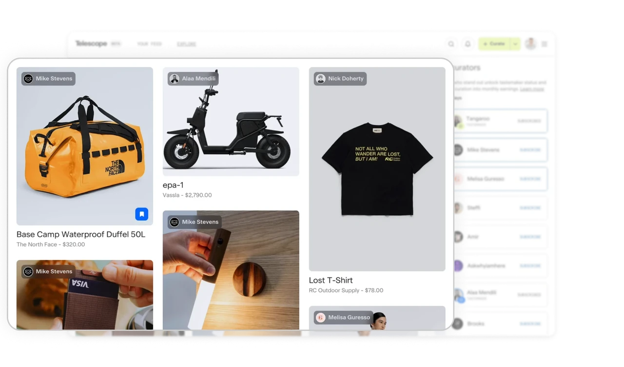
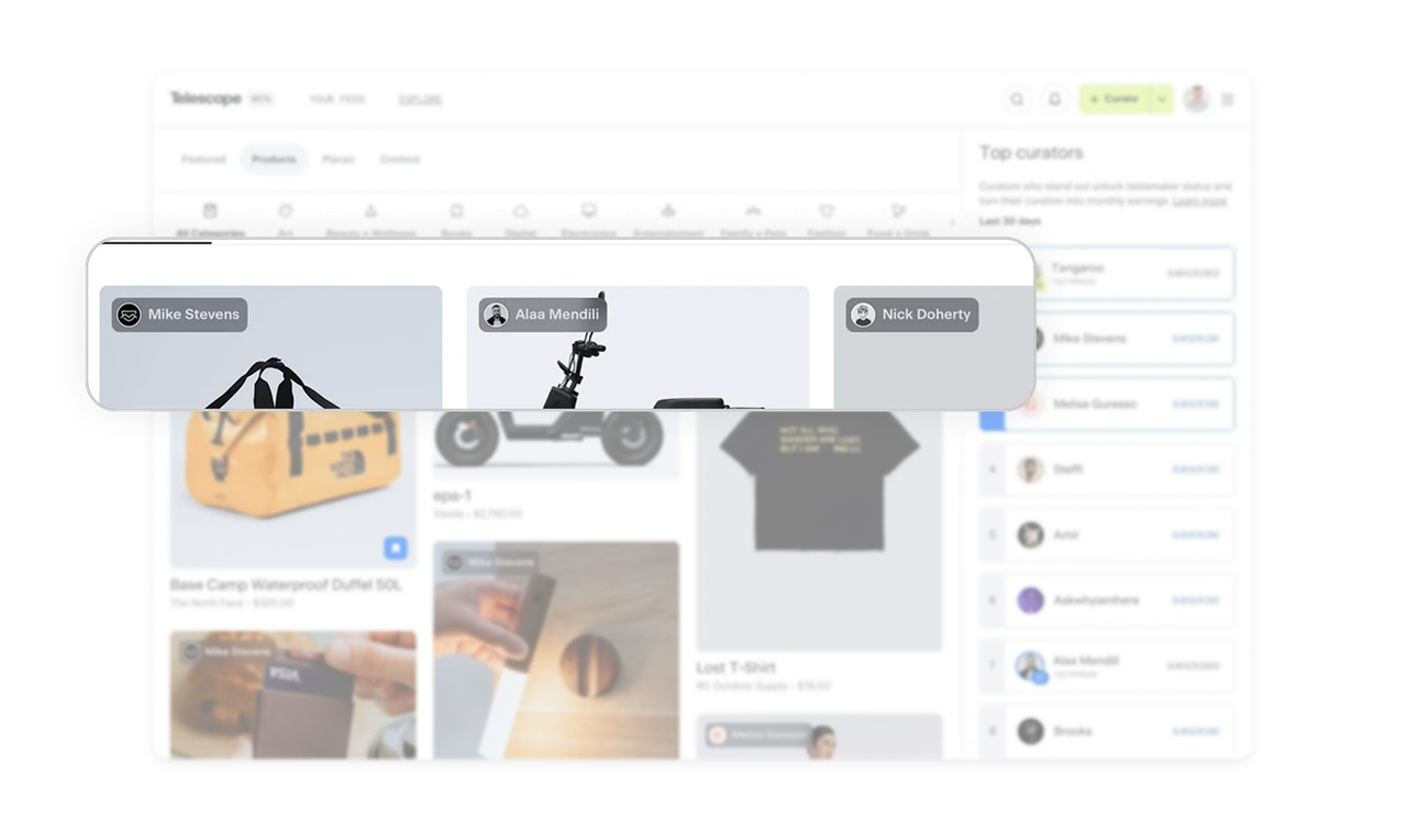
Curator name sits on the image as the primary credit
Names appear as small avatar pills over each product image, before the product name itself. The curator is the source of trust, not the brand. This flips the typical e-commerce hierarchy where the seller comes first. Putting the recommender above the product reframes the entire experience as social discovery, not shopping.
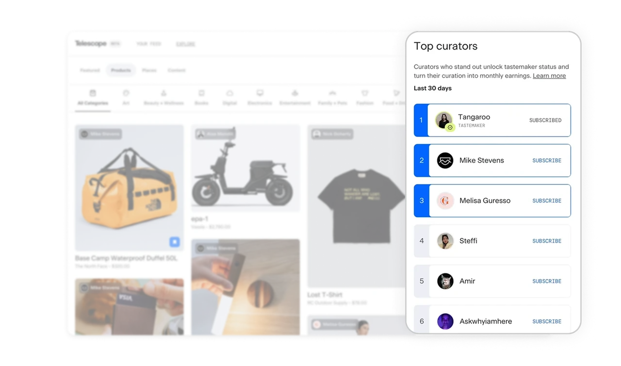
Top Curators leaderboard creates earnable status
The right panel ranks curators with numbered positions, Tastemaker badges, and Subscribe buttons. New users find the best recommenders instantly. Existing curators get a visible reason to keep contributing. "Curators who stand out unlock tastemaker status and turn their curation into monthly earnings" ties recognition to revenue. Public ranking plus monetization is the strongest possible incentive for high-quality user contribution.
Price sits last and small because discovery is the goal, not purchase
Product name is bold, brand and price sit small and gray beneath it. This hierarchy is deliberate, Telescope is not an e-commerce store, it is a discovery platform. Putting price last signals to users that exploration matters more than transaction. The same product card on Amazon would lead with price. Hierarchy reflects product philosophy, and small choices like font weight communicate what kind of product this actually is.
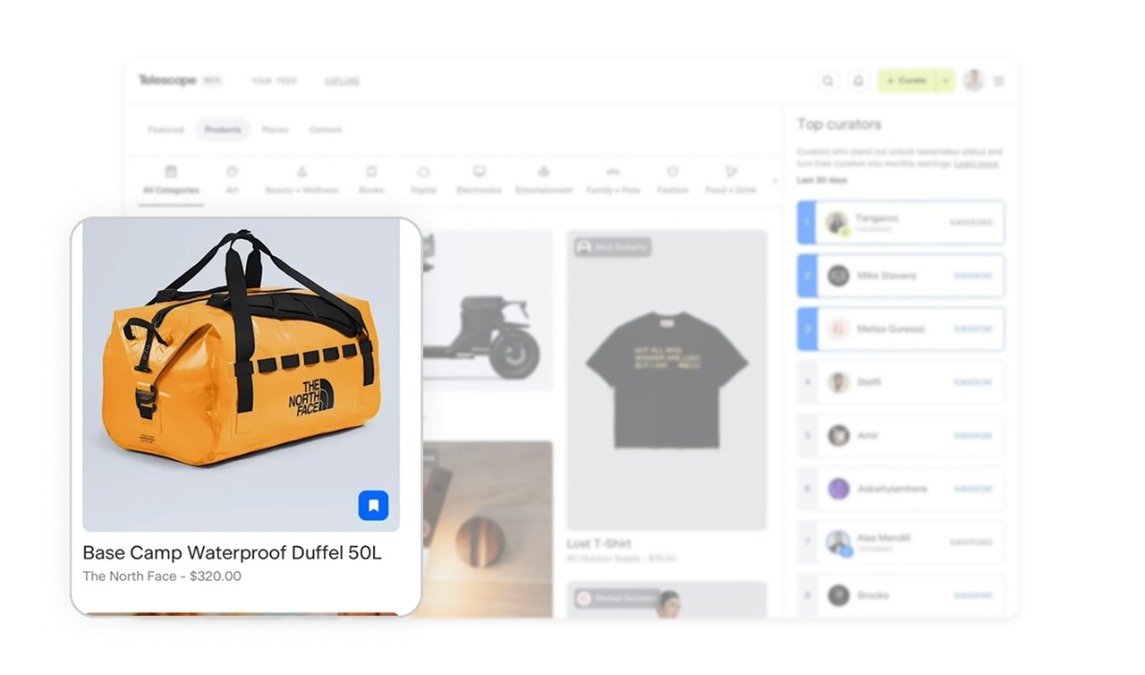
Inline bookmark icon shows save state without opening the product
A small bookmark icon sits in the bottom corner of each product card. Filled blue means saved, outline means unsaved. Users save items in one tap without leaving the feed or seeing a confirmation modal. Inline save state plus quiet visual confirmation respects the user's scroll momentum.
Similar Breakdown Lessons

