5 UX Lessons From Komoot's Trip Planning UI - Komoot UI Breakdown
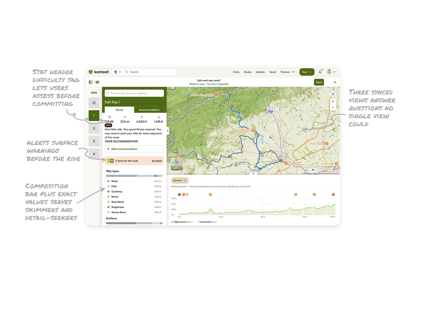
Three synced views answer questions no single view could
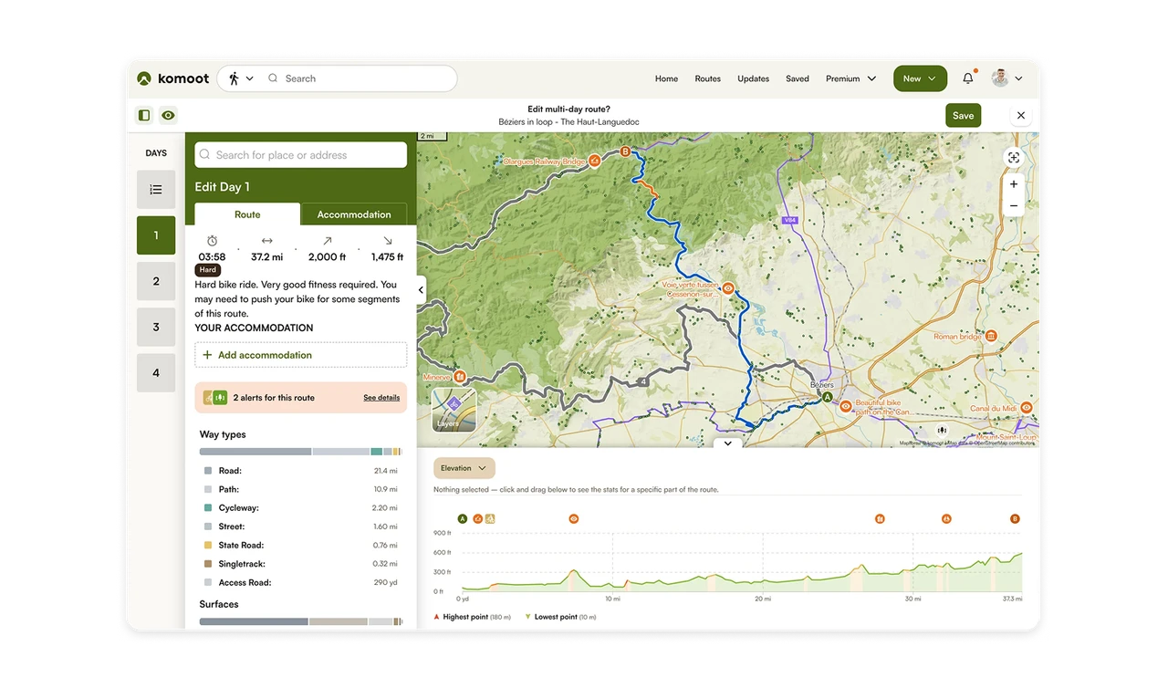
The map shows where the route goes, the data panel shows how much (distance, climb, time), and the elevation graph shows how hard. All three reference the same route from different angles. For complex spatial data, multiple synchronized representations beat one crowded view. Each answers a distinct question, and together they let users understand a route they have never ridden before committing to it.
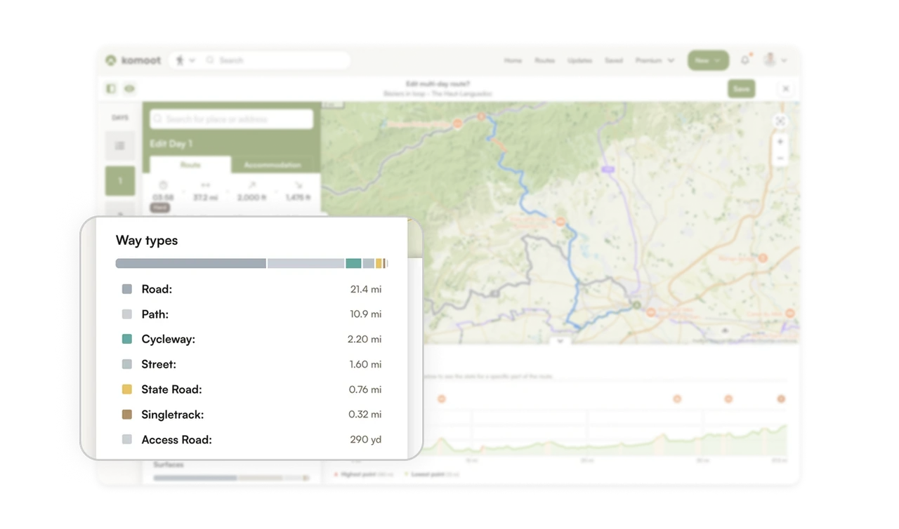
Composition bar plus exact values serves skimmers and detail-seekers
The Way Types bar visualizes surface composition as a segmented, color-coded bar with exact distances listed below. Skimmers read the bar shape, detail-seekers read the numbers. A segmented proportion bar is the ideal way to answer "what is this made of?" Pairing the visual with precise values means one component satisfies two very different reading styles at once.
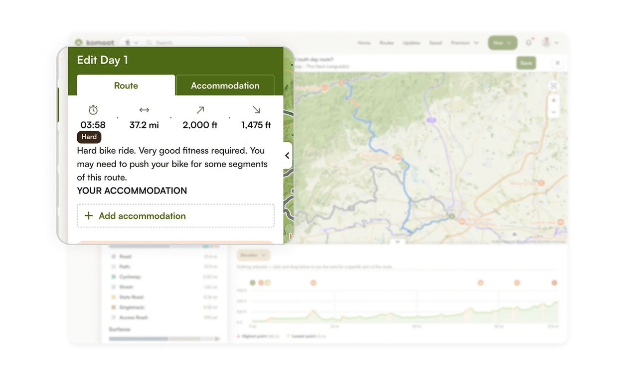
Stat header plus difficulty tag lets users assess before committing
Time, distance, ascent, and descent sit as four bold numbers with icons, followed by a "Hard" tag and a plain-language warning: "you may need to push your bike for some segments." Users assess whether the route fits their ability in seconds. Pairing scannable metrics with an honest difficulty label and prose description sets accurate expectations, which prevents the worst outcome in route planning: committing to something beyond your level.
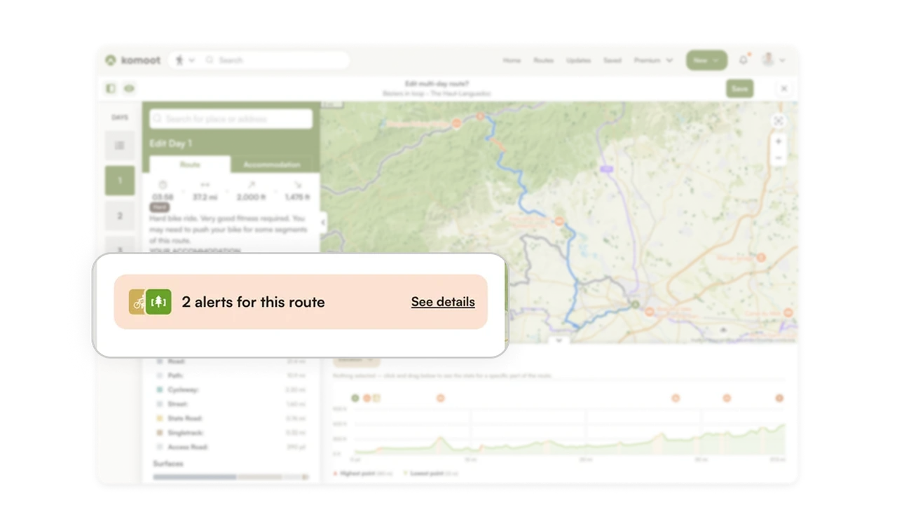
Route alerts surface warnings before the ride, not during
"2 alerts for this route" sits in an orange card with a See details link, plus orange route segments highlighted on the map. Users learn about hazards or restrictions while planning, when they can still adjust, not mid-ride when it is too late. Proactive warnings at the planning stage turn potential surprises into informed choices. Surfacing risk early is what separates a tool users trust from one that lets them down on the trail.
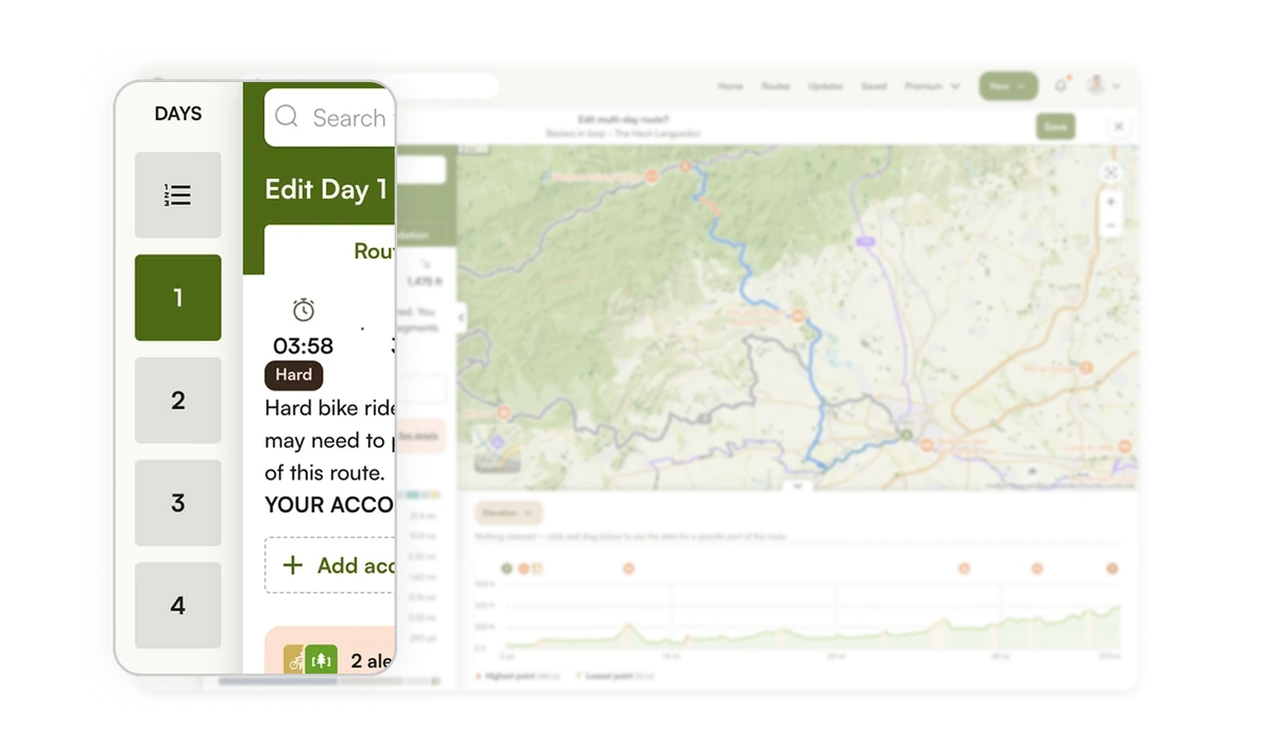
Numbered day sidebar makes multi-day planning navigable
The left rail shows days 1 through 4 as large numbered tiles, with the active day highlighted. Users jump between days of a multi-day trip without losing their place. Breaking a complex multi-day route into discrete, switchable day units mirrors how people actually think about a tour: one day at a time. The persistent day selector keeps a large planning task organized and never overwhelming.
Similar Breakdown Lessons


