5 UX Lessons From Vercel's New Project Setup UI - Vercel UI Breakdown
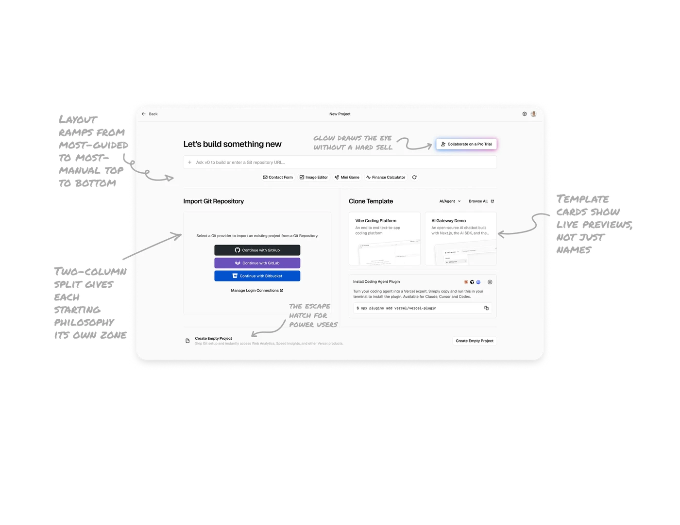
Layout ramps from most-guided to most-manual top to bottom
The screen flows from the AI prompt (easiest) to templates, then Git import, then Create Empty Project (most manual) at the bottom. The vertical order is a difficulty gradient. New users land on the easy path first, experienced users scan down to their preferred level of control. Spatial order does the user segmentation automatically, no "are you a beginner or expert" question needed.
Two-column split gives each starting philosophy its own zone
Import Git Repository and Clone Template, each gets a dedicated column separated by a vertical divider. These are fundamentally different mental starting points. Giving each a distinct spatial zone lets users self-select their path without confusion. When users arrive with opposing intents, separate them spatially rather than forcing one combined flow.
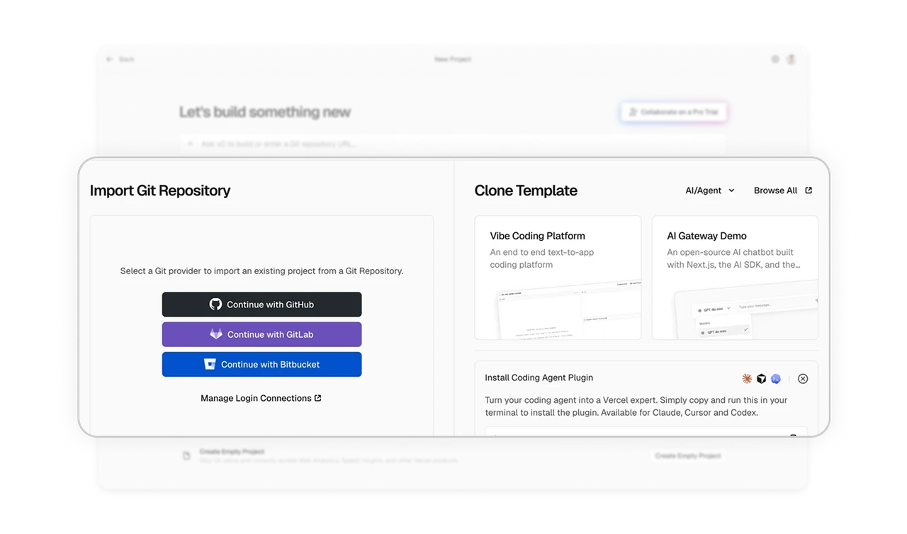
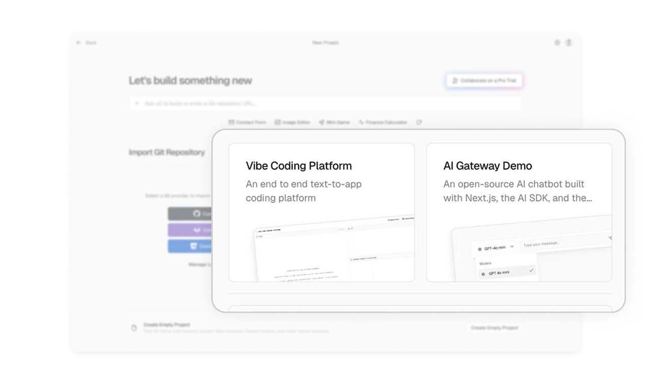
Template cards show live previews, not just names
Vibe Coding Platform and AI Gateway Demo cards include miniature screenshots of the actual templates. Users see what they are cloning before committing. A name and description tell you what something is, a screenshot tells you whether you want it. For any visual output, always show the actual result, the preview removes the guessing that causes users to pick wrong and abandon.
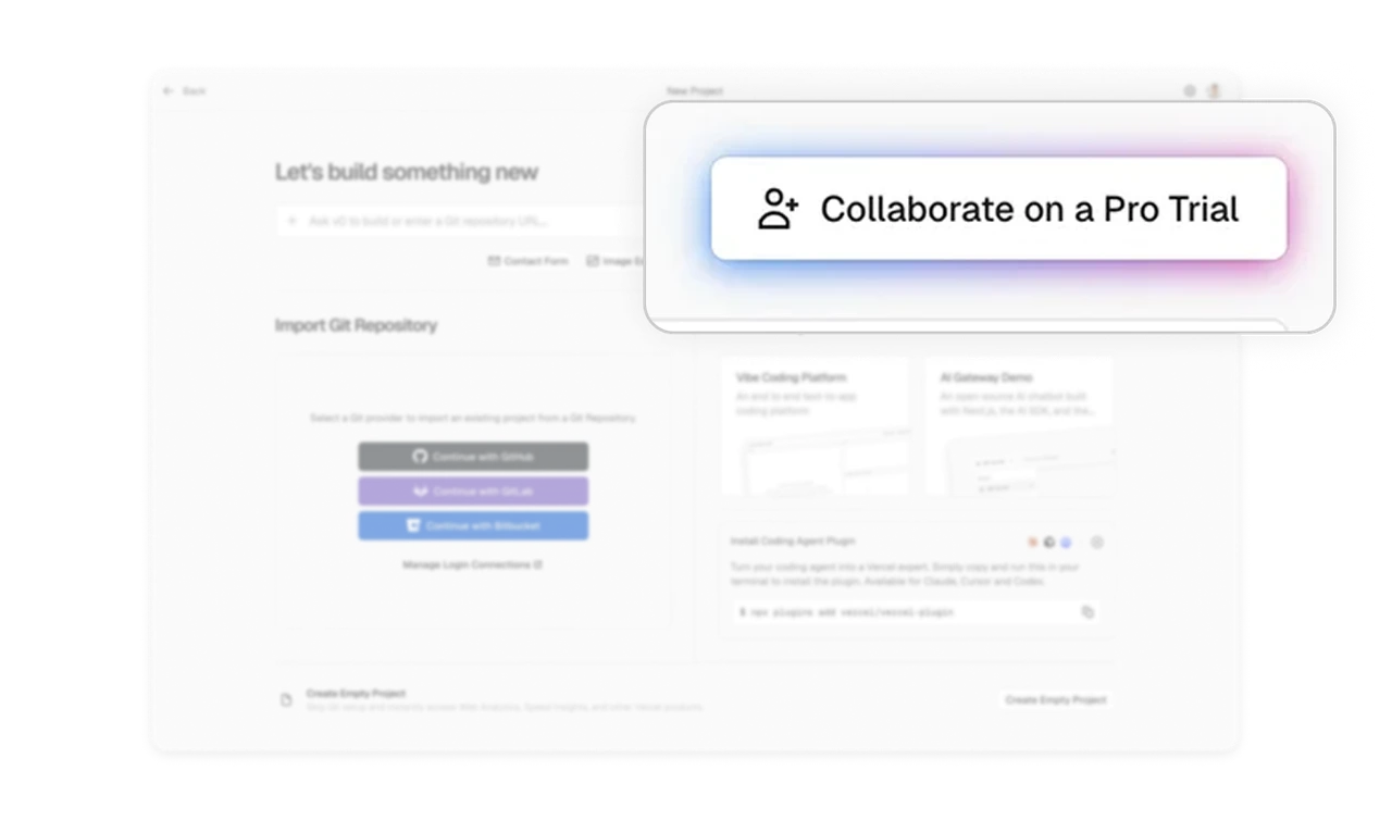
Subtle gradient glow draws the eye without a hard sell
The "Collaborate on a Pro Trial" CTA top-right has a soft gradient glow border instead of an aggressive color block or banner. It feels like a premium invitation, not a pushy upsell. Upgrade prompts can attract attention through refined visual treatment rather than disruptive placement. Matching the tone to a developer audience, who reject obvious marketing, makes the invitation feel earned rather than imposed.
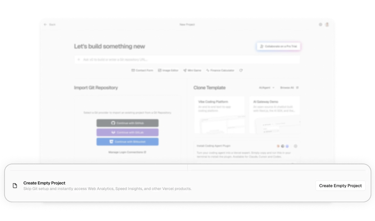
Create Empty Project is the escape hatch for power users
At the very bottom, "Create Empty Project" serves users who reject every guided path, with a clear note about what they still get (Analytics, Speed Insights). The shortcut is present but de-emphasized. Always give an escape hatch for users who want to do it their own way. Placing it last and quiet respects the guided majority while still honoring your most advanced segment, which builds trust where it matters most.
Similar Breakdown Lessons