AI Health Dashboard

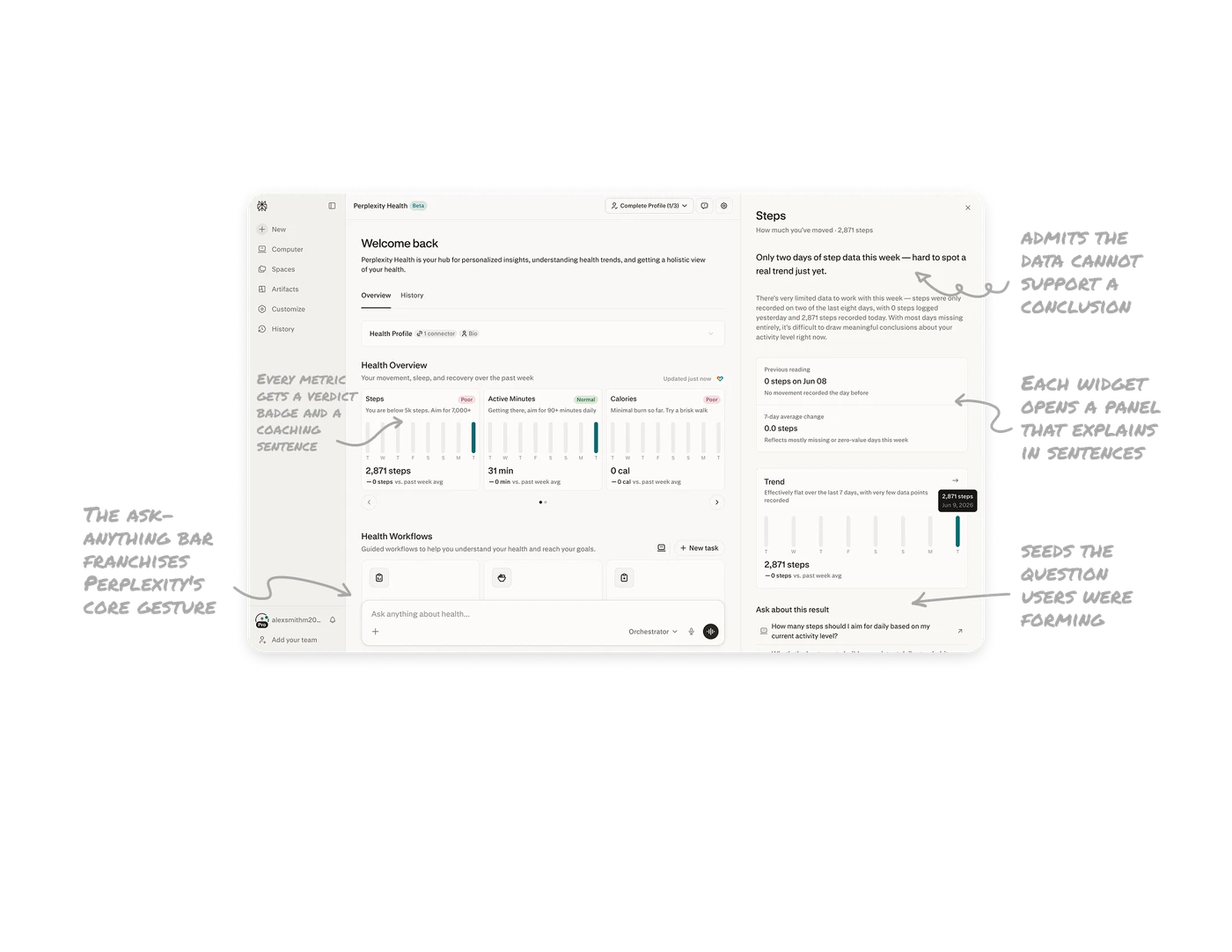
The headline admits the data cannot support a conclusion
The Steps drill-down leads with "Only two days of step data this week, hard to spot a real trend just yet," then explains exactly why: steps on two of eight days, most days missing. When data is insufficient, say so as the headline instead of rendering a confident chart over garbage inputs. Most dashboards would show the flat line and let users misread it. Narrating the reliability of the data before its content is epistemic honesty, and in health AI it is the trust differentiator.
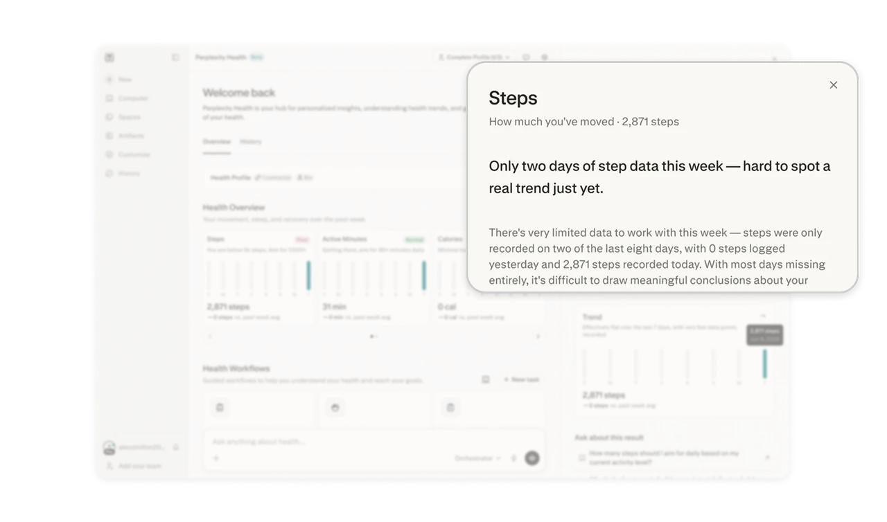
Every metric gets a verdict badge and a coaching sentence
Steps and Calories carry red "Poor" badges, Active Minutes gets green "Normal," and each card adds a next step: "You are below 5k steps. Aim for 7,000+." The number says what happened, the badge says how to feel about it, the sentence says what to do. Complete the data-verdict-action ladder on every card. A metric without a prescription leaves the user informed but unhelped, and health dashboards exist to change behavior, not report it.
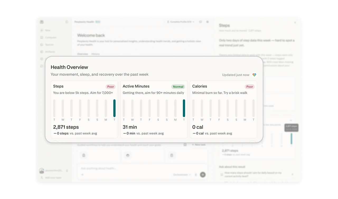
Each widget opens a panel that explains in sentences
Clicking a metric opens a right panel narrating it: previous reading, 7-day average change, trend chart, all woven with prose that answers what the chart raises ("why is it flat?" gets "very few data points recorded"). Give every dashboard metric a drill-down that speaks in sentences, not just bigger charts. This is the dashboard-to-conversation transition in mid-form: an AI analyst attached to each widget, explaining on demand without replacing the glanceable grid.
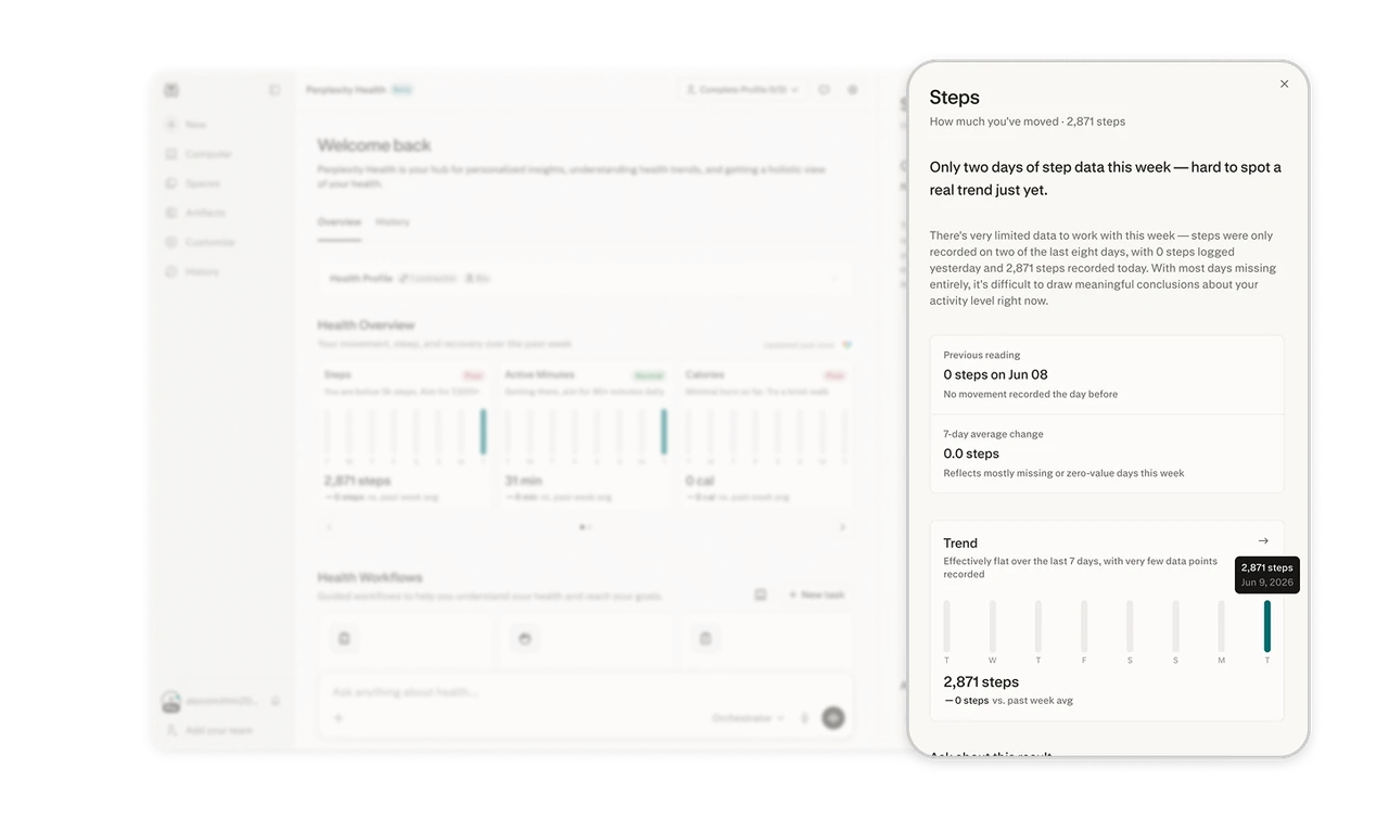
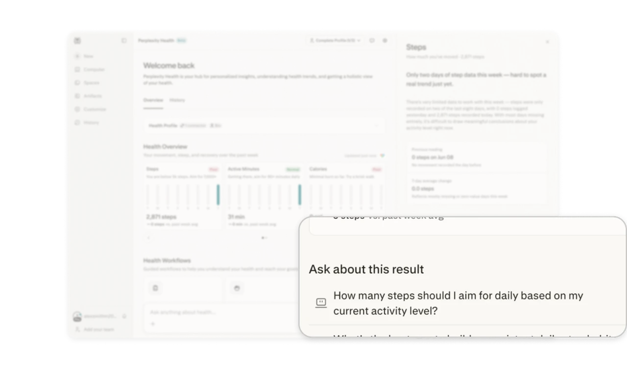
"Ask about this result" seeds the question users were forming
Below the analysis sits a pre-written follow-up scoped to the exact metric: "How many steps should I aim for daily based on my current activity level?" The user just read their steps verdict, and the natural next thought is "so what should I do?" Pre-phrasing it removes the prompt-writing burden and quietly teaches what the AI can answer. Seed contextual questions at the end of every insight, scoped suggestions beat generic ones because they meet a thought already in motion.
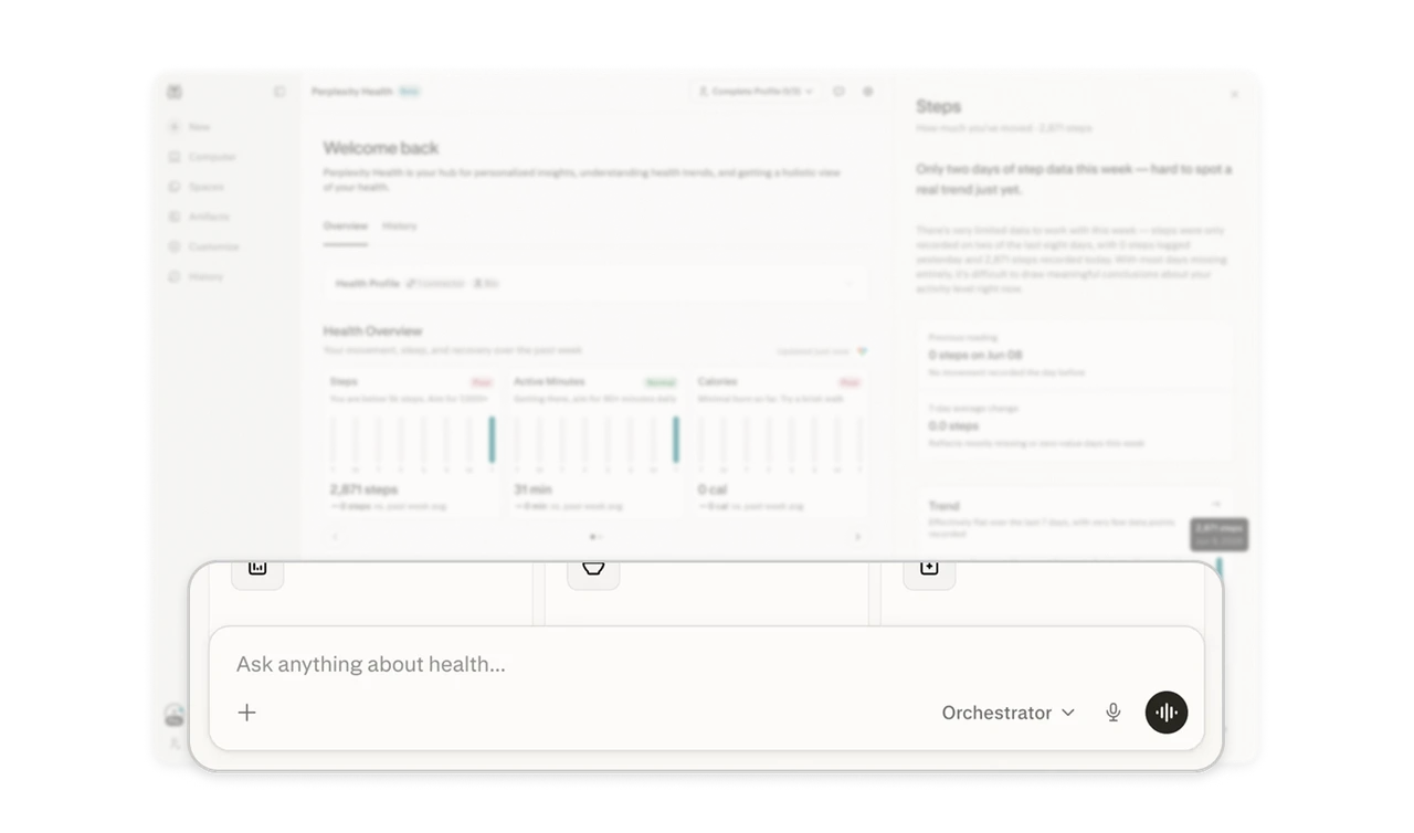
The ask-anything bar franchises Perplexity's core gesture
The persistent input ("Ask anything about health...") carries the Orchestrator model dropdown, voice, and attachments, Perplexity's search DNA transplanted into a health hub. When a company extends into a new vertical, carry the signature interaction as the anchor. Existing users already know how to use the new product on arrival, and the familiar gesture makes an unfamiliar domain feel like home ground. Franchise your core gesture across verticals, it is onboarding you already shipped.
Similar Breakdown Lessons