5 Advanced UI Lessons from Sana AI Chat - Sana AI UI Breakdown
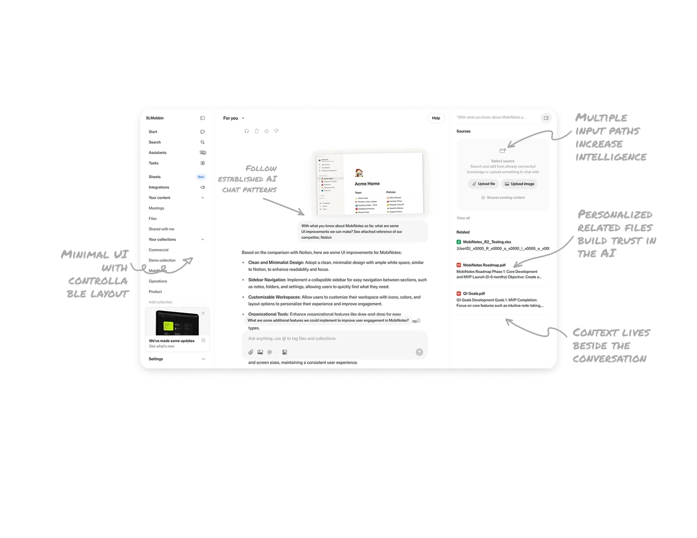
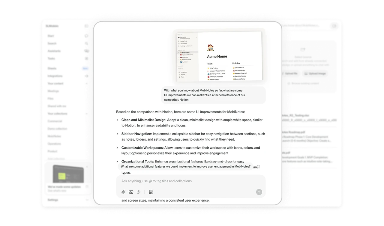
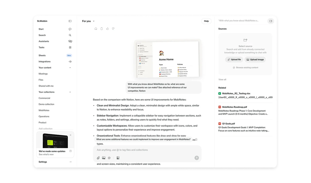
Follow established AI chat patterns to reduce friction
Instead of inventing a new interaction model, the interface follows familiar AI chat conventions. Input at the bottom, conversation in the center, context on the side. This lowers cognitive load and helps users focus on what matters: the prompt and the response.
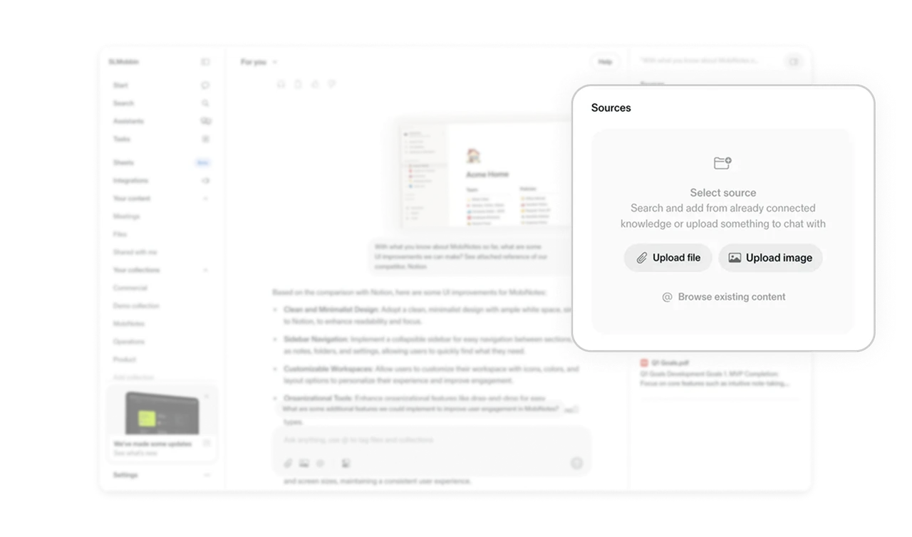
Context lives beside the conversation, not inside it
The Sources panel sits on the right, separate from the main chat. Users can upload files, browse content, or reference documents without breaking their flow. Keeping context adjacent but not embedded prevents clutter and keeps the conversation readable.
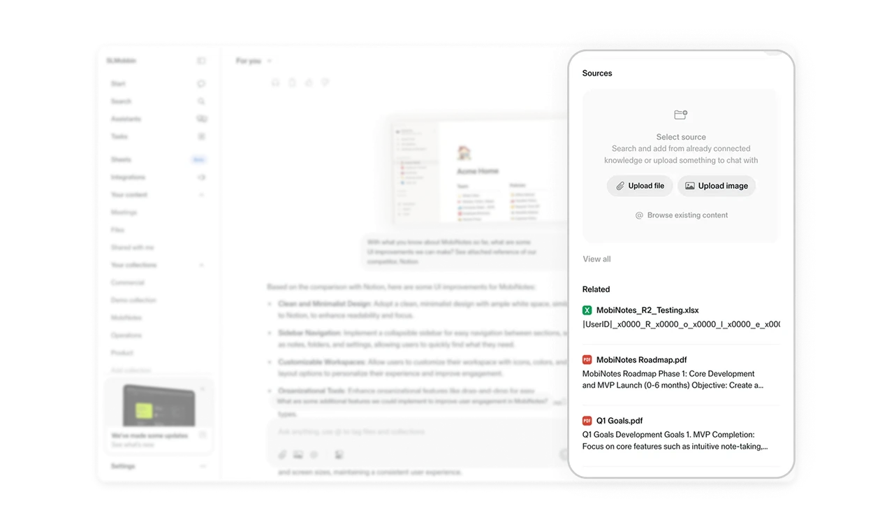
Multiple input paths increase perceived intelligence
The Sources card supports file upload, image upload, browsing content, and @ tagging. This creates flexibility in how users provide context. When the system adapts to different input behaviors, it feels more capable and responsive.
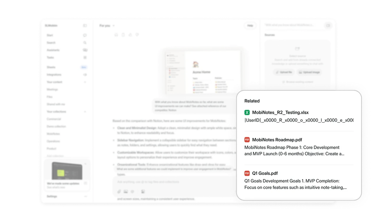
Personalized related files build trust in the AI
The Related section surfaces documents connected to the current query. This small detail signals that the AI understands context beyond a single message. It reduces search effort and makes the experience feel tailored.
Minimal UI with controllable layout keeps focus intact
The interface uses restrained color and generous spacing to prioritize content. Side panels can be collapsed, giving users control over complexity. This balance between simplicity and customization supports both beginners and power users.
Similar Breakdown Lessons