5 UX Lessons From Apple Wallet Card Dashboard - Apple Wallet UI Breakdown
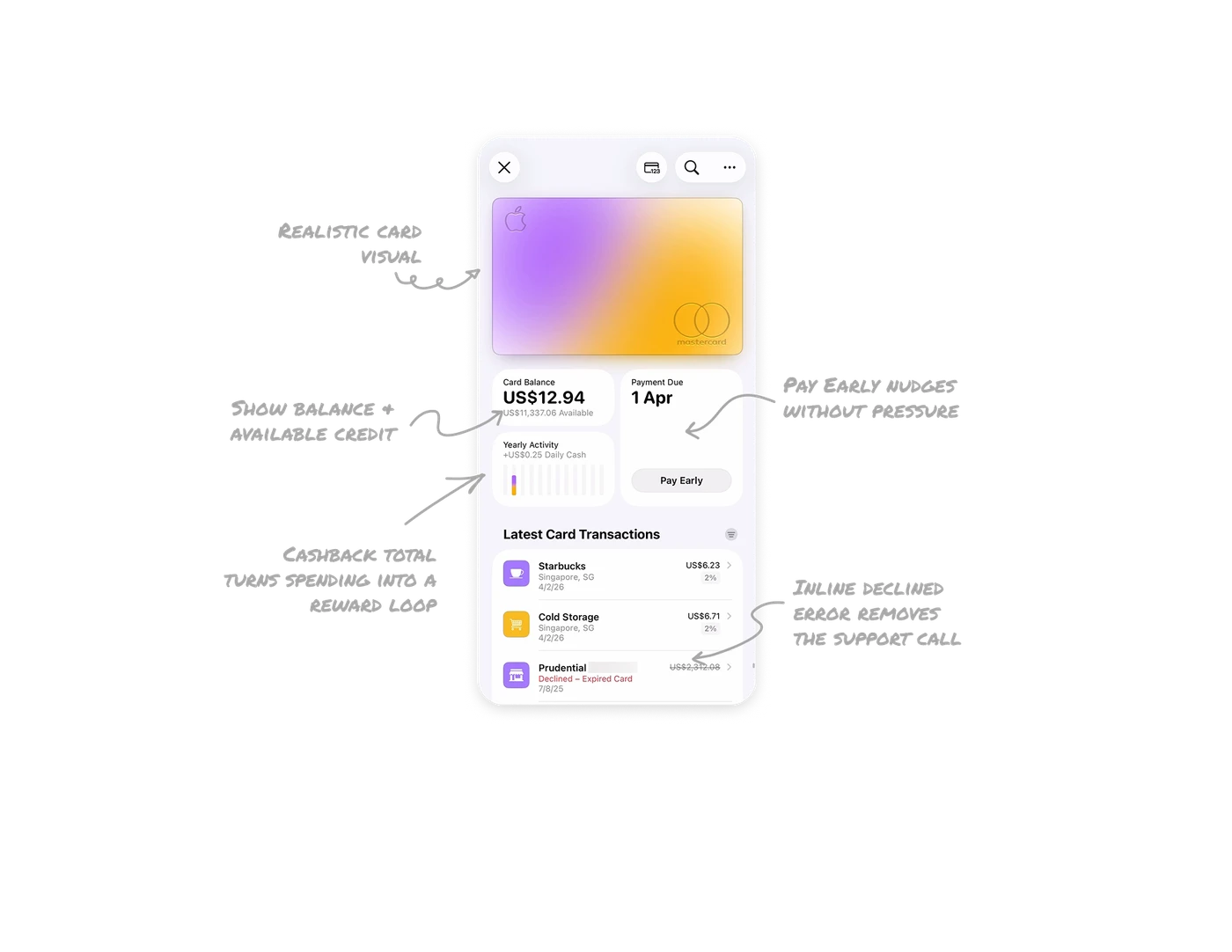
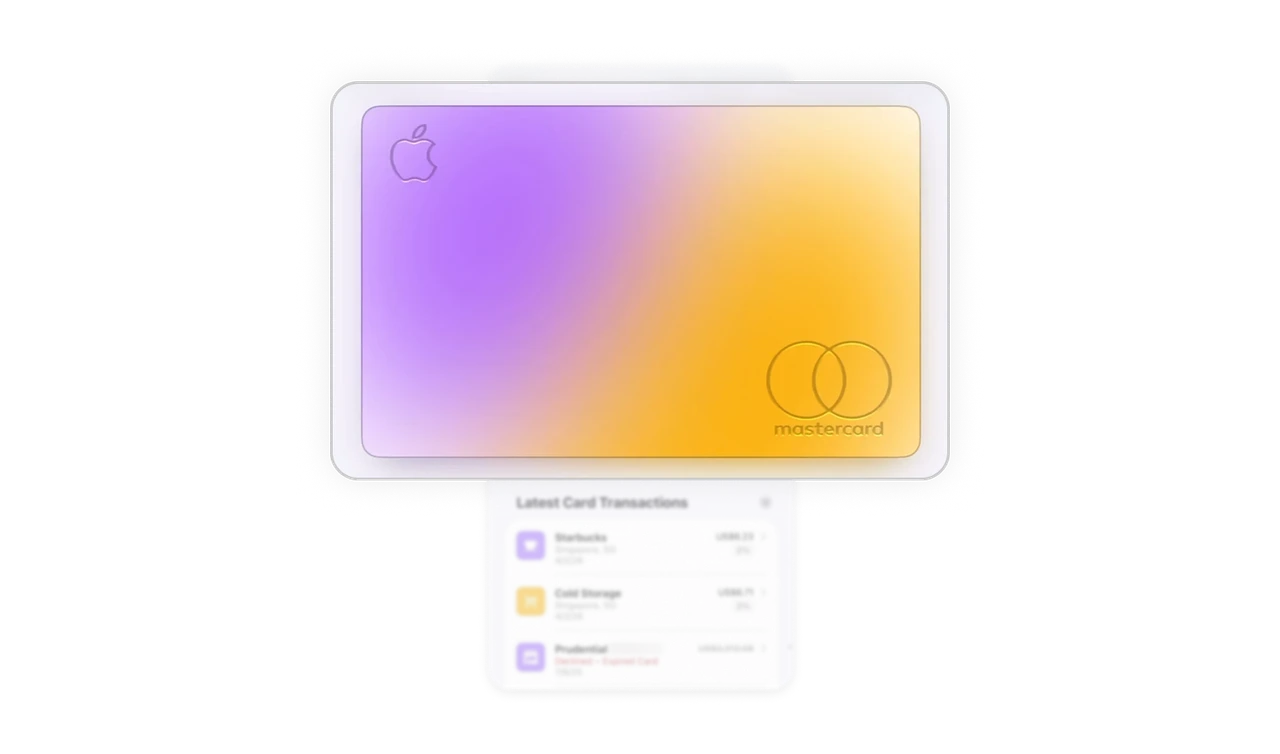
Realistic card visual = instant recognition
The digital card mirrors the physical one exactly. Users do not read the name to know which card they are on. In apps with multiple cards, this eliminates the risk of acting on the wrong account before a single label is read.
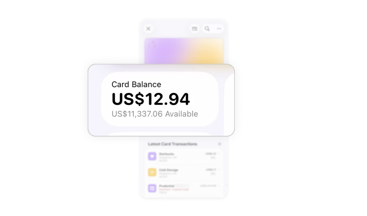
Show balance and available credit together
Bold balance paired with muted available credit gives users two financial contexts at a glance. Showing only the balance creates anxiety. Showing both creates clarity. A small layout decision with a large impact on user confidence.
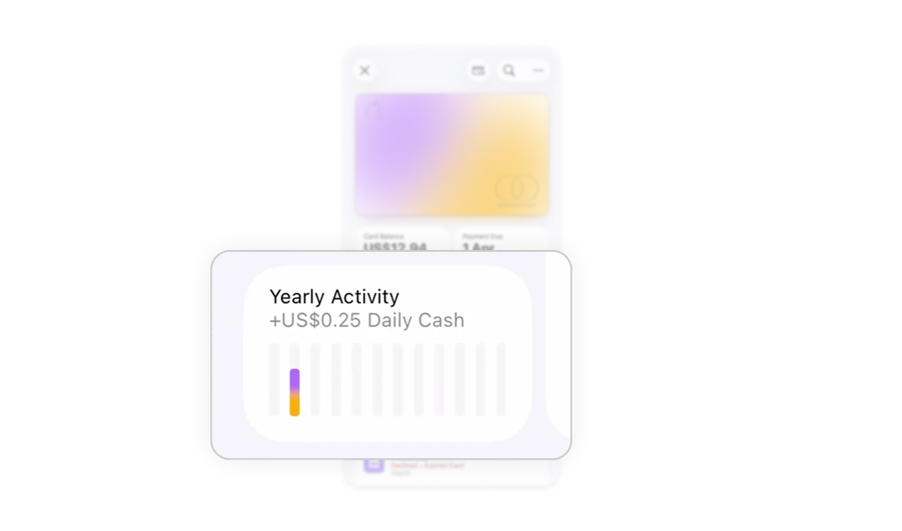
Cashback total turns spending into a reward loop
A running cashback number makes users feel they are gaining something from every purchase. No points, no badges, just one number. That single figure drives card usage frequency more quietly than any loyalty program with ten features.
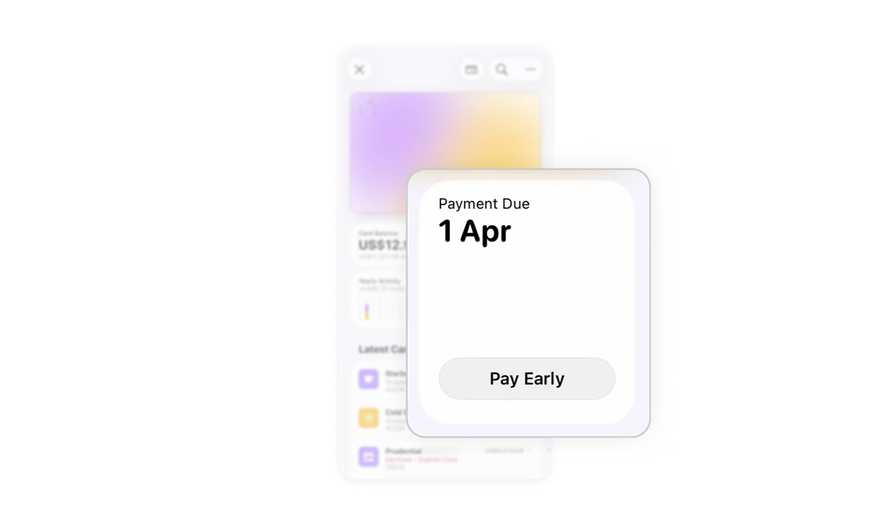
Pay Early nudges without pressure
The due date is clear. The Pay Early button is a quiet gray pill, not red, not urgent. Apple benefits when users pay early, but the UI never makes them feel chased. Subtlety here is a deliberate business decision, not just an aesthetic one.
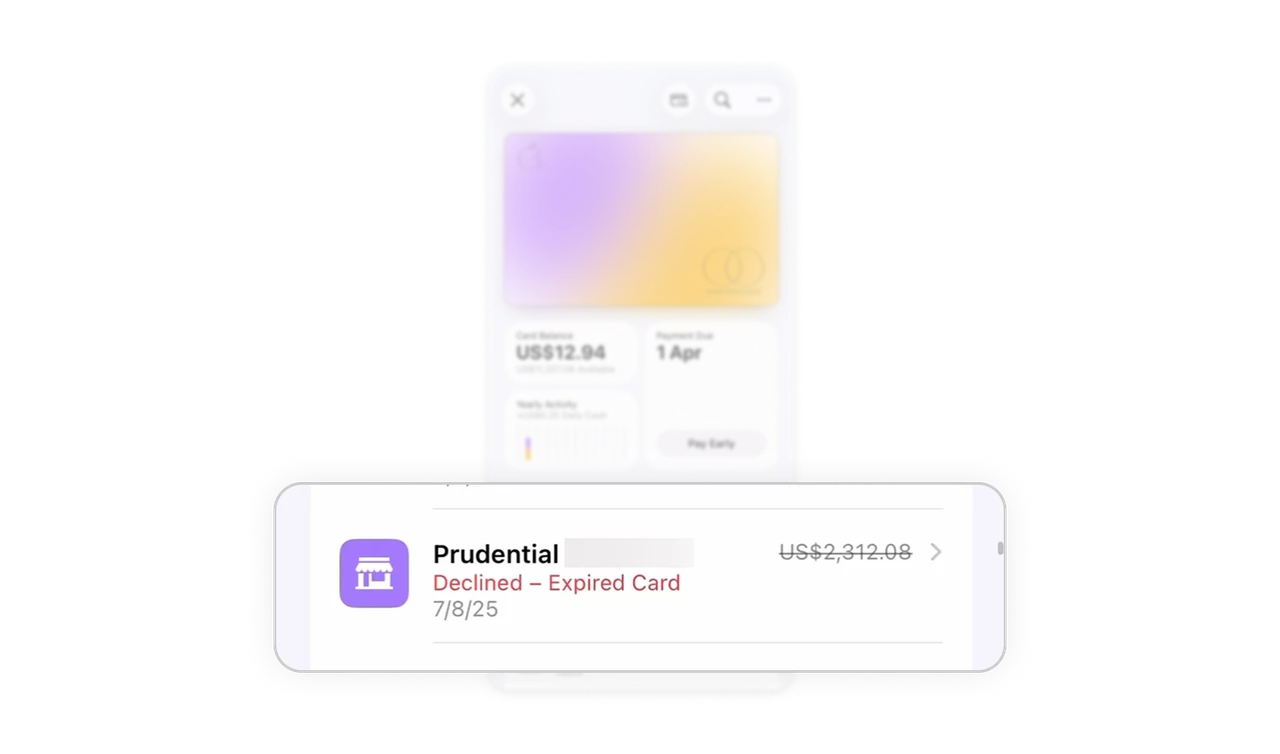
Inline declined error removes the support call
Red label and strikethrough amount live inside the transaction row, no modal, no alert. "Declined - Expired Card" tells users what happened and why in four words. Precise UX writing at the exact point of failure eliminates confusion before it becomes a support ticket.
Similar Breakdown Lessons


