Card Management

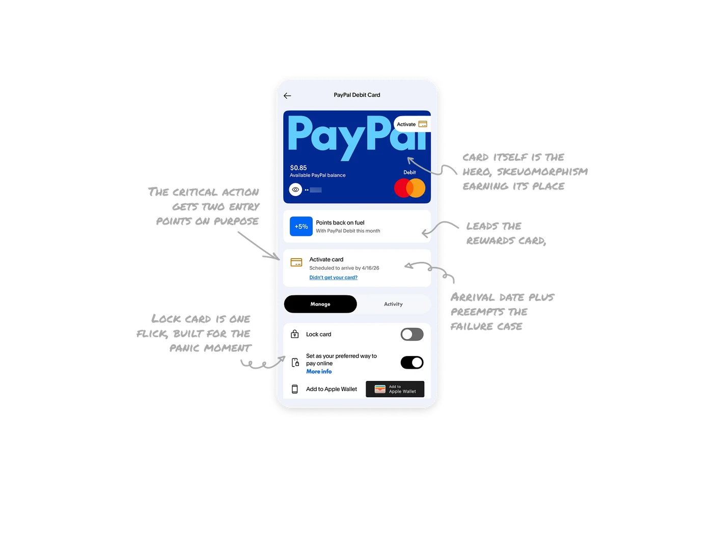
The card itself is the hero, skeuomorphism earning its place
The screen leads with a full-width render of the actual card: PayPal branding, Mastercard mark, Debit label, live balance overlaid. The digital twin mirrors the physical object arriving in the mail, creating instant recognition that this screen is about that card. For physical products with digital twins, render the object as the hero. The realism makes an abstract account feel tangible and ownable.
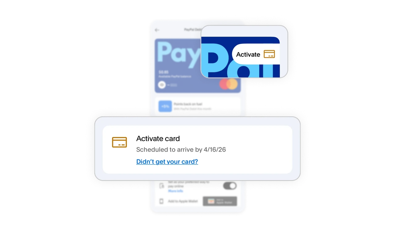
Arrival date plus "Didn't get your card?" preempts the failure case
"Activate card, Scheduled to arrive by 4/16/26" pairs a concrete date with a pre-built path for when things go wrong. The card-in-transit limbo is the most anxious stretch of the relationship, and the escape hatch anticipates the support scenario before frustration peaks. For fulfillment waiting states, always ship the expected date and the failure path together, users should never have to hunt for help at the exact moment trust is thinnest.

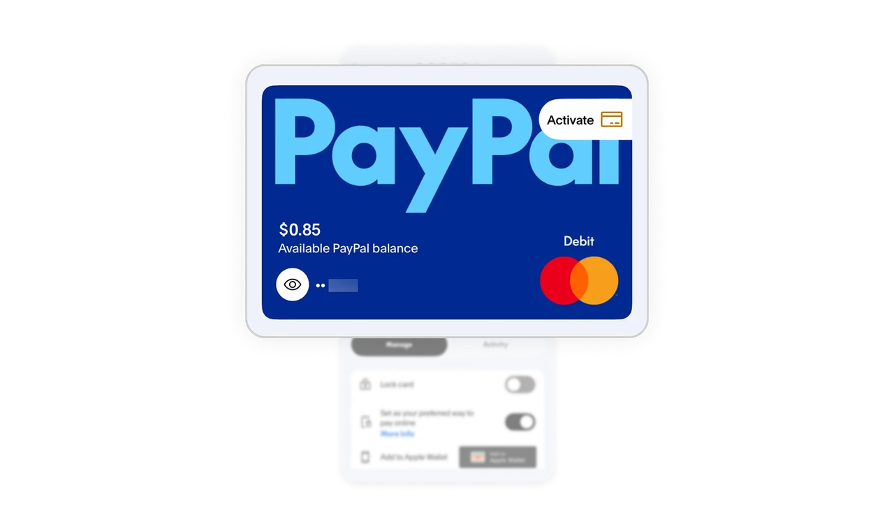
The critical action gets two entry points on purpose
An Activate pill sits on the card visual itself AND an activation card repeats below in the content. Activation gates everything else this screen offers, so the door appears wherever the user's eyes land, on the object or in the task list. When one action unlocks the whole experience, duplicate its entry point. Redundancy on the critical path is not clutter, it is insurance against the one miss that strands the user.
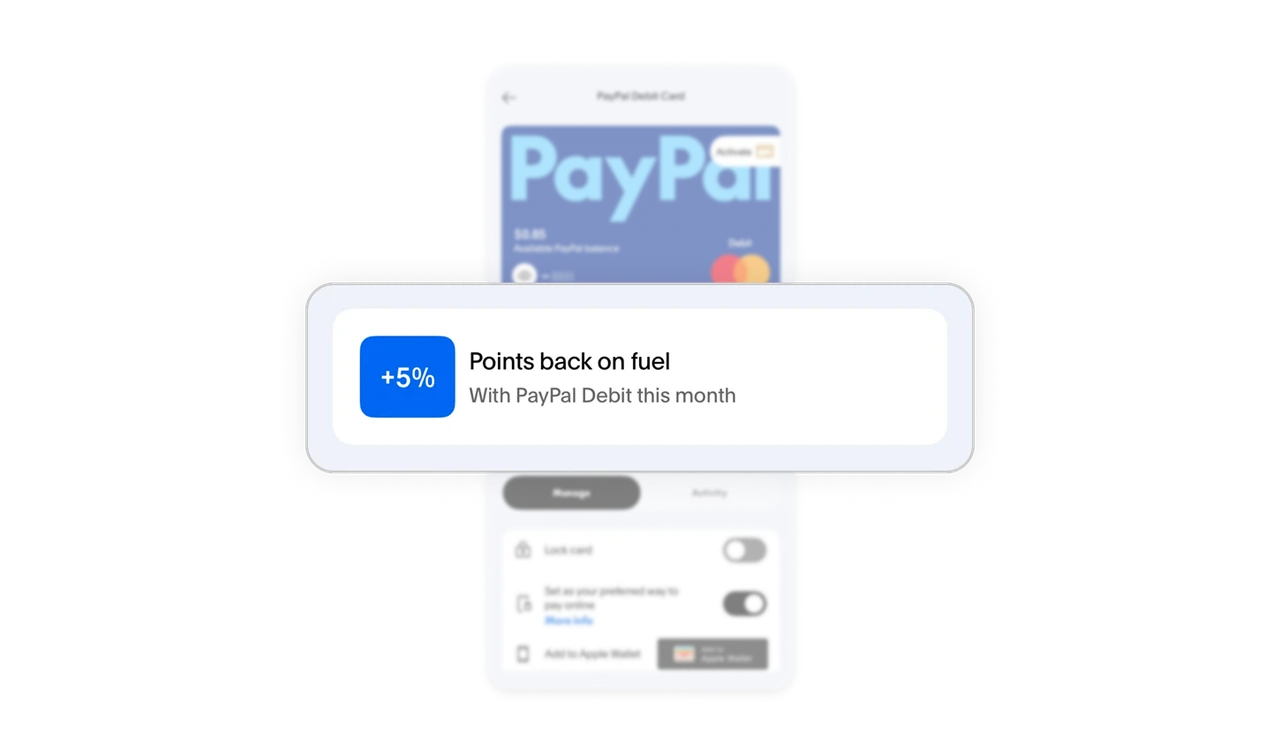
"+5%" leads the rewards card, the program name never appears
The perk card opens with a bold +5% badge, names the category (fuel), and time-boxes it (this month). The number communicates value before a single word is read, where "PayPal Rewards Program update" would communicate nothing. Lead benefit cards with the number, not the program. Time-boxing adds quiet urgency, and rotating categories keep the card top-of-wallet, a retention mechanic wearing a promo card's clothes.
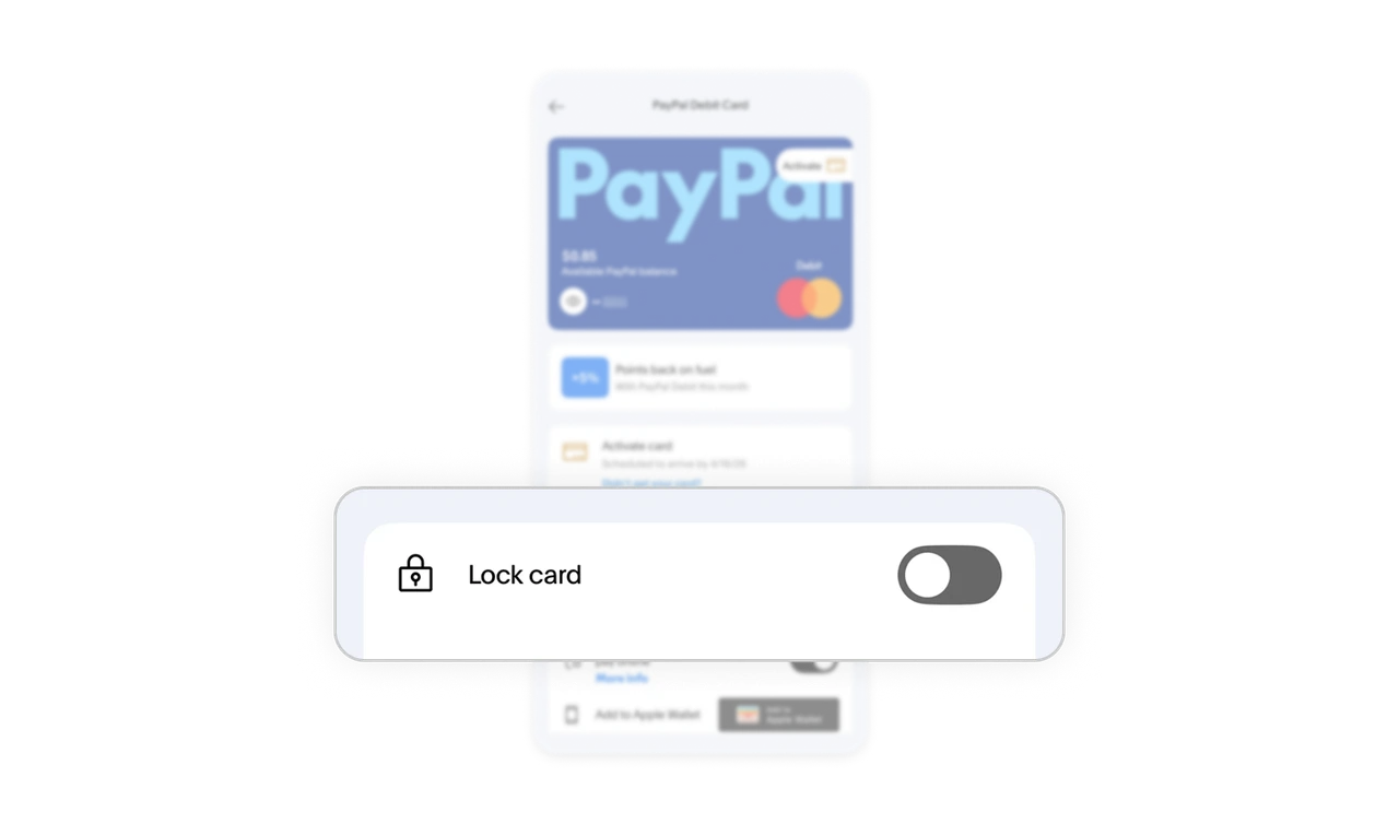
Lock card is one flick, built for the panic moment
"Lock card" sits at the top of the controls as a simple switch, no confirmation maze, no support call. The panic moment ("where is my card?!") demands instant, reversible action, and a toggle communicates both how fast it is and how easily it reverses. Make freezing the most accessible control on the screen. Self-service safety is the trust feature users may only touch once, but its constant visibility is what lets them relax the rest of the time.
Similar Breakdown Lessons