Content Idea Board

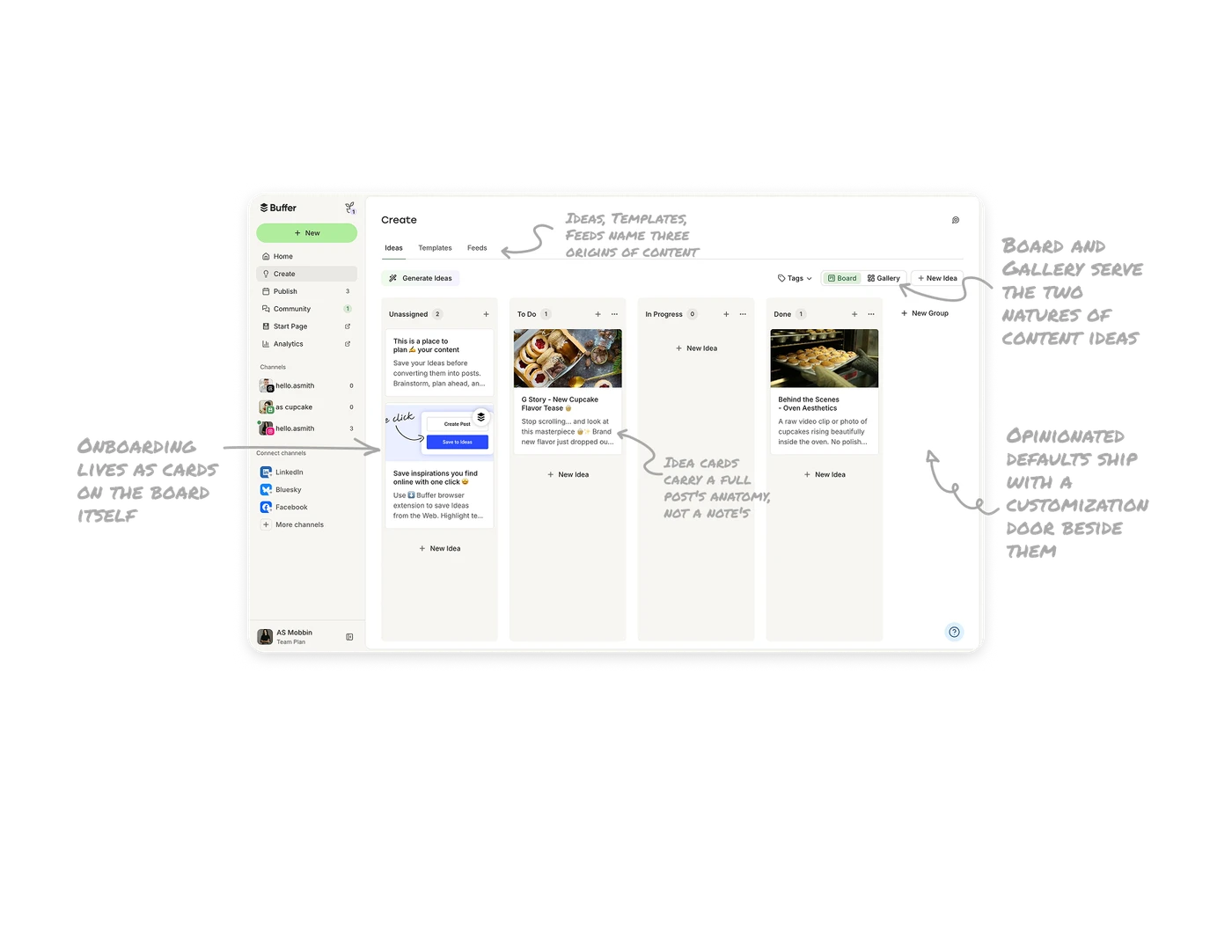
Opinionated defaults ship with a customization door beside them
Four universal stages, Unassigned, To Do, In Progress, Done, end with "+ New Group" sitting exactly where a fifth column would. Defaults teach the intended workflow on day one, the escape hatch admits Buffer cannot know yours: a bakery adds "Seasonal Ideas," an agency adds "Client Review." Blank slates paralyze new users, rigid structures frustrate mature ones. Placing "make your own" in the same spatial grammar as the defaults teaches that columns are addable, no settings page needed.
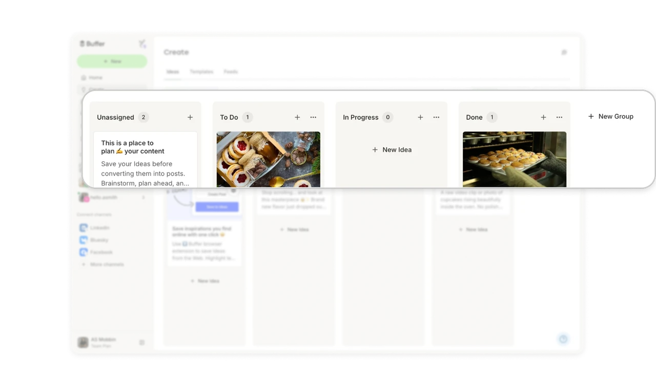
Onboarding lives as cards on the board itself
"This is a place to plan your content" and "Save inspirations you find online with one click" sit as regular cards in the Unassigned column, complete with a screenshot of the browser extension. The tutorial occupies the exact spot user content will fill, teaching by example in situ. Users learn what a card is by reading one, and clearing the tutorial cards is itself practice. Onboarding that lives inside the empty state it explains never needs a tour overlay.
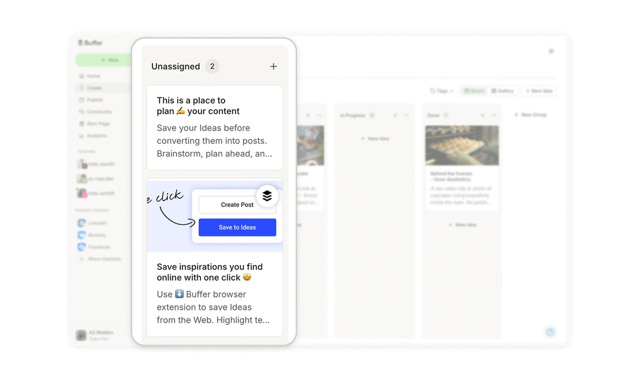
Ideas, Templates, Feeds name three origins of content
The tab row names three places an idea can come from: Ideas (your own captures), Templates (proven formats to start from), and Feeds (external sources to harvest). Most content tools serve only the first, assuming inspiration is the user's problem. Structuring the workspace around all three admits the truth of creative work: some days you have ideas, some days you need a format, some days you go looking. Name your raw-material sources as top-level navigation and no session starts at a dead end.
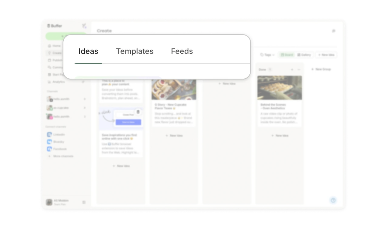
Idea cards carry a full post's anatomy, not a note's
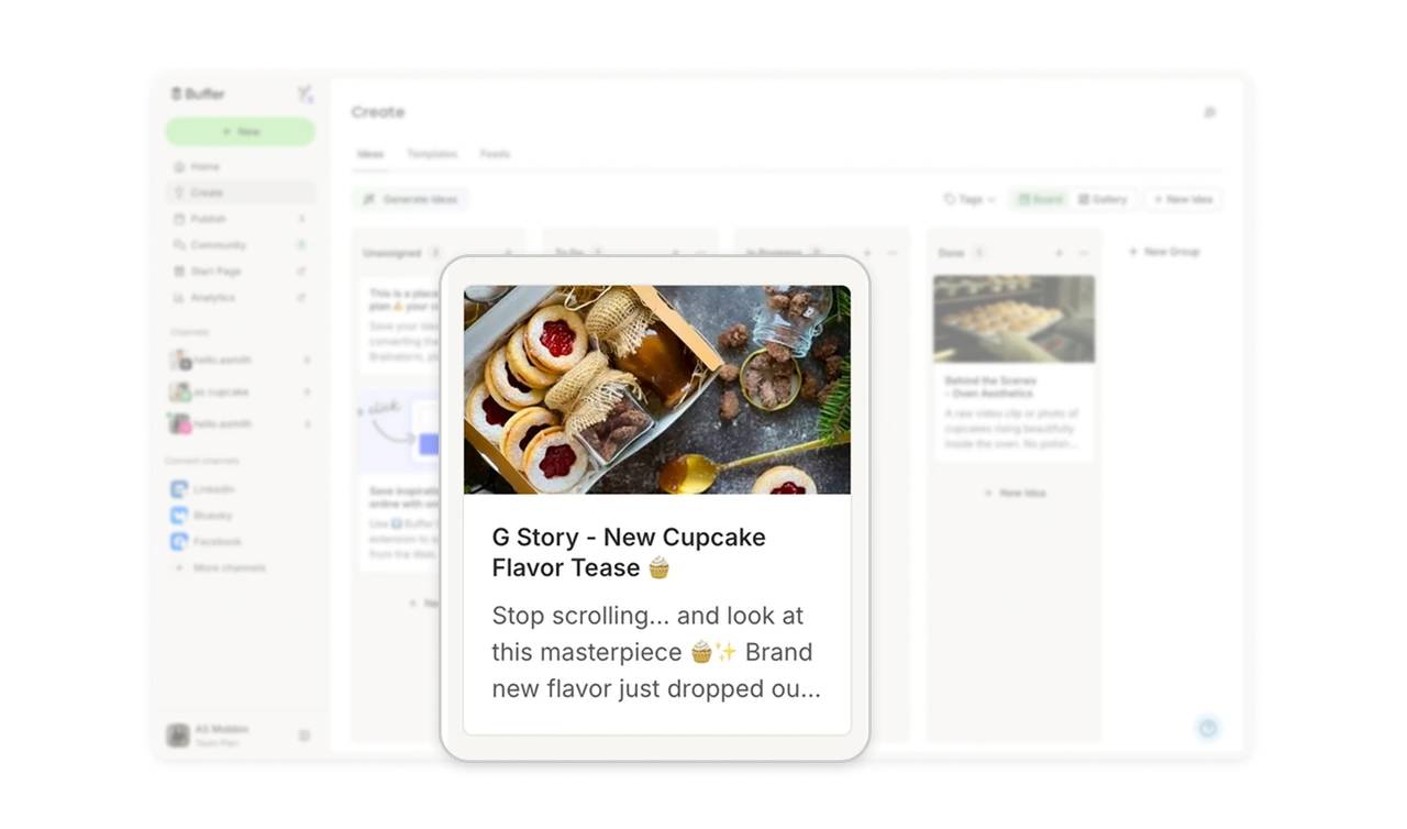
Each card holds an emoji-inflected title ("G Story, New Cupcake Flavor Tease"), preview copy written like an actual caption, and an attached image. The card format is a miniature of the post it will become, not a bare text note. When the destination is a rich social post, the capture format should rehearse it: title, voice, and visual from the first draft. Ideas stored as full-anatomy cards are one promotion away from publishing, while bare notes still need everything.
Board and Gallery serve the two natures of content ideas
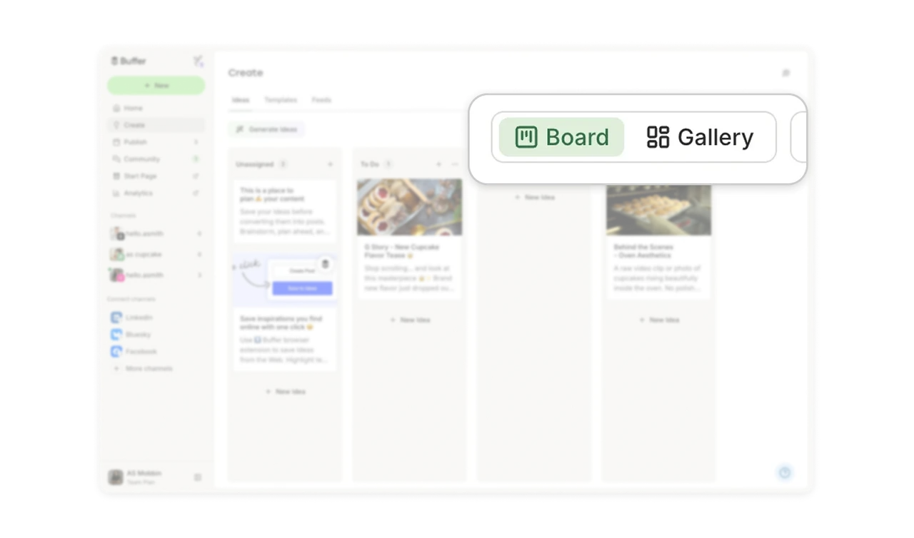
A toggle switches between Board (kanban columns, process view) and Gallery (visual grid, inspiration view). Content ideas are simultaneously tasks to manage and visuals to browse, and neither view alone serves both natures. Some sessions are "what should I work on next," others are "show me everything and let me feel it." When your objects are both work items and visual media, offer both projections and let the session's mood pick.
Similar Breakdown Lessons