Budget Dashboard

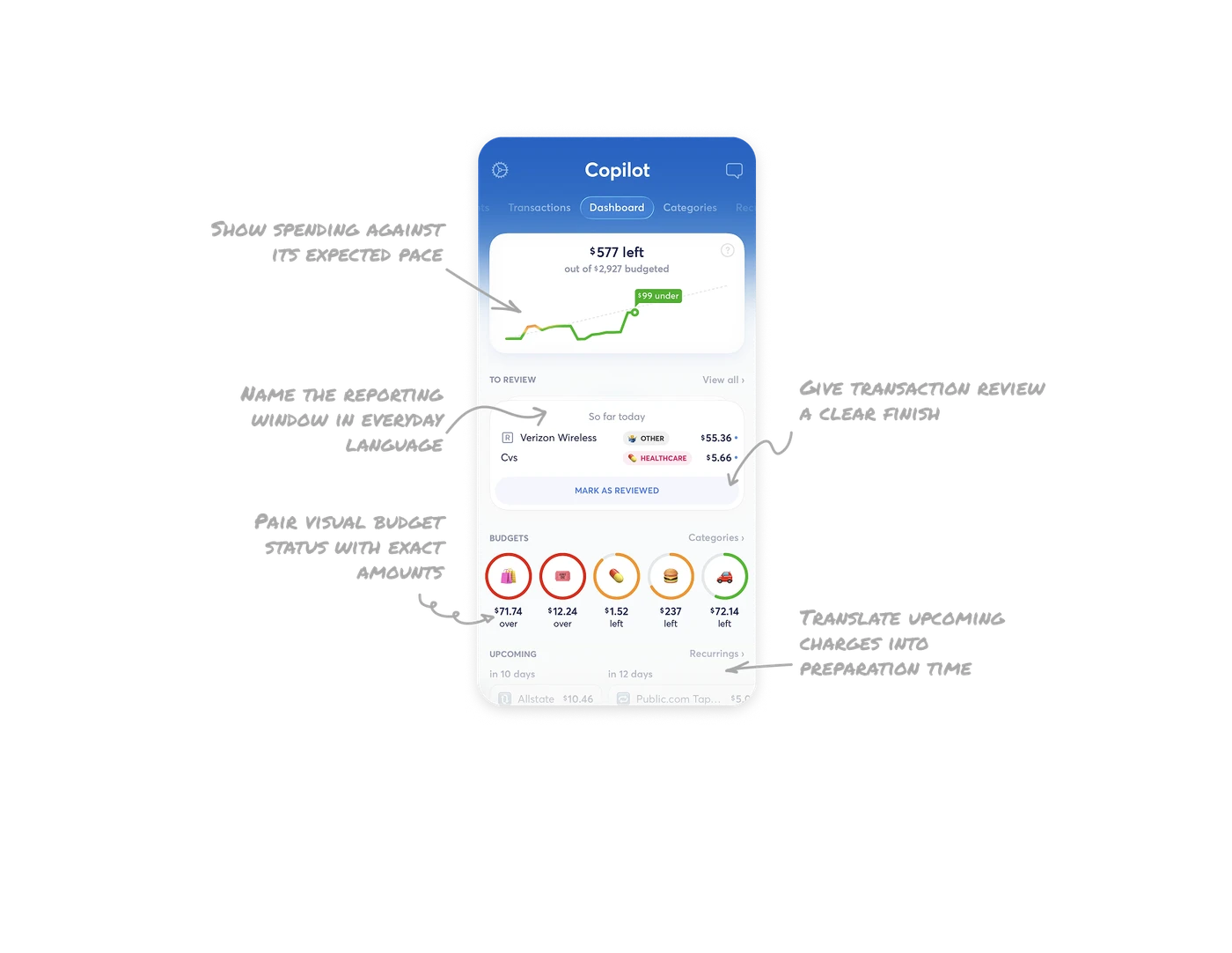
Show spending against its expected pace
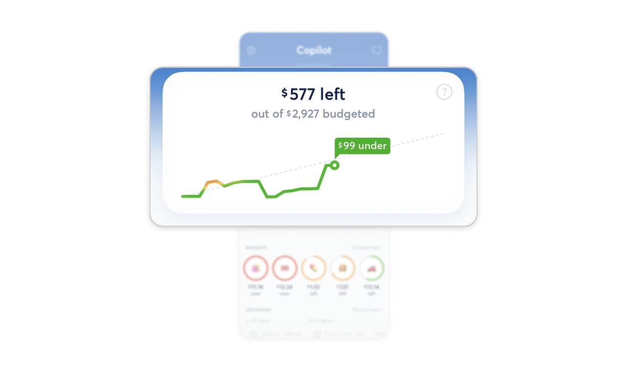
The budget card pairs “$577 left” with a “$99 under” label attached to the chart’s endpoint. The dotted benchmark shows expected pace, and the callout calculates the gap. Green and amber segments make changes in spending status visible along the line. When resources must last through a period, show remaining capacity alongside pace, with the current difference labeled directly.
Give transaction review a clear finish
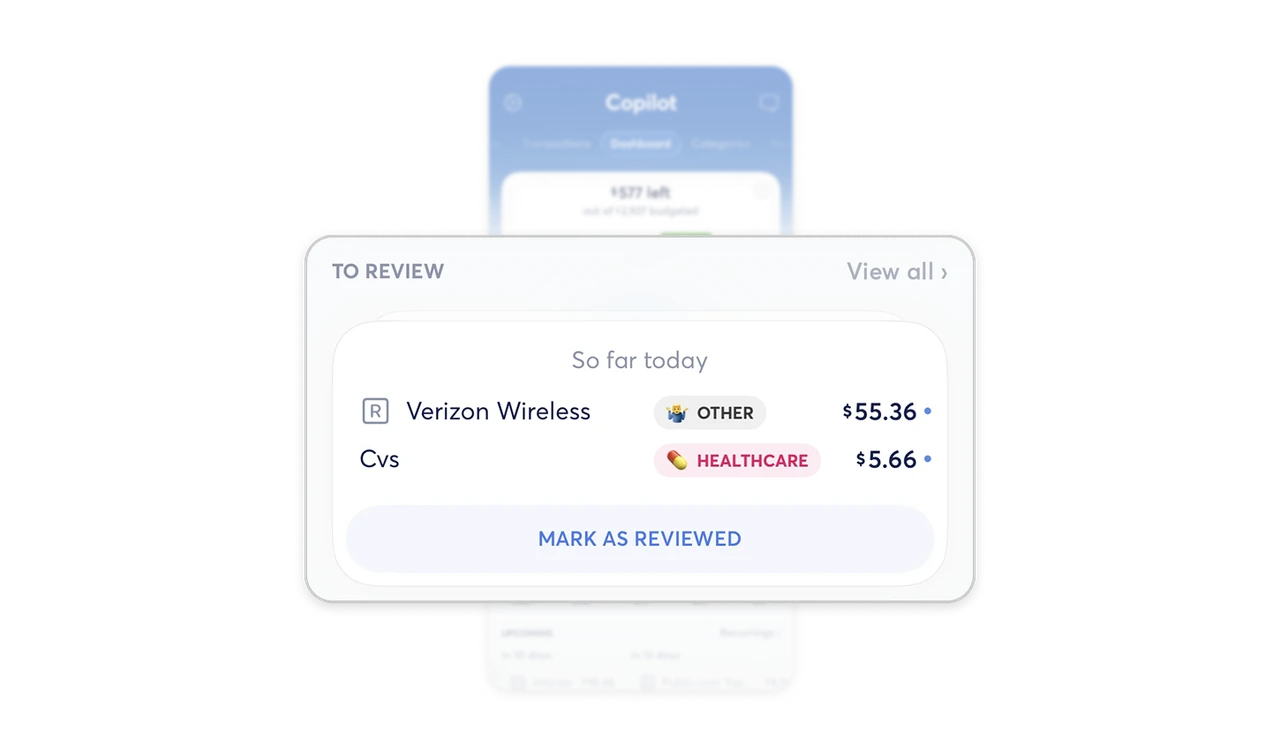
Two transactions appear in “To Review,” followed by a shared “Mark as reviewed” button. Blue dots sit beside the amounts, reinforcing the queue’s inbox-like presentation. Merchant names and categories remain visible for checking, while one action acknowledges the batch. For recurring administrative work, keep review lightweight by showing the relevant details together and giving the pending group a clear completion action.
Pair visual budget status with exact amounts
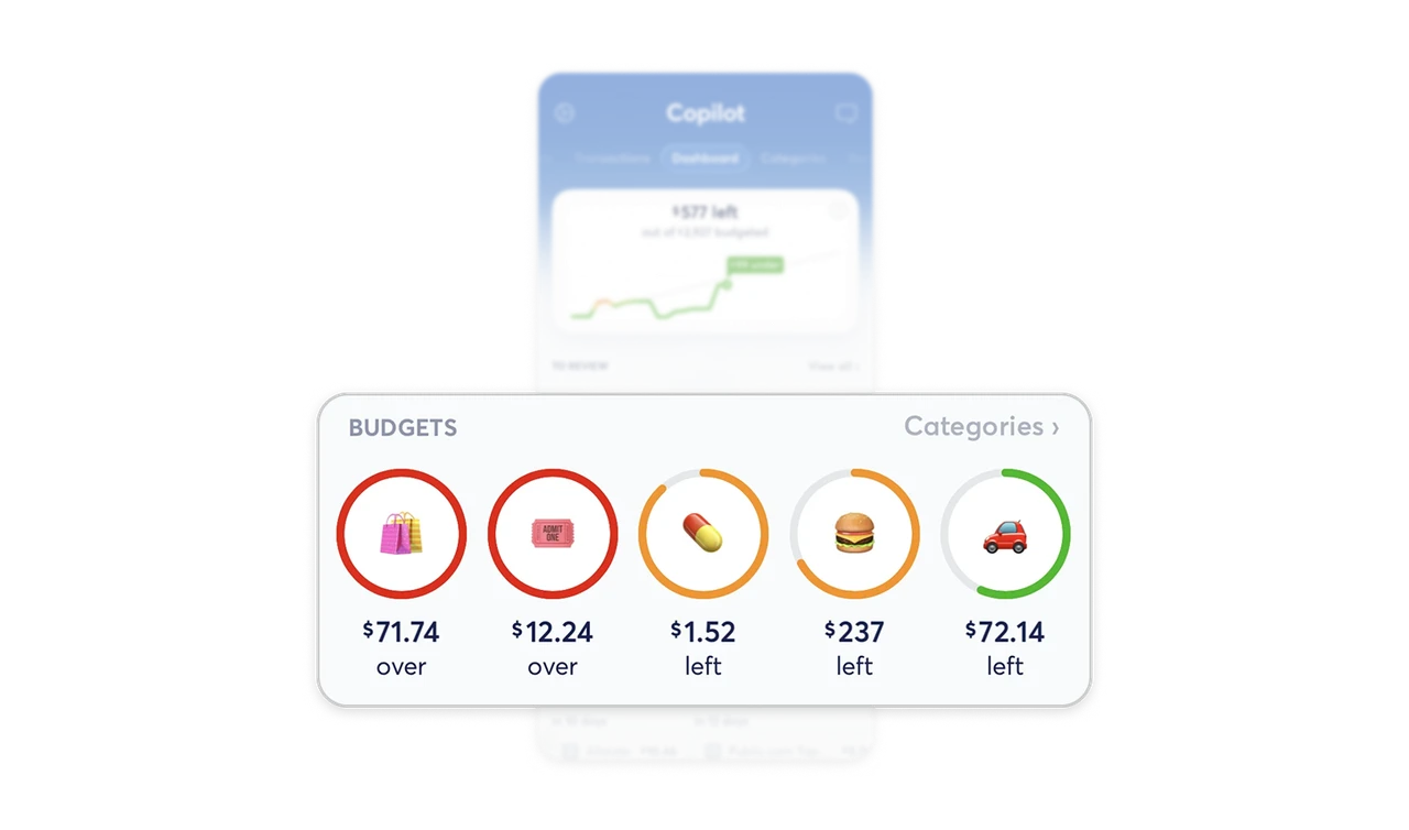
Emoji identify the budget rings, while color, fill, and “over” or “left” labels communicate their status. Two full red rings look similarly exceeded, but $71.74 and $12.24 reveal different-sized overruns. The text preserves information the graphics cannot express alone. Use visual cues to direct attention, then provide the exact amount and its meaning so users can assess the consequence.
Name the reporting window in everyday language
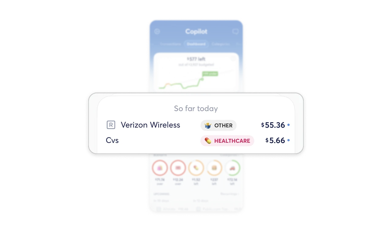
The transaction card says “So far today” above the listed purchases. “Today” defines the period, while “so far” makes clear that the day is incomplete. This small wording choice helps users interpret the scope without mistaking a partial view for a finished daily total. Name both the reporting window and its completeness wherever users need to judge an accumulating set of records.
Translate upcoming charges into preparation time
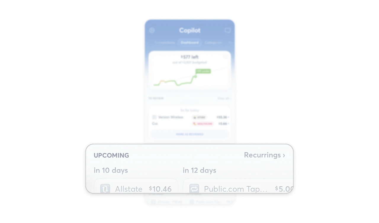
The “Upcoming” section pairs merchants and amounts with “in 10 days” and “in 12 days.” Relative timing saves users from subtracting today’s date from a future charge date. Placing these commitments beneath current budgets connects present capacity with approaching demands. For near-term obligations, show how soon they arrive alongside their size, giving users the information needed to plan ahead.
Similar Breakdown Lessons