Crypto Search

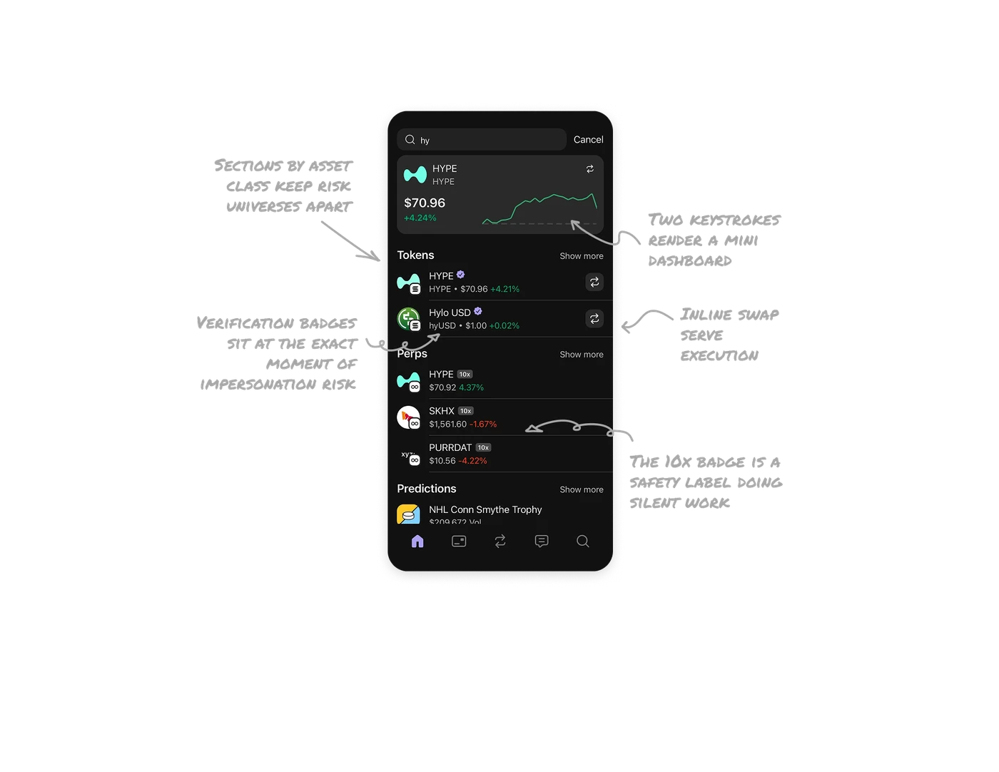
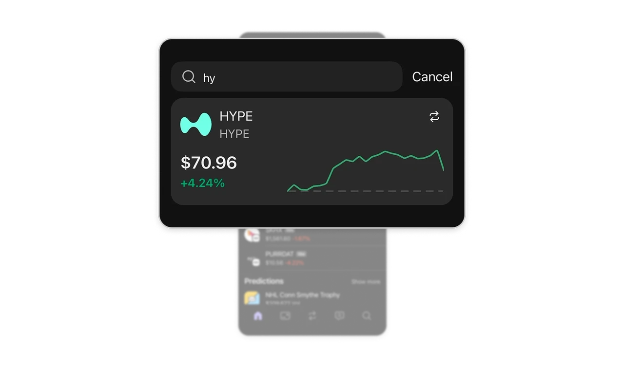
Two keystrokes render a mini dashboard, not a text row
Typing "hy" surfaces a full hero card for HYPE: live price, daily change, and a sparkline, rendered mid-keystroke. Traders searching an asset almost always want price and trend first, so the top match answers that inside the results. For the most probable match, render a rich preview card instead of a list row. Search results can be the destination, and every navigation step you delete is a step where nobody drops off.
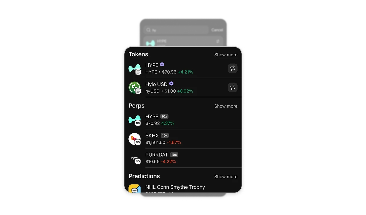
Sections by asset class keep risk universes apart
One query returns matches grouped into Tokens, Perps, and Predictions, each with its own Show more. A spot token and a 10x perpetual with the same name are different risk universes, and the sectioning does the disambiguation so users never buy the wrong instrument. When one query can match fundamentally different object types, group by type rather than interleaving. Ambiguity in a feed is annoying, ambiguity in a trade is expensive.
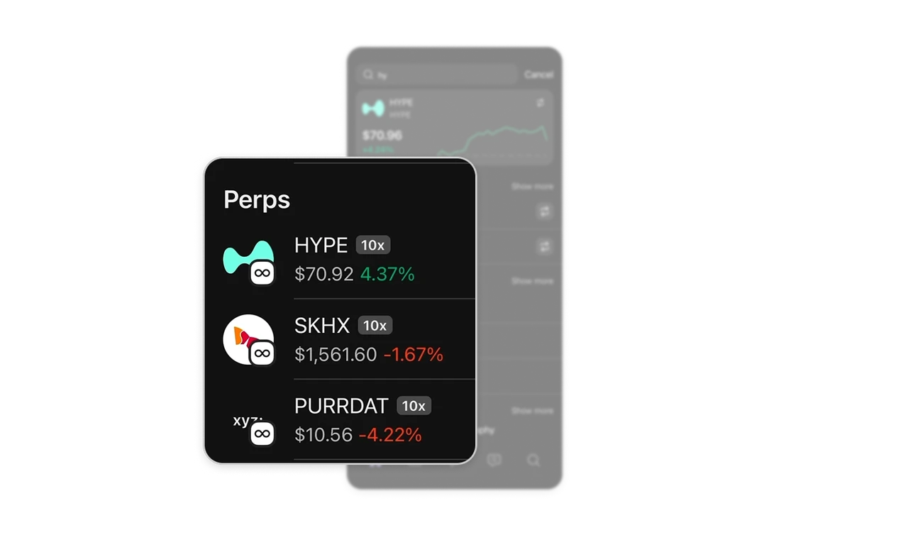
The 10x badge is a safety label doing silent work
Every perpetual row carries a grey 10x tag beside its name. Leverage, the instrument's risk-defining attribute, is unmissable at the list level, before any tap. A leveraged instrument mistaken for spot is a financial injury, and the persistent badge prevents it constantly and wordlessly. Surface the risk-defining attribute inline in list rows, not just on detail pages, protection has to arrive before the decision, not inside it.
Verification badges sit at the exact moment of impersonation risk
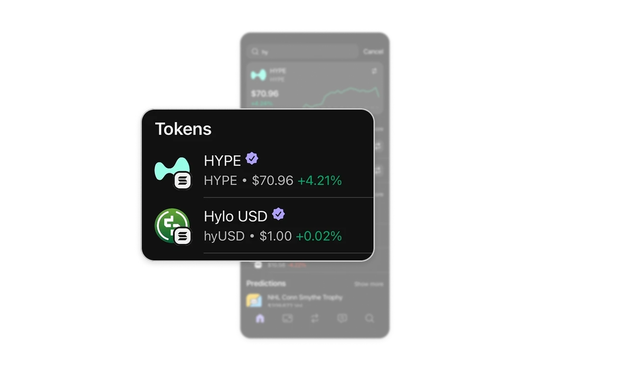
HYPE and Hylo USD carry purple verified checks in the results list. In crypto, anyone can mint a token named "HYPE" to catch searchers, so verification at the search-result level is anti-fraud infrastructure. A scam caught at the list costs nothing, one caught after purchase is irreversible. In open ecosystems where anyone can create assets, trust signals must appear before the click, timing is the entire defense.
Inline swap buttons serve execution, detail pages serve research
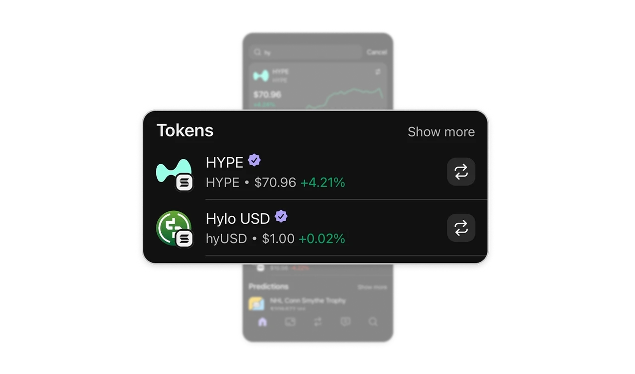
Every token row ends in a swap icon, trade directly from search with no detail page required. Traders who already know what they want should not pay a navigation tax. The row serves two user modes at once: the inline button is for execution, the detail page is for research, and neither mode blocks the other. In high-frequency transactional products, put the terminal action on the list row itself.
Similar Breakdown Lessons