Daily Health Dashboard

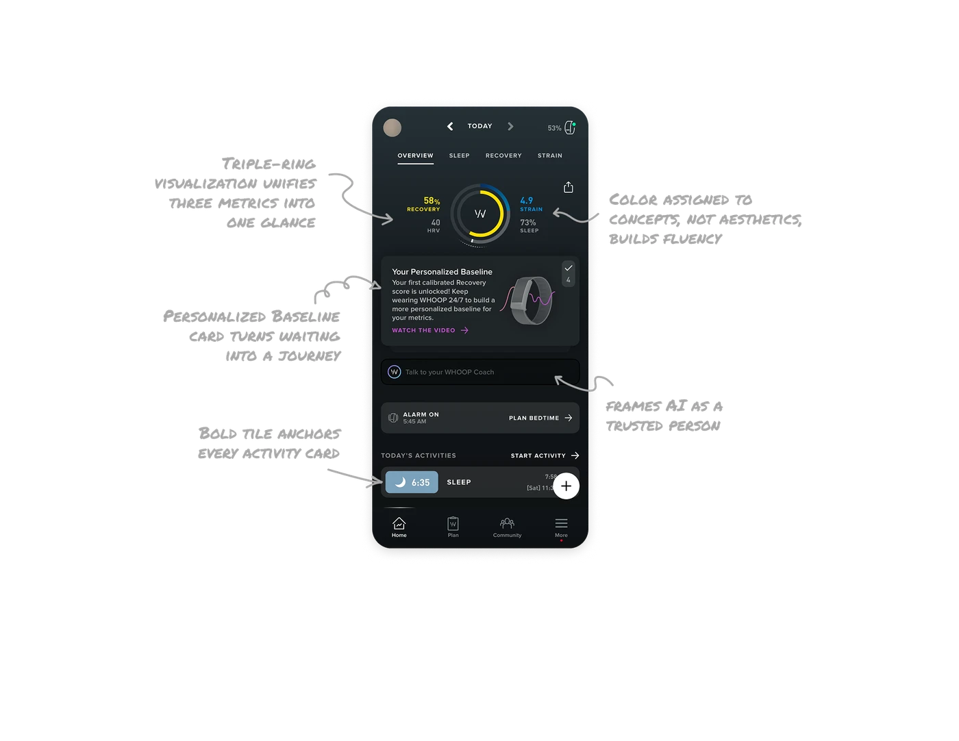
Triple-ring visualization unifies three metrics into one glance
Recovery, Strain, and Sleep coexist as concentric arcs in a single ring at the center of the screen. Users read their entire body status in one look without parsing three separate charts. When metrics are related, a unified visual container creates meaning that stacked cards never can. Spatial grouping turns data into a story instead of a checklist.
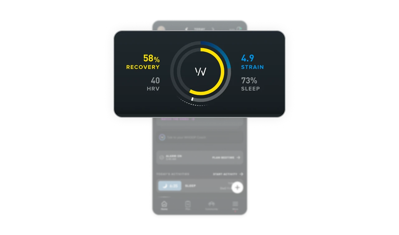
Color assigned to concepts, not aesthetics, builds fluency
Yellow always means Recovery. Blue always means Strain. Purple always means brand or coach. Grey always means Sleep. Color is used with absolute consistency across the entire app, no legend ever needed. When users develop color fluency, they stop reading and start feeling. This requires discipline most design systems lack, the willingness to never use a color for decoration only meaning.
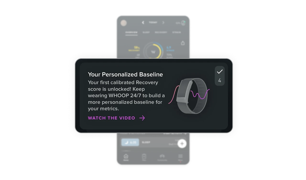
Personalized Baseline card turns waiting into a journey
"Your first calibrated Recovery score is unlocked! Keep wearing WHOOP 24/7 to build a more personalized baseline" reframes incomplete data as progress, not a product gap. Most apps show empty states or loading spinners. WHOOP tells users why the data isn't perfect yet and what to do about it. When your product needs time to personalize, narrate the journey instead of hiding the wait.
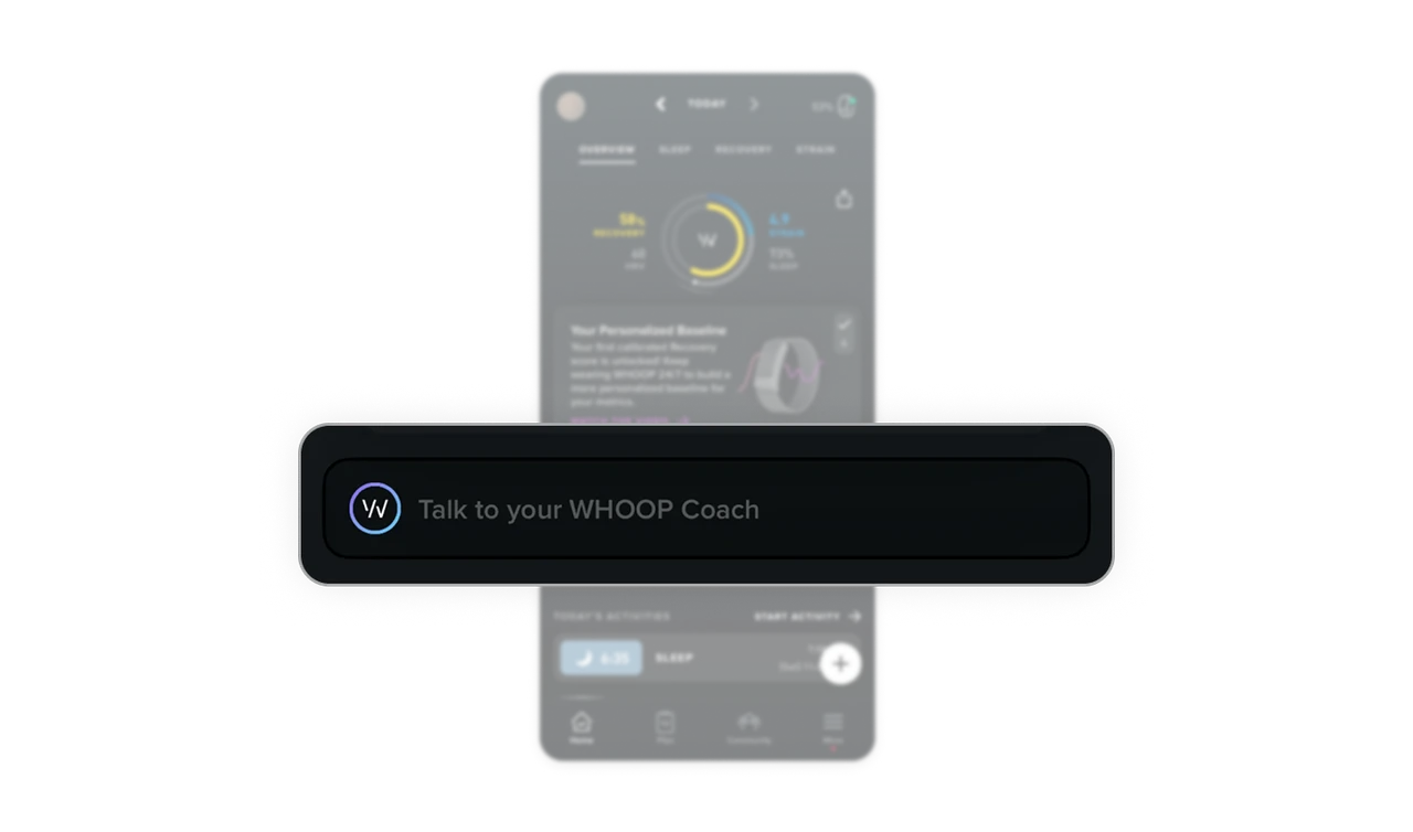
"Talk to your WHOOP Coach" frames AI as a trusted person
The AI entry point is a single full-width pill labeled "Talk to your WHOOP Coach," not "AI Assistant" or "Chat." The wording positions the feature as a coach on standby, not a chatbot being marketed. In health and wellness, the tone of AI introductions matters as much as the feature itself. Users open up to coaches and trusted people, not to AI.
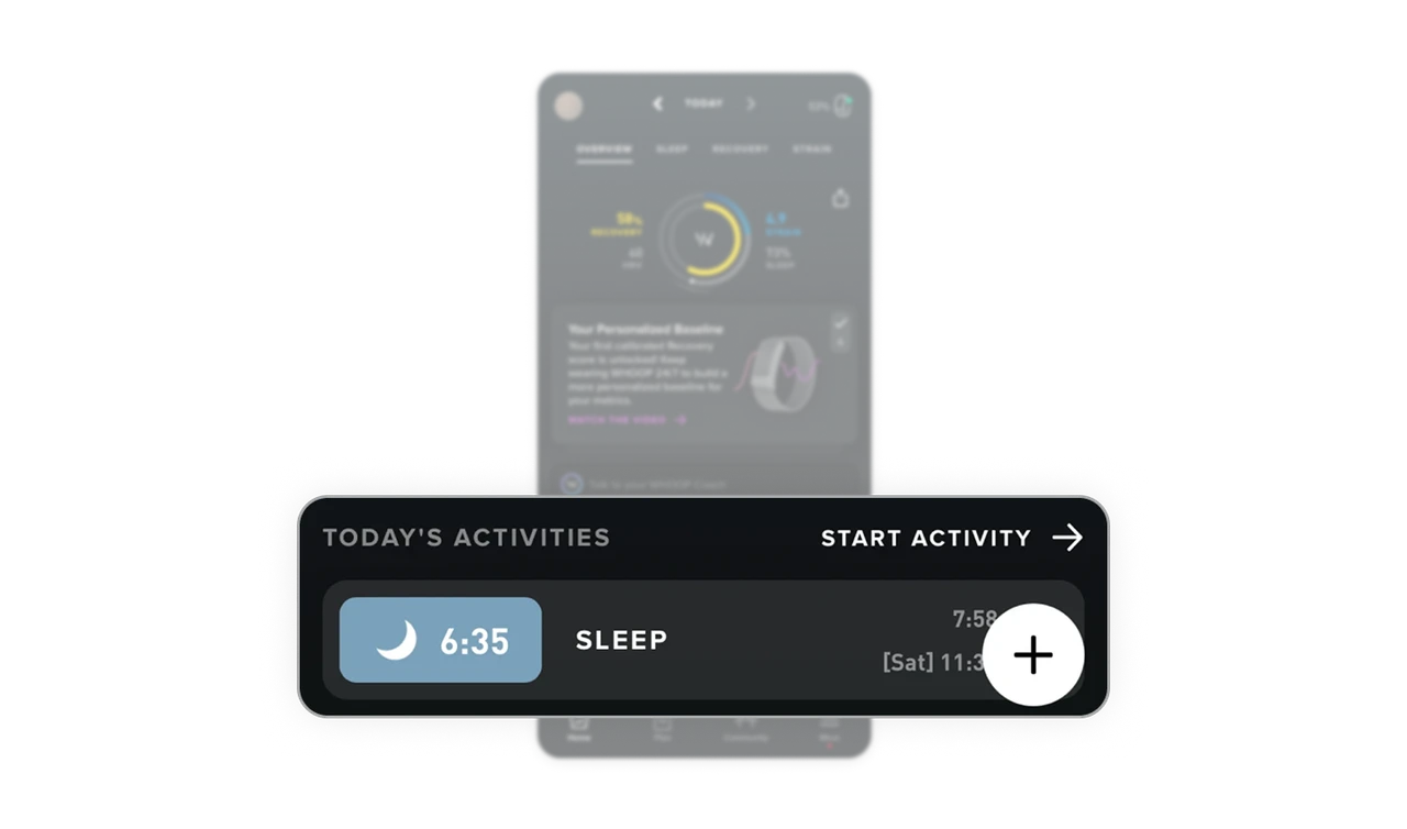
Bold duration tile anchors every activity card
The Sleep activity shows "6:35" in a bold teal tile on the left, visually distinct from the label and timestamp. Duration is the most important data point for a sleep entry, so it gets the most weight. Treating all data fields equally is the silent mistake that makes dashboards feel flat. Identify the one number that matters most per entry, then make it the visual anchor.
Similar Breakdown Lessons