Hotel Search Results


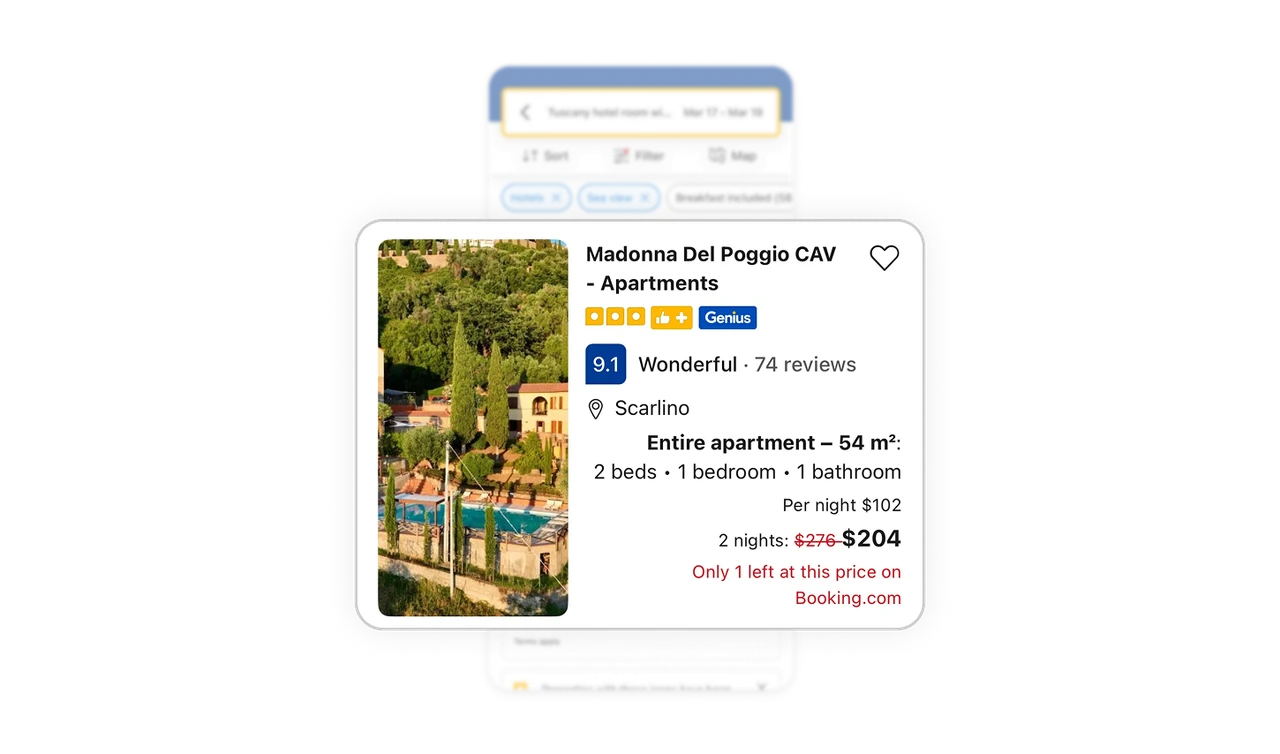
Property card sequences emotional, trust, rational, price in order
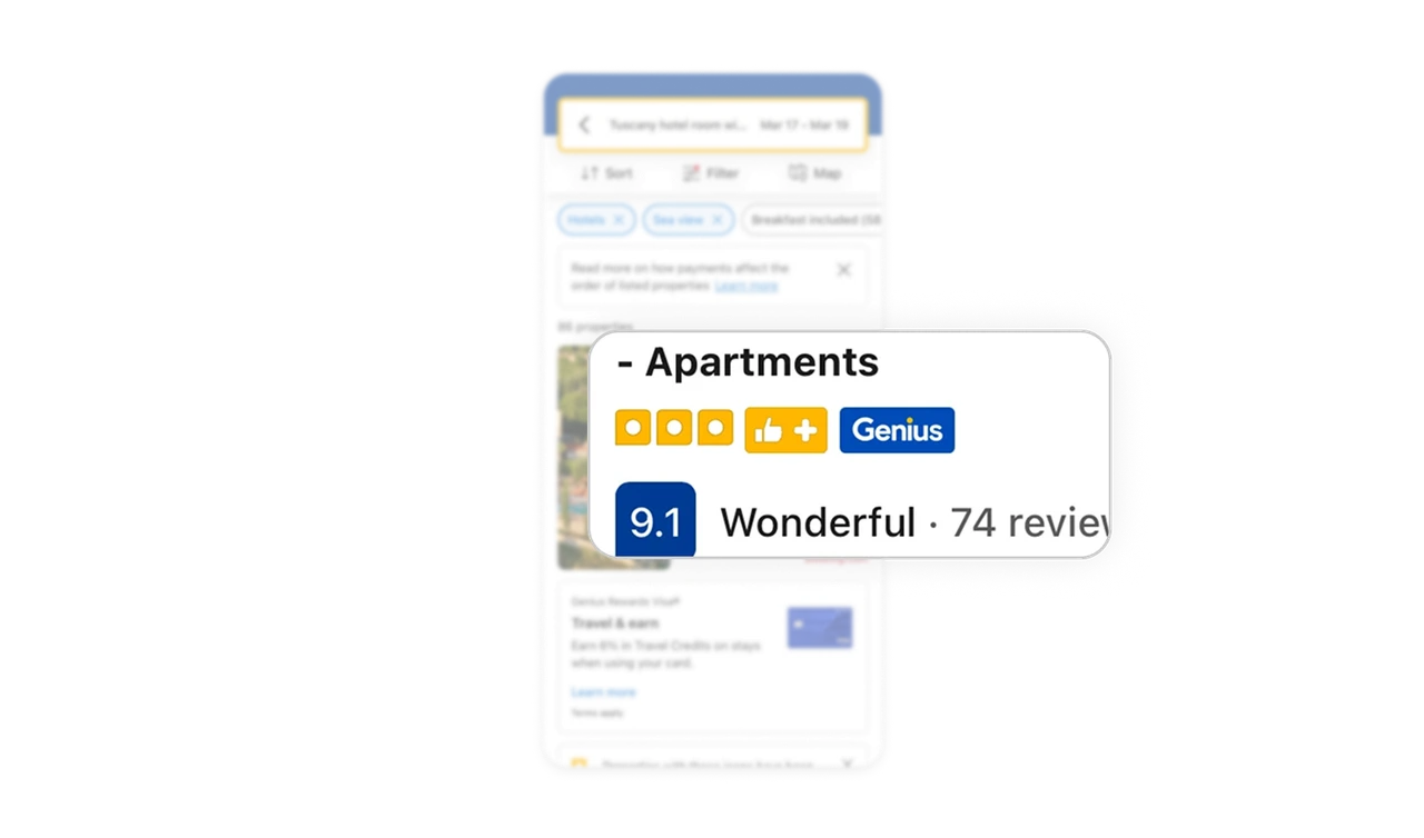
Photo first (emotional pull), then name with Genius badge and 9.1 "Wonderful" score (trust), then location and room specs (rational criteria), then price with strikethrough (value signal). The sequence mirrors how travelers actually evaluate listings, feel first, verify second, compare third. Cards that match the user's mental decision flow convert better than cards optimized for visual balance.
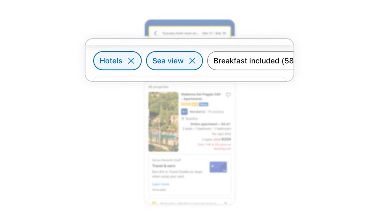
Filter chips above results enable one-tap refinement
Hotels, Sea view, and Breakfast included sit as horizontal pills with X buttons right above the listings. Users add or remove filters in one tap without opening a modal. Common refinements should never require a full filter sheet. Surfacing the top three to five filters as chips reduces the friction of iteration, which is critical in search-heavy products where users refine multiple times before booking.
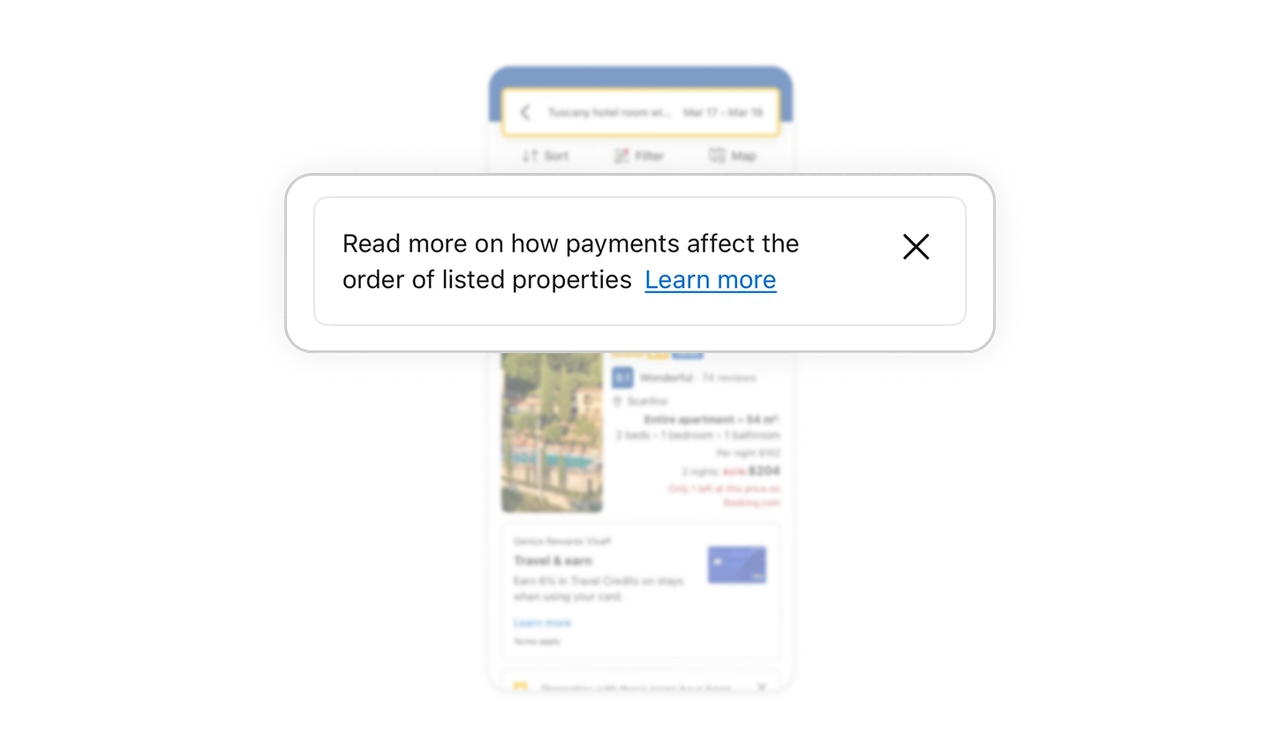
Ranking transparency banner treats users as adults
"Read more on how payments affect the order of listed properties" admits paid placements influence results. The banner is dismissable, not forced. Most platforms hide commercial influence behind legal disclaimers. Booking surfaces it as a normal piece of UI. Users who understand the system trust it more than one that feels opaque. Transparency about ranking factors builds long-term loyalty even if it introduces short-term friction.
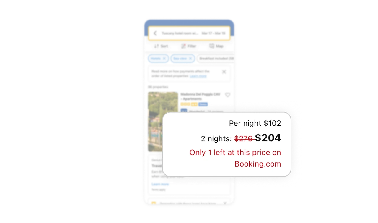
"Only 1 left at this price" lands at the exact moment of price evaluation
The scarcity message appears in red directly below the strikethrough price, not as a separate banner or popup. Users read the deal, then immediately read the urgency cue. Timing matters more than treatment with scarcity messaging. Same message in a popup feels manipulative. Same message inline after the price feels like helpful context. Placement on the card itself is what makes it credible.
Trust signal row stacks multiple credibility cues in one glance
Orange dots (property class), thumbs up (recommended), and Genius badge (loyalty tier) sit side by side in one tight row under the property name. Each signal carries different meaning but together they form a quick trust verdict. Users do not interpret each badge individually, the cluster itself becomes the trust signal. Stacking credibility cues into one scannable row beats spreading them across the card because users read them as a group, not as separate facts.
Similar Breakdown Lessons