5 UX Lessons From Acorns Investment Dashboard - Acorns UI Breakdown
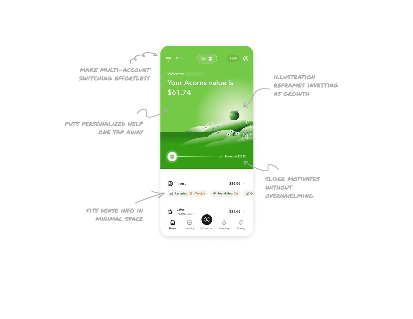
Nature illustration reframes investing as growth
Rolling green hills, a growing acorn, and blooming flowers replace charts and graphs as the hero visual. This is brand storytelling doing emotional work. Investing feels intimidating when framed with numbers. Framing it as something that quietly grows in the background, like nature, lowers anxiety and keeps users coming back to check on it the way they would a plant.
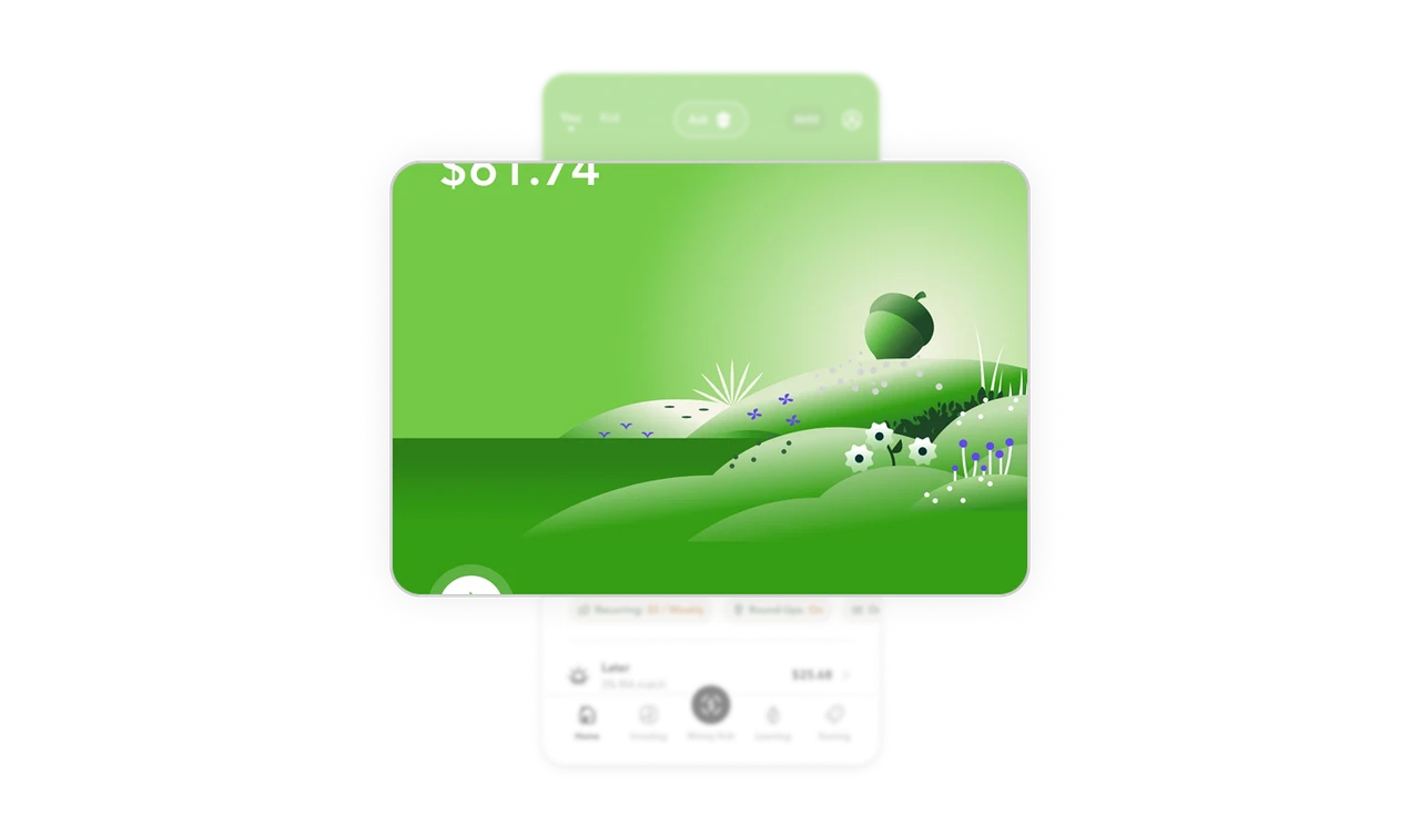
Potential slider motivates without overwhelming
The slider showing "Potential $225K" at the far right gives users a glimpse of long-term outcome from their current small balance. The acorn icon sits at the left showing where they are now. This single visual communicates the entire investment journey in one line. Showing future potential alongside present reality is one of the most powerful retention mechanics in any savings or investment product.
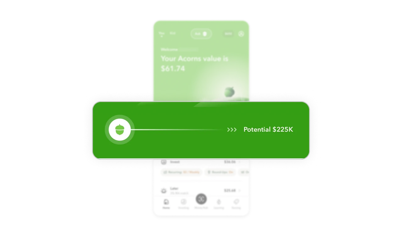
Horizontal pill row fits dense info in minimal space
Recurring amount, Round-Ups status, and other settings sit as scrollable horizontal pills below each investment section. Users see the most important settings at a glance without expanding a detail view. Horizontal pill rows solve a real mobile layout problem: showing multiple metadata values in a single line without making the card feel cluttered or requiring a separate settings screen.
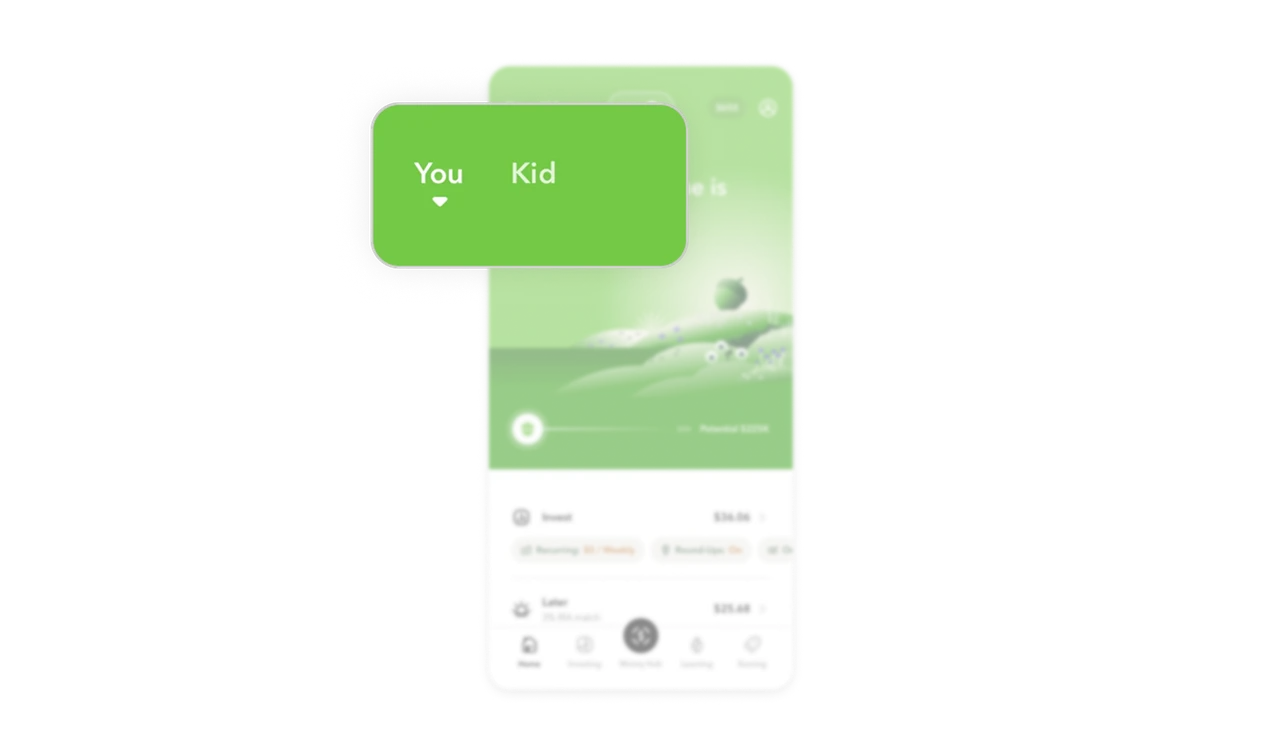
You and Kid tabs make multi-account switching effortless
Two tabs at the top left switch the entire dashboard between personal and child accounts. No dropdown, no settings navigation, no confusion about which account is active. The underline on "You" makes the current context unmistakable. In family finance products, reducing the friction of account switching directly increases how often parents engage with the child account section.
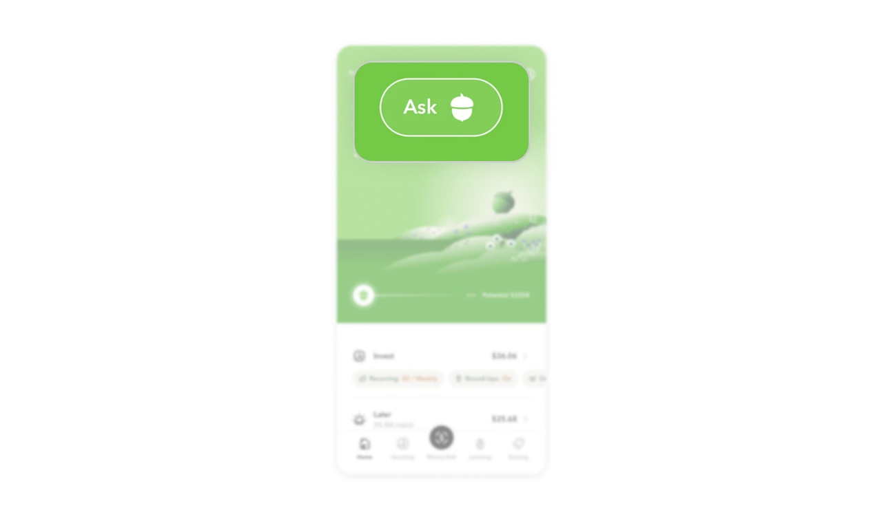
Ask button puts personalized help one tap away
The Ask button with the acorn chatbot icon sits centered in the top nav, not buried in a help menu. Financial questions are high-anxiety moments and users who cannot find an answer quickly churn. Surfacing a conversational assistant at the top level of a fintech dashboard signals that getting help is a first-class action, not an afterthought tucked away in settings.
Similar Breakdown Lessons


