5 UX Lessons From Blinkist's My Library UI - Blinkist UI Breakdown
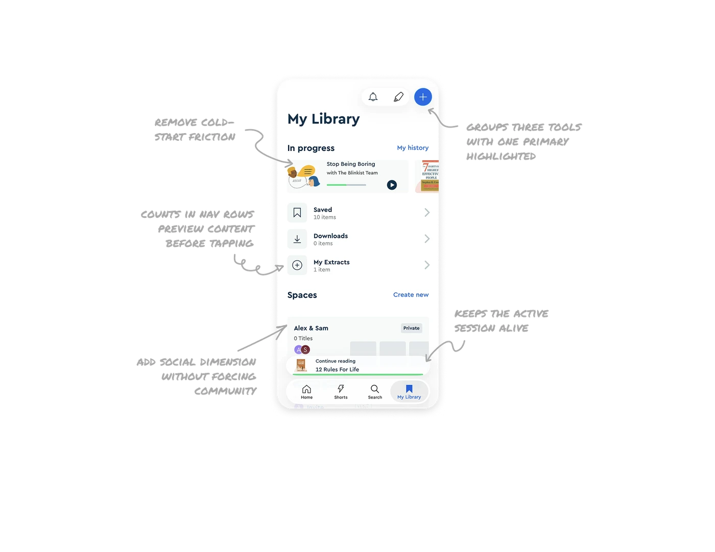
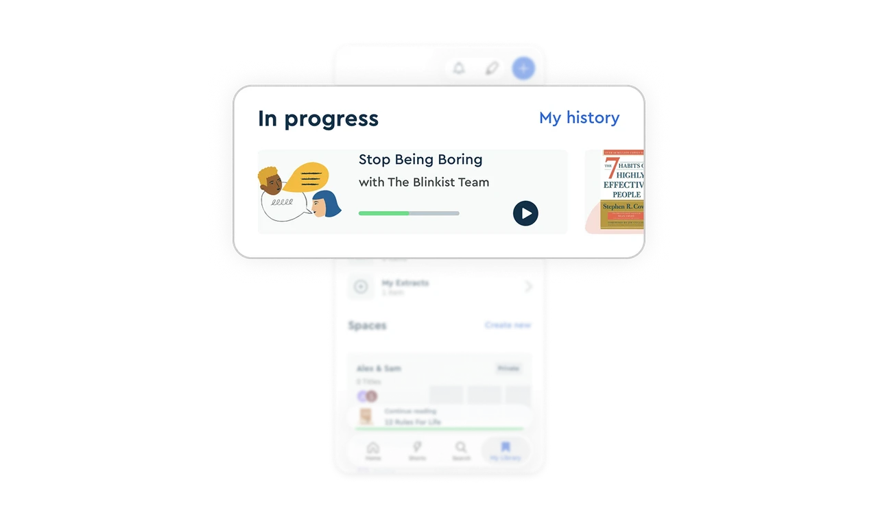
In-progress cards with progress bars remove cold-start friction
Each item in progress shows a thumbnail, title, progress bar, and play button right on the card. Users tap and resume in one motion, no navigation needed. In learning apps where consistency drives outcomes, the gap between intent and resume is where most users drop off. Cards that contain the entire resume action turn "I'll read later" into "I'll read now."
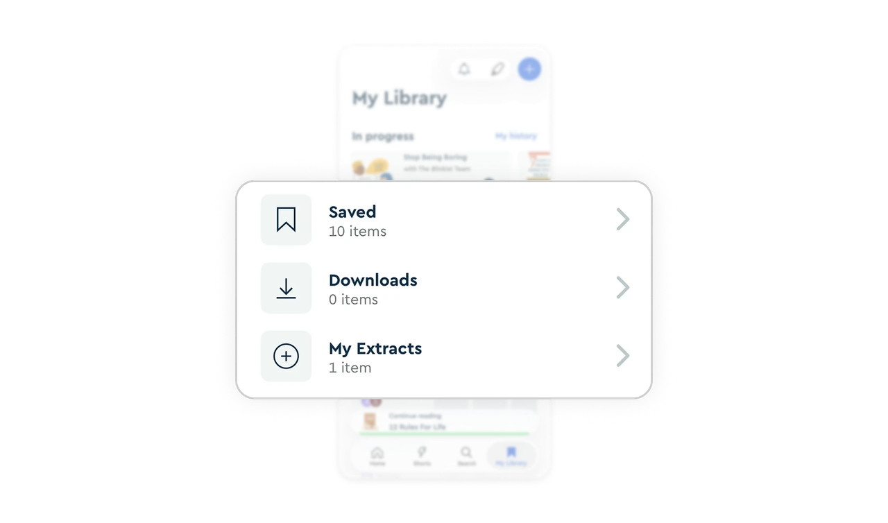
Item counts in nav rows preview content before tapping
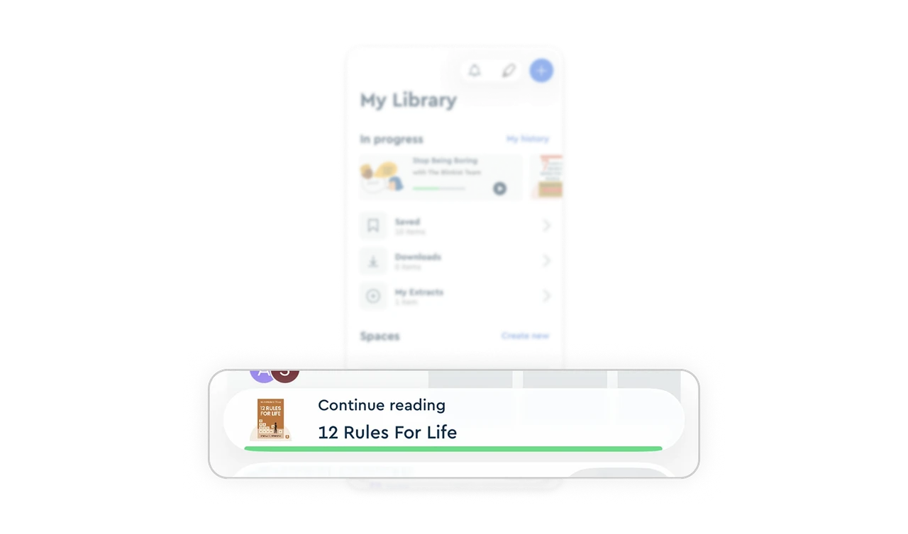
Saved (10 items), Downloads (0 items), and My Extracts (1 item) each show their count next to the title. Users instantly know which folders have content and which are empty before tapping in. This tiny detail prevents the disappointment of opening an empty folder and helps users decide which area to engage with. Showing inventory at the navigation level beats hiding it behind a tap.
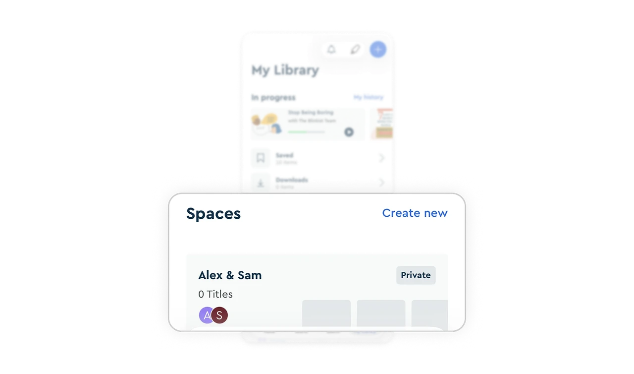
Spaces add social dimension without forcing community
The Spaces section lets users create private shared collections with avatar stacks showing collaborators. It is opt-in, not forced. Learning is traditionally solitary, but Blinkist gives users the option to make it social without pushing it on everyone. Optional social layers respect introverts while creating retention loops for users who want shared learning experiences.
Sticky Continue Reading bar keeps the active session alive
"Continue reading, 12 Rules For Life" pins to the bottom above the tab bar with a thin progress underline. No matter what users browse in the library, their current book is always one tap away. This bridge between exploration and consumption is the single most underrated retention mechanic in any content product, and most apps bury it behind a separate screen.
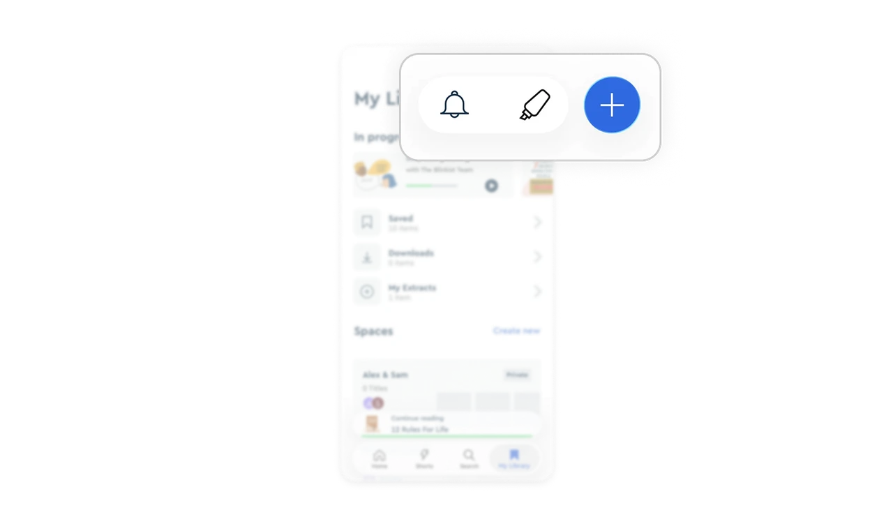
Top-right action pill groups three tools with one primary highlighted
Bell (notifications), highlighter (notes), and plus (add) sit together in a single pill at the top right, with plus elevated as a solid blue circle. The grouping signals these are all action tools. The visual emphasis on plus signals which one drives growth (adding content). This hierarchy within a single component lets multiple tools coexist without diluting the primary action.
Similar Breakdown Lessons


