Podcast Search UI UX Lessons from Neuecast - Neuecast UI Breakdown
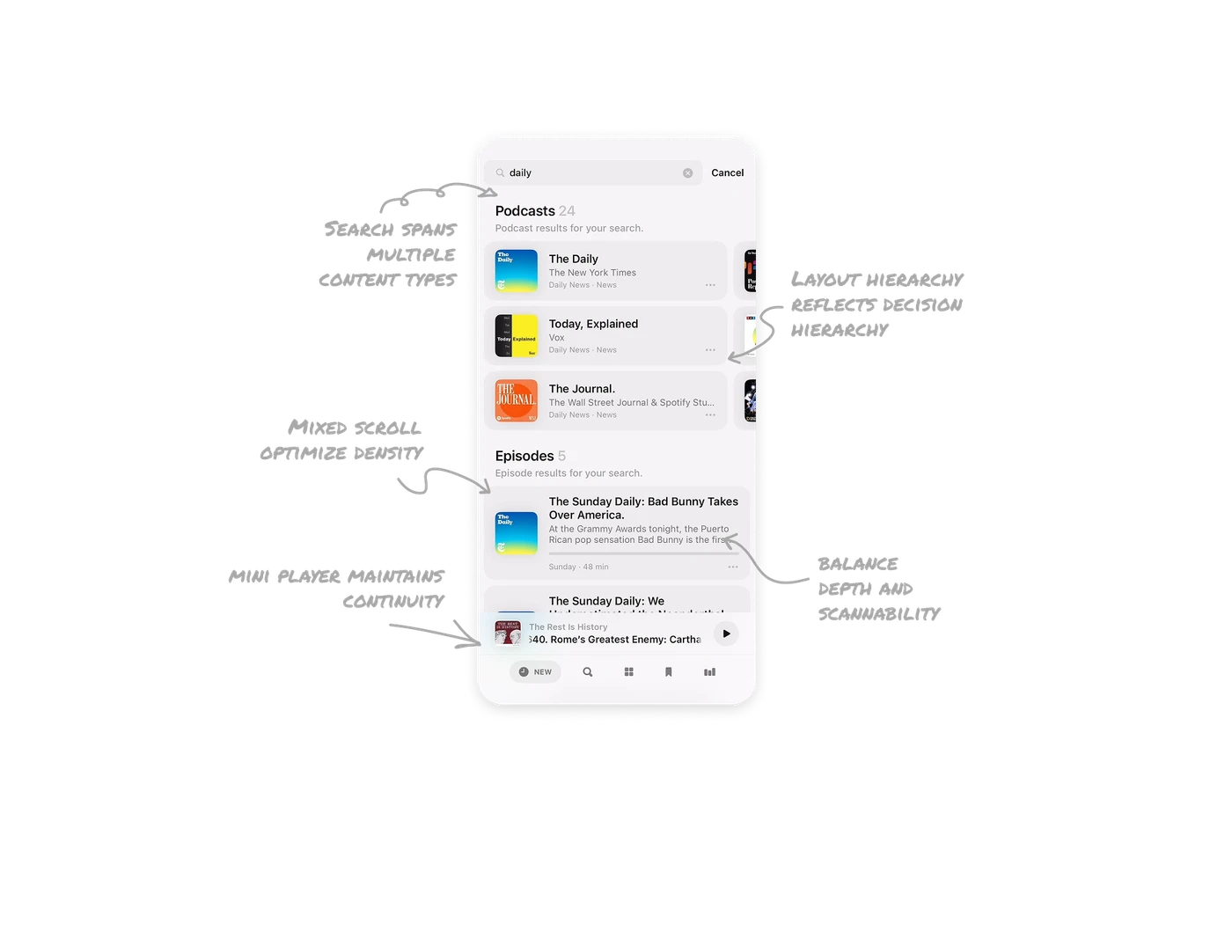
Search spans multiple content types by default
Results are split into Podcasts and Episodes within the same screen. Users do not need to toggle filters or refine queries to see both entity types. The system interprets intent and surfaces layered results instantly. This reduces steps and respects user momentum during search.
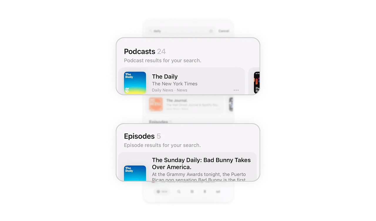
Layout hierarchy reflects decision hierarchy
Podcasts appear first, followed by Episodes. This mirrors how people think. They either want to follow a show or jump into a specific episode. By structuring results in this order, the UI aligns with natural decision paths. A good hierarchy reduces cognitive switching.
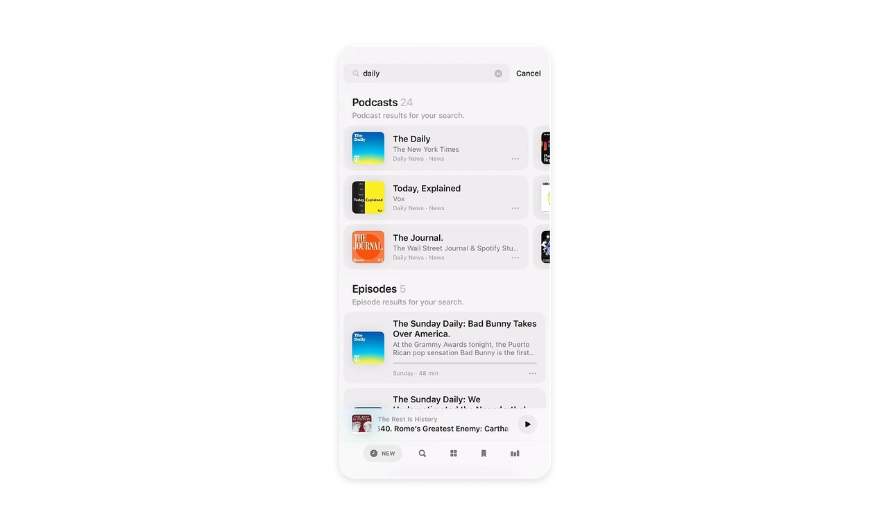
Mixed scroll directions optimize density and scanning
Podcast results are arranged horizontally, allowing many shows to fit in limited vertical space. Episodes are stacked vertically for deeper reading and metadata scanning. Each layout matches the information depth required. Choosing scroll direction strategically can dramatically improve content density.
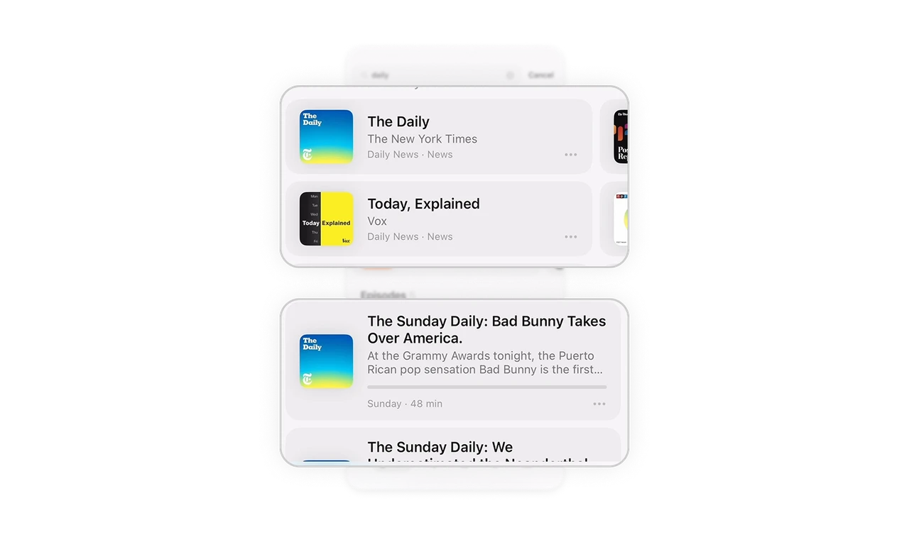
Episode cards balance depth and scannability
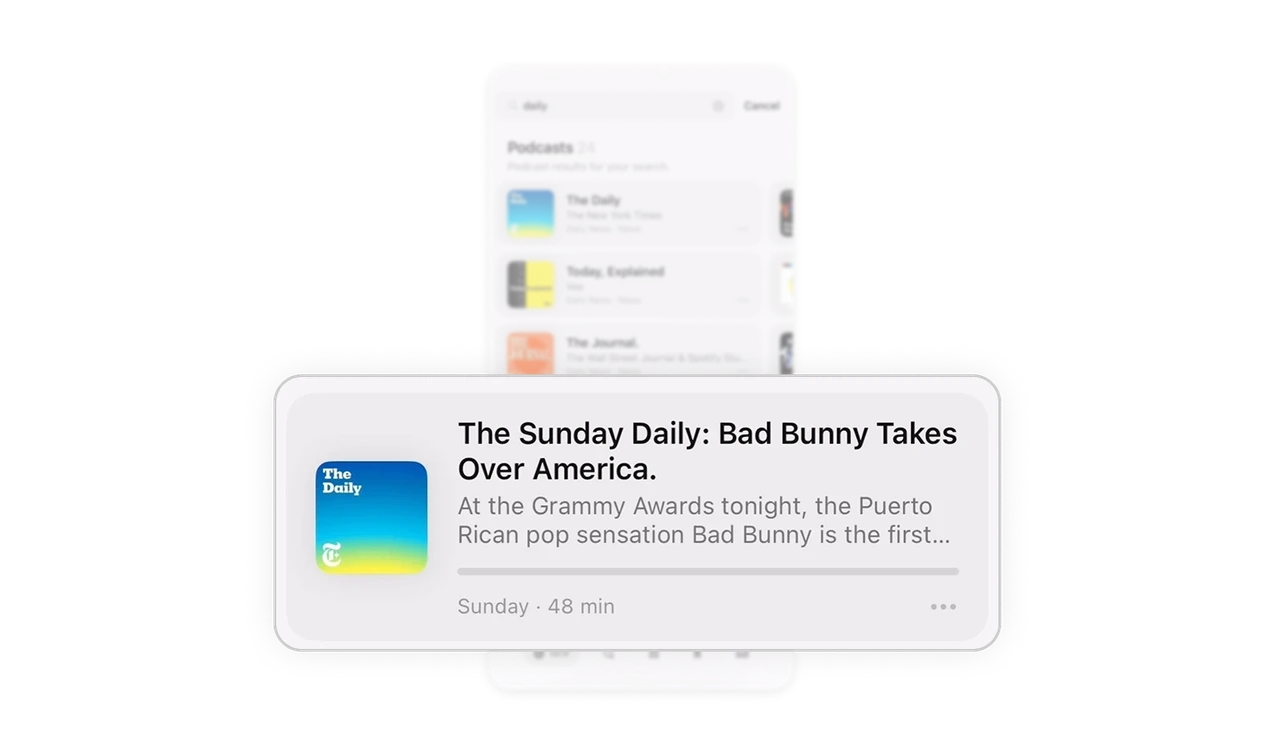
Each episode card uses strong title typography, supporting description text, duration, and a visible progress bar. The progress indicator gives immediate feedback on listening status without opening the episode. Context at a glance increases confidence and reduces repeat listening errors.
Persistent mini player maintains continuity
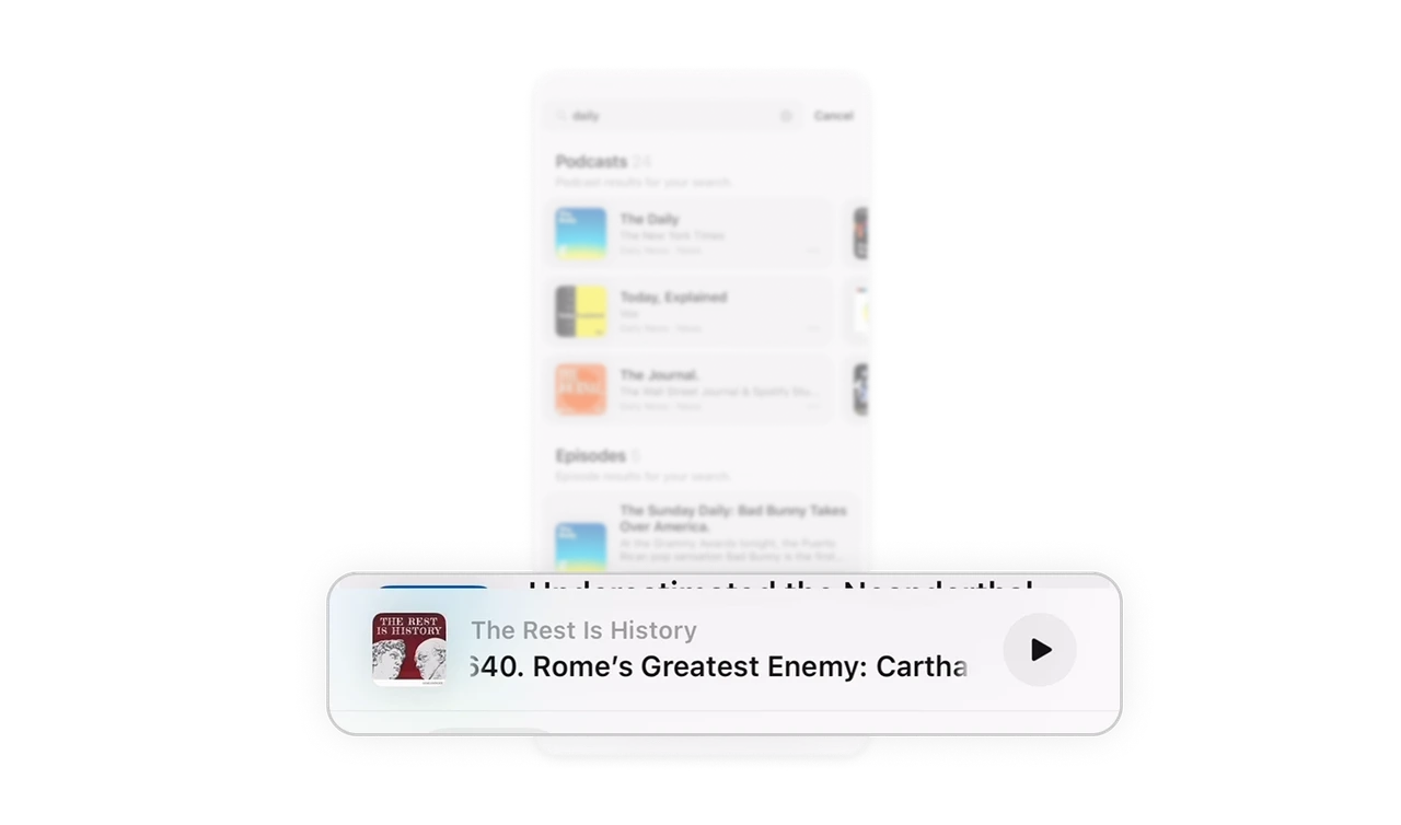
The sticky bottom player shows the currently playing episode and quick play control. Even while searching, users stay aware of ongoing playback and can act instantly. Persistent context builds control and strengthens session continuity.
Similar Breakdown Lessons


