5 UX Lessons From foodpanda's Restaurant Page UI - Foodpanda UI Breakdown
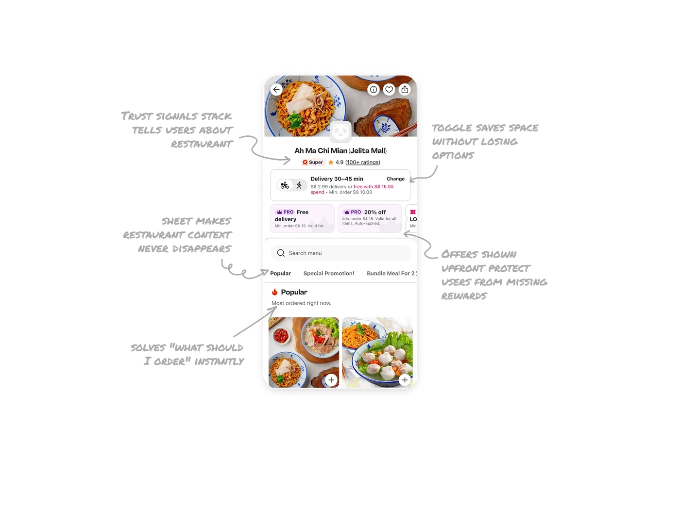
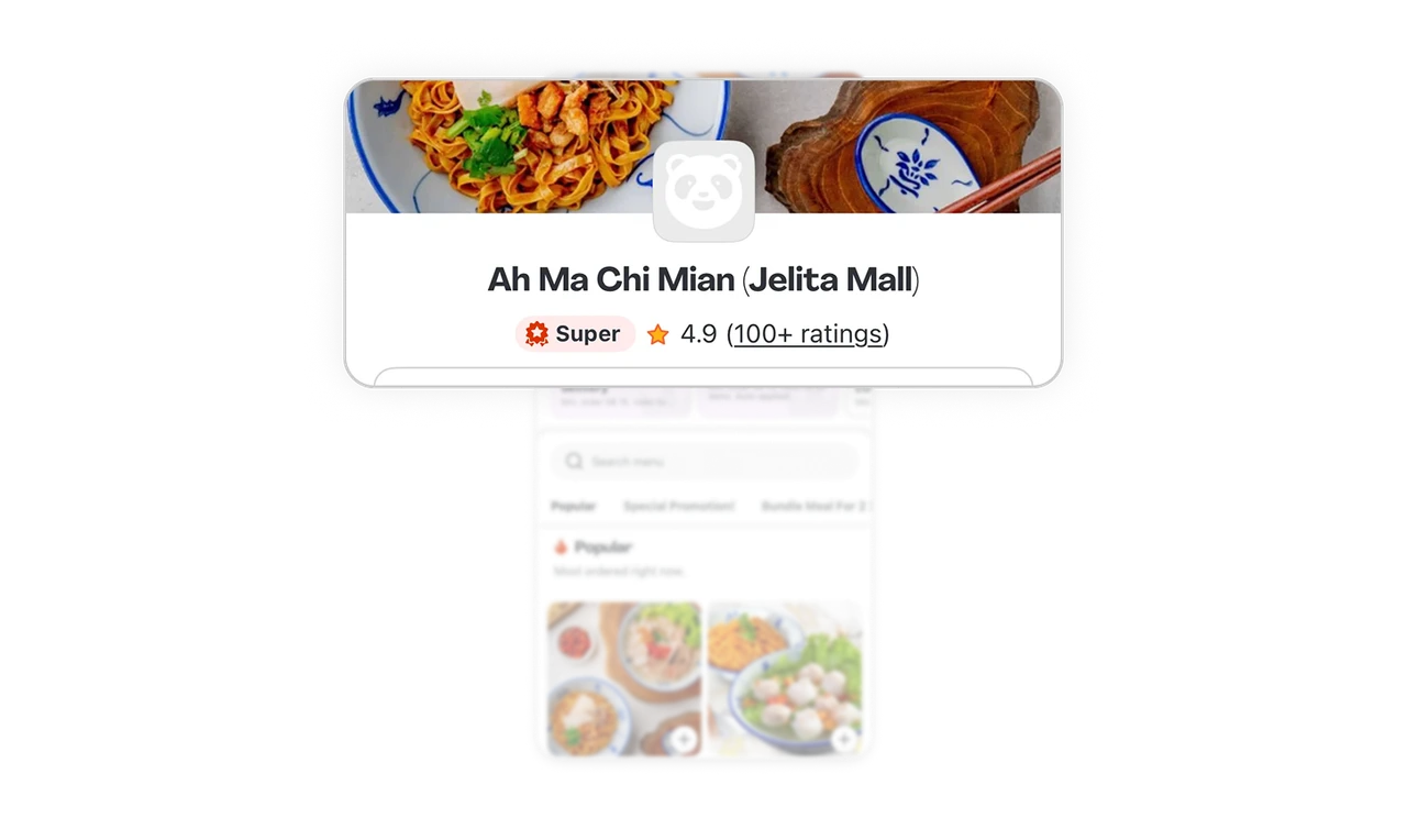
Trust signals stack tells users this restaurant is worth ordering from
Super badge, 4.9 rating, and "100+ ratings" sit in one compact row under the name. Each is a different trust signal: platform endorsement, customer score, and review volume. No single signal carries enough weight alone. Stacking them creates a quick credibility check that closes the "is this place actually good" question in under a second.
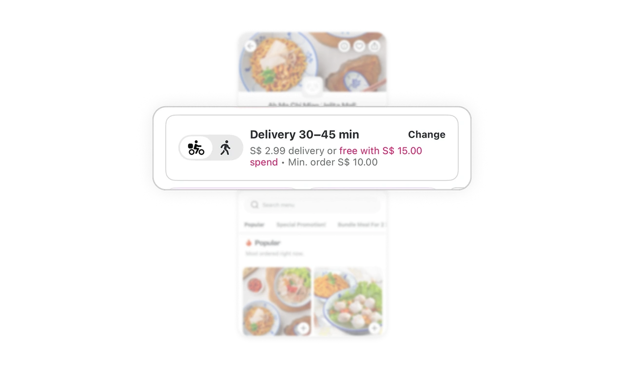
Delivery and Pickup toggle saves space without losing options
A single tile holds both delivery and pickup info with a small bike-walker toggle on the left. Users see only their currently selected mode, but switching is one tap away. Most apps duplicate this info or hide pickup behind a separate flow. Combining both into one toggle-driven card respects screen space while making the alternative discoverable.
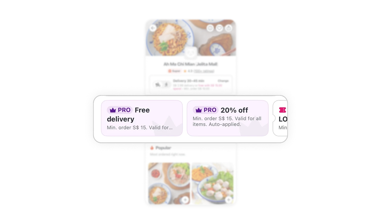
Offers shown upfront protect users from missing rewards
PRO Free delivery, PRO 20% off, and LOYALTY codes scroll horizontally right below the trust signals. Users see all applicable discounts before they start browsing the menu. Hiding offers until checkout creates frustration when discounts are missed. Surfacing them upfront builds transparency, increases perceived value, and lets users mentally budget while ordering.
Menu lives in a sheet so the restaurant context never disappears
The menu opens as a bottom sheet over the hero image and restaurant info. Users can scroll the menu deep but the restaurant context is always one swipe down away. This layered pattern means users never get lost in a long menu without remembering whose menu they are reading, which protects against accidental orders from the wrong place.
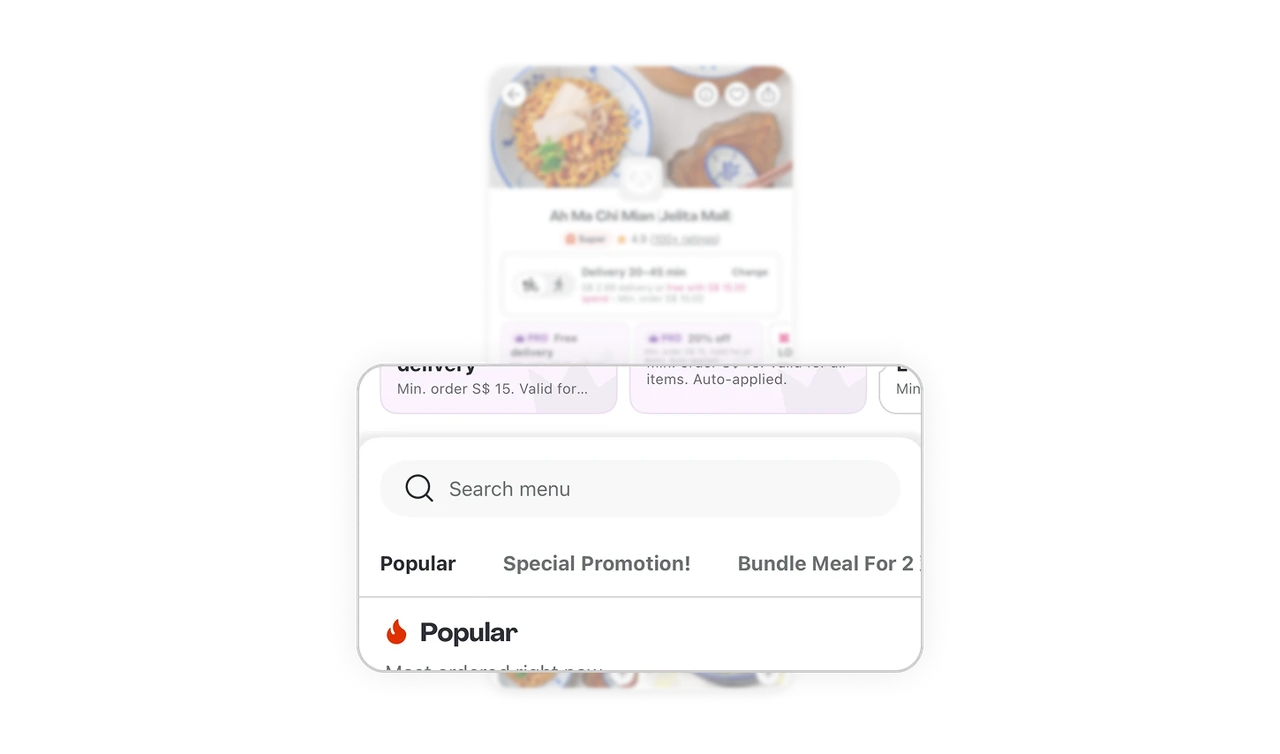
Popular section first solves "what should I order" instantly
"Popular: Most ordered right now" appears as the first menu category before Special Promotion or Bundle Meals. Users who do not know what to order get a crowdsourced answer in one scroll. This is Hick's Law applied to food choice: when faced with too many options, users default to what others picked, and the menu structure makes that default fast and visible.

Similar Breakdown Lessons


