5 UI UX Lessons from Stake Discover Screen - Stake UI Breakdown
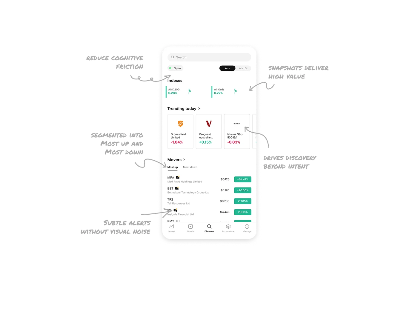
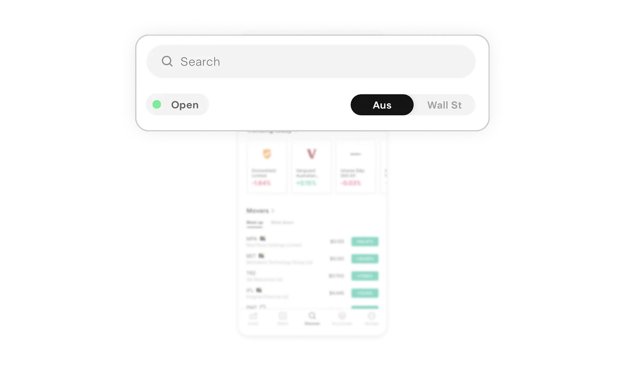
Market status + region toggle reduce cognitive friction
The green Open indicator instantly answers a high intent question before the user even searches. When multiple markets are supported, this prevents costly mistakes. The Aus and Wall St toggle at the top reinforces control. Users decide the context before they explore, not after. This is strong contextual framing. It reduces mental switching and keeps discovery focused.
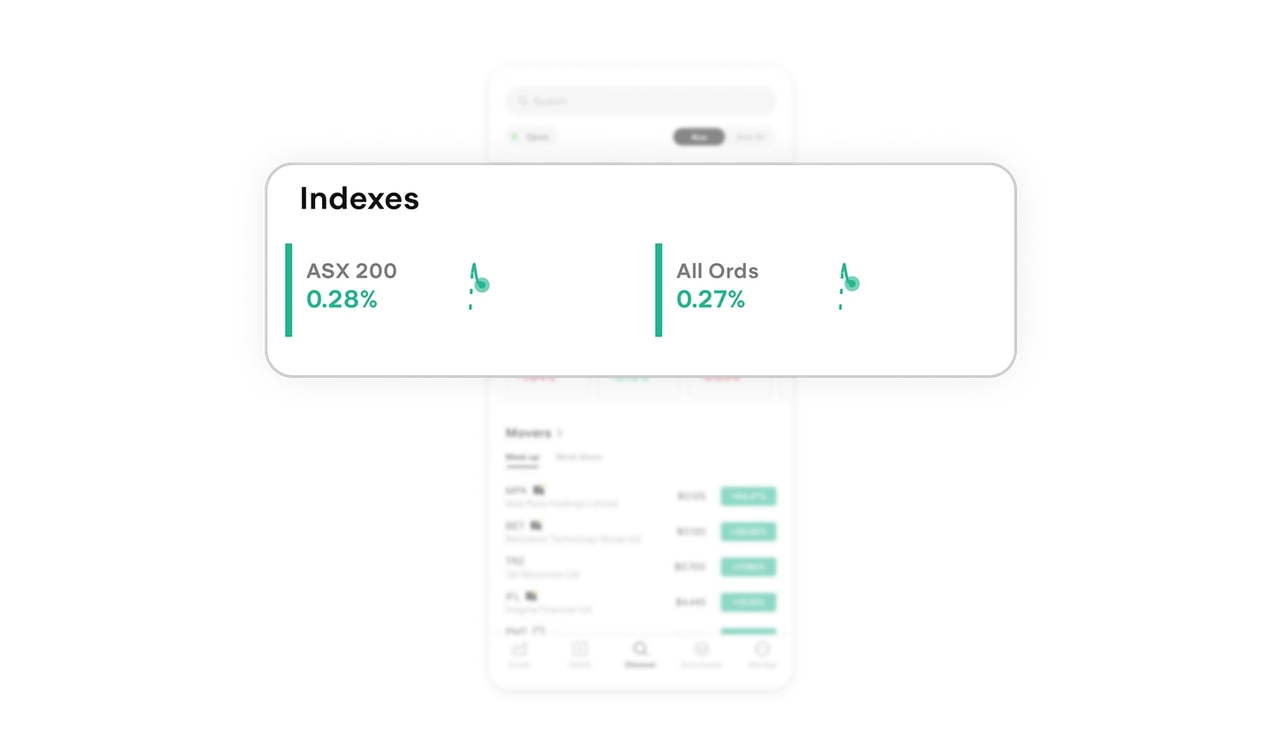
Index snapshots deliver high value in low space
Indexes are compact, horizontally arranged, and paired with micro live charts. In one glance, users see performance and direction. The small sparkline preview removes the need to tap into each index just to understand momentum. It respects time and reduces unnecessary navigation.
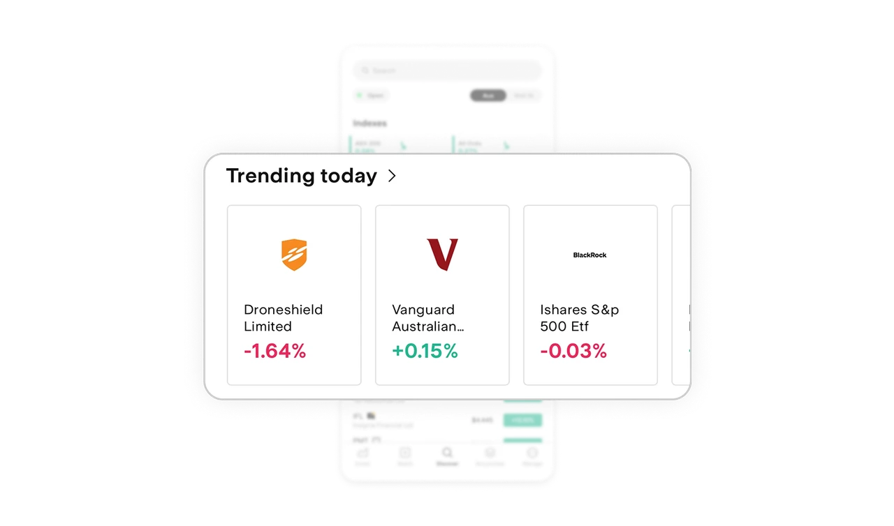
Trending today drives discovery beyond intent
Most users open a trading app without a specific ticker in mind. Trending today captures that moment. It nudges exploration and surfaces opportunities users may not have considered. This increases session depth and engagement without feeling pushy. Discovery becomes part of the product, not an afterthought.
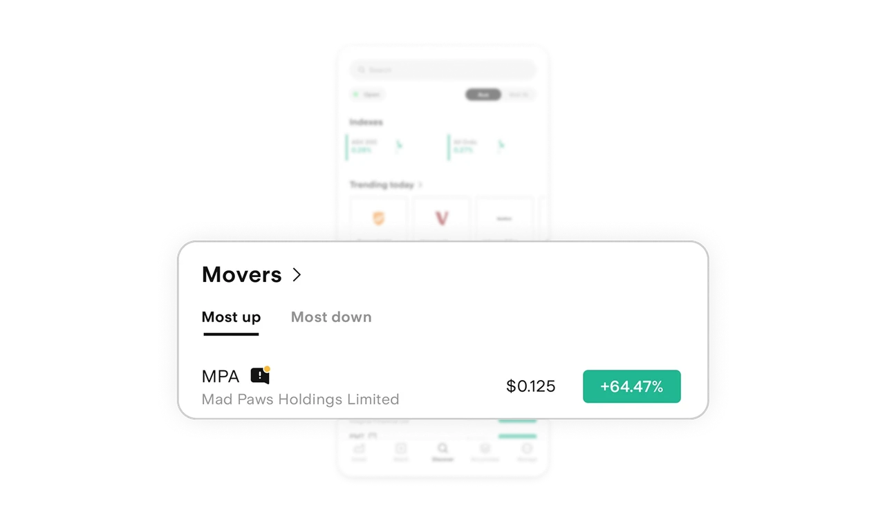
Movers segmented into Most up and Most down
Instead of one long volatile list, the screen splits movers into clear categories. This reduces scanning effort and speeds decision making. The structure mirrors how investors think. Gainers and losers. It matches mental models, which makes the interface feel intuitive. Clear grouping always beats long lists.
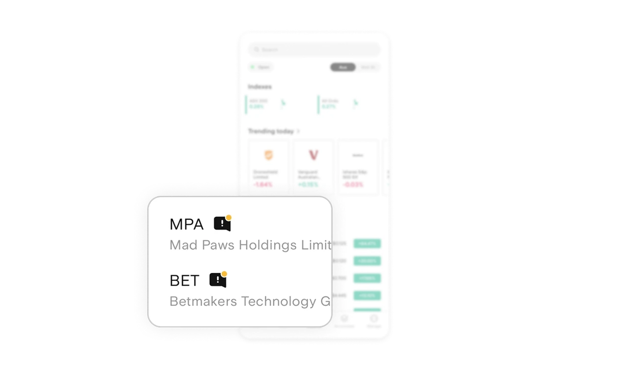
Subtle stock alerts without visual noise
Small message icons beside stock names quietly signal announcements or major updates. There are no loud banners or heavy labels. Just a minimal indicator that rewards attentive users. It informs without overwhelming. That balance between awareness and cleanliness is hard to get right.
Similar Breakdown Lessons


