5 UX Lessons From Zip's BNPL Shopping Hub UI - Zip UI Breakdown
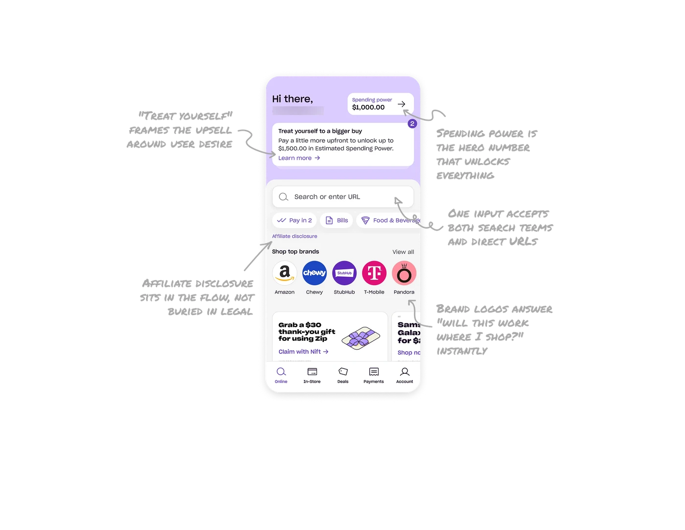
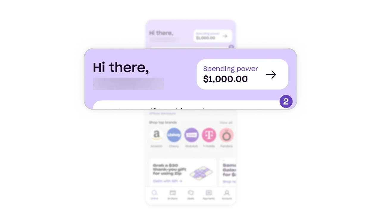
Spending power is the hero number that unlocks everything
"Spending power $1,000.00" sits top-right in a clean white card with a tap-through arrow. It is the single most important answer in a BNPL app: how much can I spend right now? Every product has one unlocking metric that gates the core action. Identify yours and make it impossible to miss, because until users know that number, nothing else on the screen matters to them.
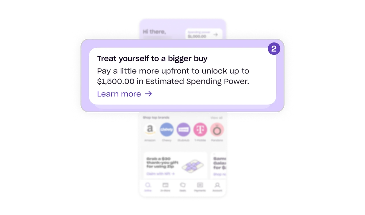
"Treat yourself" frames the upsell around user desire
The card nudges users to unlock $1,500 in spending power by paying more upfront. "Treat yourself to a bigger buy" feels like an invitation to indulge. "Increase your credit limit" would feel like debt. Same mechanic, completely different emotional register. Framing upsells around user aspiration rather than company benefit is language doing design work, and in lending products the words carry most of the emotional load.
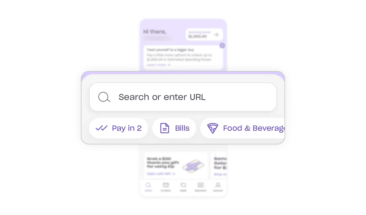
One input accepts both search terms and direct URLs
"Search or enter URL" is a single field that takes a query or a pasted store link. Zip works across any online store, so the input embraces that openness. Users arrive with different levels of specificity, some know the exact site, some are browsing. One flexible field meets both without forcing a choice. When your product spans an open ecosystem, the primary input should accept every format users naturally bring.
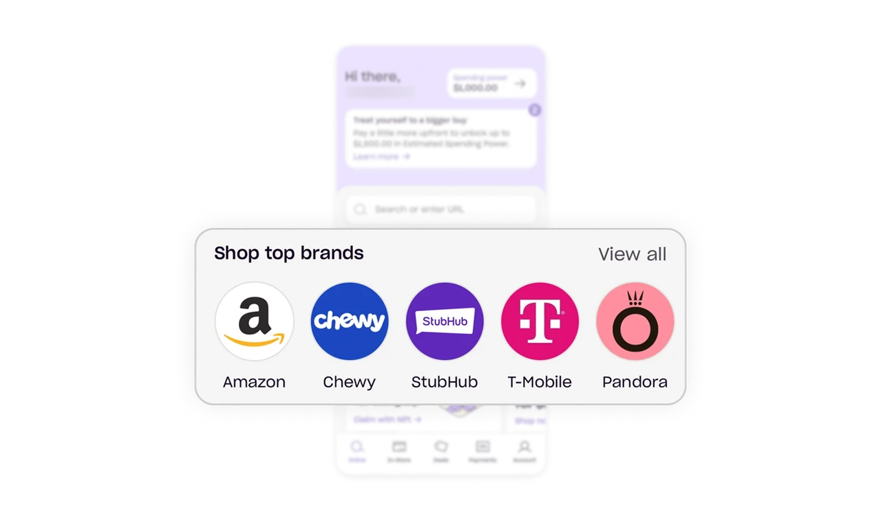
Brand logos answer "will this work where I shop?" instantly
You spot Amazon's smile before you read any label. Logos are processed faster than words and carry borrowed trust. For a BNPL product, seeing familiar brands immediately answers the key adoption question: will this work where I actually shop? Recognition beats description when trust is the barrier.
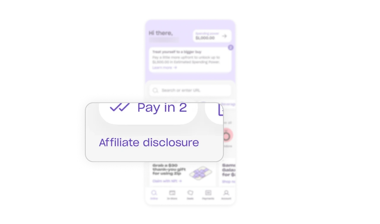
Affiliate disclosure sits in the flow, not buried in legal
A visible "Affiliate disclosure" link sits right below the category chips, in the shopping flow itself. Zip earns from merchant referrals and says so where the shopping happens, not in a footer or terms page. Disclosing commercial relationships visibly treats users as adults and builds long-term trust. In financial products, where trust is the entire foundation, honesty about incentives is a competitive feature, not a legal chore.
Similar Breakdown Lessons


