5 UX Lessons From Netflix's Show Details Screen - Netflix UI Breakdown
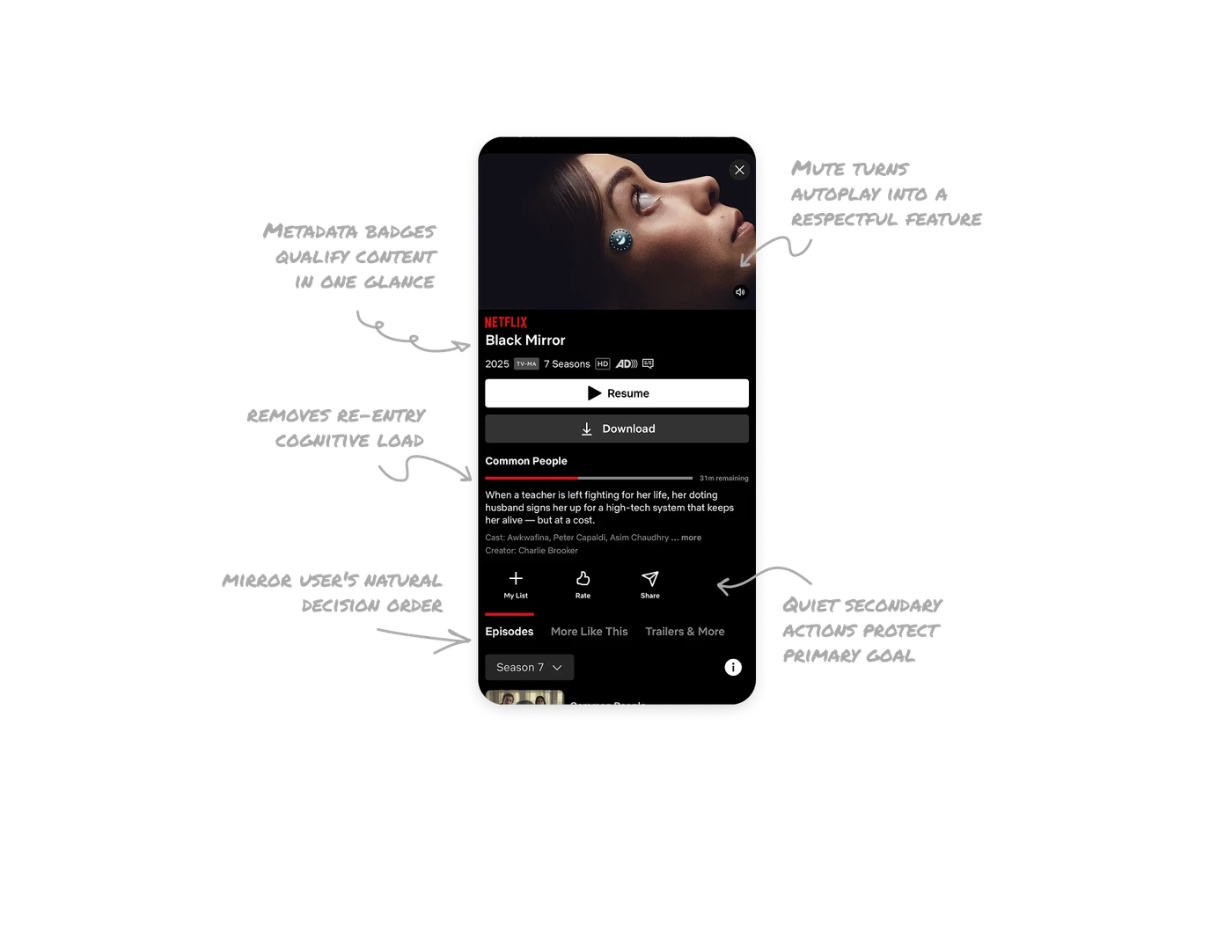
Mute button turns autoplay into a respectful feature
Netflix autoplays a preview the moment you open a title. The mute button in the corner hands control back without stopping the preview. Giving users a visible, low-effort exit from an assertive feature is what separates confident UX from annoying UX.

Metadata badges qualify content in one glance
Year, rating, seasons, HD, and captions packed into one tight row. Users decide relevance in seconds without scrolling. Information compression without clarity loss is one of the hardest layout problems to solve well.

Progress bar removes re-entry cognitive load
Resume button, red progress bar, and "31m remaining" restore viewing context instantly. Users do not need to remember where they stopped. Removing that mental load is a quiet but powerful retention driver in any content product.

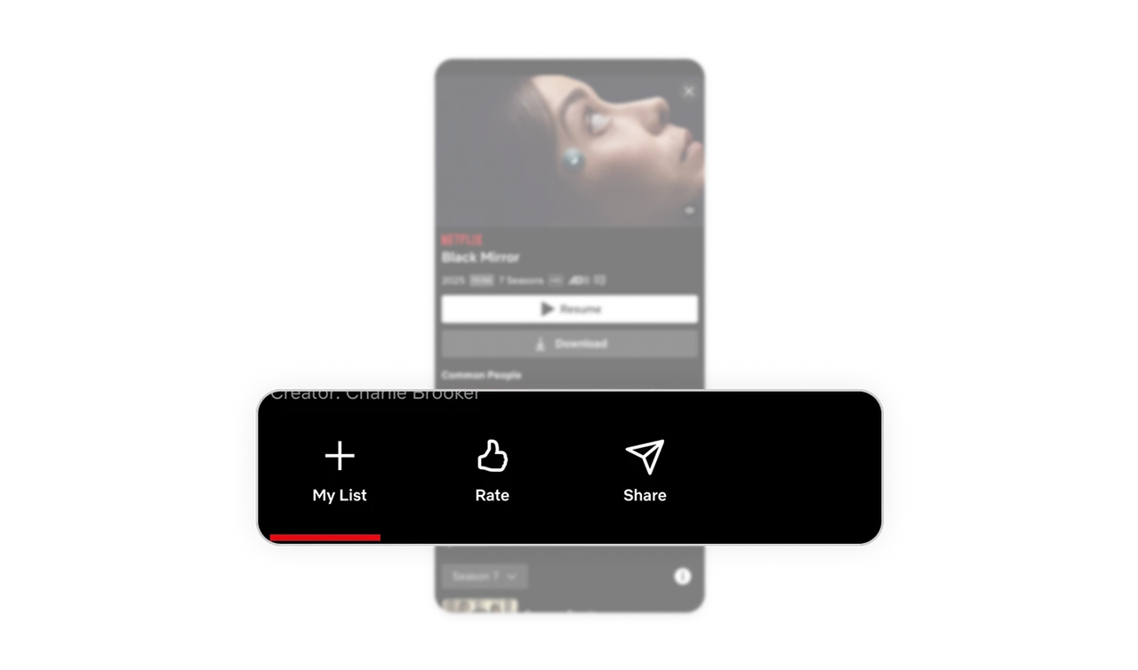
Quiet secondary actions protect the primary goal
Download is dark and outlined. My List, Rate, Share are small icon-label pairs. Resume is the only white-filled button. Every visual decision pushes toward one outcome: watching the content. That is hierarchy enforced through contrast.
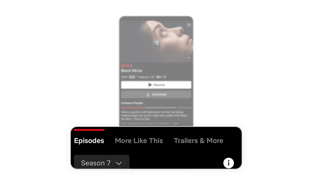
Tabs mirror the user's natural decision order
Episodes, More Like This, and Trailers follow the user's actual mental sequence: watch first, explore episodes next, discover similar shows. Tabs that reflect decision behavior feel intuitive without users ever noticing the design choice.
Similar Breakdown Lessons


