5 UX Lessons From Tide Sleep Analytics UI - Tide UI Breakdown
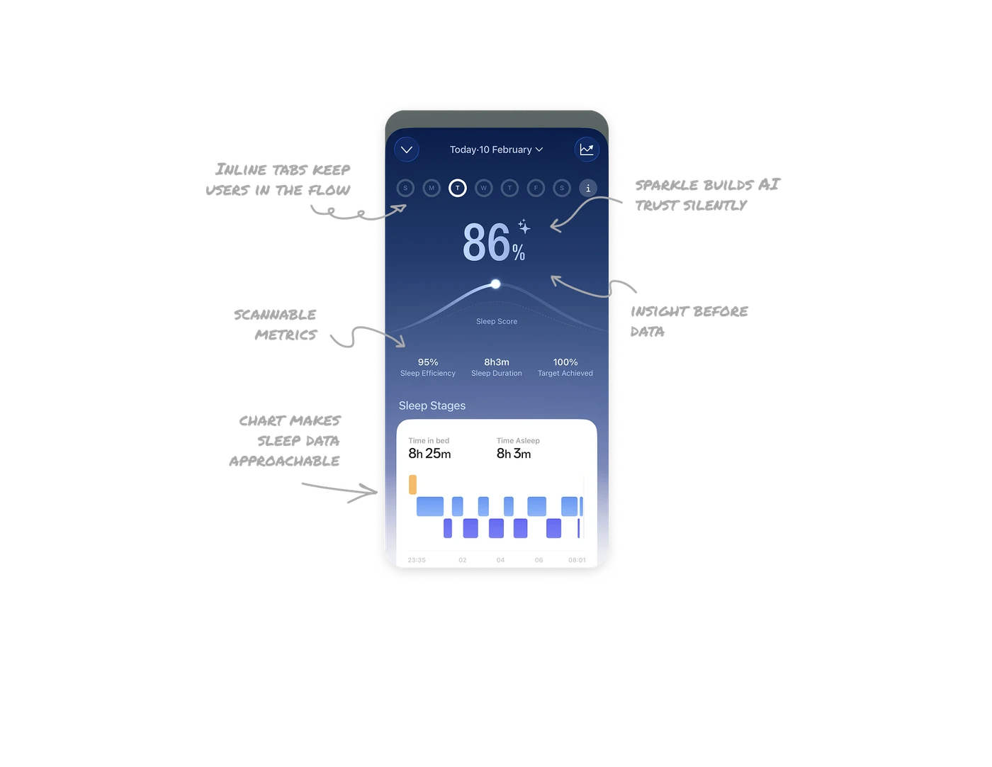
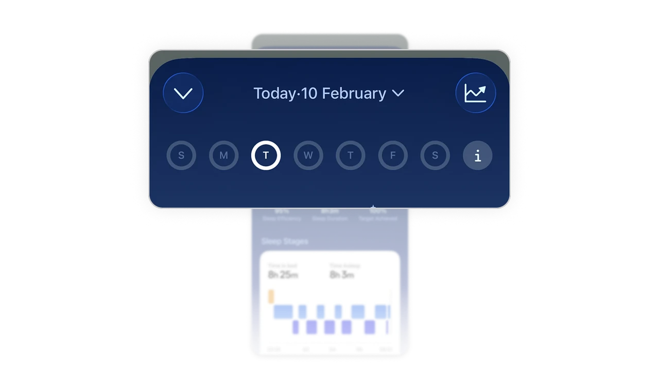
Inline date tabs keep users in the flow
Tapping through days without leaving the screen removes friction from pattern comparison. In habit-based products, quick reflection is critical. Inline navigation means users stay in the insight flow rather than jumping to filters or calendars.
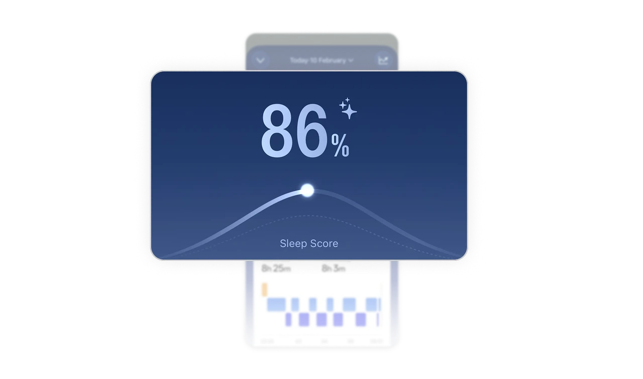
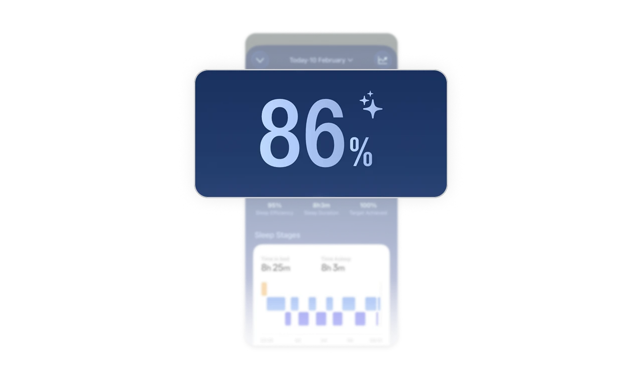
Big score + wave curve = insight before data
The large 86% answers "how did I sleep?" before the user reads a single label. The wave curve adds trend context without adding numbers. Meaning arrives before data. That order separates a dashboard from a decision tool.
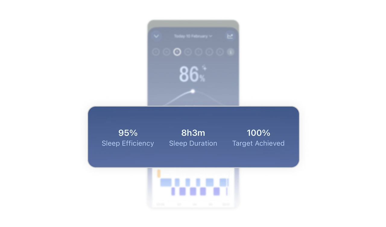
Bold values, muted labels = scannable metrics
Sleep efficiency, duration, and target sit in a three-column row with bold values and muted labels. Size contrast alone communicates what matters. Users glance and absorb without cognitive effort, keeping focus anchored to the main score above.
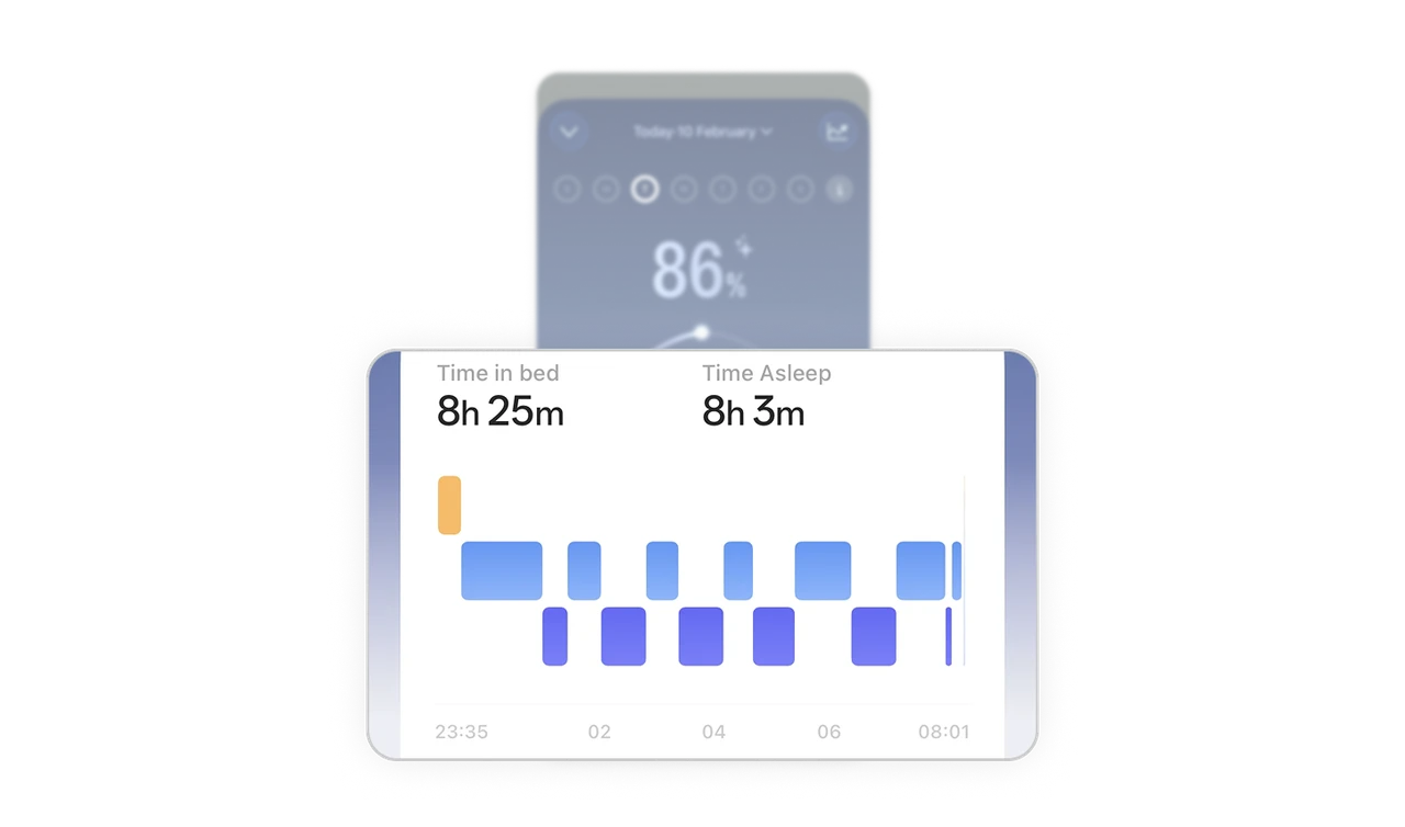
Block chart makes sleep data approachable
Instead of a technical line graph, sleep stages are simple stacked blocks across a timeline. The shape language is familiar and readable for non-experts. Approachable visualization builds trust and makes users more likely to engage with the data daily.
A sparkle icon builds AI trust silently
The small sparkle next to 86% signals AI-generated scoring without a word of explanation. One decorative mark sets user expectations about how the number was produced. Designers over-explain algorithmic features. A well-placed icon communicates the same thing in zero reading time.
Similar Breakdown Lessons


