Daily Timeline

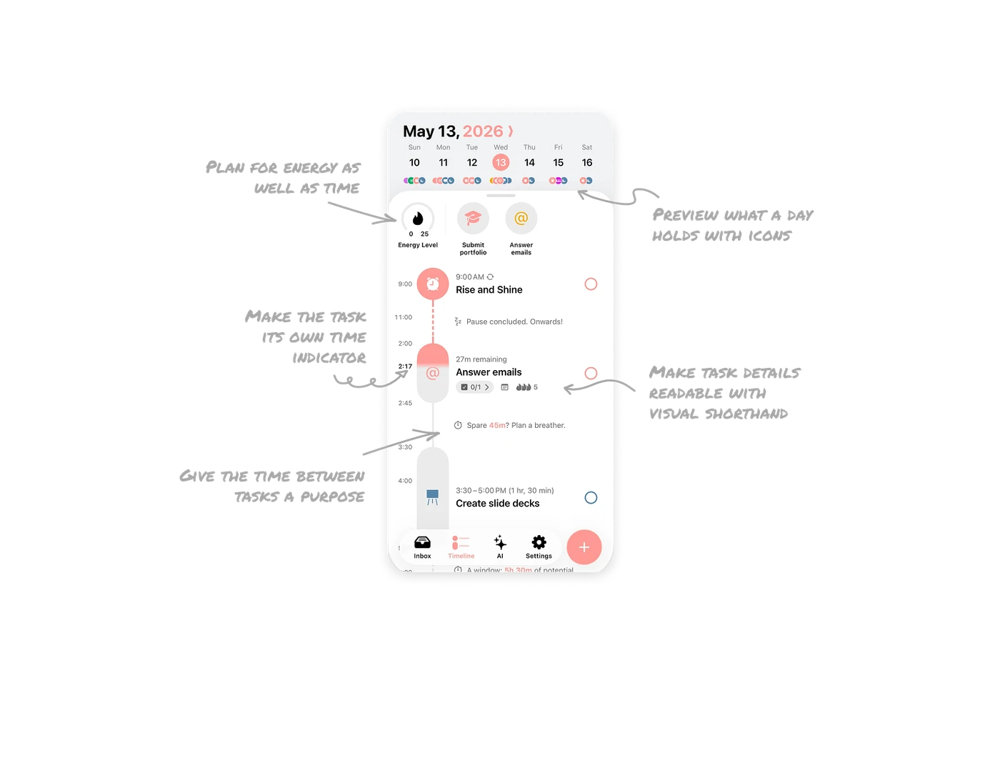
Make the task its own time indicator
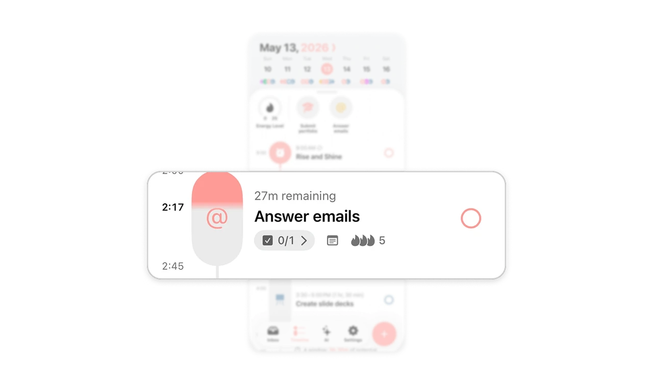
The “Answer emails” capsule has a coral-to-gray boundary beside the bold 2:17 marker, with “27m remaining” next to it. Together, the shape, current-time marker, and countdown connect the activity to its progress through the allotted time. Users get a spatial cue and a readable duration in the same place. When time matters during an activity, integrate its progress into the object people are already following.
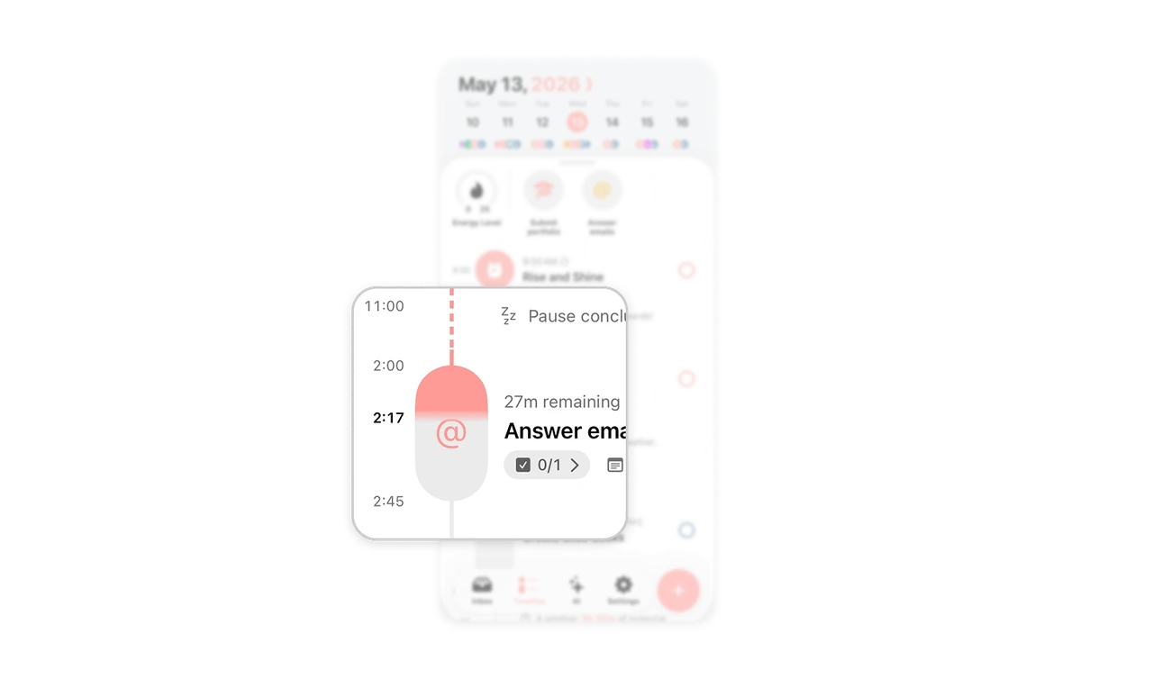
Give the time between tasks a purpose
Structured labels an open interval “Spare 45m? Plan a breather.” It makes the gap measurable and suggests a use without requiring users to subtract neighboring timestamps. The wording also treats rest as a legitimate planning choice, while “Pause concluded. Onwards!” offers a gentle transition back to activity. In scheduling products, give available time the same editorial attention as booked time: show its length and help people consider how to use it.
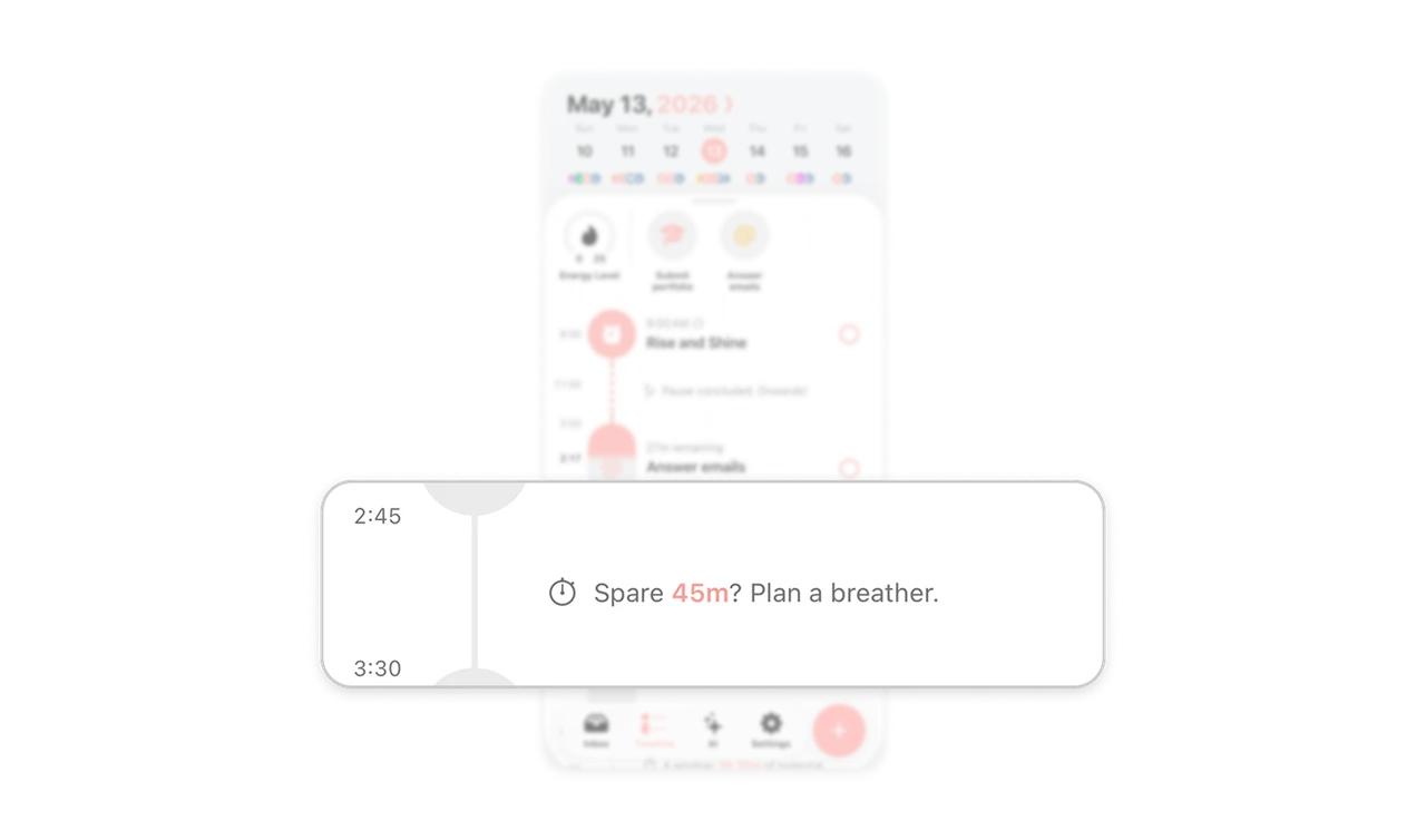
Plan for energy as well as time
An “Energy Level” gauge sits above the timeline, bringing an energy budget into daily planning. Structured calculates task Energy Points from the chosen energy level and task duration, then relates them to a configurable daily limit. This gives users another basis for deciding whether work fits their day. In planning tools, show the capacity a schedule consumes alongside the time it occupies. An available hour is only one part of availability.
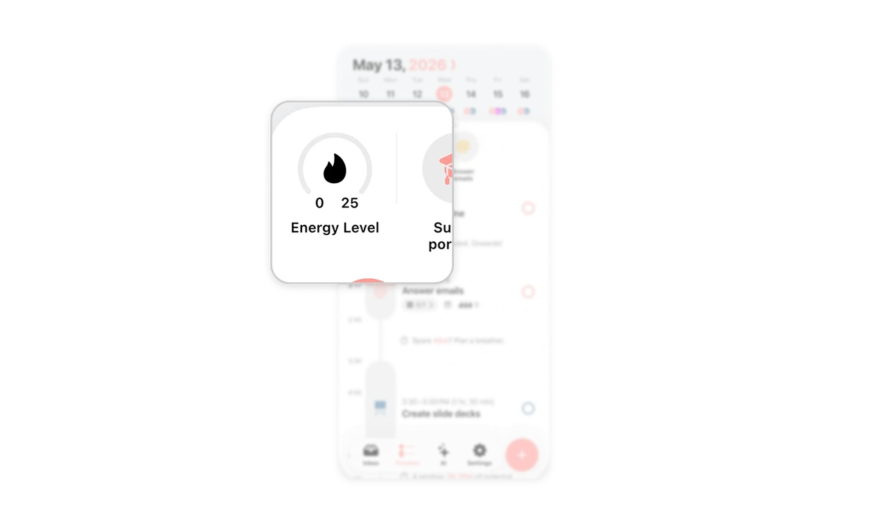
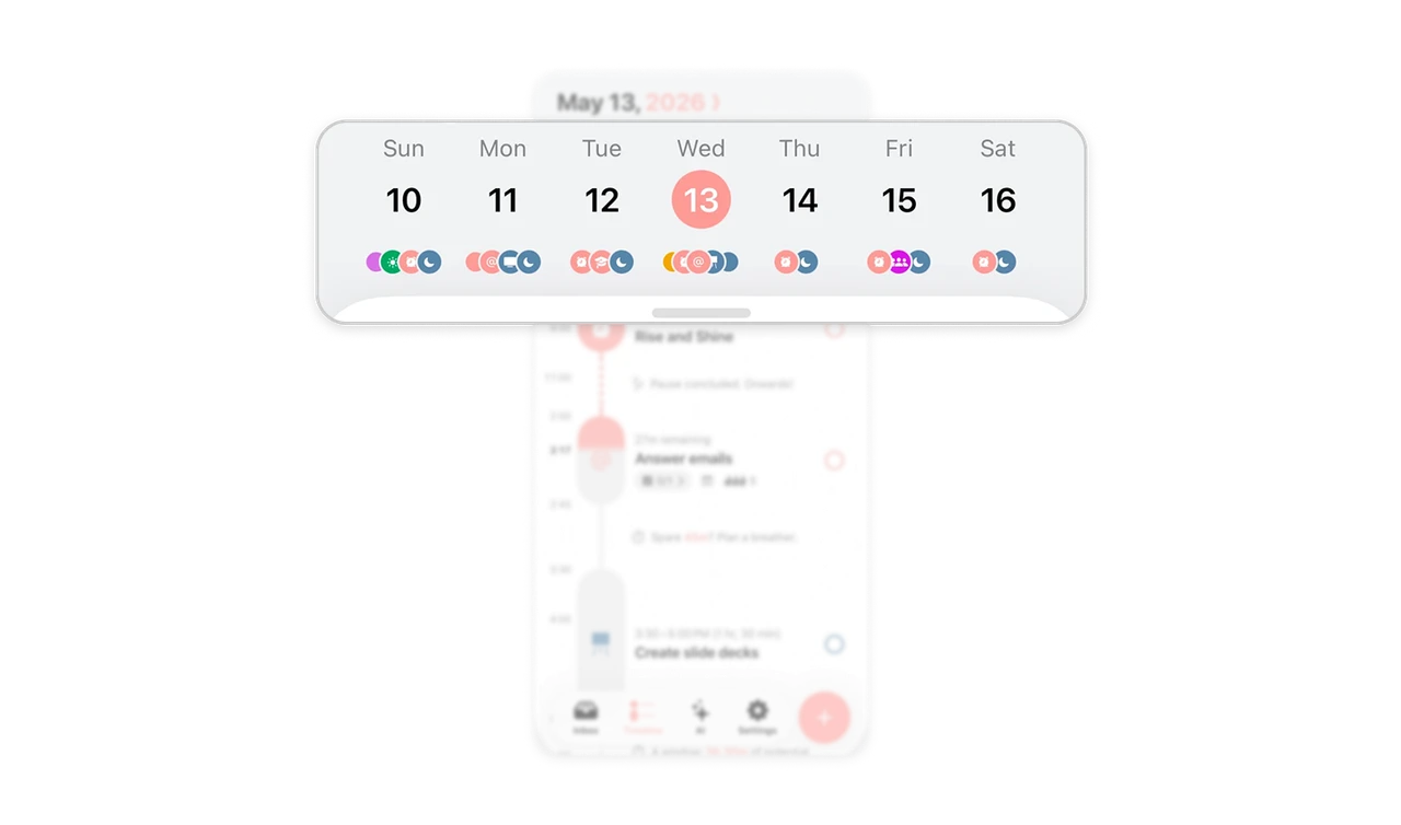
Preview what a day holds with icons
Small alarm, email, graduation cap, and moon icons appear beneath dates in the weekly strip. These symbols preview the kinds of activities a day contains, adding meaning beyond a generic event dot. The larger timeline supplies the names and timing that the compact overview cannot carry. For visual planning tools, summarize days with recognizable activity cues so users can compare their character before inspecting the full schedule.
Make task details readable with visual shorthand
Below “Answer emails,” a checklist count, chevron, note icon, and flames with “5” form a compact metadata row. The count communicates subtask progress, the chevron signals further detail, and three flames indicate high energy demand, with the number showing Energy Points. This keeps useful distinctions visible without repeating full labels on every task. Pair recognizable symbols with precise values so compactness preserves meaning as users scan their schedule.
Similar Breakdown Lessons