Banking Home

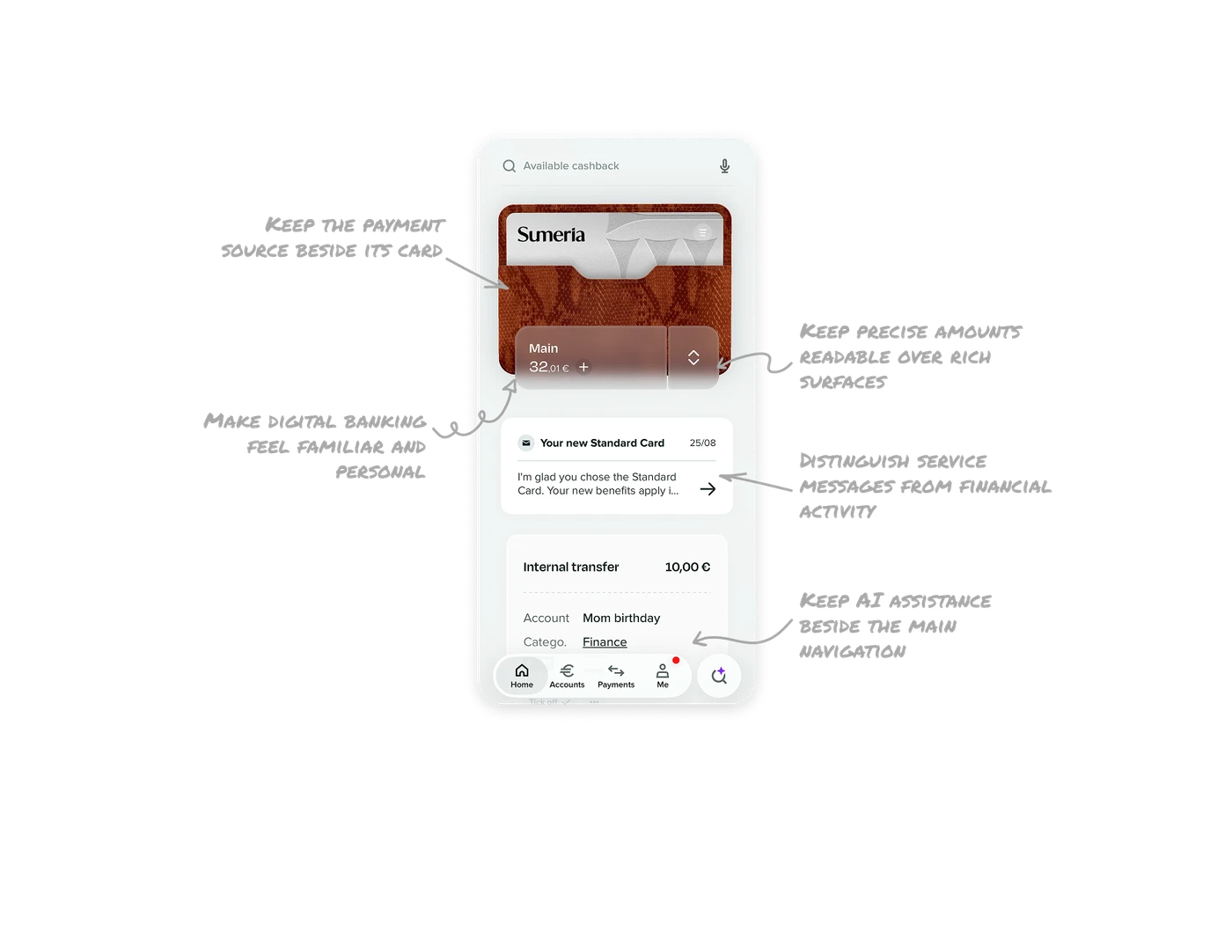
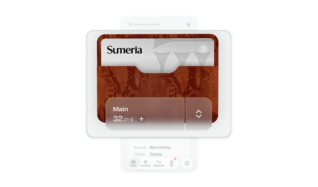
Keep the payment source beside its card
A card sits inside a wallet illustration, with “Main,” its balance, and an account selector attached below. The selector changes which account funds future card payments. Placing the account name, balance, and selector beside the card makes its funding source explicit. When a card can draw from different accounts, show its current funding source alongside it and make switching available where that relationship is already visible.
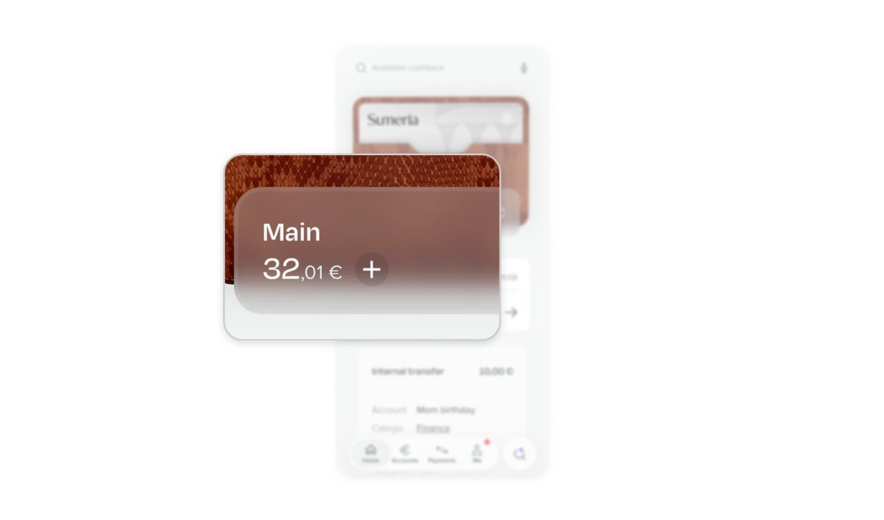
Keep precise amounts readable over rich surfaces
The Main balance sits in a translucent panel over the textured wallet, with a soft fade along its lower edge. Within “32,01 €,” the whole euros use larger type while the cents and currency remain alongside them. When financial information sits over imagery, treat background contrast and number grouping as one readability problem. Preserve the complete value as a legible unit, even when its parts have different visual emphasis.
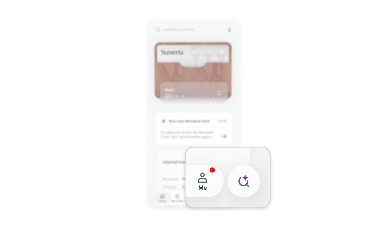
Keep AI assistance beside the main navigation
The magnifying glass with a purple sparkle sits in its own large circle beside Home, Accounts, Payments, and Me. It opens Sia’s text and voice composer from Home. This gives assistance a prominent place at the lower edge, close to the app’s main navigation. When an assistant supports several tasks, consider thumb reach alongside visibility: provide a recognizable, generous target near familiar controls so help is easy to find and activate.
Make digital banking feel familiar and personal
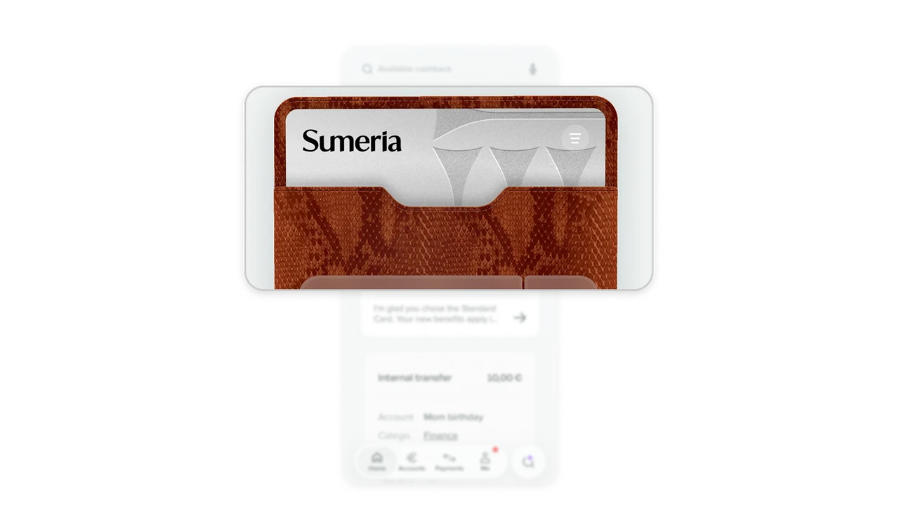
The textured wallet, stitched edges, and partly exposed card recreate a familiar everyday object on the home screen. Sumeria also lets users choose cardholder materials and Home colors, giving that recognizable object room for personal taste. When bringing a physical object into software, use its familiar shape and material details to make the digital version recognizable. Add customization where it helps people make a frequently visited screen feel like their own.
Distinguish service messages from financial activity
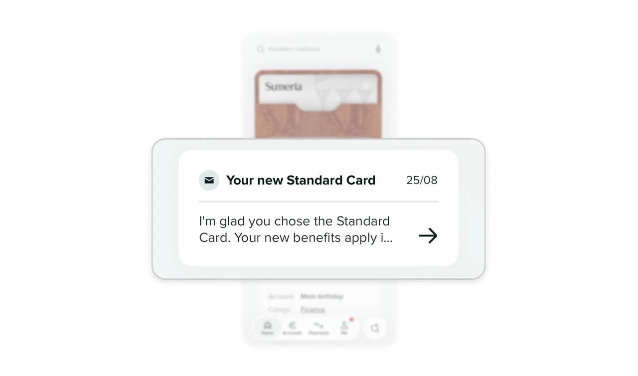
The message’s first-person opening, “I’m glad you chose the Standard Card,” acknowledges the card choice conversationally. Its envelope icon, subject, date, and forward arrow identify correspondence, while the transfer below presents an event and amount. When service messages and transactions share a home screen, distinguish them through both writing and structure. Use the preview to establish relevance while keeping messages to read recognizable alongside financial activity to inspect.
Similar Breakdown Lessons