Restaurant Discovery

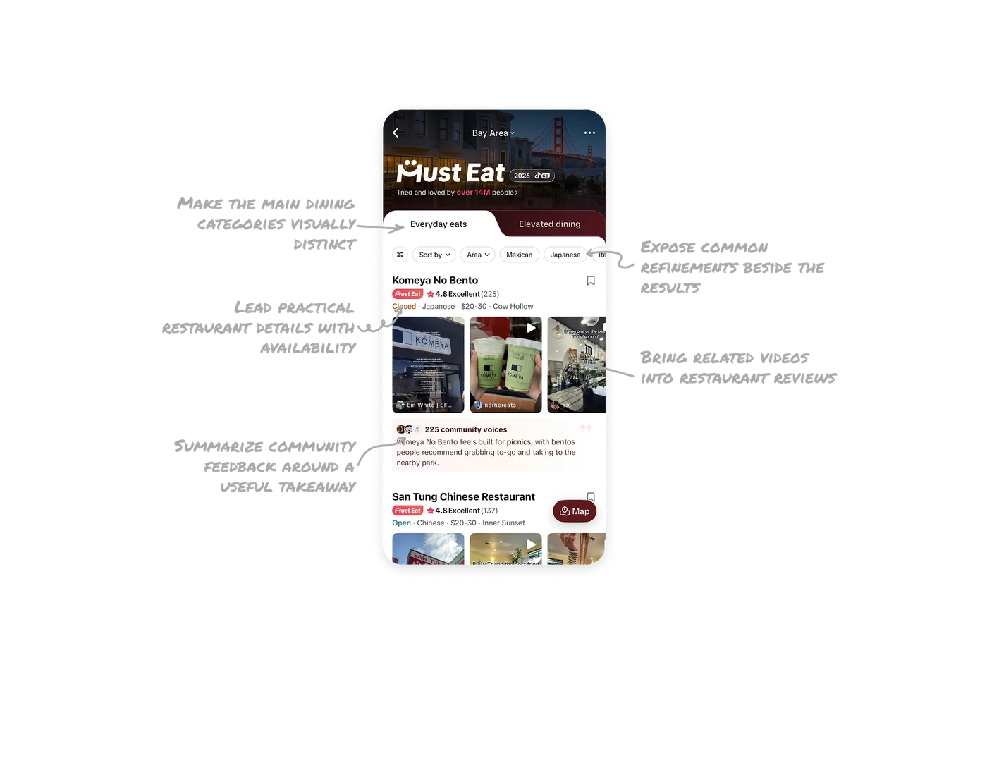
Bring related videos into restaurant reviews
Related TikTok videos appear as portrait previews within each restaurant result, showing food, surroundings, and creator commentary. Some previews include recommendations or tips in on-video captions, while names and avatars keep the source visible. This makes existing platform content useful during restaurant comparison, with information available before playback. When a product already contains relevant user content, bring it into the decision flow and preserve its context so people can assess options through shared experiences.
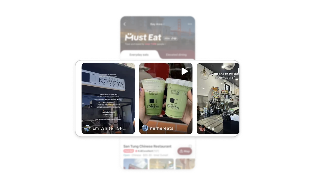
Lead practical restaurant details with availability
“Open” or “Closed” leads a compact line of cuisine, price range, and neighborhood, with explicit wording and color making availability easy to spot. Above it, the Must Eat badge and rating identify guide membership and provide an overall appraisal. This keeps practical facts and recommendation signals together. When users compare options, use a consistent summary and give time-sensitive information a prominent position so they can assess suitability at a glance.
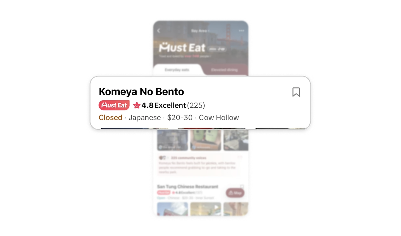
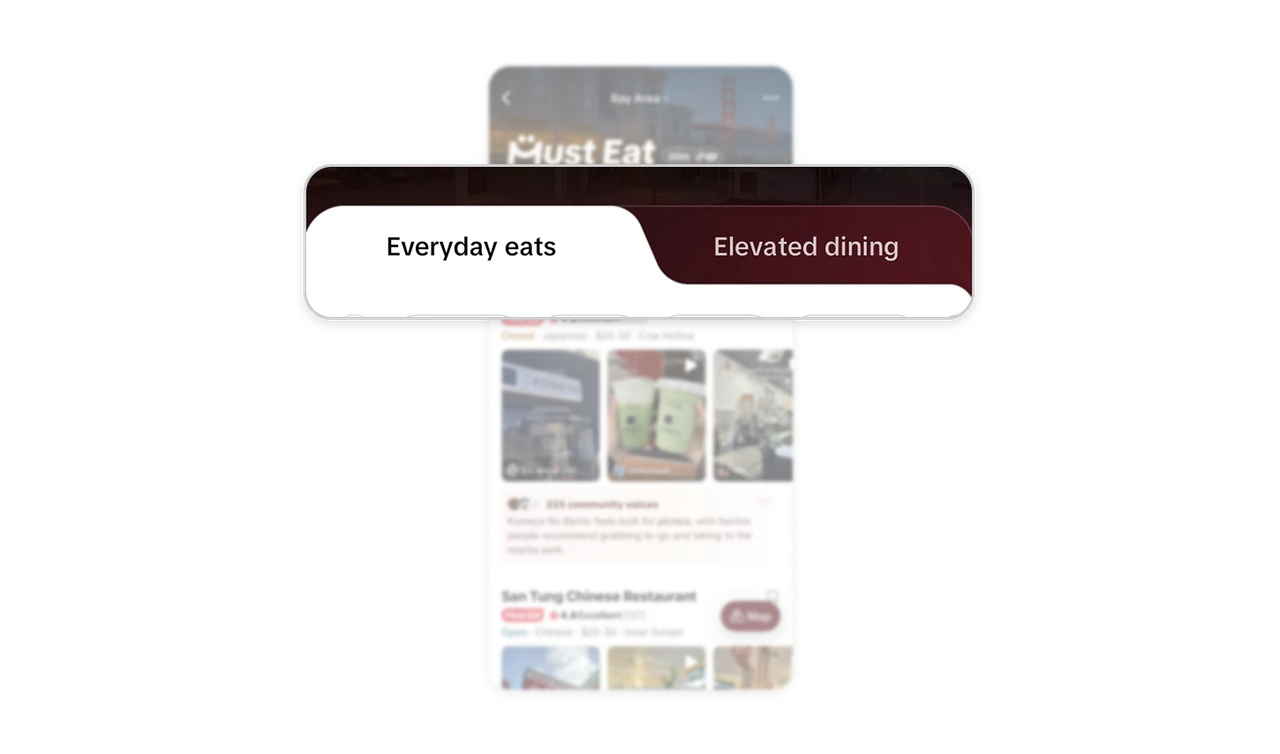
Make the main dining categories visually distinct
The large “Everyday eats” and “Elevated dining” tabs divide the guide into two recognizable dining categories. The selected tab shares the white surface of the results below, connecting the active category to its content. This makes the main browsing choice visible before users inspect individual restaurants. When a collection serves different kinds of occasions, give those categories a clear navigation level and make the current selection easy to recognize.
Summarize community feedback around a useful takeaway
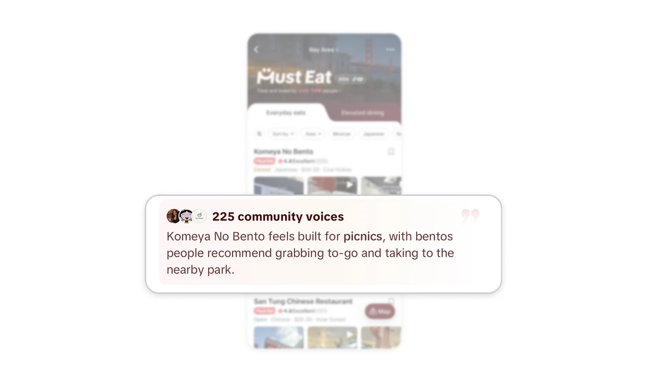
The “225 community voices” label and avatars frame the paragraph as community feedback, while bold “picnics” makes its practical takeaway easy to spot. Users get a short overview alongside the videos and rating. For products using AI to summarize feedback, surface concrete reasons an option might suit someone’s plans. Keep the stated source visible and emphasize the useful takeaway so people can judge relevance before deciding which individual contributions to explore.
Expose common refinements beside the results
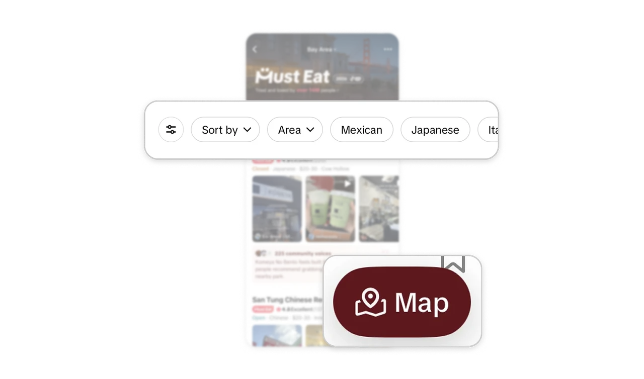
The general filter control sits beside visible Sort by, Area, and cuisine pills, making several useful refinements recognizable without first opening that control. A separate, clearly labeled Map button offers a route to geographic browsing. This gives users ways to narrow the list and consider location while evaluating restaurants. When a discovery flow has many filtering options, expose frequent choices near the results and keep alternative browsing views easy to identify.
Similar Breakdown Lessons