AI Business Dashboard

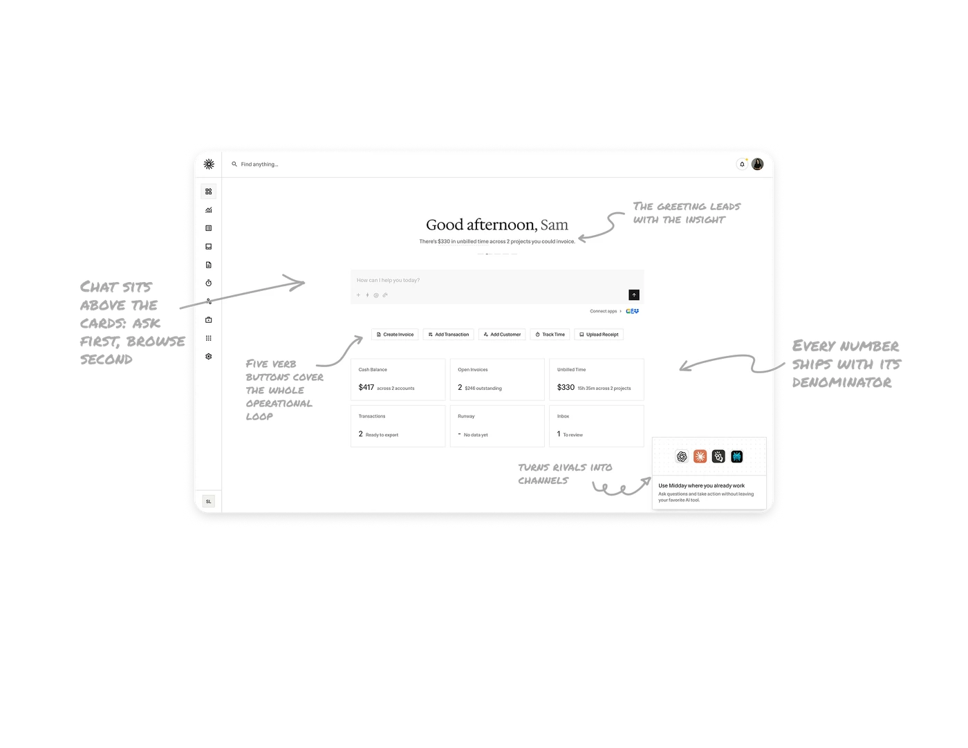
The greeting leads with the insight that makes you money
"Good afternoon, Sam" is followed by "There's $330 in unbilled time across 2 projects you could invoice," computed from the user's data, with the key phrase linked. The opening line is the single highest-leverage action available right now, and pagination dots hint at more insights to cycle. A dashboard's job is not showing data, it is telling you what the data means you should do. Pleasantries waste the most-read line on the screen.
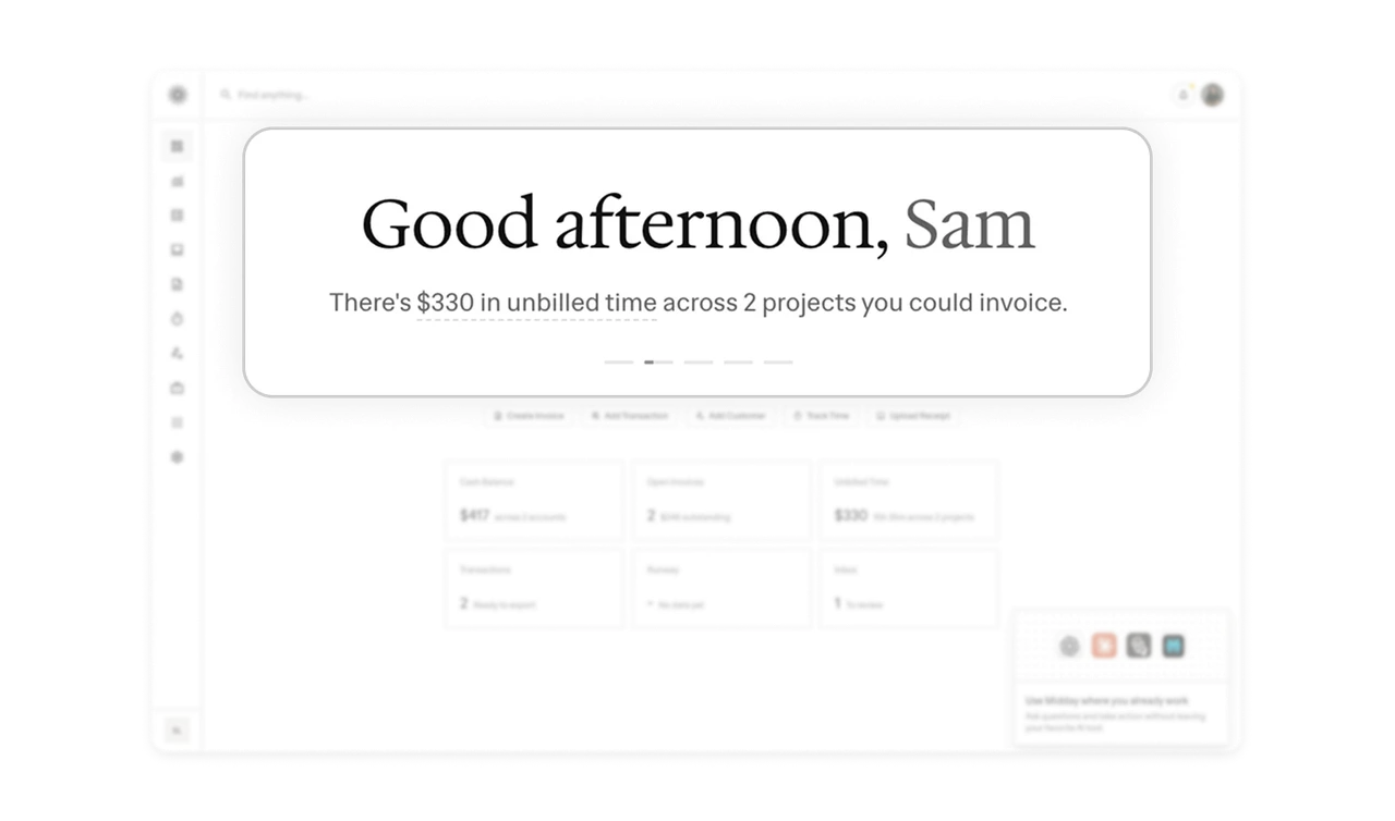
Chat sits above the cards: ask first, browse second
"How can I help you today?" occupies the prime position above the metric grid. Conversation is the front door, the dashboard is the fallback, and the visual hierarchy declares it. When natural language answers "how is my cash flow?" faster than scanning six cards, the input deserves the top slot. This is the dashboard-to-conversation inversion happening across software, made explicit in a single layout decision.
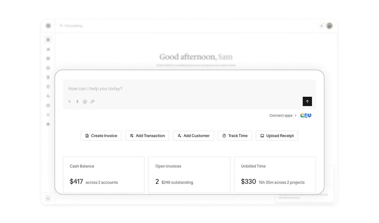
Five verb buttons cover the whole operational loop
Create Invoice, Add Transaction, Add Customer, Track Time, Upload Receipt sit as a flat row between chat and metrics. Each button is a complete job-to-be-done, icon plus verb phrase, no nesting. Users with a known task skip both chat and navigation. The screen ends up offering three entry paths by intent level: ask, act, or browse, and each user self-selects without the product asking which kind of moment they are in.
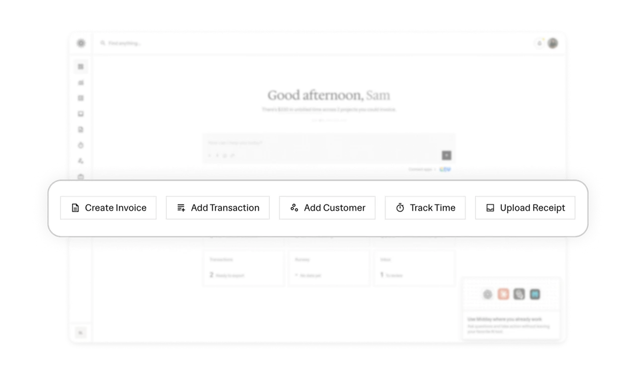
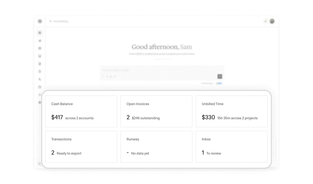
Every number ships with its denominator
"$417 across 2 accounts." "2 open invoices, $246 outstanding." "$330, 15h 35m across 2 projects." Each card pairs the bold figure with a context annotation: the number answers "how much?", the annotation answers "of what?" A metric alone is unverifiable, a metric with its composition is trustworthy. Never show a number without its denominator, the context is what turns a statistic into something the user can act on and audit.
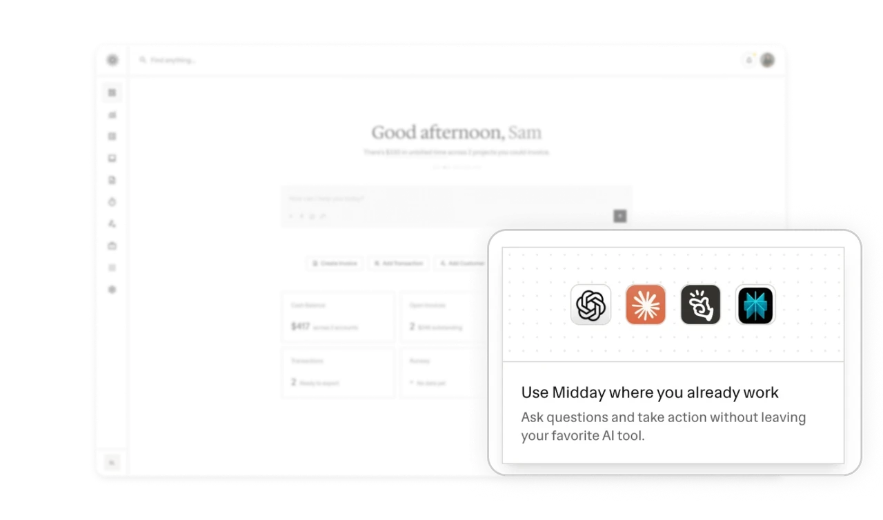
"Use Midday where you already work" turns rivals into channels
The corner card shows ChatGPT, Claude, and other AI tool icons: "Ask questions and take action without leaving your favorite AI tool." Midday advertises its presence inside other products. In the AI era, your product's surface extends beyond your app, and acknowledging that users live elsewhere converts a threat into a distribution channel. The integration promo card is a brand-new pattern, and this is one of its first clean executions.
Similar Breakdown Lessons