AI Outfit Planner

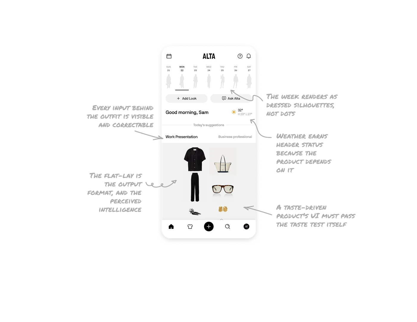
The week renders as dressed silhouettes, not dots
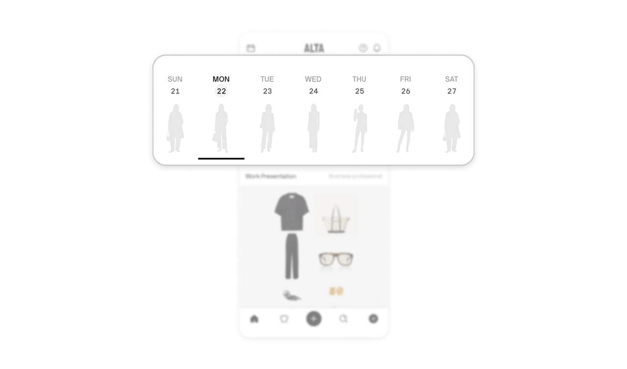
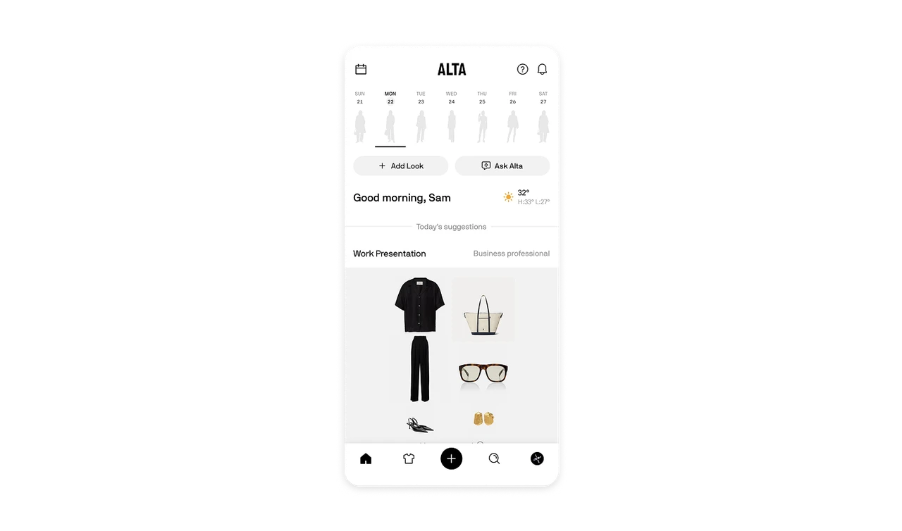
Each day in the calendar row shows a greyed human figure wearing that day's planned look, with today underlined. The week is literally a row of dressed figures, a wardrobe preview instead of abstract markers. When your domain is inherently visual, outfits, meals, rooms, calendar cells should show the thing itself, not a symbol for it. Representing planned content in its native visual form turns a schedule into a mirror.
Every input behind the outfit is visible and correctable
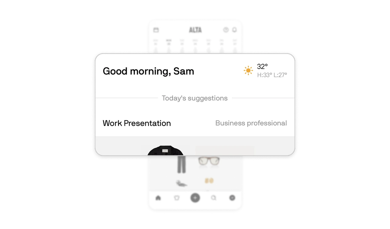
The suggestion shows its full reasoning chain: "Work Presentation" pulled from the calendar, "Business professional" as the inferred dress code, 32° in the header. Silk short sleeves suddenly make sense for a hot day with a formal meeting. Show each signal the AI personalized from, trigger and interpretation both, so if either is wrong the user knows exactly which layer to correct. Visible inputs turn a guess into a reasoned recommendation the user can audit in one glance.
The flat-lay is the output format, and the perceived intelligence
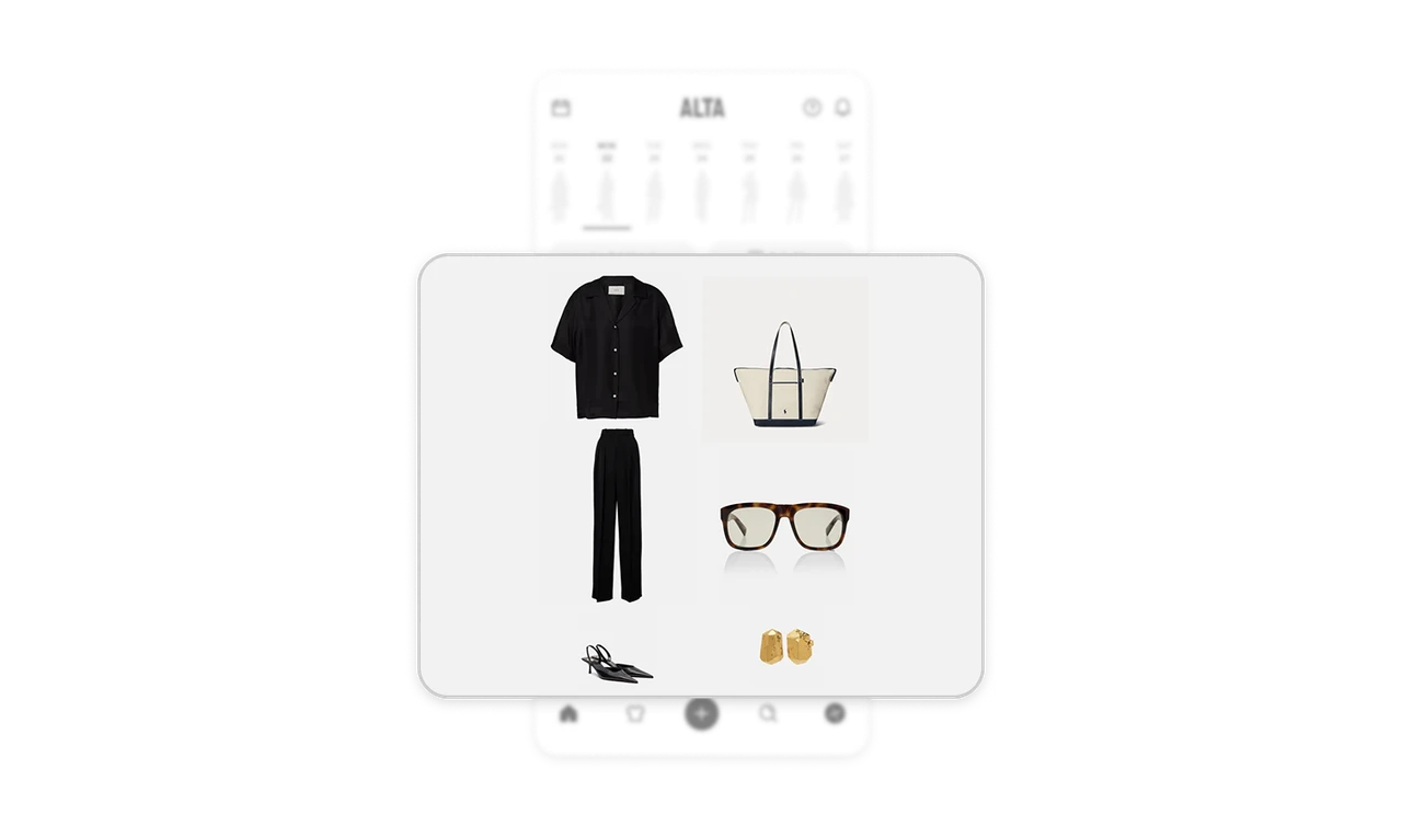
The outfit renders as an editorial flat-lay, shirt, trousers, heels, bag, sunglasses, earrings arranged spatially like a magazine spread of your own closet, not a vertical list of product cards. Present composed recommendations in the visual grammar of the domain's aspirational media. Fashion thinks in lookbooks, not inventory rows, and matching that format makes the AI's output feel like styling rather than search results. The presentation is the perceived intelligence.
Weather earns header status because the product depends on it
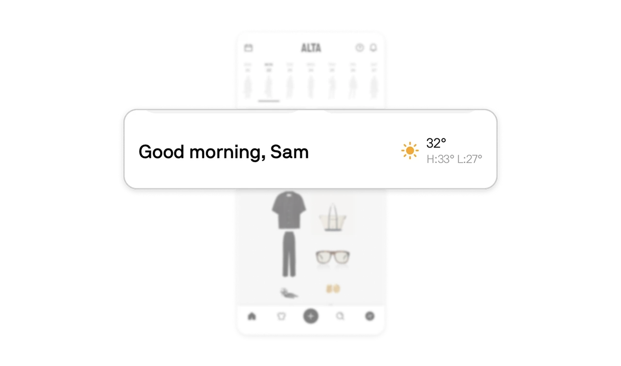
"32°, H:33° L:27°" sits beside the greeting, not buried in a widget, because for outfit planning weather is a core input, not ambient trivia. A stylist app without visible weather forces users to app-switch before trusting any suggestion. Identify the outside fact your users check before using your product, and bring it inside. Promoting external data to header status is how a product proves it already thought of what you were about to verify.
A taste-driven product's UI must pass the taste test itself
Stark black-and-white chrome, a bold wordmark, generous whitespace, the interface dresses like a fashion magazine and lets the clothing photography carry all the color. A stylist app with a noisy, colorful interface undermines its own authority. The monochrome restraint signals editorial judgment, and the chrome recedes so the content can be the style. In any product selling taste, the interface is the first demonstration of whether the product has any.
Similar Breakdown Lessons