Banking Home

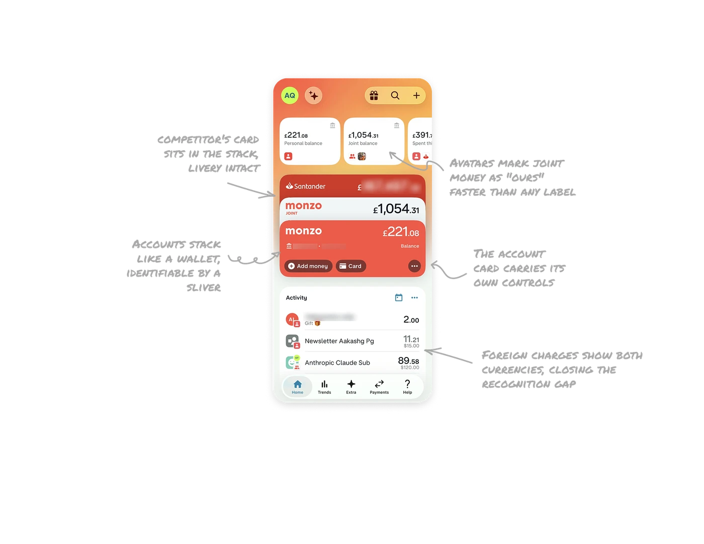
Accounts stack like a wallet, identifiable by a sliver
Bank accounts render as a physically stacked deck, each peeking from behind the one in front in its brand color. The active card sits forward with balance and actions, the others show just their edge. The wallet metaphor matches how people mentally model accounts, and colored edges make each identifiable by a sliver alone. The stack shows full inventory without consuming space, skeuomorphism promoted to the core navigation metaphor.
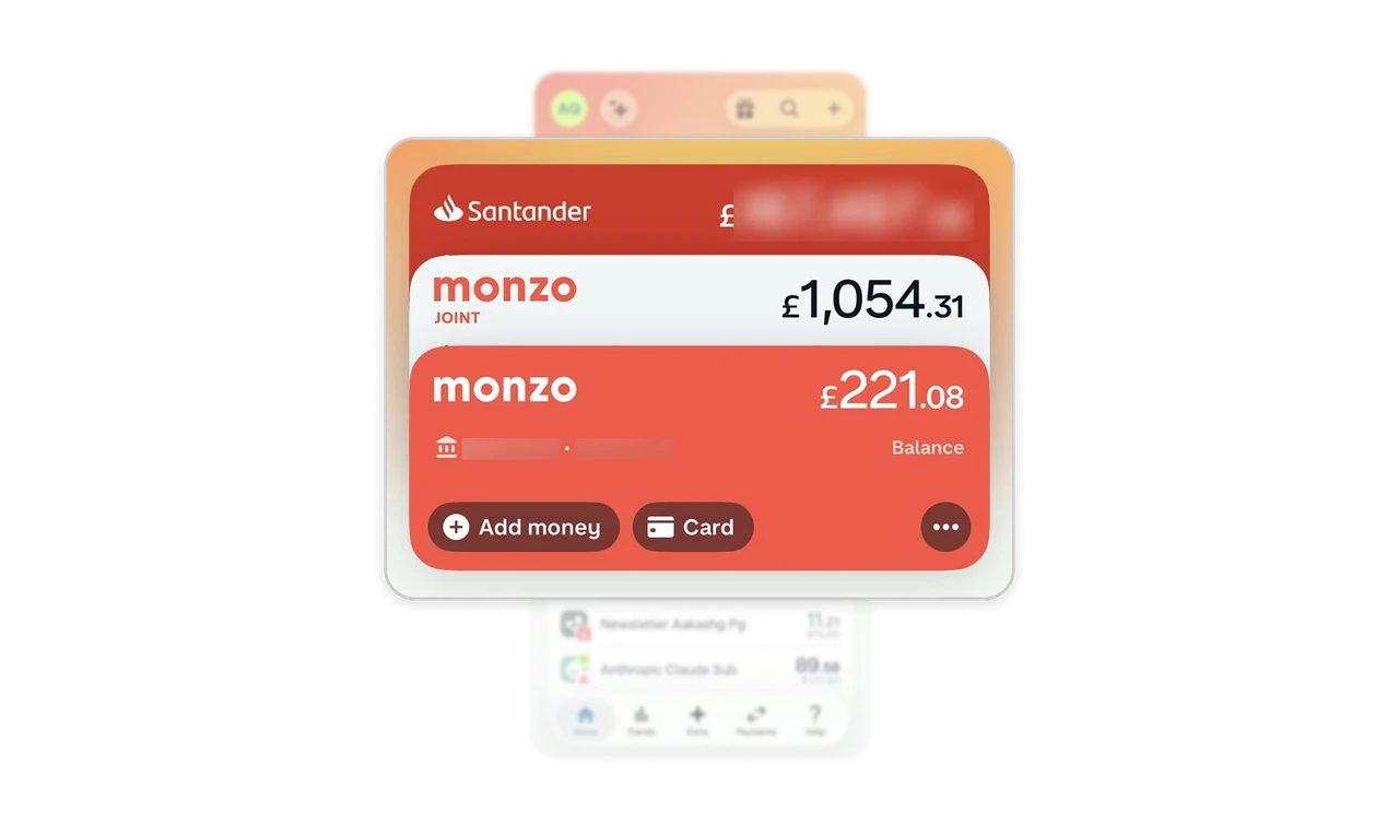
A competitor's card sits in the stack, livery intact
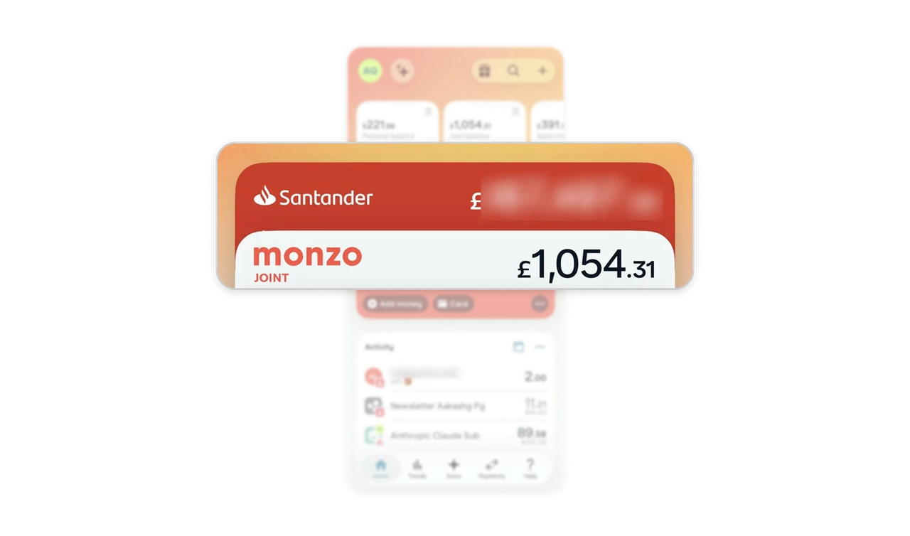
The Santander account lives inside Monzo's own stack, in Santander red, with its real balance, a rival rendered as a first-class citizen. Users do not think in "our accounts versus their accounts," they think "my money." Aggregate external accounts in the same visual system as native ones, brand livery preserved. The open-banking land grab is won by whoever owns the overview, because the app that shows everything becomes the app that gets opened first.
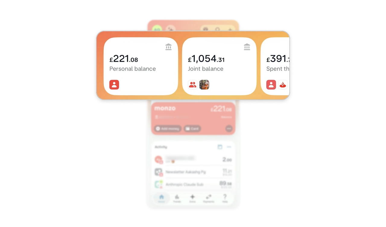
Avatars mark joint money as "ours" faster than any label
The Joint balance widget carries both partners' avatar chips, while Personal shows one. Shared finances are distinguished with people, not labels, and the two-person chip says "ours" before any text is read. Ownership ambiguity in shared accounts causes real-world arguments, so when personal and shared money live one swipe apart, avatar marking is relationship-safety design. The distinction has to be instant because the consequences of confusing it are not digital.
Foreign charges show both currencies, closing the recognition gap
"Anthropic Claude Sub" shows £89.58 with $120.00 stacked beneath, the converted amount that left the account and the original price the user remembers agreeing to. Showing only one creates the "wait, what is this charge?" panic that drives support tickets and disputes. For foreign-currency transactions, always show both amounts. The recognition gap between what you paid and what you see is where trust in a bank quietly erodes.

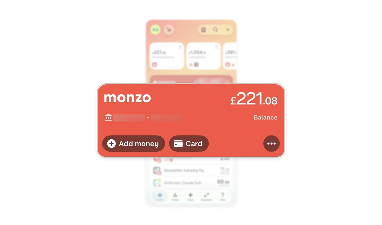
The account card carries its own controls
The forward Monzo card holds Add money, Card, and an overflow directly on its face. Each account is a self-contained control surface, so the two most-used everyday tasks never require leaving home or hunting a menu. Attach the top actions to the object itself and overflow the rest. PayPal rendered the card as a picture of the account, Monzo makes it the account's cockpit, representation and control in one surface, which is where the object-as-interface idea actually pays off.
Similar Breakdown Lessons