Wallet Home

Separate holdings from market unit prices
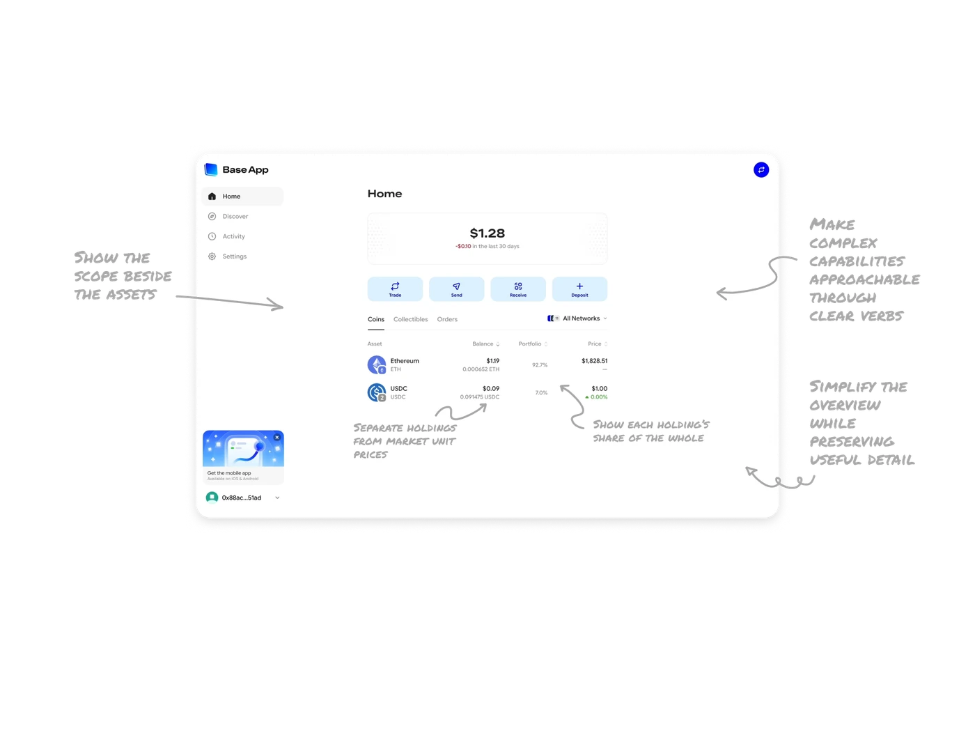
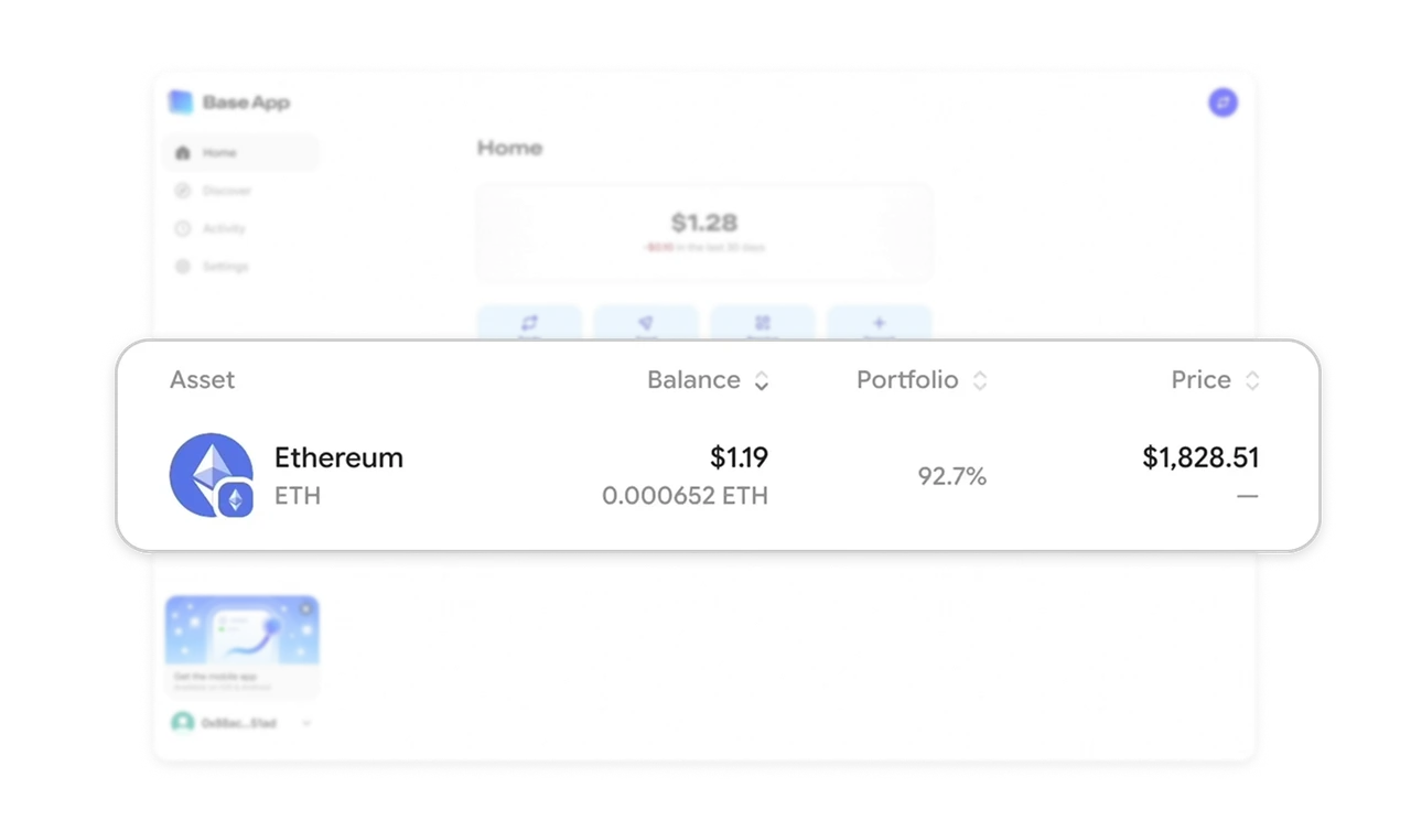
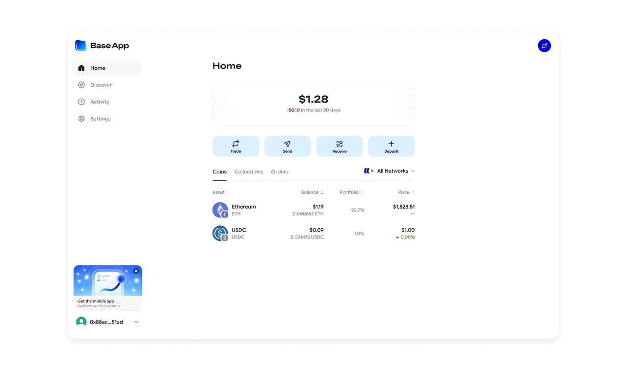
Ethereum’s row leads with a $1.19 balance, places 0.000652 ETH beneath it, and shows $1,828.51 in a separate Price column. Dollars support comparison, token quantities preserve precise ownership information, and unit prices provide market context. Keep these related values together but distinctly labeled. Users should be able to understand what they own without confusing their holding’s value with the cost of one unit.
Show each holding’s share of the whole
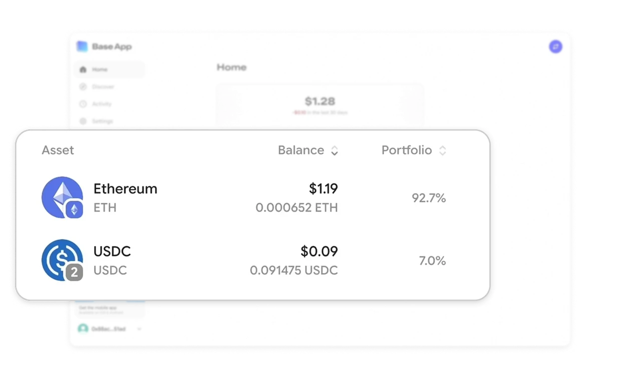
The Portfolio column places 92.7% beside Ethereum and 7.0% beside USDC. These percentages answer a question the dollar balances leave to calculation: how much of the wallet does each holding represent? Show relative share alongside absolute amounts when composition matters. This turns individual rows into an allocation picture, helping users recognize which items dominate the total without needing a separate chart.
Show the scope beside the assets
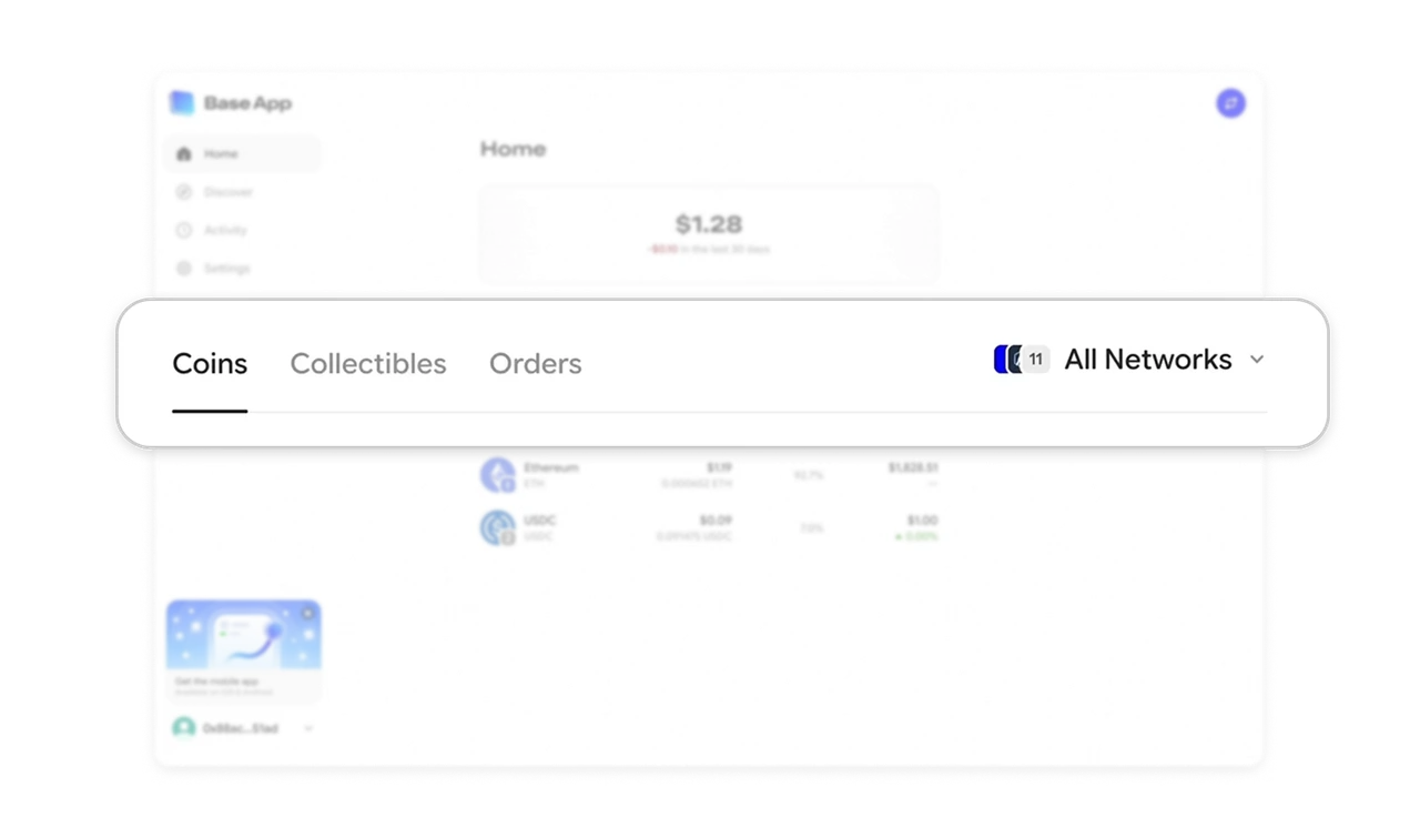
The “All Networks” selector sits beside the Coins, Collectibles, and Orders tabs. This separates two questions: what kind of content is displayed, and which networks the view covers. In products where items span several contexts, keep the active scope beside the list it describes. Users can then interpret the view before drawing conclusions about its contents or looking for something missing.
Make complex capabilities approachable through clear verbs
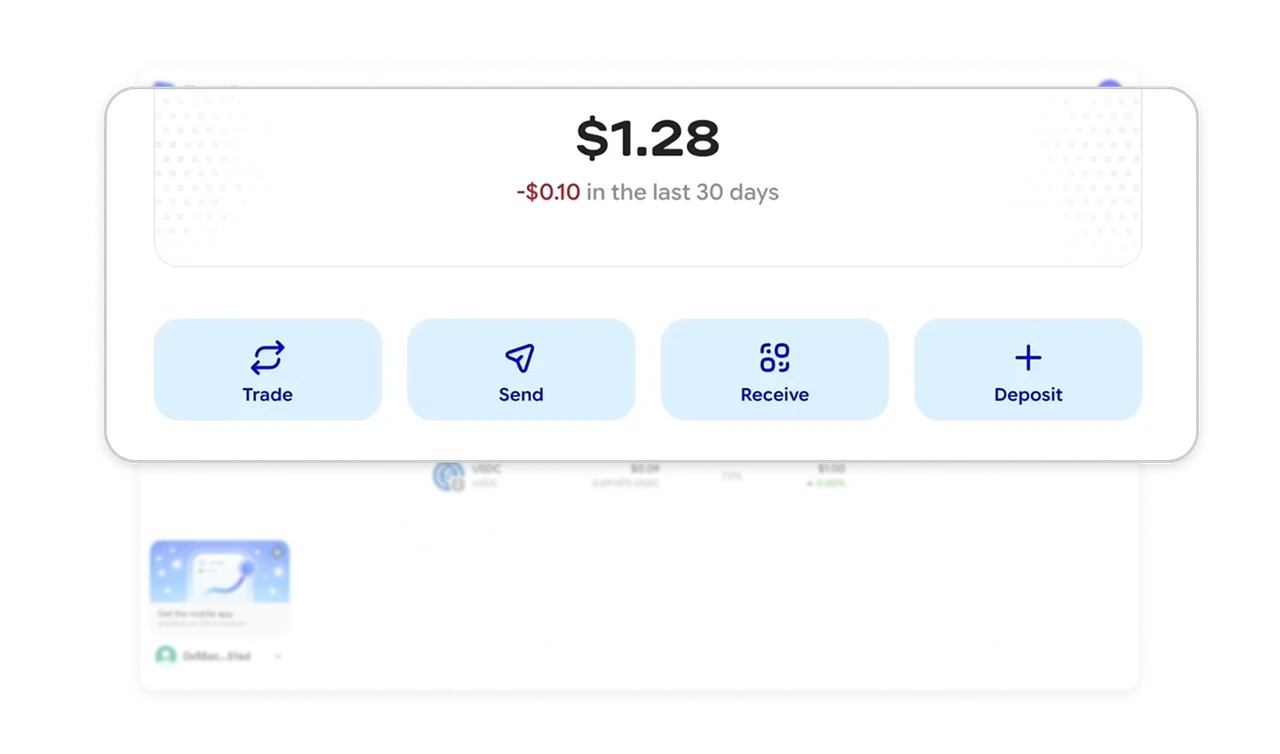
Trade, Send, Receive, and Deposit form a short row of equally prominent buttons beneath the balance. This gives a technical wallet a manageable starting vocabulary: users can begin with what they want to do before encountering transaction details. Use familiar action labels to introduce complex capabilities, and reserve deeper terminology for where it becomes necessary. Equal emphasis keeps several intentions available.
Simplify the overview while preserving useful detail
Base gives the balance its own card, groups four actions beneath it, and places detailed holdings in a compact table surrounded by whitespace. This creates a clear reading order without removing quantities, allocation, or prices. In financial dashboards, use spacing and grouping to separate the overview from supporting detail. Simplicity should help users find the information they need, not reduce what they can understand.
Similar Breakdown Lessons