Shopping Home

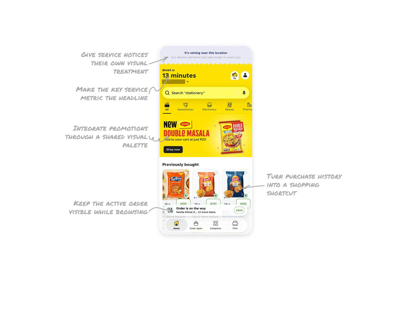
Make the key service metric the headline
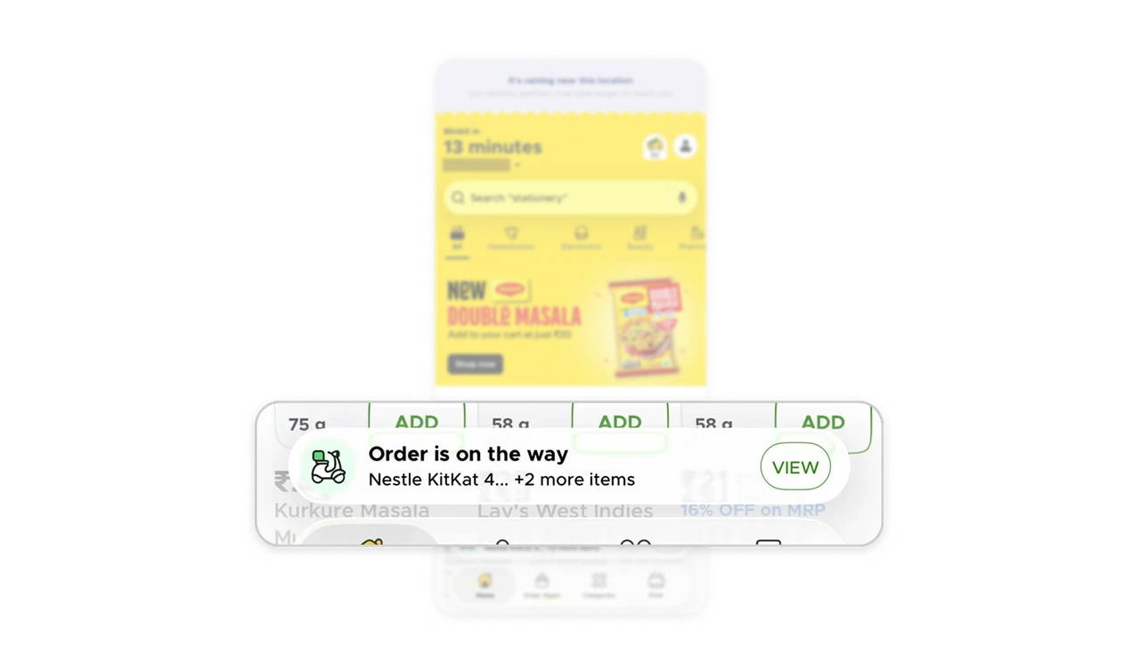
“Blinkit in” appears as a small introductory label, while “13 minutes” dominates the delivery header above search and product browsing. The hierarchy makes delivery speed one of the first things users can assess when opening the shopping page. When a measurable service benefit matters to the purchase decision, give that value a prominent position and clear supporting label. Use scale to establish its importance before introducing the rest of the experience.
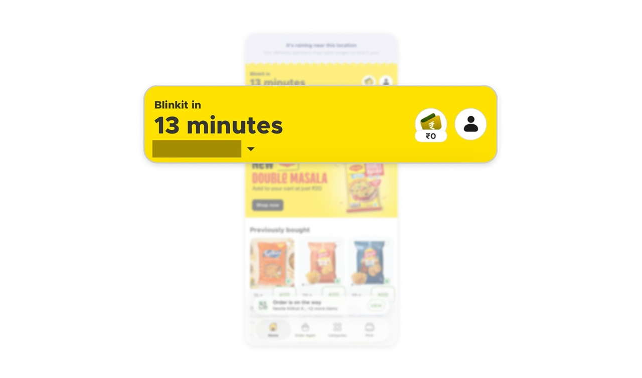
Give service notices their own visual treatment
The rain notice occupies a separate pale band above the yellow shopping interface. A bold line states the condition, lighter copy explains the possible delay, and the scalloped edge marks the transition into the main page. This creates a distinct space for an operational update within a heavily branded screen. Give service notices their own visual treatment and pair the cause with its consequence so users can understand the situation while continuing their task.
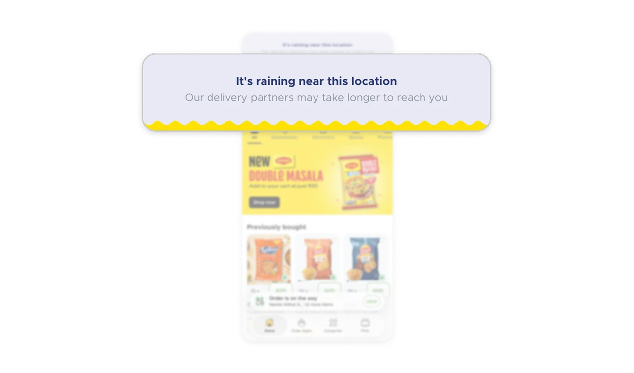
Integrate promotions through a shared visual palette
Maggi’s Double Masala promotion shares the yellow surface of the delivery header and category navigation, giving it visual continuity with the storefront. A large packet image and red headline create a hero treatment, while the ₹20 offer and black “Shop now” button make the next action clear. Connect campaign artwork to the surrounding interface through a shared palette, then use scale and contrast to keep the product, offer, and action easy to identify.
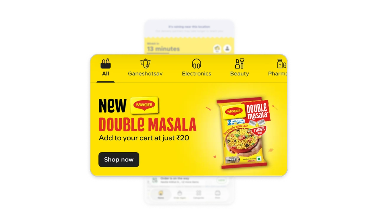
Turn purchase history into a shopping shortcut
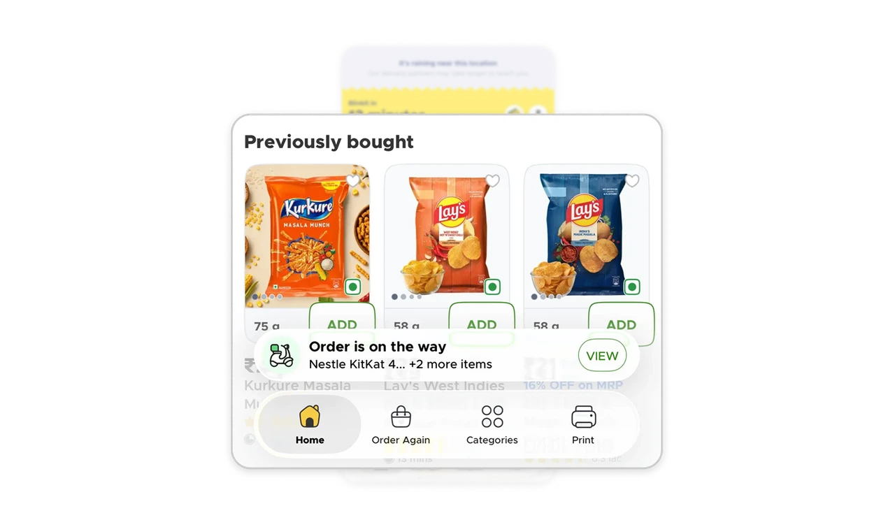
“Previously bought” presents familiar products with recognizable packaging, visible pack sizes such as “75 g” and “58 g,” and individual “ADD” controls. “Order Again” also has a dedicated place in the bottom navigation. Together, these provide both an immediate shopping shortcut and a named destination for repeat purchases. When customers return for familiar items, keep product identity, quantity, and the purchase action together so they can check what they are selecting before adding it.
Keep the active order visible while browsing
A compact bar above the bottom navigation shows “Order is on the way,” an item snippet, an additional-item count, and a “VIEW” action. The shopping home remains visible behind it, giving the current order a place within the browsing experience. When a task continues after checkout, pair its status with enough identifying detail and a clear route back to it so users can reach the related information without searching through their account.
Similar Breakdown Lessons