Weekly Meal Menu

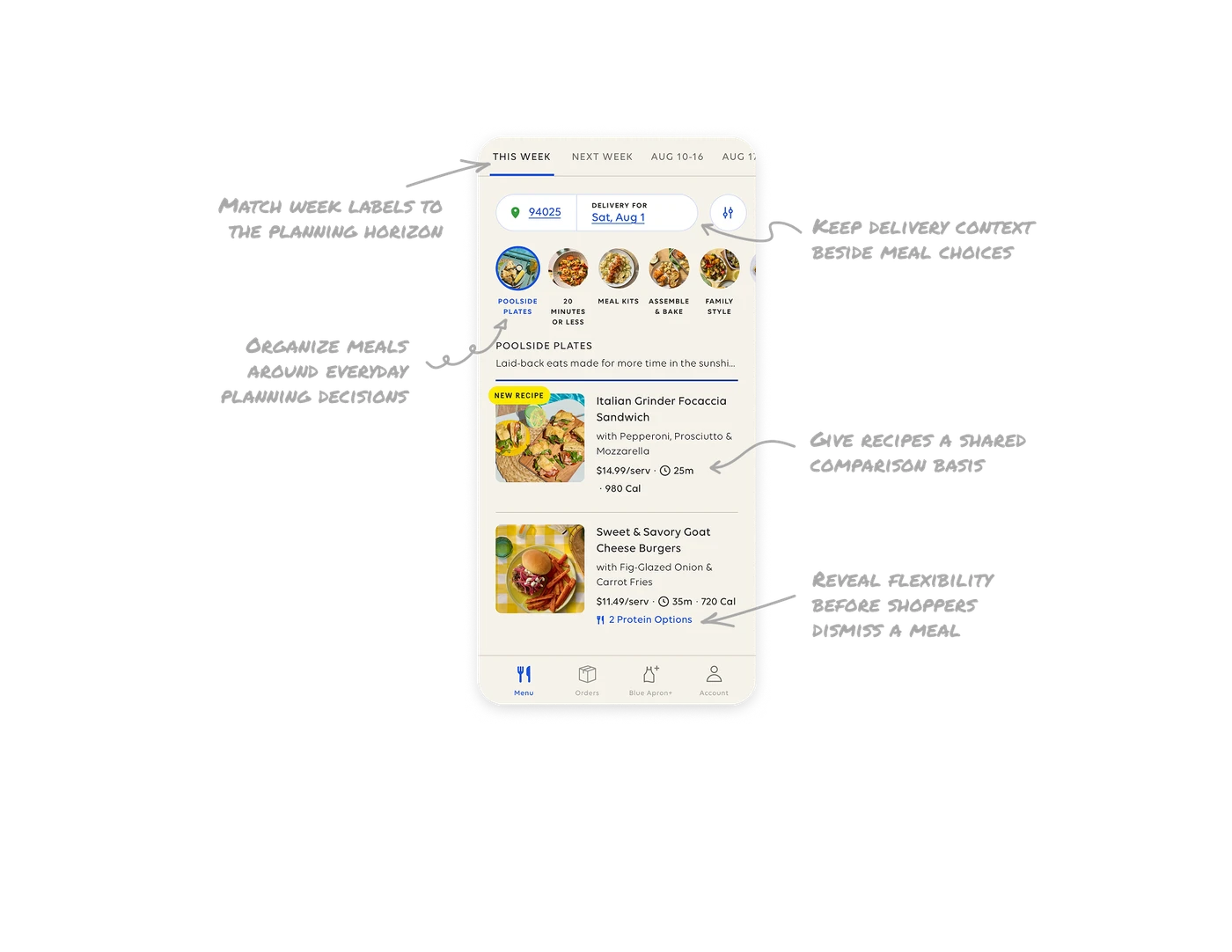
Match week labels to the planning horizon
The menu uses “This Week” and “Next Week” for nearby choices, then explicit date ranges for later weeks. Familiar language makes immediate plans easy to recognize, while dates give future choices precision. In products organized around recurring schedules, establish the planning period before users compare its contents. Match the label’s specificity to how far ahead people are planning.
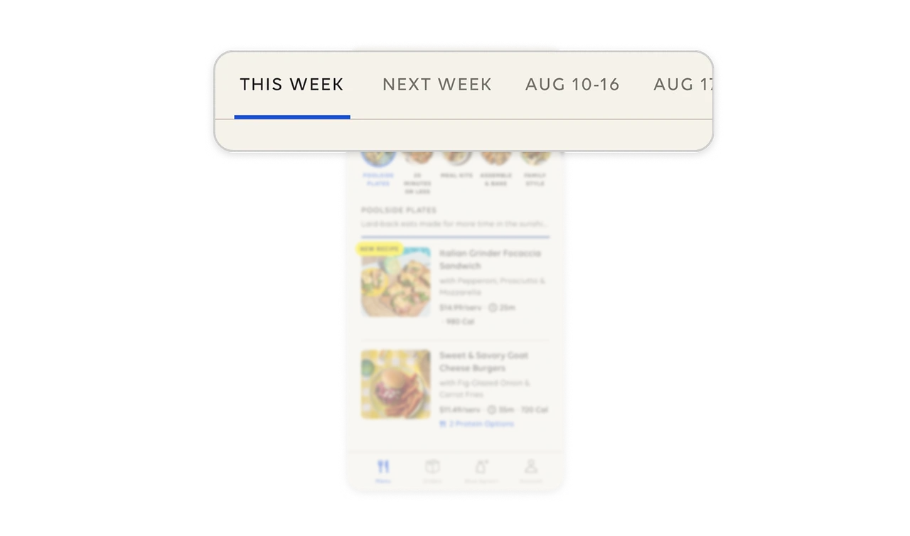
Organize meals around everyday planning decisions
“20 Minutes or Less,” “Assemble & Bake,” and “Family Style” offer browsing paths based on time, preparation, and serving style. “Poolside Plates” adds an editorial theme that connects the food to a moment shoppers can imagine. Organize choices around the constraints and situations that shape a purchase, giving shoppers several useful ways to find what fits.
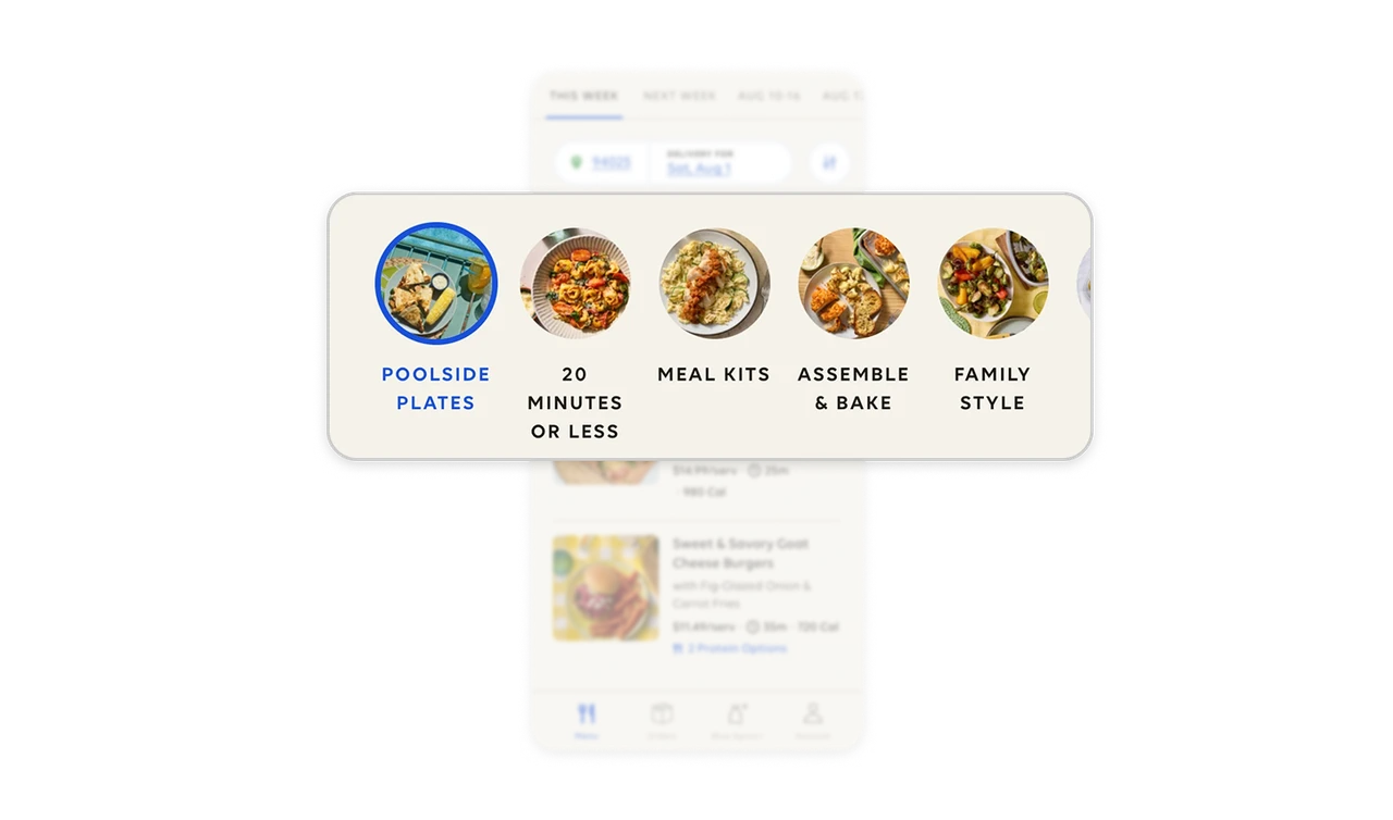
Keep delivery context beside meal choices
The delivery ZIP code and date sit together above the meal categories, with blue underlined values making both look actionable. Shoppers can check where and when the delivery is planned while browsing dishes. For purchases that require coordination, keep shared logistical details close to selection. Users should be able to inspect the plan while deciding what belongs in it.
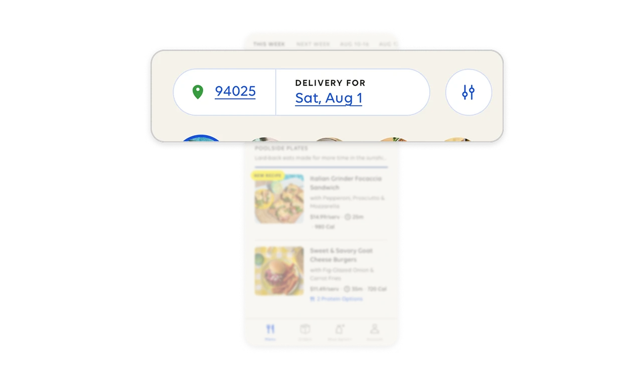
Give recipes a shared comparison basis
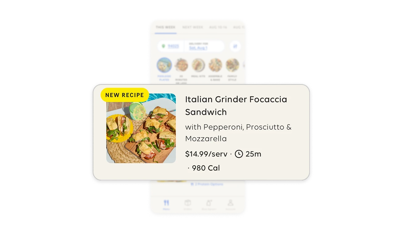
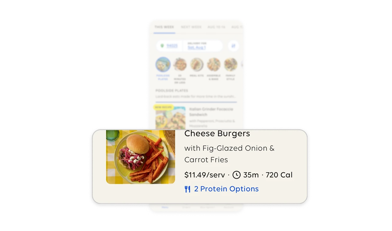
Each visible recipe lists price per serving, preparation time, and calories in the same order. Shoppers can compare cost, time commitment, and nutrition information alongside the appetizing photography. The explicit “/serv” unit makes the price easier to interpret. Identify the criteria people weigh across alternatives, then present them consistently so comparison requires less searching and mental rearrangement.
Reveal flexibility before shoppers dismiss a meal
The burger listing includes a blue “2 Protein Options” label beneath its price, time, and calories. Shoppers learn that the protein can vary while they are still comparing meals. Surface meaningful customization in the listing so the default description does not prematurely rule an item out. Naming the adjustable attribute and counting its options communicates flexibility without exposing every choice.
Similar Breakdown Lessons