Daily Wellness Dashboard

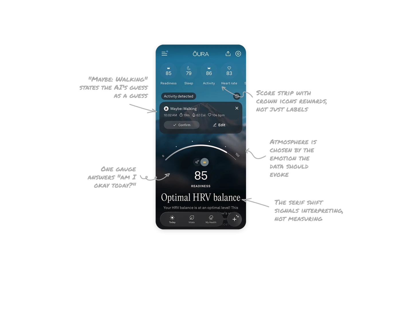
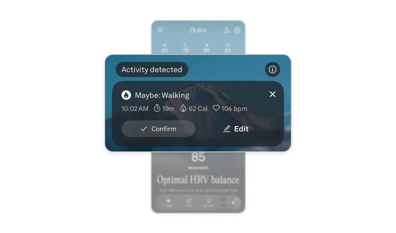
"Maybe: Walking" states the AI's guess as a guess
The ring detected movement and proposes it with uncertainty-honest language: "Maybe: Walking," backed by evidence (10:02 AM, 19m, 62 Cal, 104 bpm) and two actions, Confirm or Edit. The AI states its hypothesis, shows its work, and asks. When AI infers something about the user, present it as a proposal, never a silent record. The "Maybe:" prefix alone is a masterclass in trustworthy AI copy, two seconds of collaboration instead of a possibly-wrong fact in the log.
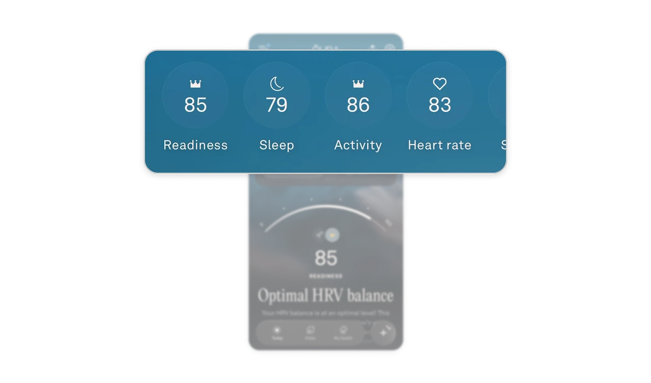
Score strip with crown icons rewards, not just labels
Wellness scores sit as a swipeable strip of circular chips, each with a symbolic icon. The crown appears on strong scores, quiet celebration built into the iconography itself. Compress a health product's vitals into one scannable header row, and let the icons do double duty: identify the metric and acknowledge the achievement. Iconography that rewards turns a status readout into a small daily win.
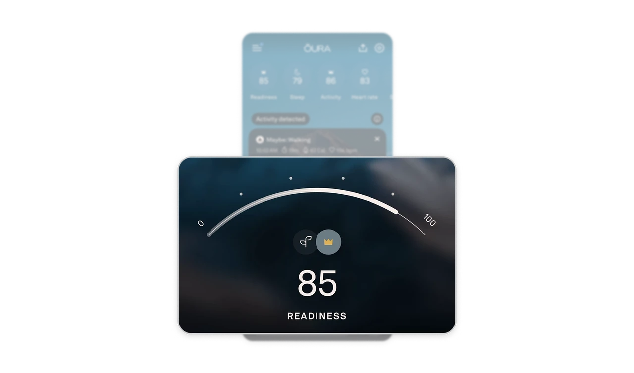
One gauge answers "am I okay today?"
A large 0-100 arc with the needle at 85 and the number rendered huge beneath. Of everything the ring measured overnight, the screen elevates one synthesized verdict as today's answer. Users do not wake up asking about HRV standard deviation, they ask "am I okay?" Synthesize many measurements into one hero number, keep the granular data below for those who want it. The gauge is the answer, everything else is the appendix.
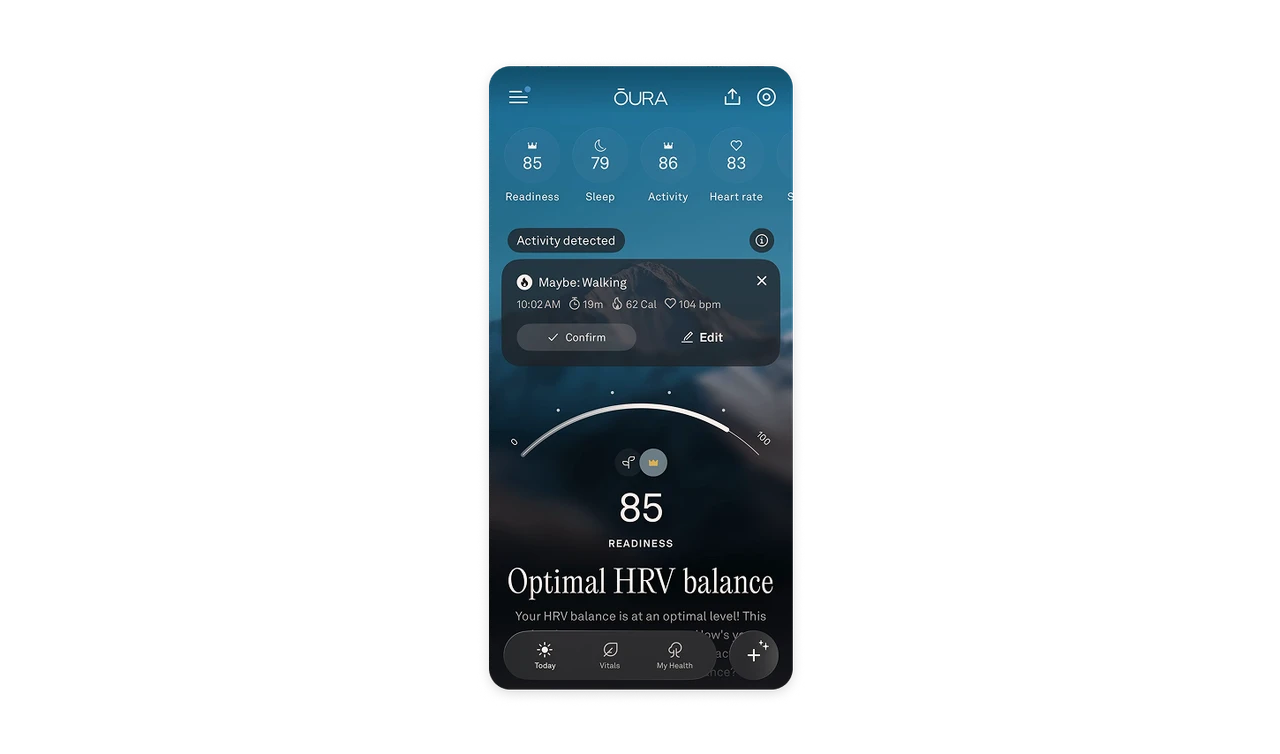
The serif shift signals interpreting, not measuring
"Optimal HRV balance" renders in a large literary serif, followed by plain-language explanation in sans. The typeface change marks the moment the product stops reporting numbers and starts offering a verdict, reading like a wellness magazine rather than a lab report. In health UX, tone is clinical-anxiety management: serif delivers the interpretation as wisdom, not diagnosis. Typography can mark the boundary between data and meaning better than any layout divider.

Atmosphere is chosen by the emotion the data should evoke
The whole screen rests on a dusky mountain photograph, cool blues fading to dark, calm and still, matching a product about recovery and balance. Emergent's bright sky says "limitless building," Oura's twilight says "rest and steadiness." Same principle, opposite register, which is the proof: background imagery is a tonal instrument, not decoration. Pick the atmosphere for the feeling the data should leave, and the dark palette fits an app checked at dawn and bedtime.
Similar Breakdown Lessons