Developer Dashboard

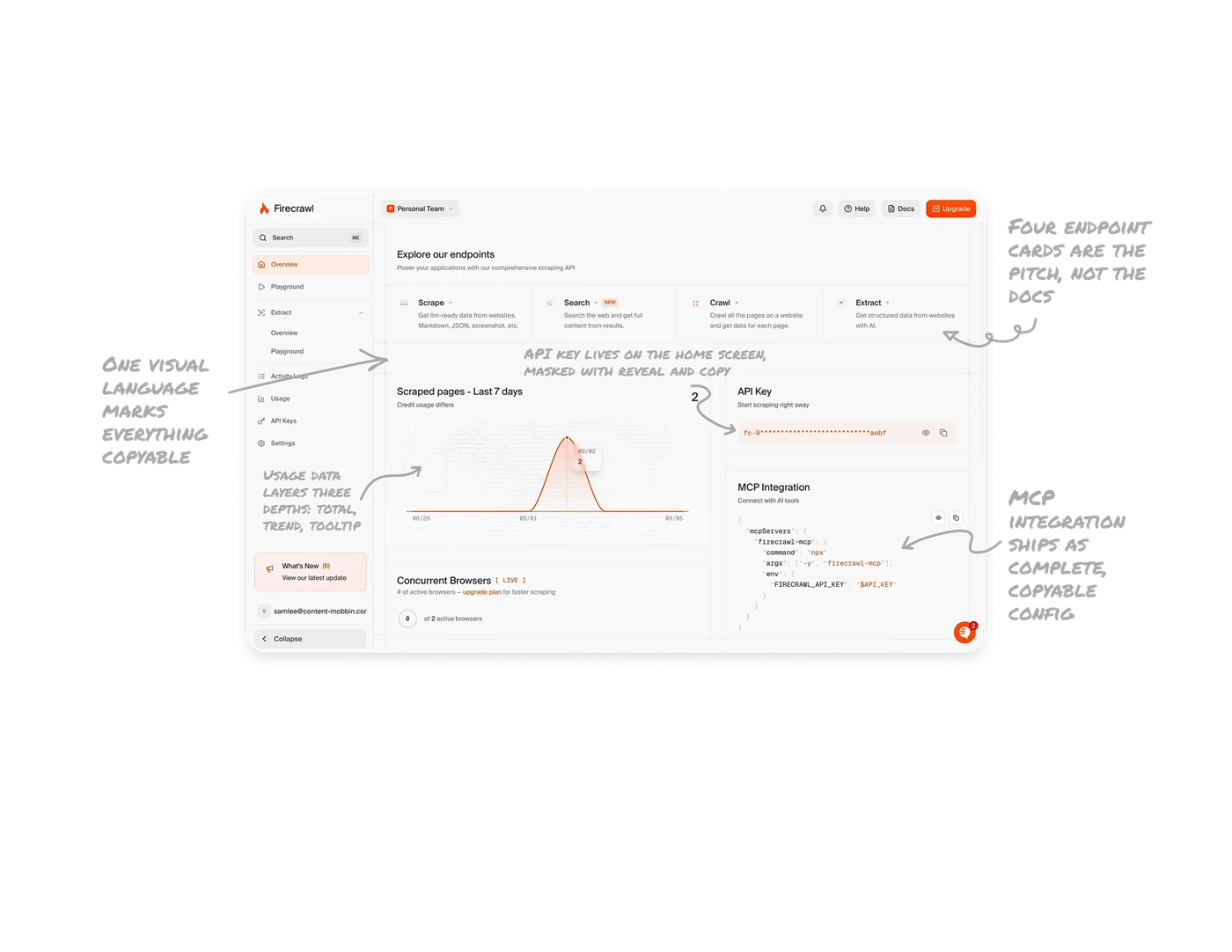
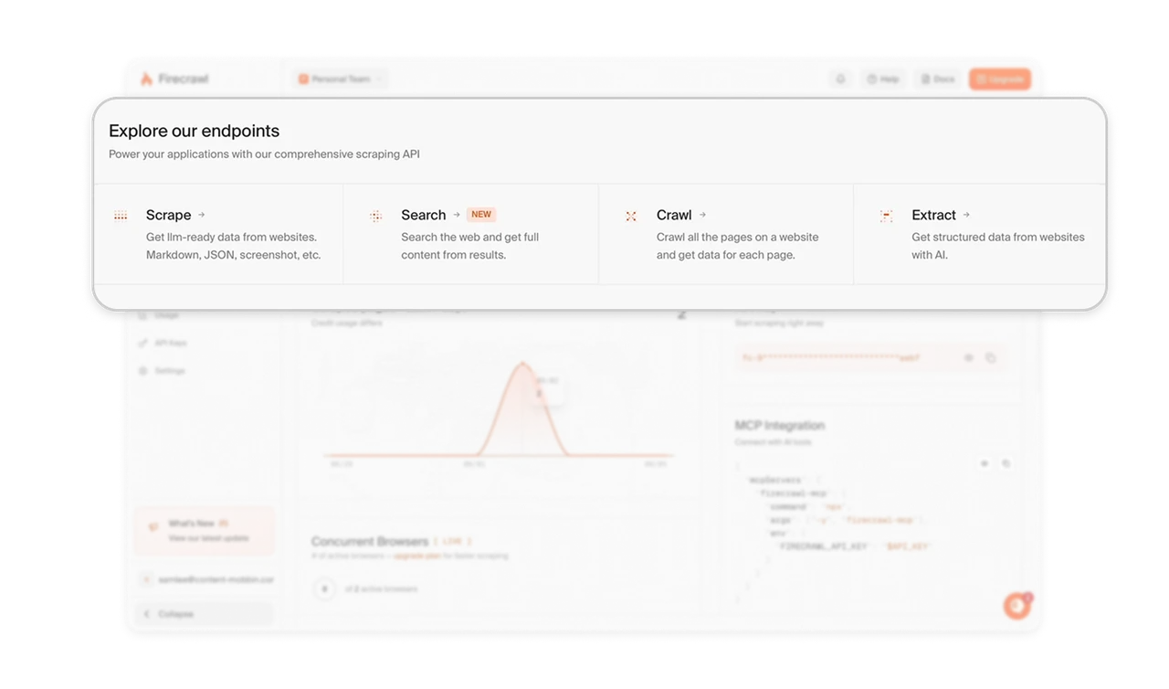
Four endpoint cards are the pitch, not the docs
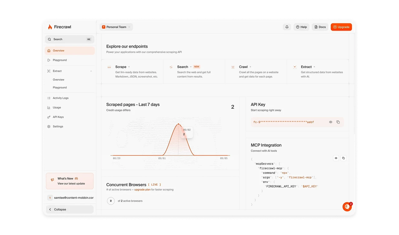
The entire API surface reads as four capability cards: Scrape, Search, Crawl, Extract, each with an icon and a plain-language outcome ("Get llm-ready data from websites"). The whole product is comprehensible in one row. Developers evaluating a tool decide in seconds, so the endpoint cards are the pitch. Describe outcomes, not parameters, and save the parameter reference for after they are convinced.
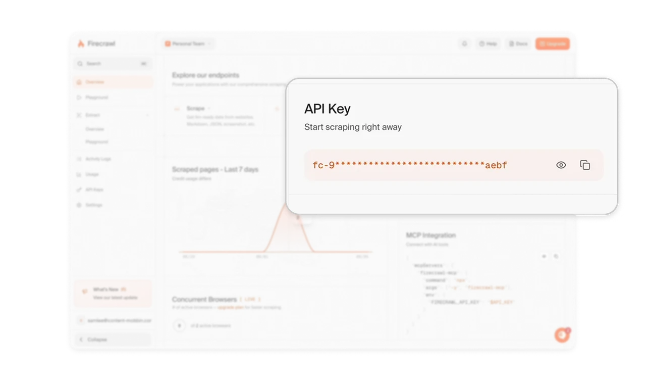
The API key lives on the home screen, masked with reveal and copy
The key sits directly on the overview as fc-9****aebf with eye and copy buttons, subtitled "Start scraping right away." Every developer's first task is grabbing the key, and burying it under Settings adds friction to the exact moment you want frictionless. Masking preserves security by default, while showing the first and last characters lets users verify which key they are copying. Zero navigation to the single most-needed asset.
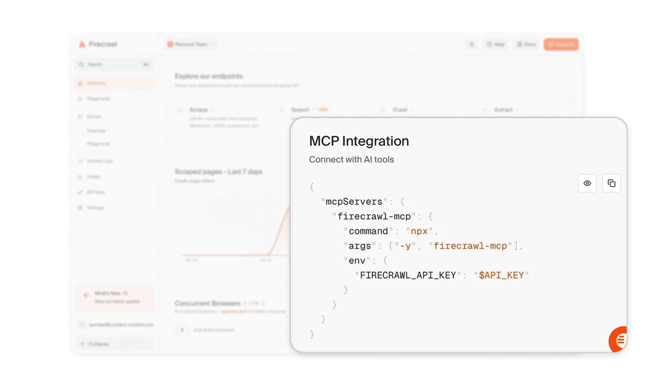
MCP integration ships as complete, copyable config
A ready-made MCP config JSON sits on the home screen, syntax-highlighted with a copy button. Connecting Firecrawl to Claude or Cursor is a paste, not a docs expedition. Ship integration as executable documentation, complete config to copy, never instructions to write config. For developers, the best onboarding is code they can paste in five seconds, and every step between "I want this" and "it runs" loses a percentage of them.
Usage data layers three depths: total, trend, tooltip
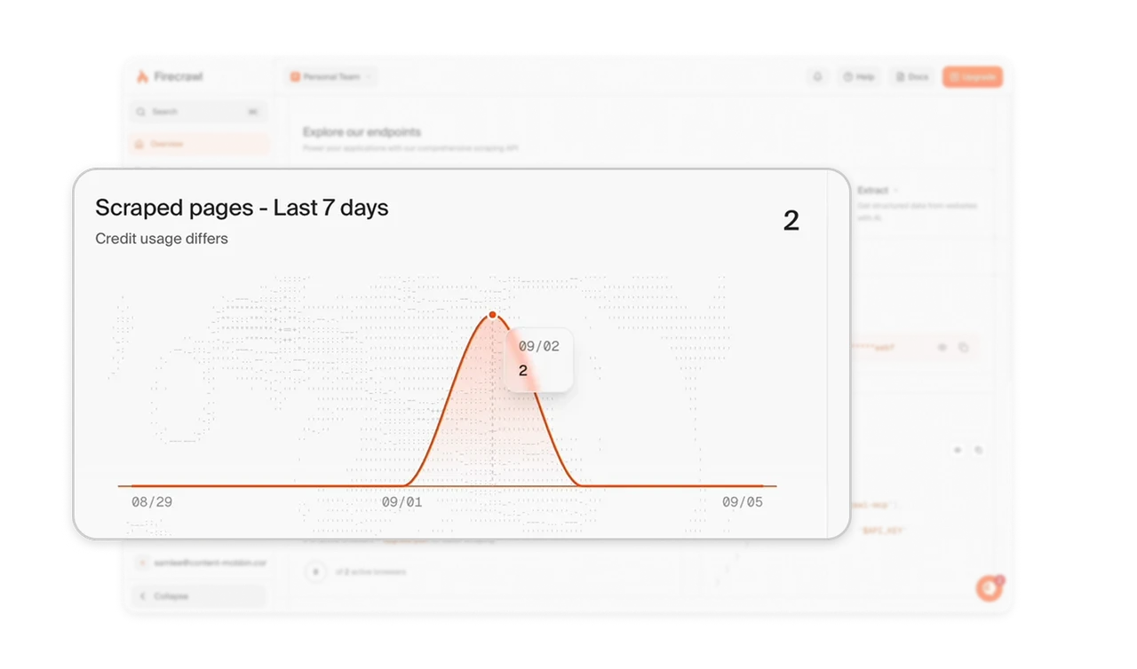
"Scraped pages, Last 7 days" pairs a bold headline total with a curve chart and a hover tooltip showing per-day detail. Each layer answers a different question: how much, trending how, what happened Tuesday, without forcing anyone into a separate analytics page. The honest caveat "Credit usage differs" preempts the billing-confusion support ticket before it is filed, the same inline-rationale move as Quicken's excluded-bills card.
One visual language marks everything copyable
API keys and config render in monospace with orange accent highlighting on tinted backgrounds, visually distinct from all UI prose. Code looks like code, instantly identifiable as "this is the part you copy." Developers scan for the copyable bits, and a consistent technical treatment makes them jump out on every screen. The visual language becomes a silent contract: whenever you see this style, it is meant for your terminal.
Similar Breakdown Lessons