Shopping Cart

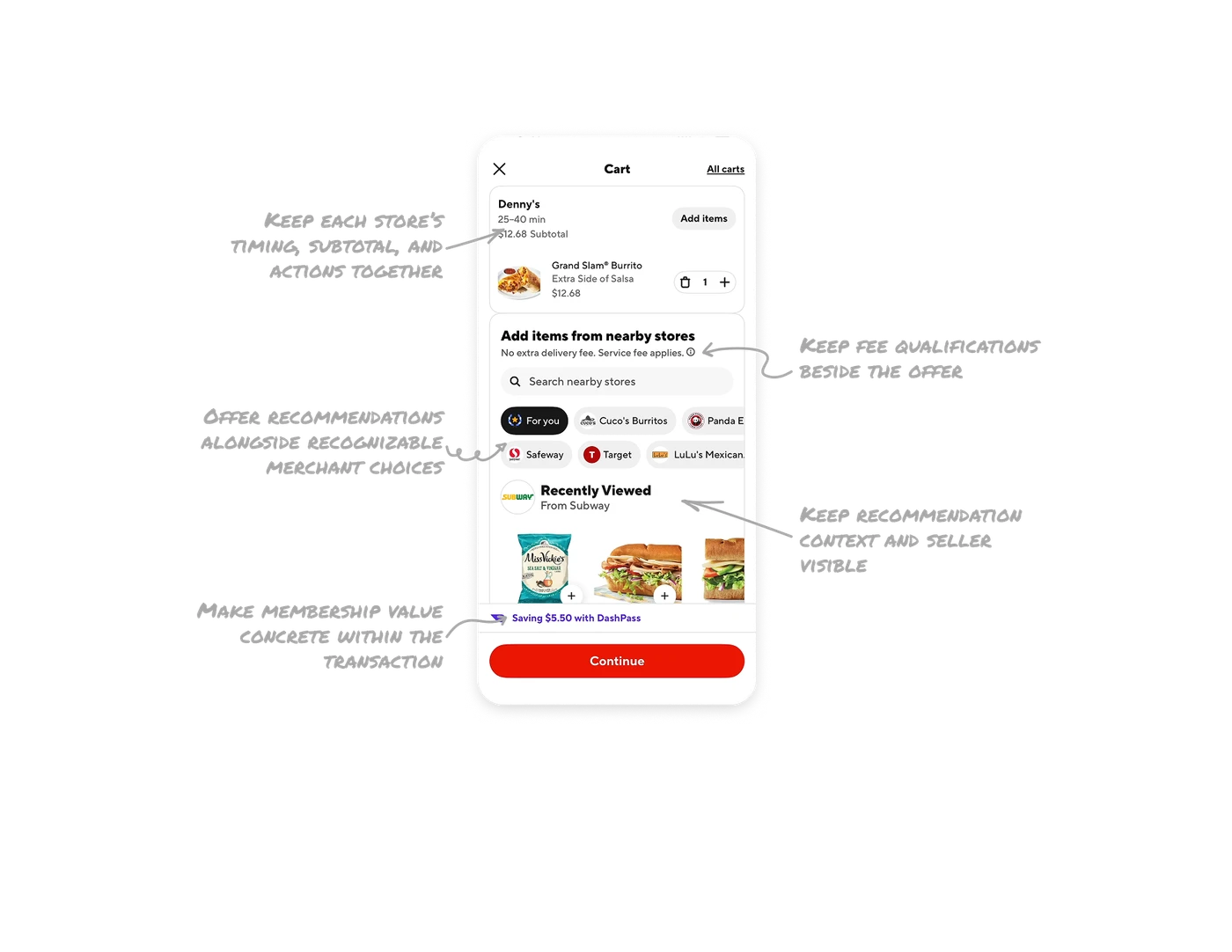
Keep each store’s timing, subtotal, and actions together
The Denny’s card places the merchant name, “25–40 min,” “$12.68 Subtotal,” and “Add items” together above its selected products. This gives the order a compact summary and a clear route to add more from that store. In marketplace carts, group each merchant’s timing, cost, and relevant actions within the same boundary so users can review one store’s portion and understand which selection an action concerns.
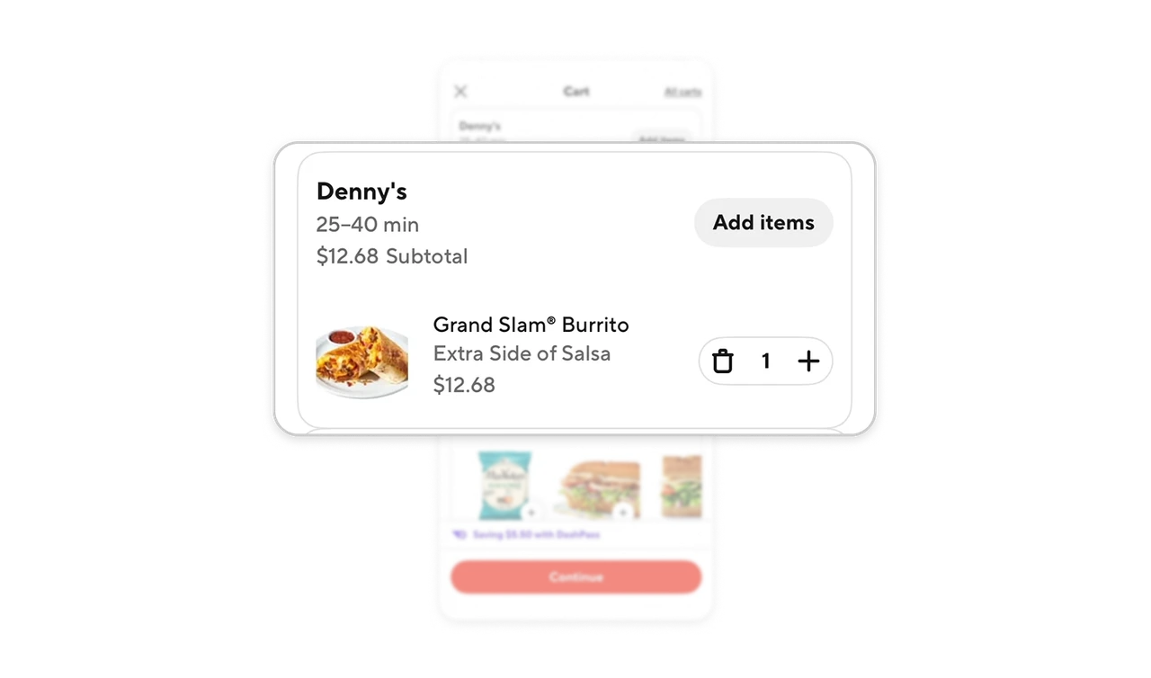
Offer recommendations alongside recognizable merchant choices
The store selector places “For you” alongside merchant chips such as Safeway and Target, using the same pill shape. A dark fill identifies the current selection, while logos and names make individual merchants recognizable. Combine a recommended collection with specific sellers in one selector so users can browse suggestions or narrow their attention to a familiar store. Logos support recognition, while text keeps each choice explicit.
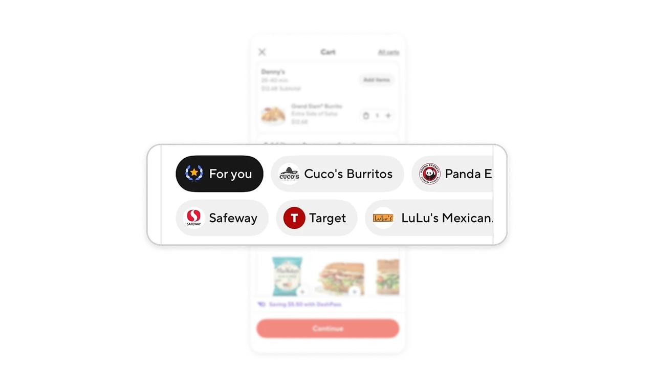
Keep fee qualifications beside the offer
“No extra delivery fee” is immediately followed by “Service fee applies,” with an information icon beside the text. Both statements appear above the nearby-store search and recommendations, where users consider another purchase. When an offer removes one charge but leaves another, explain both together at the decision point. Keep the essential qualification visible alongside the benefit, with an information control available for further explanation.
Keep recommendation context and seller visible
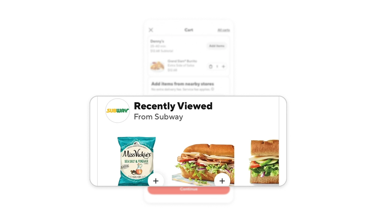
The suggestions are labelled “Recently Viewed” and “From Subway,” with a Subway logo, while the selected order above belongs to Denny’s. These cues identify both the suggestions’ stated basis and their merchant, with plus controls offering a route to add products. When resurfacing previous browsing within a cart, preserve its context and source so users can revisit familiar options without confusing another store’s suggestions with their existing selection.
Make membership value concrete within the transaction
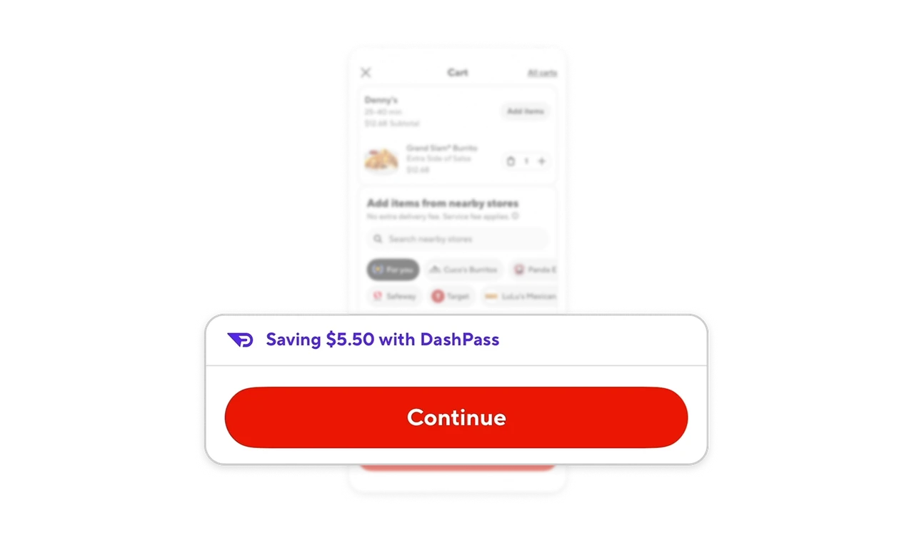
“Saving $5.50 with DashPass” appears in a purple-accented row immediately above the red Continue button. The amount connects the membership to a specific benefit displayed for this order, close to the next decision. When a subscription provides transactional benefits, show the applicable value within the task where it matters. A concrete amount helps users understand what their membership contributes without leaving the purchase flow to inspect plan details.
Similar Breakdown Lessons