Events Dashboard

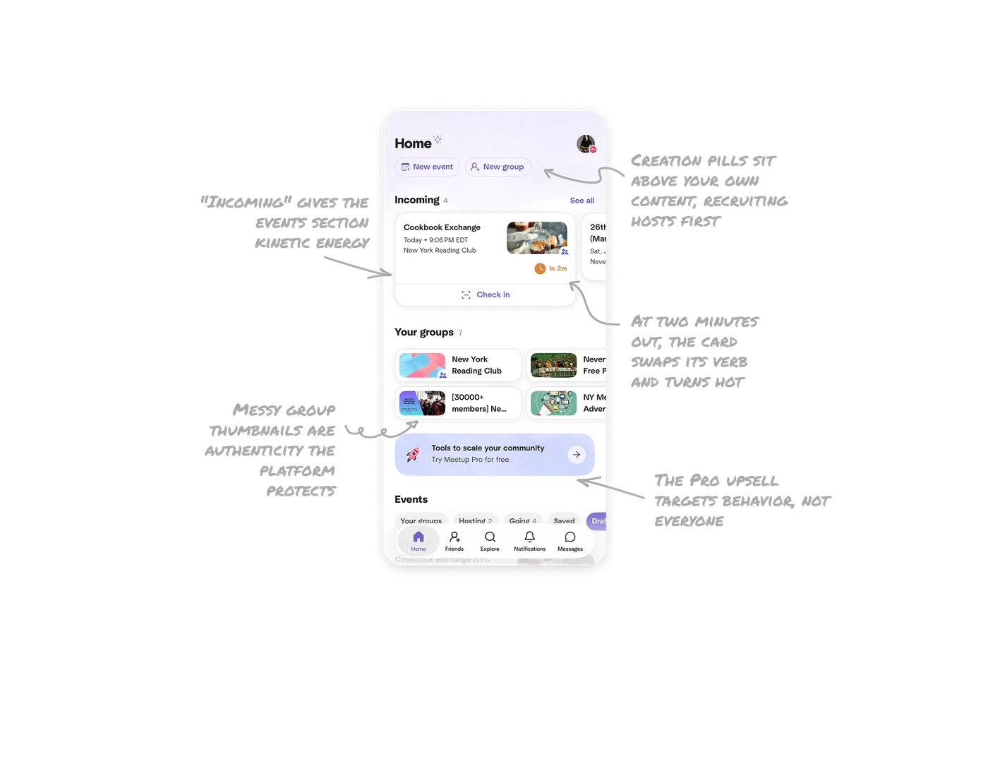
At two minutes out, the card swaps its verb and turns hot
The Cookbook Exchange card shows an orange "In 2m" chip, hotter than anything around it, and a "Check in" action with a scan icon has materialized. The UI shifted from planning mode to arrival mode because the user is probably walking into the venue. Let temporal proximity change both the action and the temperature: a week out needs "view details," two minutes out needs check-in and an alarm color. The moment defines the verb, and warm color reserved for genuine urgency never cries wolf.
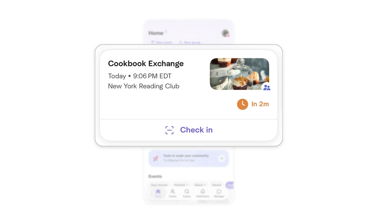
"Incoming" gives the events section kinetic energy
The section is not titled "Upcoming events," it is "Incoming," with a count and a carousel where the next event dominates and the following one peeks from the edge. "Incoming" frames events as things approaching you, slightly urgent, almost physical, where "Upcoming" is calendar-neutral. One word changes the section from a list you review into a stream you brace for. Vocabulary is pacing, and section names are the cheapest place to set a product's tempo.
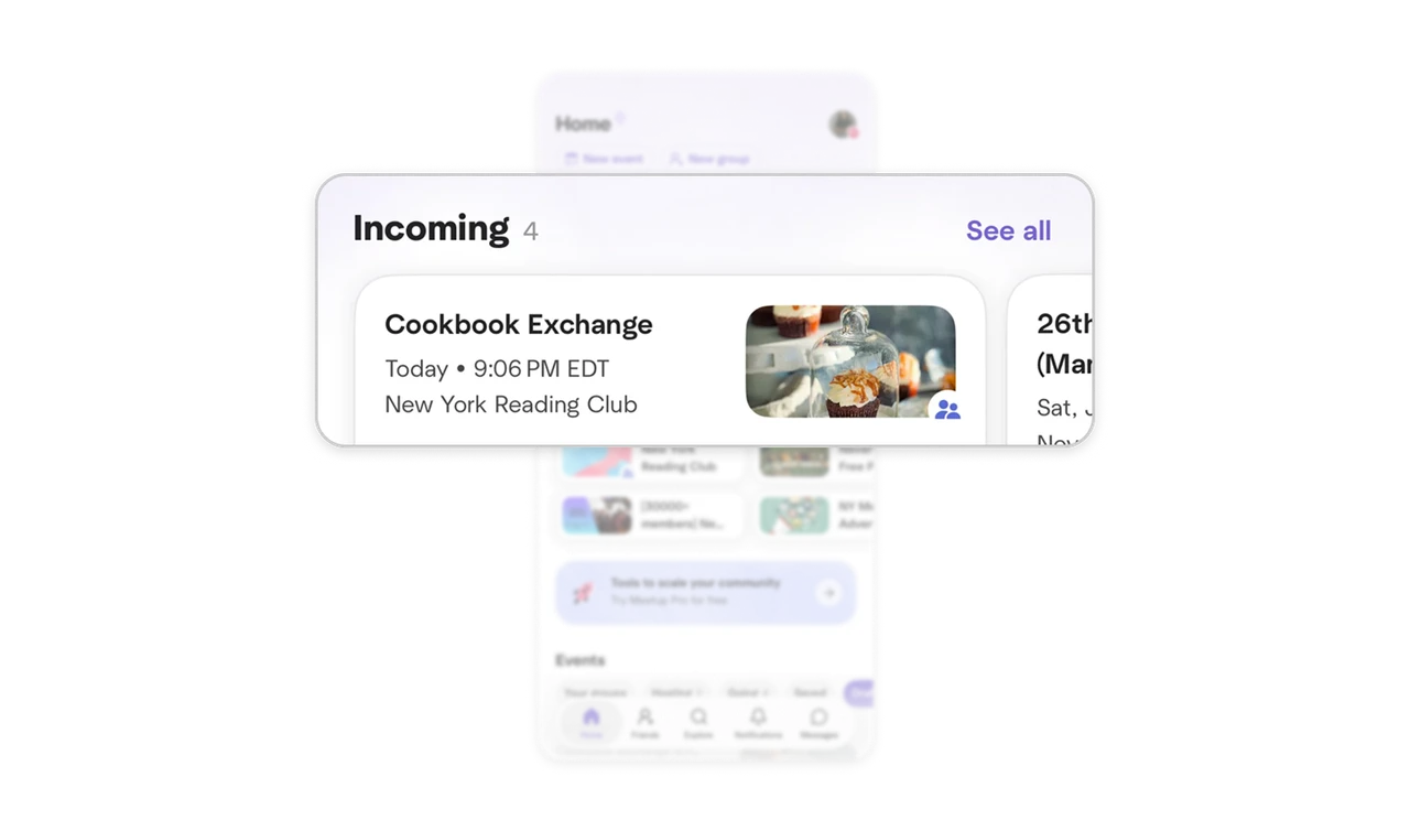
Creation pills sit above your own content, recruiting hosts first
Before any content, two outlined pills: New event and New group, the platform's two supply-side actions in the screen's prime position. Every member is a potential organizer, and organizers create the inventory everyone else consumes. Marketplaces of participation must recruit hosts on the home screen, not bury creation in a menu. The placement is the pitch: making things here is normal, expected, and one tap away from the moment you arrive.
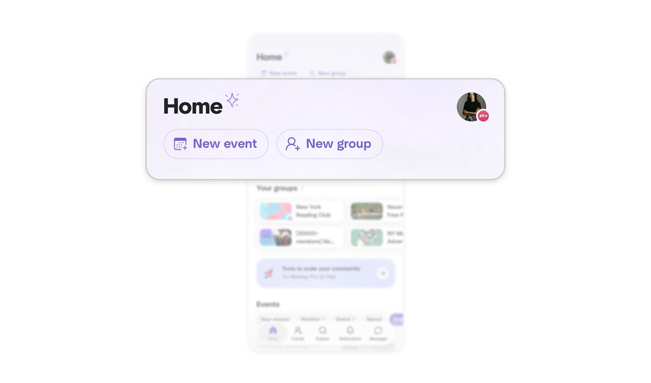
Messy group thumbnails are authenticity the platform protects
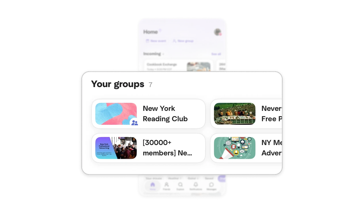
Your Groups renders each community's real, self-made cover: some polished, some cluttered, one a plain text banner reading "[30000+ members]." Meetup does not sanitize them into a uniform aesthetic, and the amateur art proves real humans run these groups. Over-standardizing would make communities feel like corporate listings. In community products, authentic visual mess is a trust signal, know when your platform's ugliness is its credibility.
The Pro upsell targets behavior, not everyone
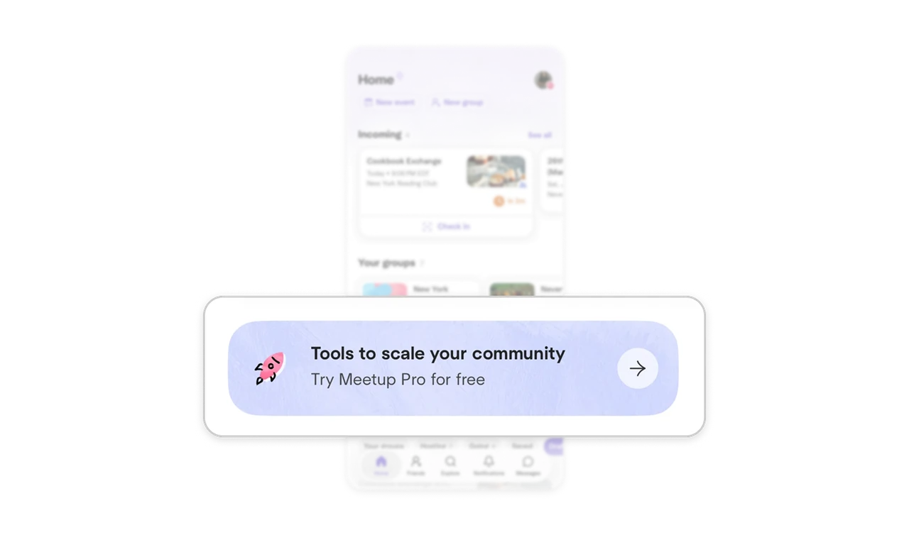
"Tools to scale your community, Try Meetup Pro for free" sits right after the groups grid, pitched at the exact audience whose screen already shows organizer ambition: seven groups, hosting two events. The copy only makes sense to someone running a community, so placement after their groups makes it read as a relevant next step, not an ad. Aim B2B upsells by behavioral segment, the person's own content on screen is the qualification, and the banner just answers it.
Similar Breakdown Lessons