Fitness Activity Feed

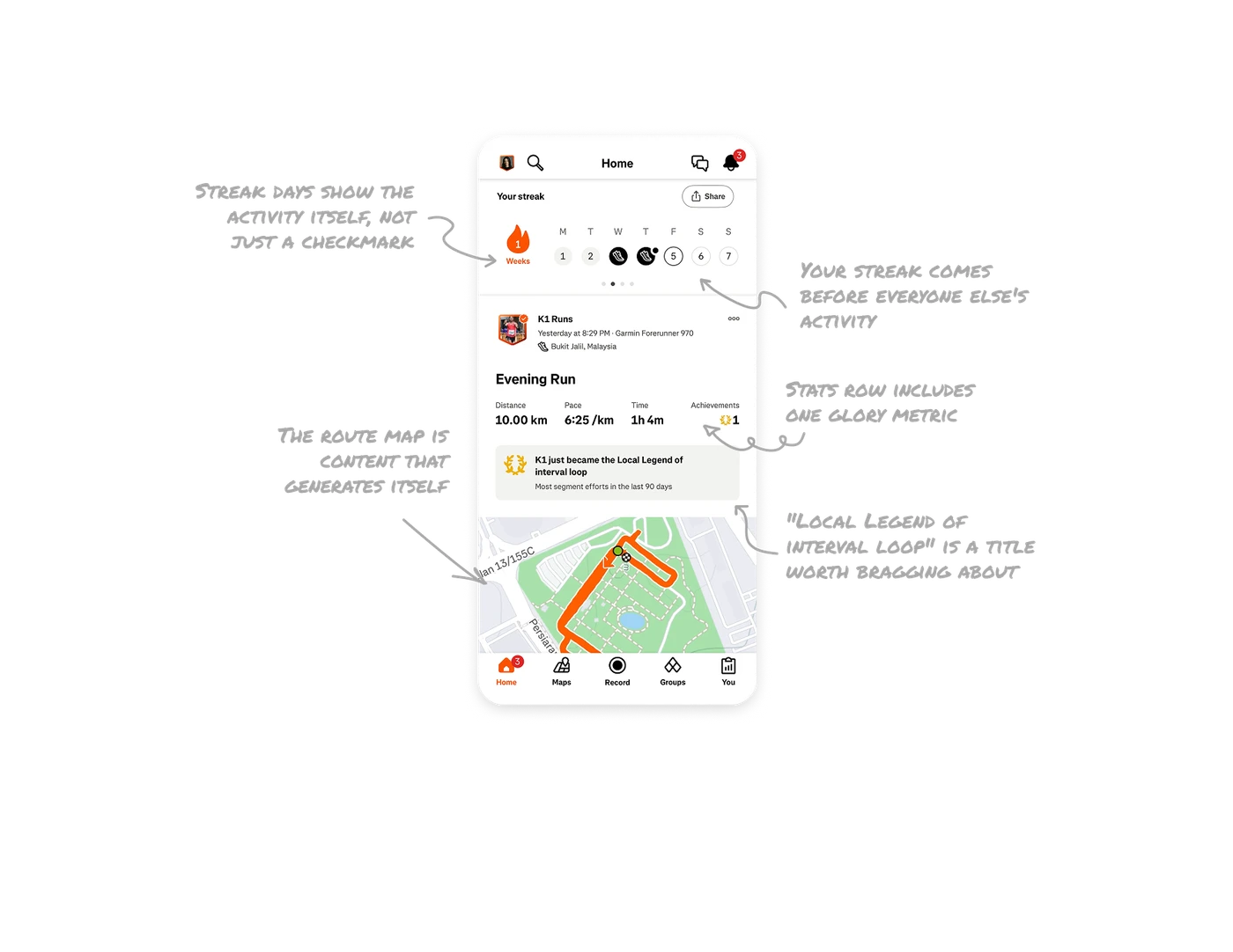
Streak days show the activity itself, not just a checkmark
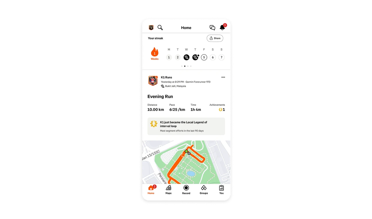
The 7-day streak strip marks completed days with a running-shoe icon instead of a generic check, anchored by a flame counter. The chain displays what you did, not just that you did something. Content-aware streaks turn an abstract compliance tracker into a visual training log. Users see their effort, which carries more identity than a row of ticks ever could.
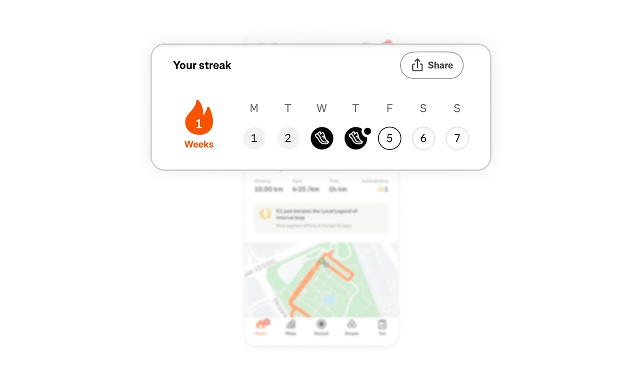
Stats row includes one glory metric alongside the numbers
Distance, Pace, Time, then Achievements with a laurel icon. Three performance numbers plus one recognition number. "Achievements: 1" answers the question friends actually care about: did anything special happen? Pure numbers inform, recognition metrics engage. In any stats row, include one metric that captures meaning rather than measurement, it is the difference between a log and a story.
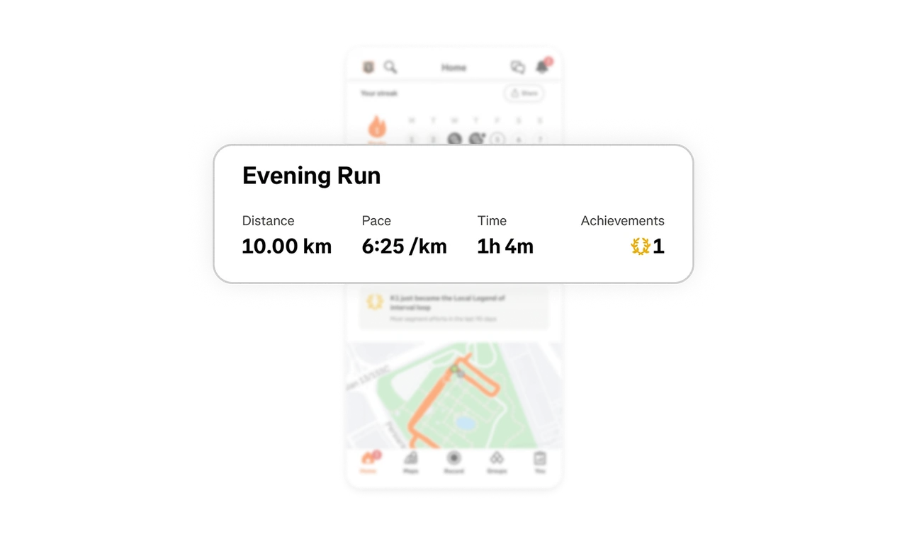
"Local Legend of interval loop" is a title worth bragging about
The achievement banner names a location-bound status ("Local Legend of interval loop") and explains the earning rule in plain language ("most segment efforts in the last 90 days"). This is an identity, not a badge. Achievements work when the title is worth saying out loud and the logic is transparent enough to chase. Tying status to a real place makes it defensible, someone can take it from you, which keeps you running.
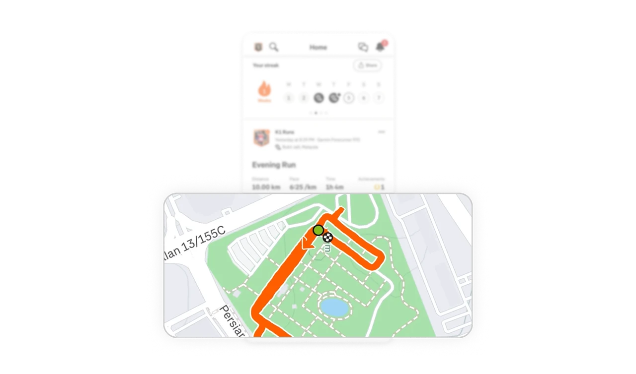
The route map is content that generates itself
The card's hero image is a full-width map with the run traced in bold orange, start and finish marked. The route is the activity's photograph, every run produces unique visual content automatically without the user creating anything. If your product generates spatial or visual data, render it as the content's hero. Self-generating content is Strava's entire feed engine, and it removes the creation burden that kills most social products.
Your streak comes before everyone else's activity
The first thing on Home is your own streak, then the community feed begins. The scroll answers "how am I doing?" before "what is everyone else doing?" Sequencing personal status before social content reinforces the user's own habit loop first, then lets the community provide inspiration and gentle pressure second. The order mirrors healthy motivation: internal first, external second, and the layout enforces it.
Similar Breakdown Lessons