Daily Coaching and Recovery Overview

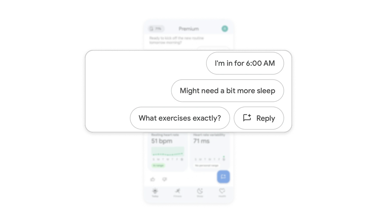
Make room for disagreement in suggested replies
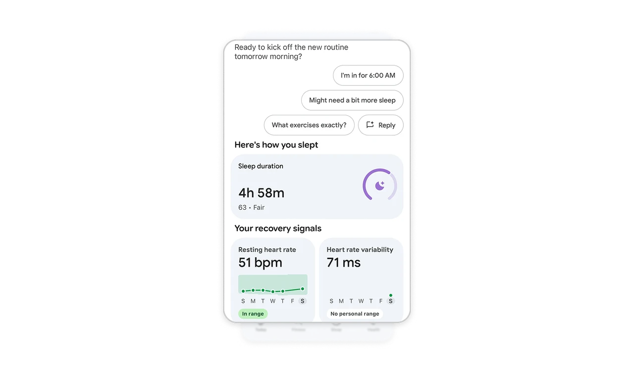
“Might need a bit more sleep” sits alongside committing to 6:00 AM and asking which exercises are planned. The suggestions make hesitation an explicitly offered choice and give users words to express it. A separate Reply control leaves room for other responses. When proposing a plan, include ways to question or challenge it, rather than offering only variations of agreement.
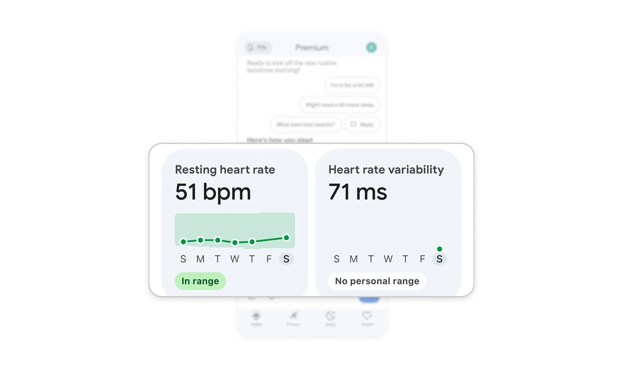
Give unavailable interpretations an explicit state
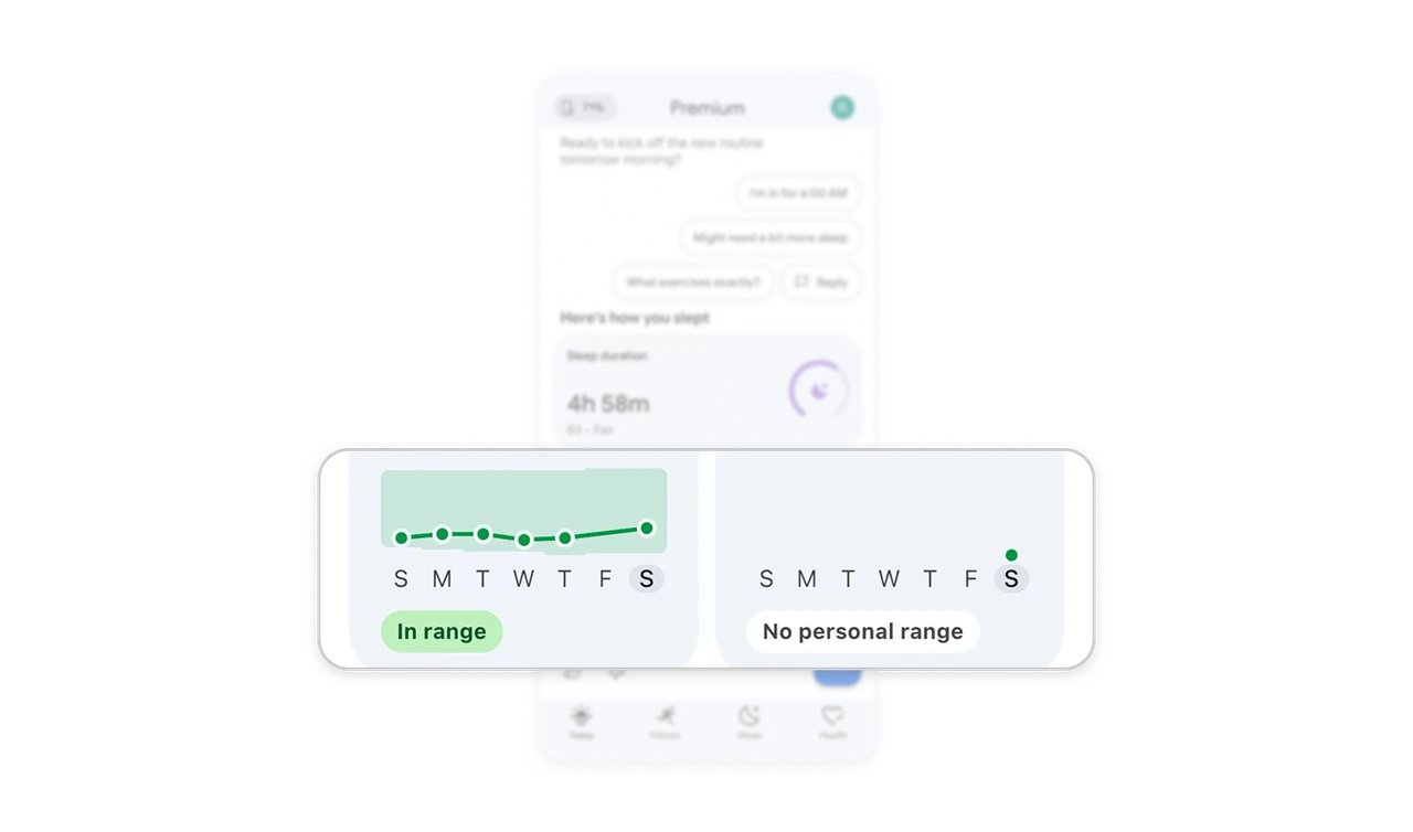
Resting heart rate says “In range,” while heart rate variability shows 71 ms with “No personal range.” The paired cards distinguish having a measurement from having the context to assess it. The absence of an interpretation receives its own label. When personalized comparisons are unavailable, preserve the reading and identify what is missing instead of presenting an unsupported verdict.
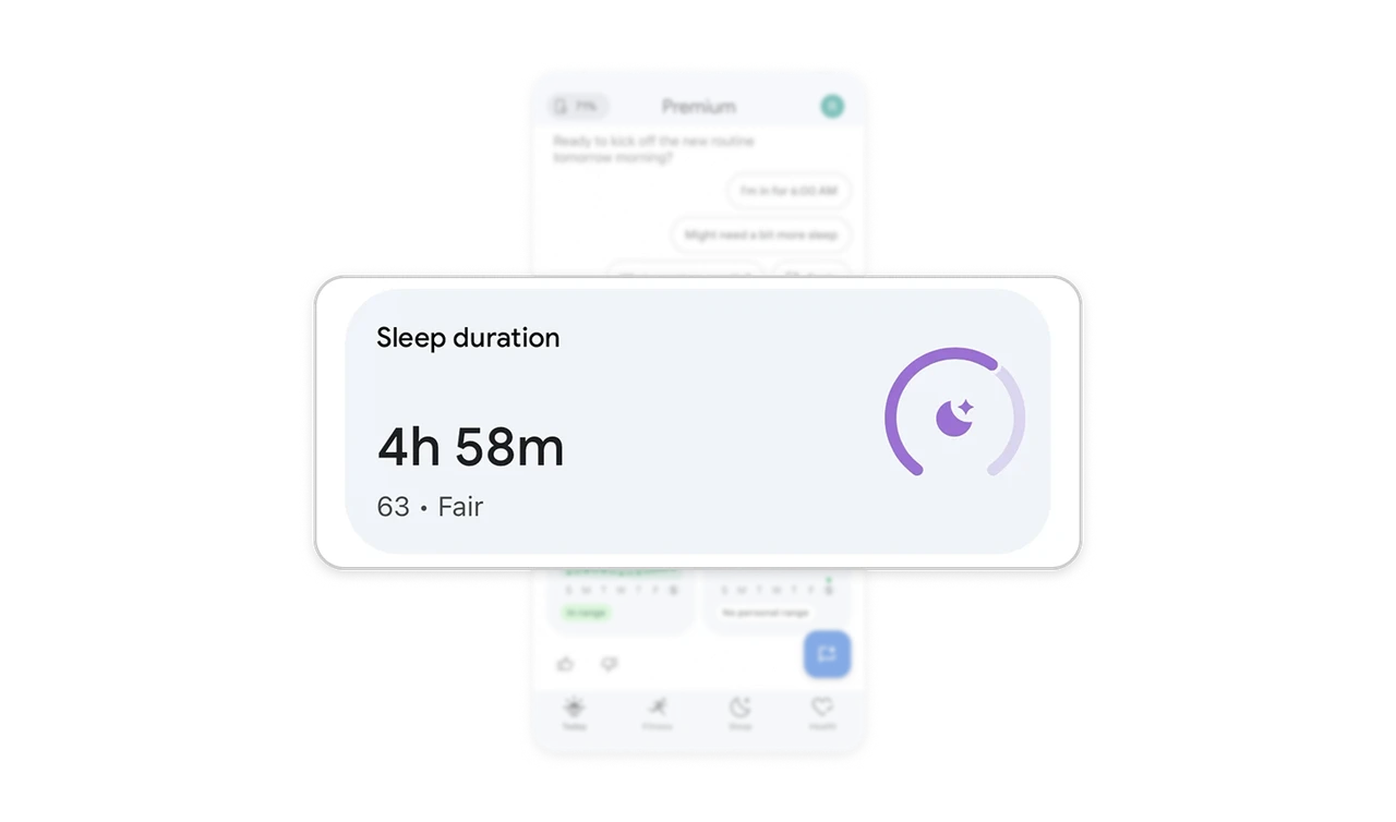
Lead with the measurement before the assessment
The sleep card gives 4h 58m the largest type, with “63 · Fair” underneath. This hierarchy lets users read the concrete duration before considering the summarized assessment. “Fair” makes the score more understandable without replacing the measurement. When a product evaluates personal data, keep the recorded quantity prominent and the assessment distinct so users can tell what was measured from how it was judged.
Anchor compact trends to recognizable days
Both recovery charts use weekday initials and highlight the final Saturday beneath their plotted readings. The repeated time axis makes it easier to locate points across cards, even though one contains a connected history and the other a single point. For compact dashboards, preserve temporal labels and a clear reference day so users can place each reading in time without opening a larger chart.
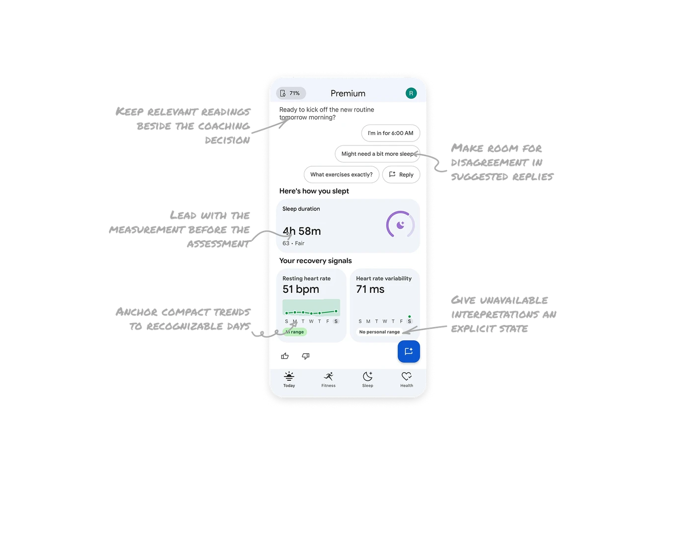
Keep relevant readings beside the coaching decision
The question about tomorrow’s routine appears directly above sleep duration and recovery measurements. Users can consult those readings while considering whether to commit, ask for more sleep or request details. The cards keep this context scannable instead of embedding every number in conversational prose. When asking users to make a decision, place relevant evidence close enough to inform their response.
Similar Breakdown Lessons