5 UX Lessons From Alan's Health Dashboard UI - Alan UI Breakdown
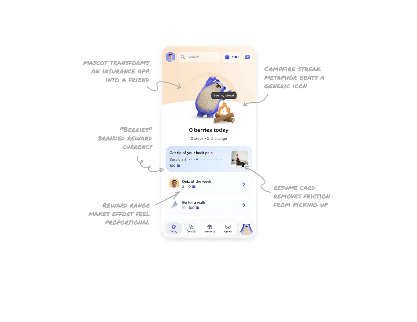
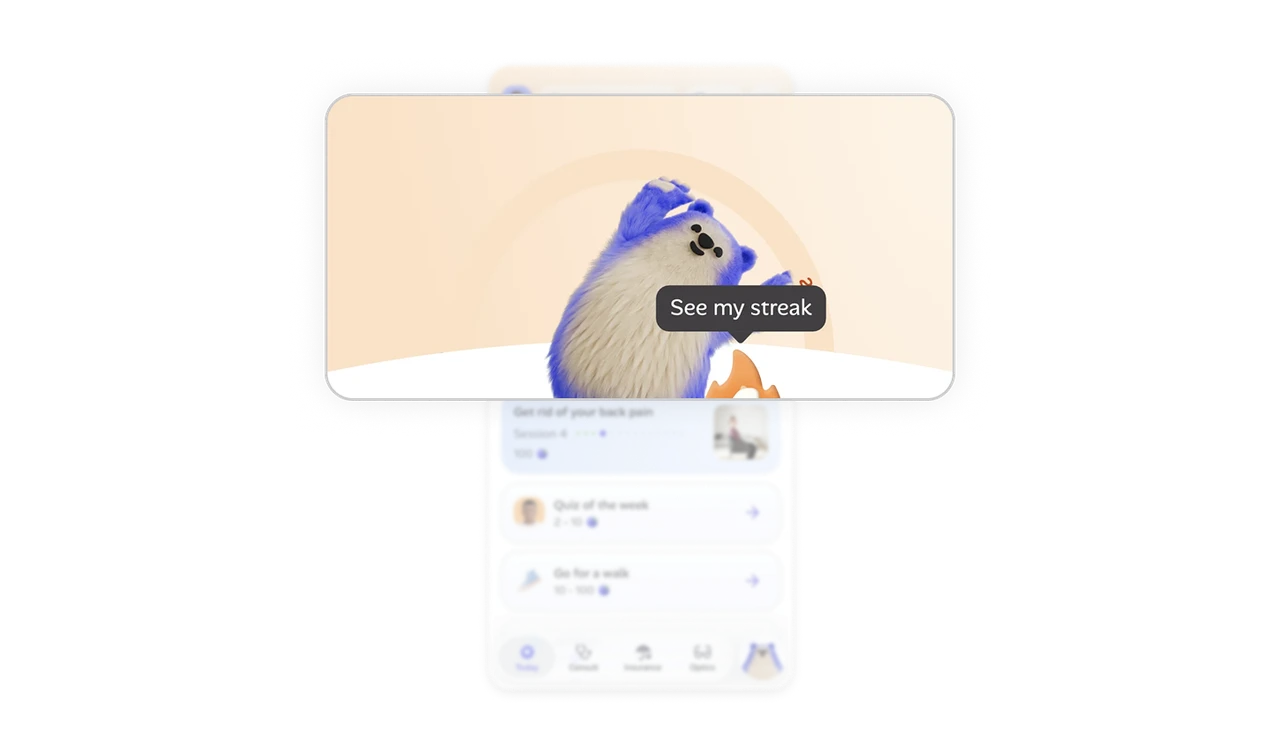
A 3D mascot transforms an insurance app into a friend
Health insurance apps are typically anxiety-inducing and clinical. Alan replaces that tone with a fluffy 3D mascot greeting users on the home screen. The mascot does emotional work that no UI element could: it makes a high-stakes financial product feel approachable. In any product where users dread engaging (taxes, insurance, banking), a friendly mascot reframes the entire emotional contract.
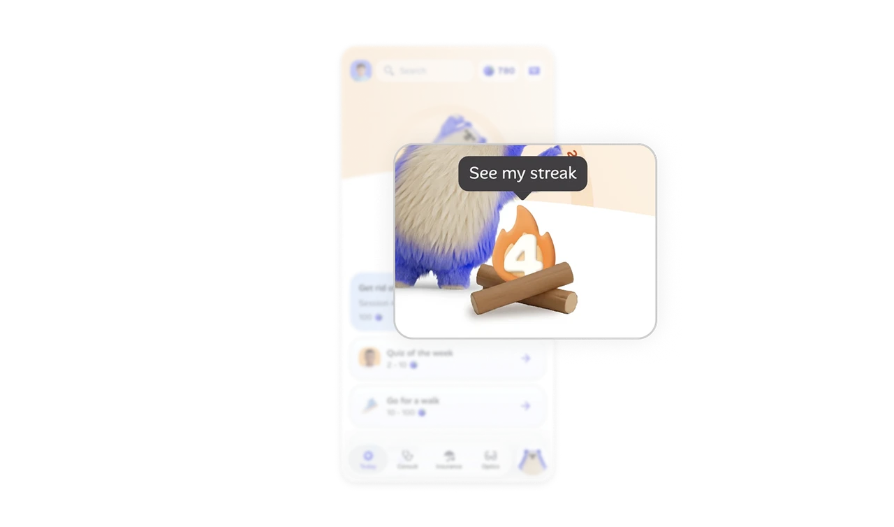
Campfire streak metaphor beats a generic flame icon
The streak shows as a literal campfire with logs and a glowing 4 inside. Most apps use a tiny flame icon and a number. Alan turns the same data into a scene that visually rewards consistency, the longer the streak, the bigger the fire. Metaphor-driven gamification creates emotional investment in the streak itself, not just the number, which is what keeps users returning daily.
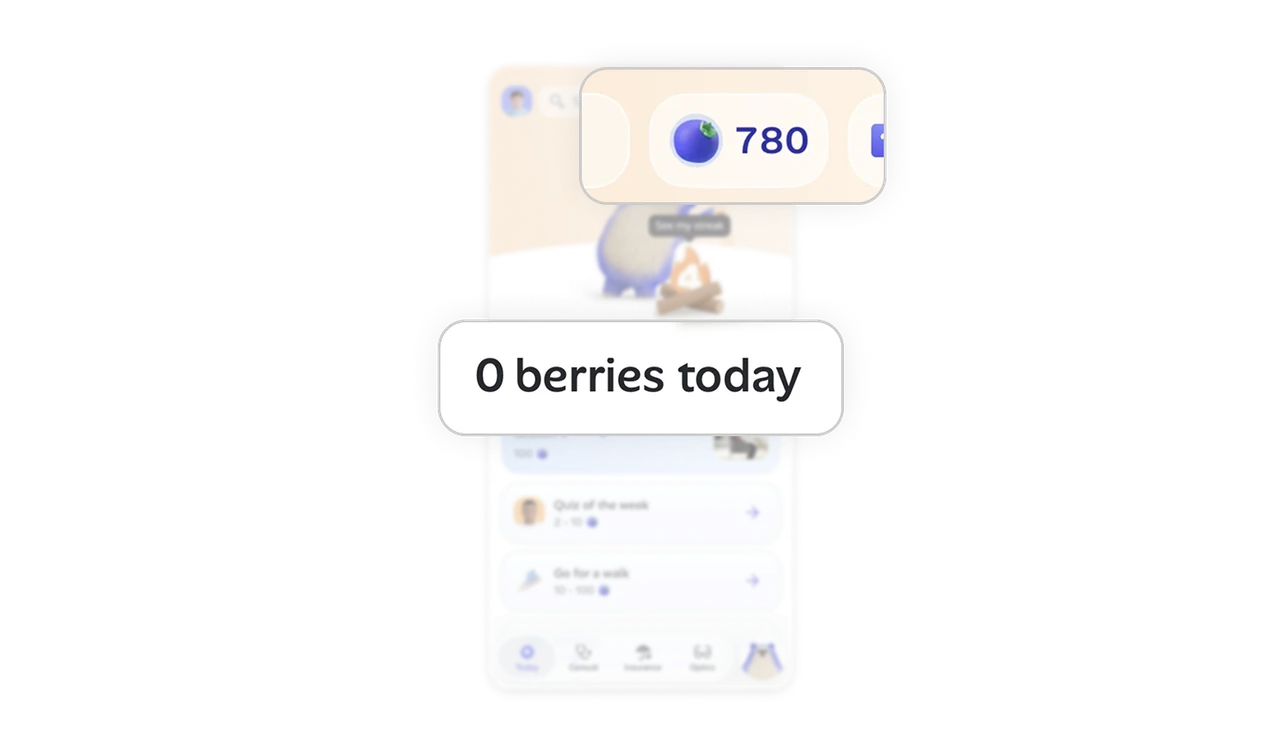
"Berries" branded reward currency builds product world
Instead of generic "points," Alan uses berries (matching the bear mascot's world) as a reward currency. 780 berries appear in the top right, 100 berries promised for completing a session. A custom currency tied to brand storytelling creates a world users want to be part of. Generic rewards feel transactional. Branded rewards feel like belonging to something.
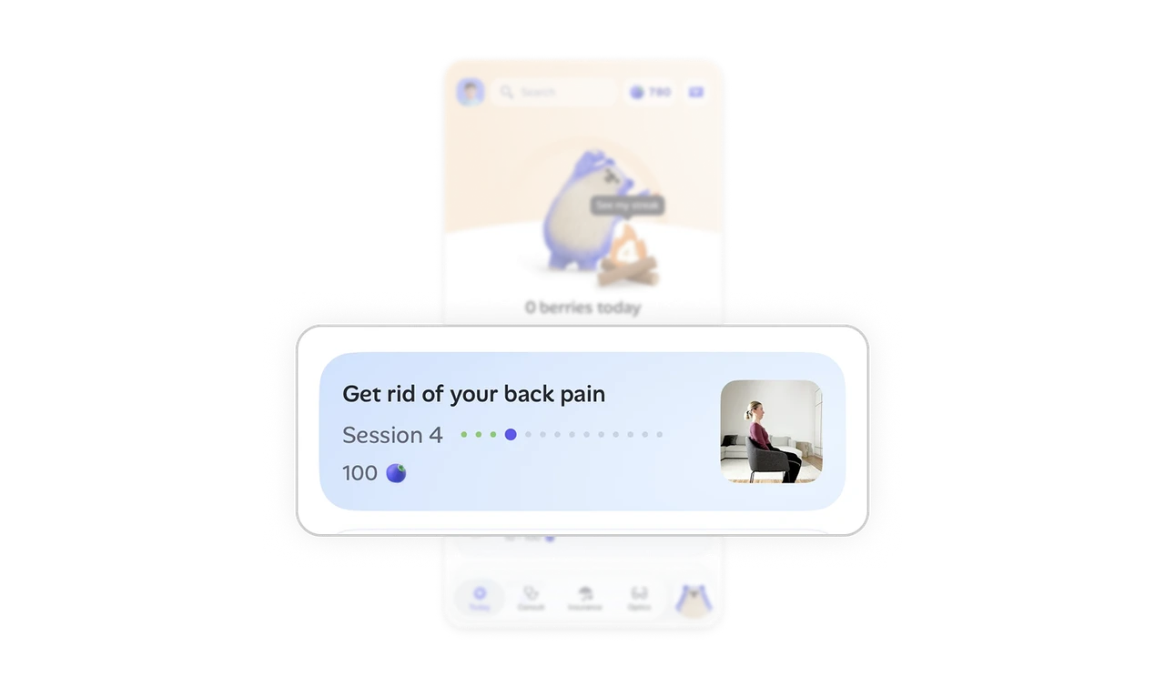
Session resume card removes friction from picking up
"Get rid of your back pain, Session 4" shows the program name, current session, dot-progress through the entire program, and a real photo of someone doing the exercise. Users do not need to navigate or remember where they left off. The card answers what to do next in one tap. Programs with multiple sessions live or die based on how easy it is to resume, not how good the content is.
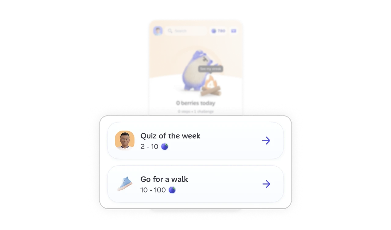
Reward range on small actions makes effort feel proportional
"Quiz of the week, 2 to 10 berries" and "Go for a walk, 10 to 100 berries" show variable rewards based on effort. Users see that small tasks earn small rewards and bigger commitments earn bigger ones. This proportionality builds trust in the reward system. Flat rewards feel arbitrary. Variable ranges make the gamification feel fair, which is what keeps users engaging long-term.
Similar Breakdown Lessons


