5 UX Lessons From Dyson's Air Purifier App UI - MyDyson UI Breakdown
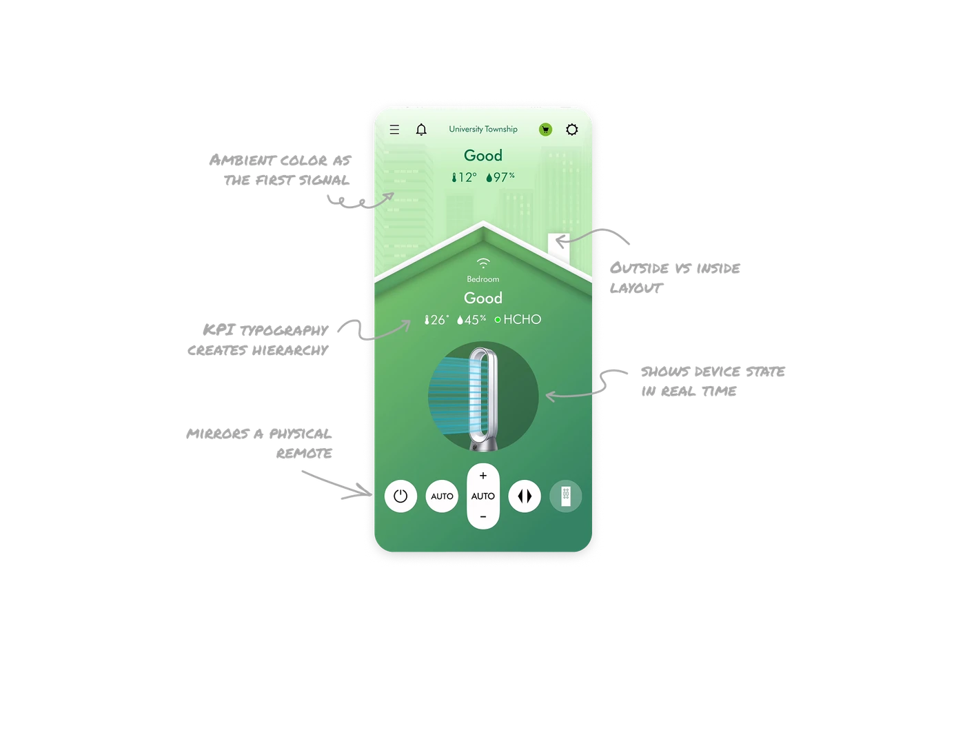
Ambient color replaces numbers as the first signal
The entire screen background shifts to green for good air and would turn orange or red for poor quality. Users understand their air condition before reading a single label. This is color strategy used as ambient feedback, not decoration. IoT and health apps that encode status into the environment itself communicate faster than any dashboard metric.

Outside vs inside layout tells the full air story
Outdoor conditions sit at the top of the screen. Indoor conditions sit inside the illustrated house below. The spatial separation mirrors physical reality: outside air affects inside air. Users instantly grasp the relationship between the two readings without any explanation. Layout doing the storytelling work that labels would otherwise need to handle.
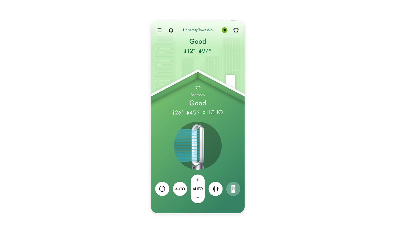
Product image shows device state in real time
The Dyson purifier renders with animated airflow lines when active. Users do not read a status label to know the machine is running. The device itself communicates its state. Real-world match at this level, showing the actual product behaving as it would physically, builds stronger trust in IoT apps than any text status indicator ever could.

KPI typography creates a zero-effort data hierarchy
Temperature, humidity, and air quality status use large bold type with small inline icons. The word "Good" is the largest element because it is the most important answer. Supporting numbers follow in smaller weight. Users absorb the full air quality picture in one glance without needing to parse a chart or table. Type size is the hierarchy.

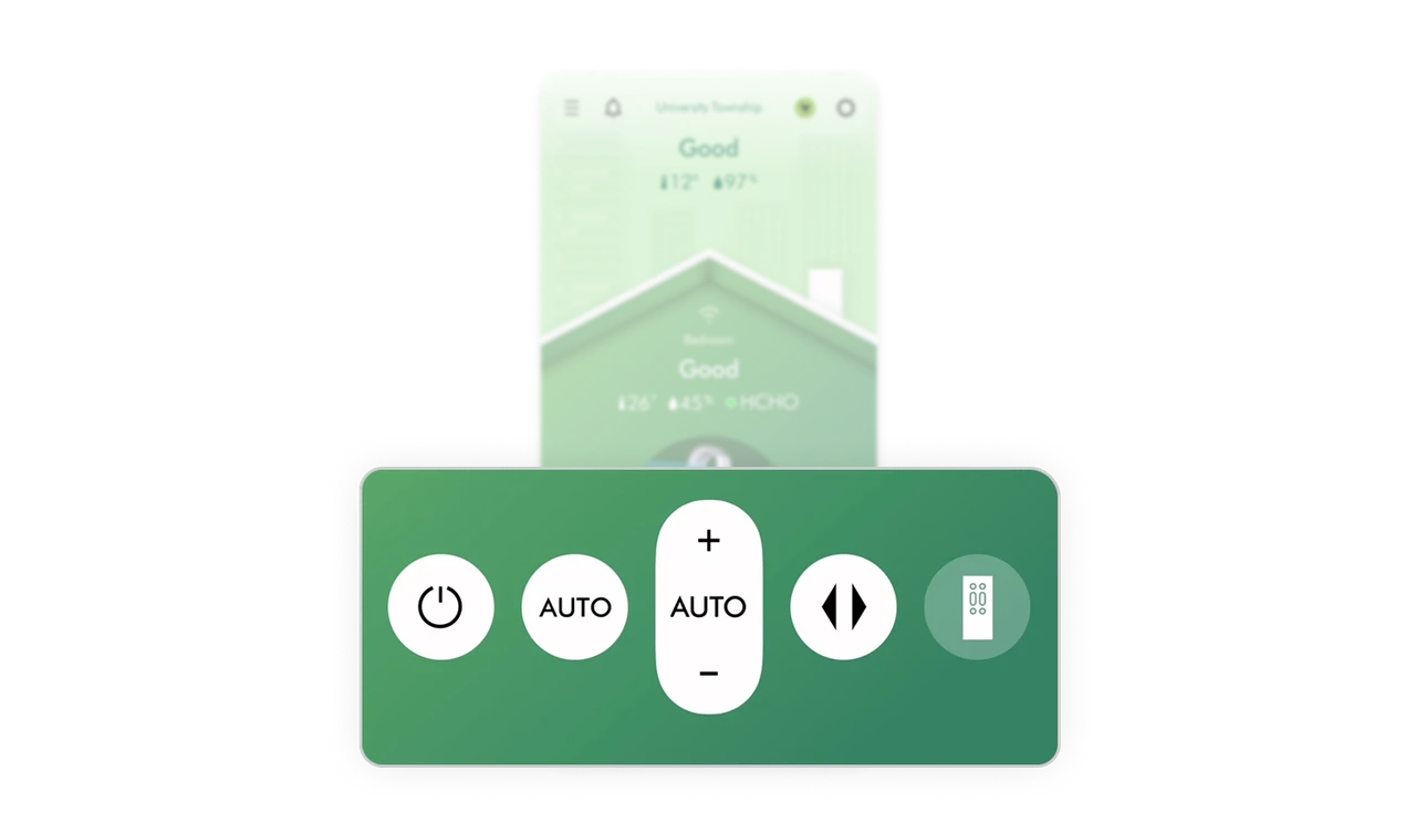
Bottom control bar mirrors a physical remote
Power, auto mode, speed, direction, and remote icon sit in a pill-shaped bar at the bottom of the screen, exactly where thumbs rest naturally. The raised center button for speed control mirrors the tactile prominence of the most-used button on a physical remote. Fitts's Law applied to IoT controls: most frequent actions get the largest target in the most reachable zone.
Similar Breakdown Lessons


