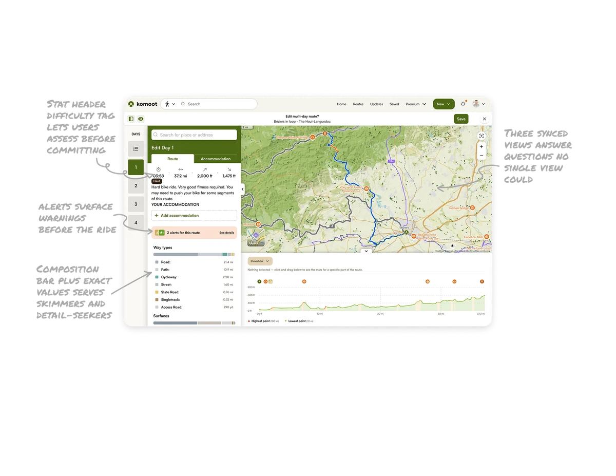
5 UX Lessons From Apollo's Meeting Insights UI - Apollo UI Breakdown
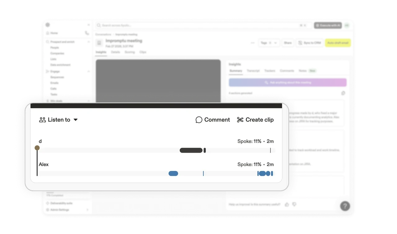
Speaker timeline makes dense audio instantly navigable
Each participant gets a horizontal track showing when and how long they spoke. Users can jump directly to any speaker's segment without scrubbing blindly through audio. In meeting tools, finding a specific moment in a 10-minute call is the highest-friction task. A per-speaker visual timeline solves it in one glance and removes the need to listen through irrelevant parts.
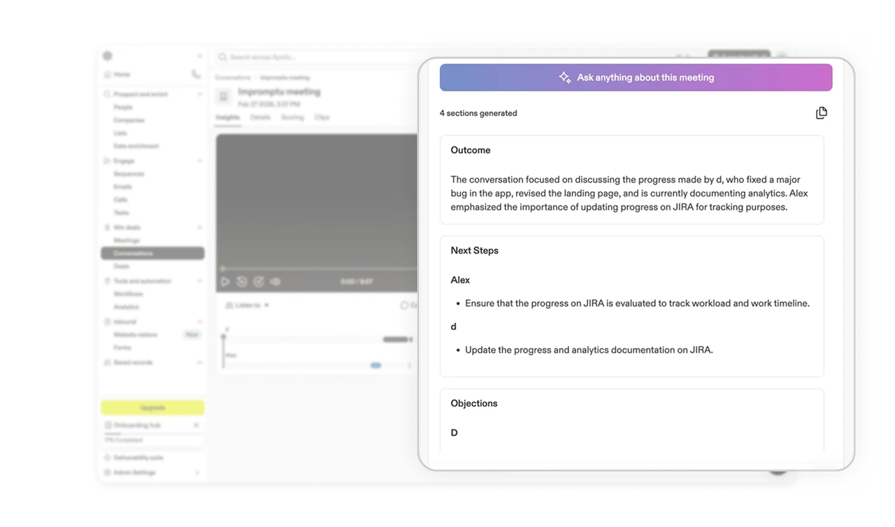
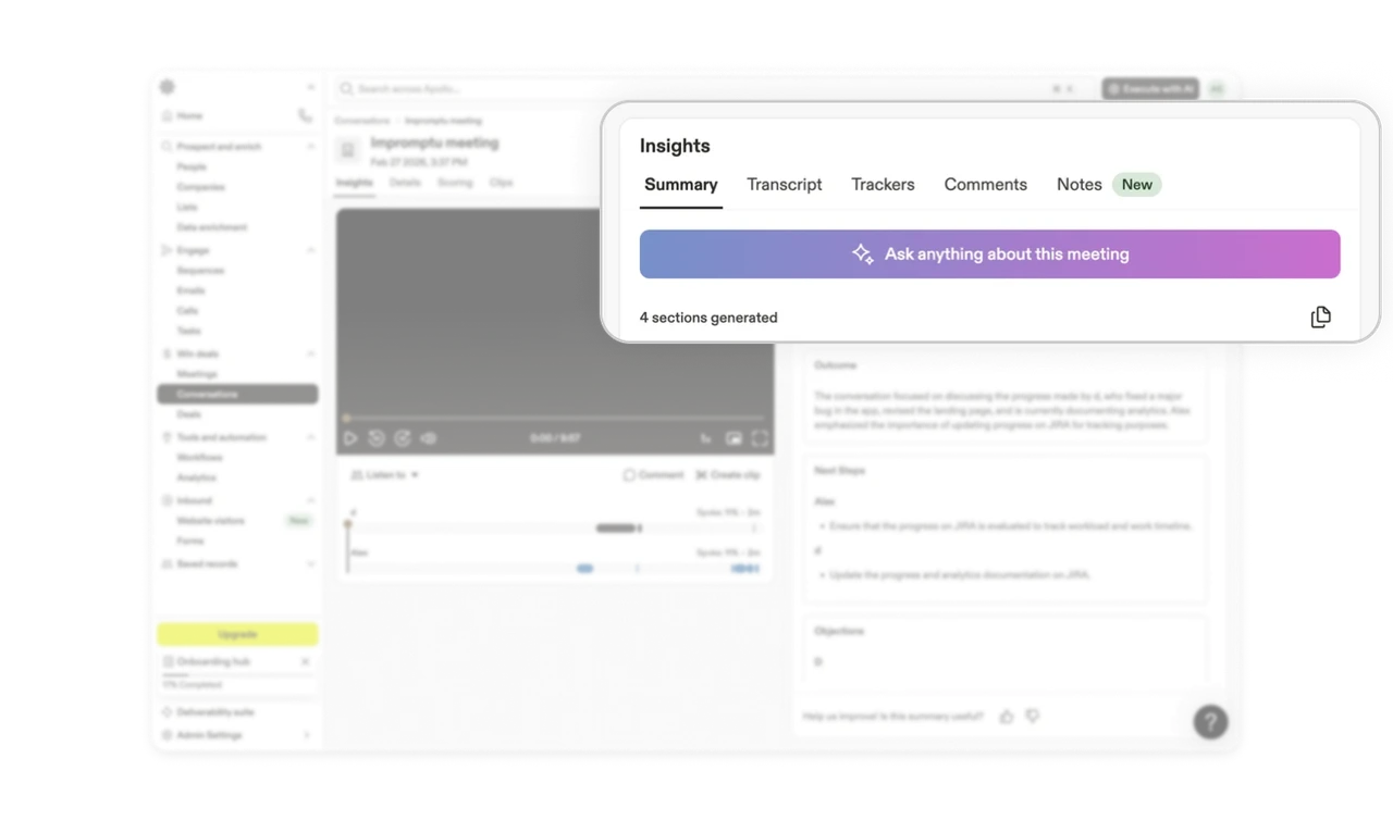
AI generates the four sections users always need
Outcome, Next Steps, and Objections are pre-generated automatically. Users get structured meeting intelligence without writing a single prompt. This is AI doing the job of knowing what matters before the user asks. Products that anticipate the output format, not just the content, deliver dramatically more value than those that give users a blank AI chat window and expect them to figure out the right questions.
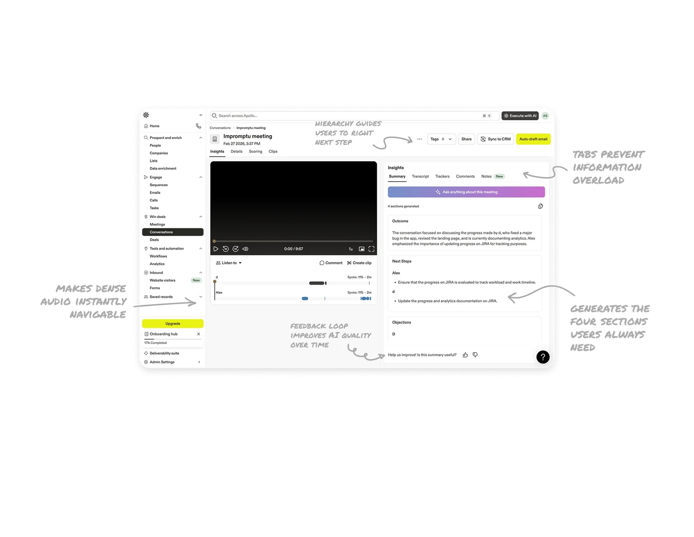
Insight tabs prevent information overload
Summary, Transcript, Trackers, Comments, and Notes are separated into tabs rather than stacked in a single scrollable view. Each tab represents a distinct job: review the meeting, read the full transcript, check talking points, collaborate, take notes. Separating by job to be done rather than by data type keeps each tab focused and prevents the right panel from becoming an overwhelming wall of content.
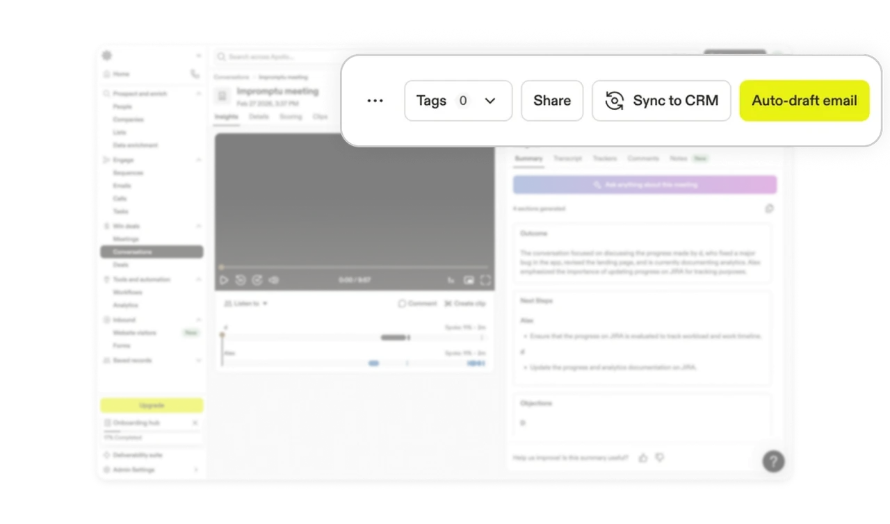
Action bar hierarchy guides users to the right next step
Tags and Share are quiet outlined buttons. Sync to CRM is a labeled action with an icon. Auto-draft email is a bold yellow pill that dominates the row. The color and weight difference communicates business priority: getting a follow-up email drafted is the most valuable post-meeting action. Top-right placement follows the F-pattern reading flow, ensuring actions are found after consuming the meeting title and date context.
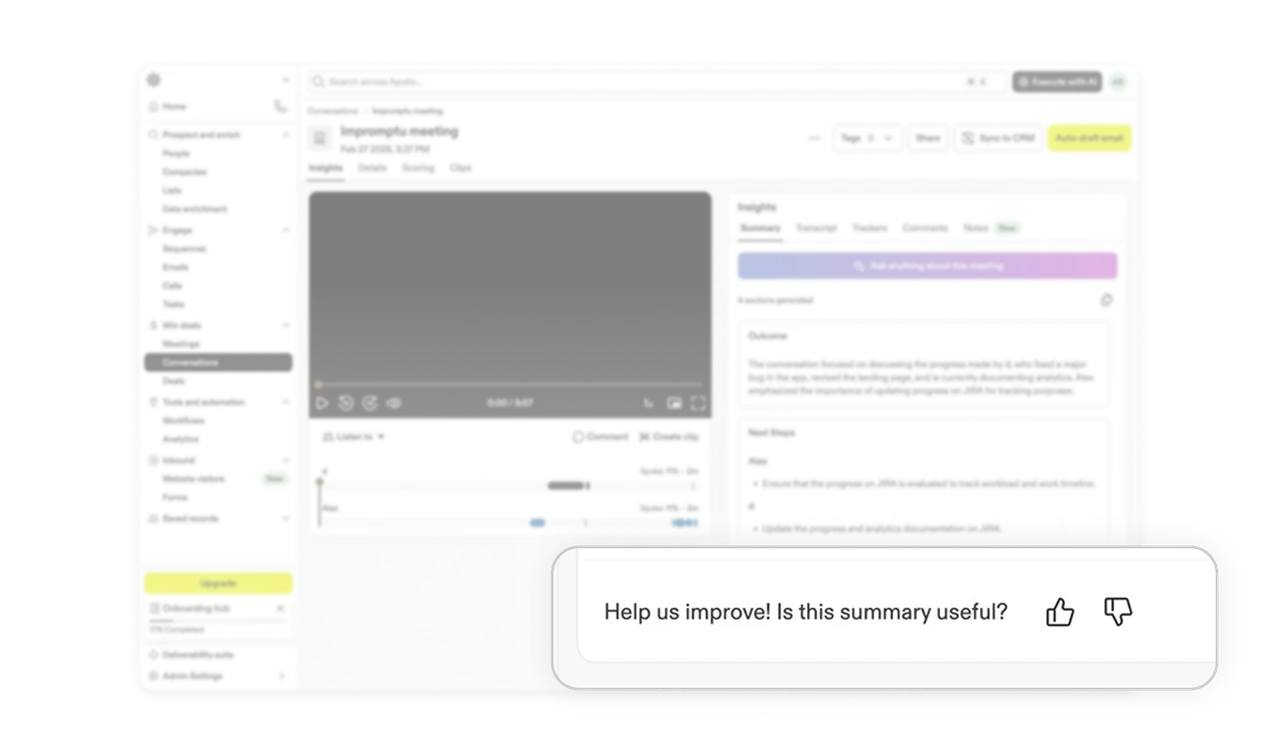
Thumbs feedback loop improves AI quality over time
"Help us improve! Is this summary useful?" with a thumbs up and down sits at the bottom of the insights panel. This is a one-tap feedback mechanism placed exactly where the user has just finished consuming the AI output. Most products bury feedback in settings. Placing it immediately after the output catches users while their judgment is fresh and turns every session into a training signal that improves the product for everyone.
Similar Breakdown Lessons