Destination Overview and Audio Guide

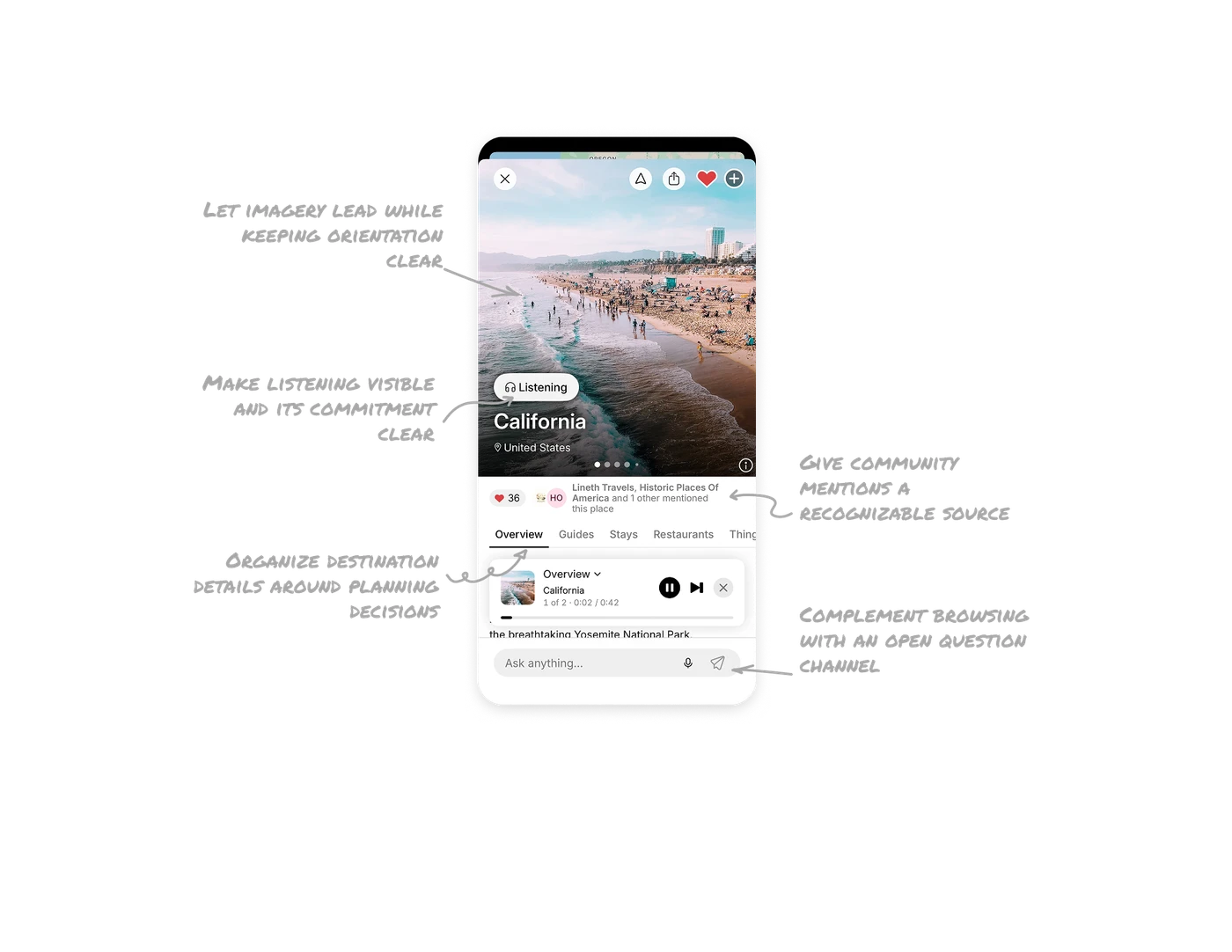
Make listening visible and its commitment clear
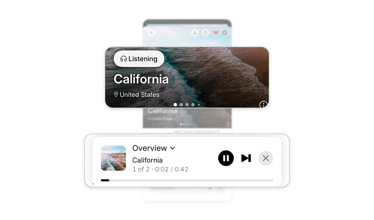
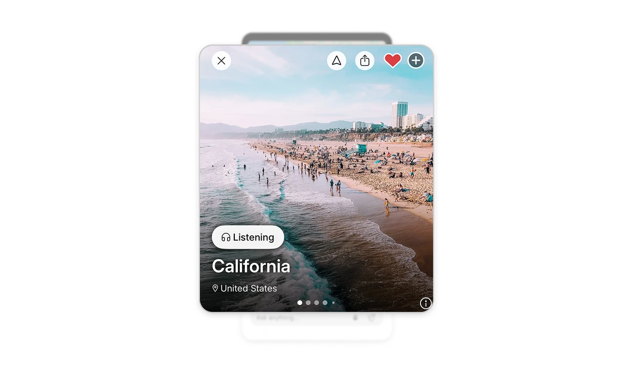
A “Listening” badge appears over California’s image, while the player names the overview and shows “1 of 2” alongside “0:02 / 0:42.” The badge connects playback to the destination; the player reveals the current segment’s length and its place in a larger sequence. When adding narration to browsable content, show what is playing, how much remains, and the controls for managing it.
Give community mentions a recognizable source
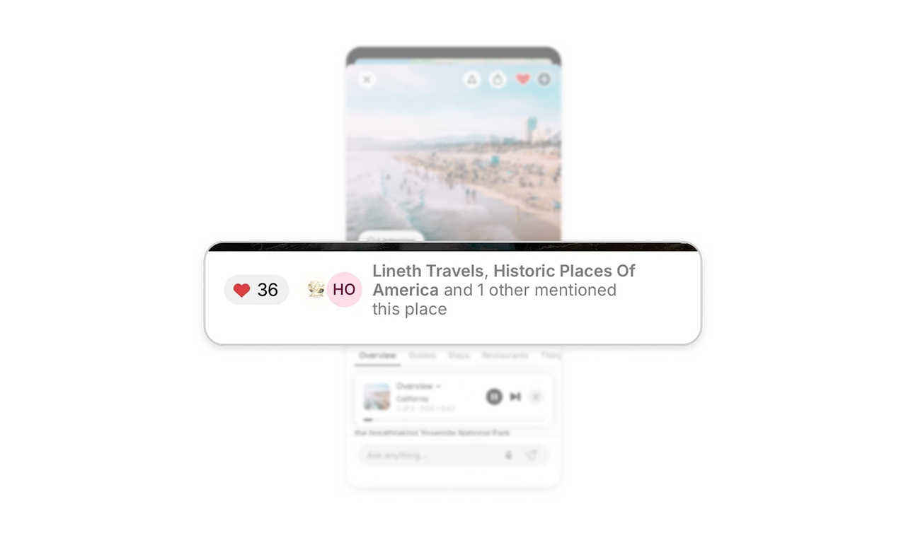
“Lineth Travels, Historic Places Of America and 1 other mentioned this place” appears beside avatars and a separate heart count. The names provide context that a number alone cannot: who connected this destination to their content. In discovery interfaces, pair aggregate interest with identifiable sources. Describe the relationship accurately so users can judge its relevance without mistaking a mention for an endorsement.
Organize destination details around planning decisions
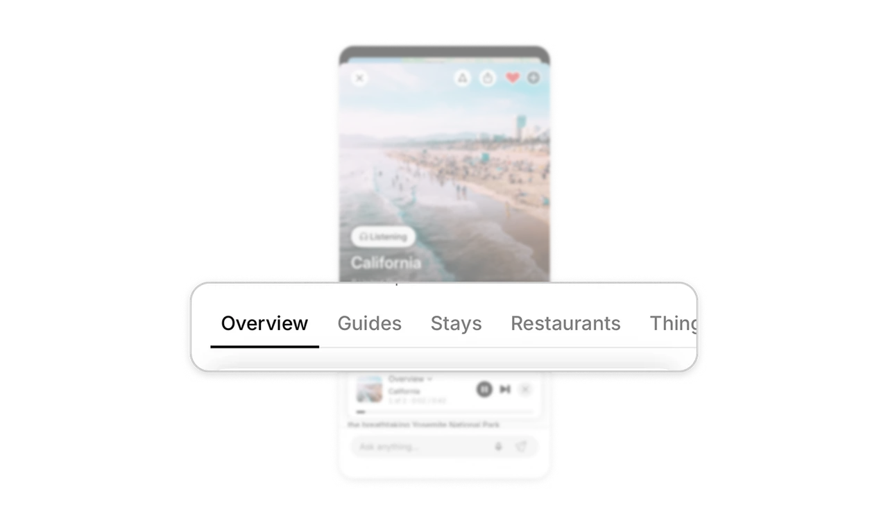
“Overview,” “Guides,” “Stays,” and “Restaurants” divide a broad destination into practical areas to explore. Travelers can start with general orientation or move directly to the part of planning that matters to them. The selected tab’s dark text and underline make that scope visible. Organize rich destination pages around recognizable decisions, giving users clear entry points without requiring a fixed planning sequence.
Complement browsing with an open question channel
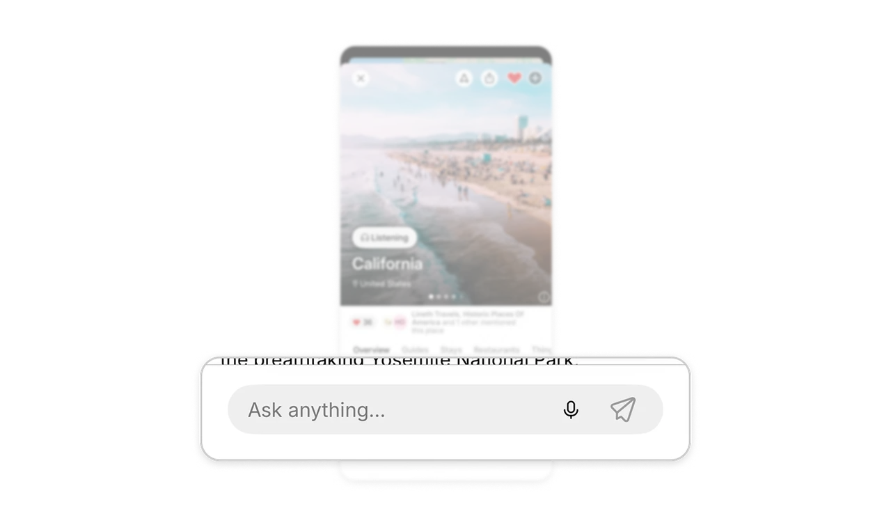
An “Ask anything…” input sits beneath the destination content, alongside microphone and send icons. The tabs offer routes into common planning needs, while the input invites questions those categories may not anticipate. In information-rich products, combine structured browsing with a way to express specific needs. Users should be able to explore what is available and articulate what they still need to know.
Let imagery lead while keeping orientation clear
A large beach photograph introduces California, with pagination dots indicating more images and a dark gradient supporting the white destination labels. The image establishes atmosphere, while “California” and “United States” keep its geographic scope explicit. For visual discovery, give imagery room to create interest while preserving orientation. Clear labels and gallery indicators help users understand both what they are viewing and what else they can explore.
Similar Breakdown Lessons