Place Details

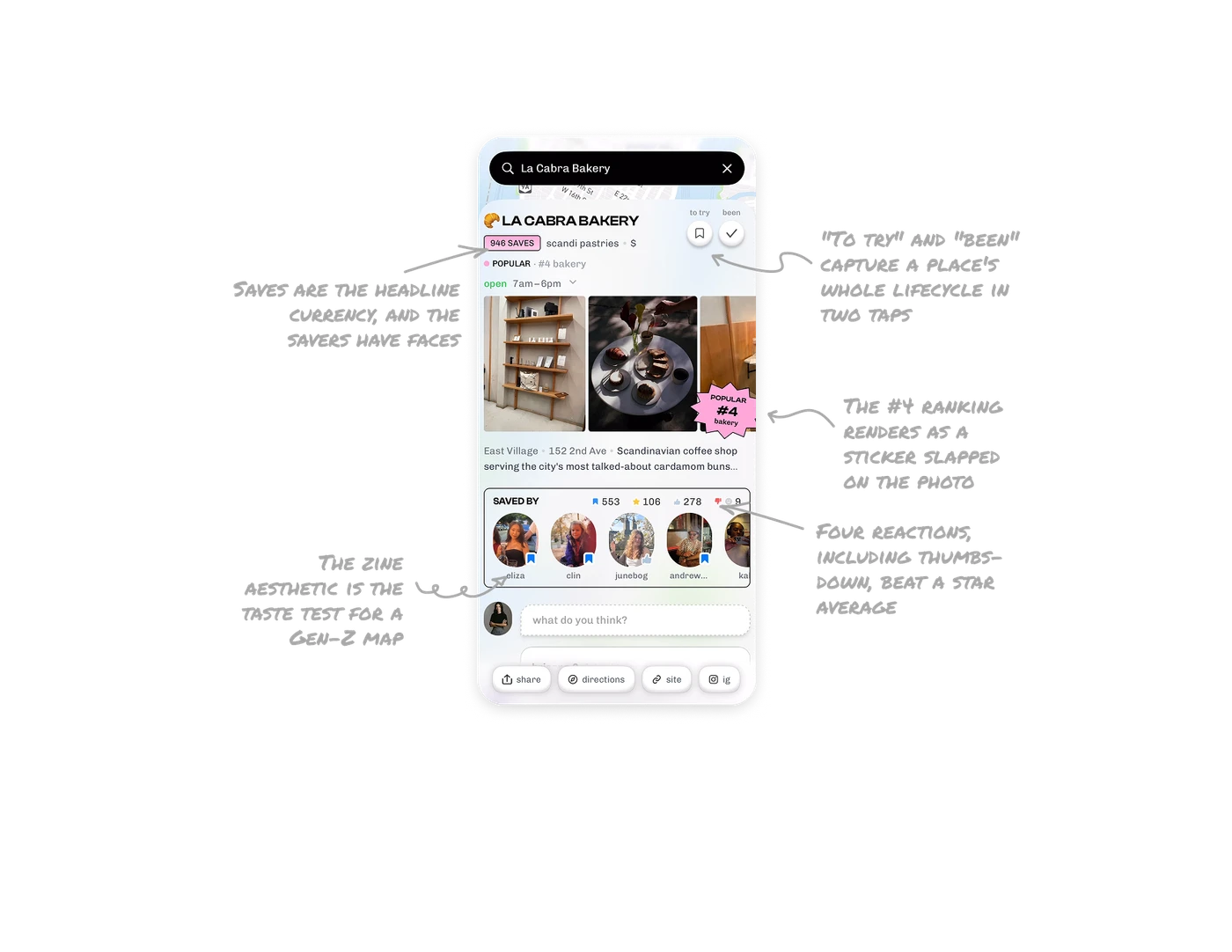
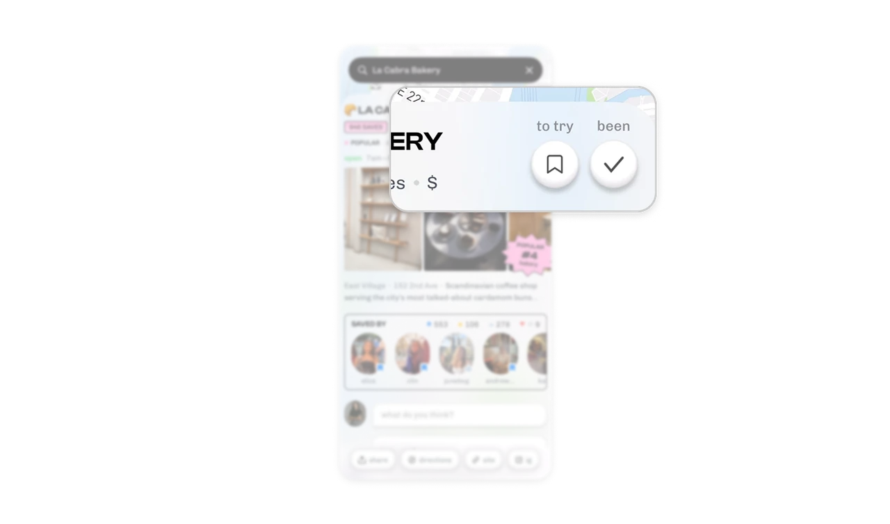
"To try" and "been" capture a place's whole lifecycle in two taps
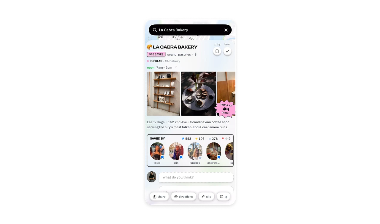
Two chips sit at the top: a bookmark for "to try" and a check for "been." Every place relationship is either intention or memory, and the pair captures both without forms, lists, or ratings. Most map products only offer save, collapsing want-to-go and already-went into one muddy state. Model the user's actual relationship to the object, future versus past, as the primary controls. The lifecycle is the data structure, and two taps maintain it.
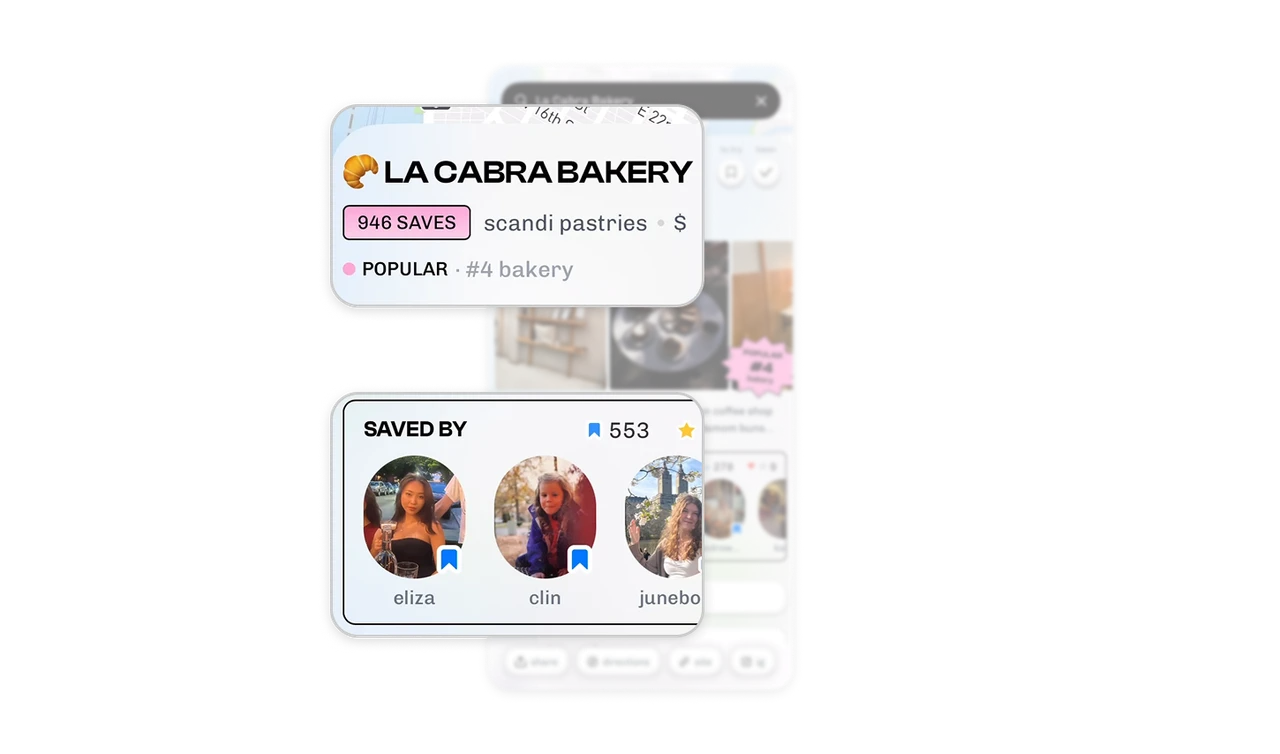
Saves are the headline currency, and the savers have faces
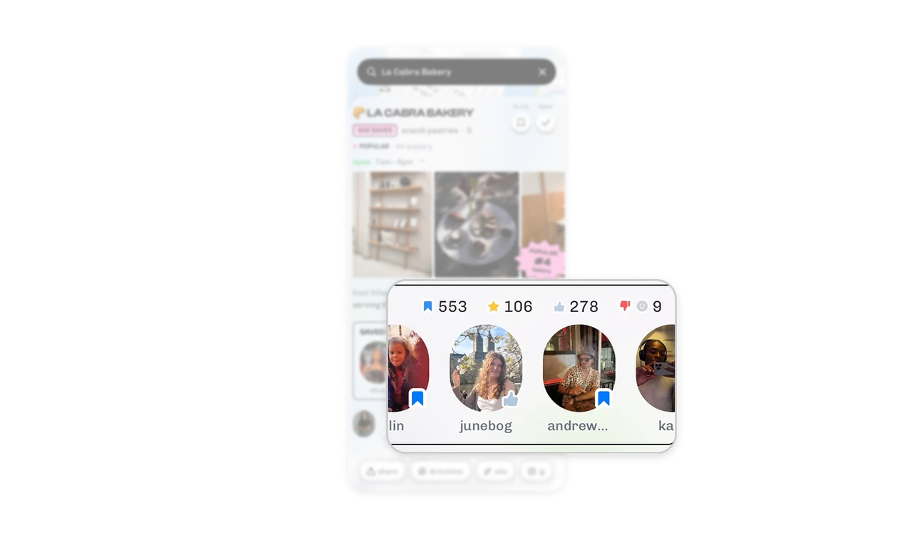
"946 SAVES" leads in a pink pill where a star rating would sit, and the Saved By row shows who: eliza, clin, junebog as avatars, each wearing a badge for the action they took. The metric of record is commitment (I want this place in my life), not opinion, and faces beat counts because "junebog saved this" carries taste information a number cannot. In social discovery, who did it is the signal, how many is just the volume knob.
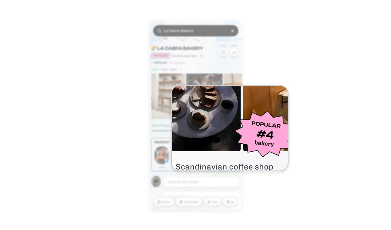
The #4 ranking renders as a sticker slapped on the photo
"POPULAR #4 bakery" appears as a pink starburst sticker overlapping the photo gallery, like a zine cutout, not a metadata row. The achievement is styled as an editorial object with the energy of a "staff pick" card in a record store. Rankings gain persuasive power when they look curated rather than computed. The same fact in a grey badge reads as algorithm output, the sticker reads as an award someone excitedly gave.
Four reactions, including thumbs-down, beat a star average
The Saved By bar tallies four distinct signals: 553 saves, 106 stars, 278 likes, 9 thumbs-downs. Each reaction means something different, intent, favorite, approval, warning, and the visible negative count is the honesty move. A 4.2-star average hides the shape of opinion, while "278 liked, 9 did not" shows it. Let the community disagree in public. Visible dissent is what makes the positive signals believable.
The zine aesthetic is the taste test for a Gen-Z map
Chunky black type, pink pills, emoji in the title, sticker shapes, dashed comment boxes, the whole screen reads like a scrapbook page, not a directory listing. Corner's audience treats place discovery as identity expression, and the interface dresses accordingly. Yelp's beige utility says "database," this says "my friend's list of spots." Match the visual register to how your users want the activity to feel, because for taste-driven social products the aesthetic IS the positioning.
Similar Breakdown Lessons