Pricing Modal

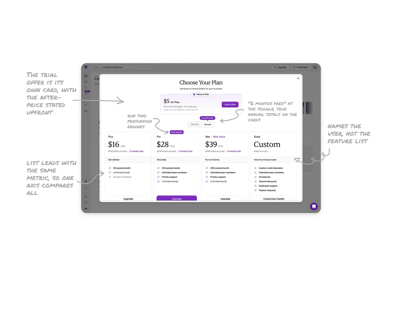
The trial offer is its own card, with the after-price stated upfront
"$5 for Plus" sits above the plan grid as a distinct card with its own badge, Claim Offer CTA, and honest fine print: "3-day trial, then $20/mo, cancel anytime." A trial answers a different question ("can I just try it?") than the grid ("which should I commit to?"), so separating them serves both mindsets. Dark-pattern trials hide the rollover price. Leading with it converts the skeptics who have been burned before, which is most of them.
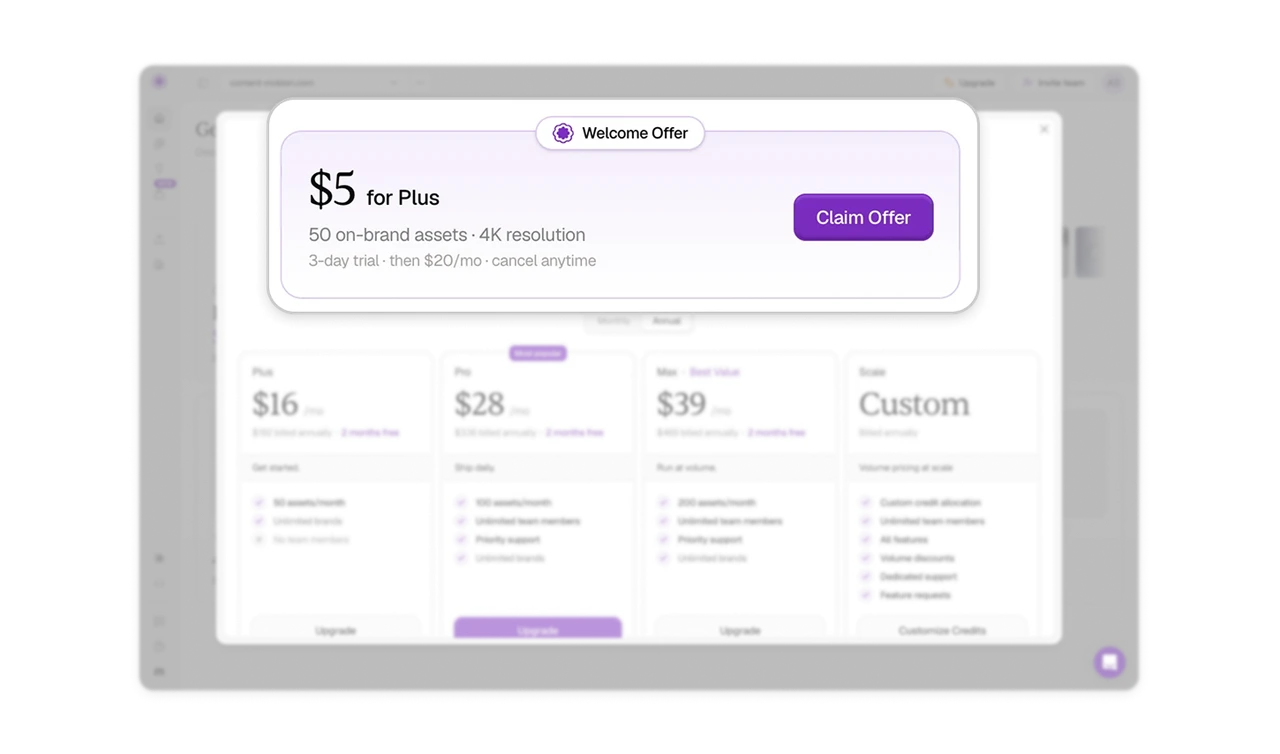
"2 months free" at the toggle, true annual totals on the cards
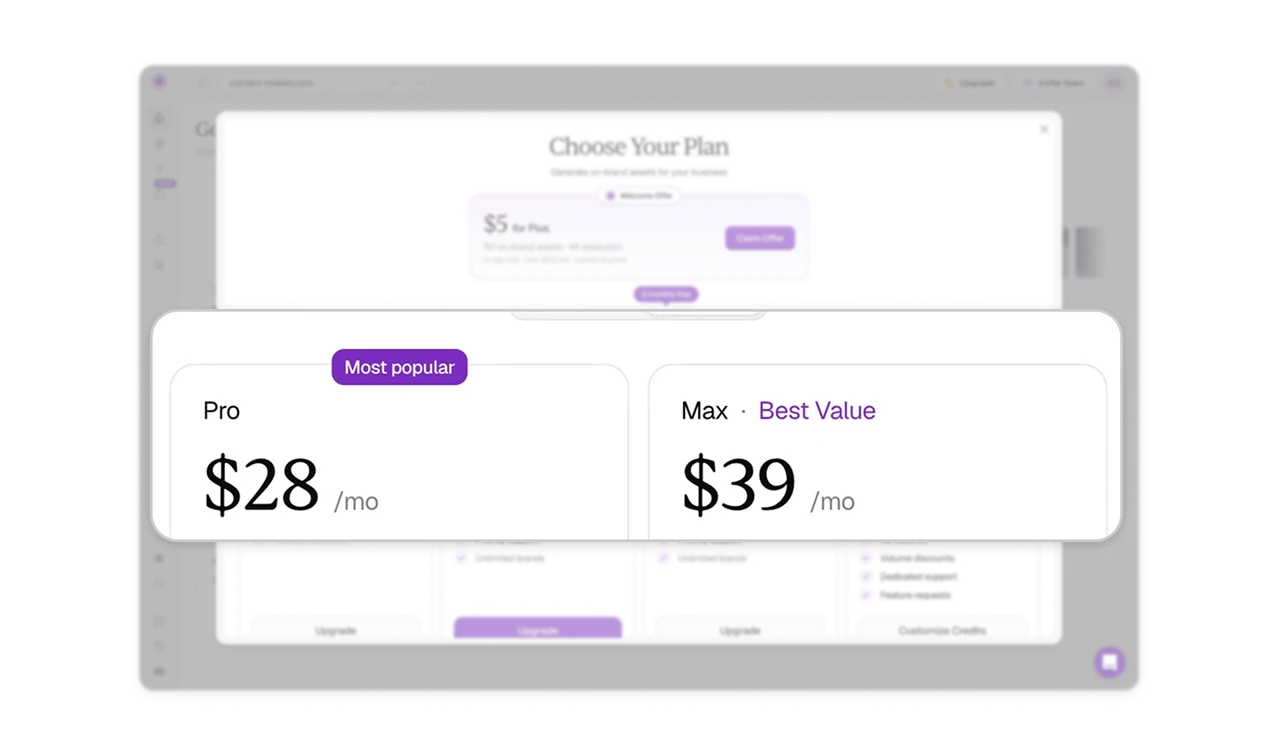
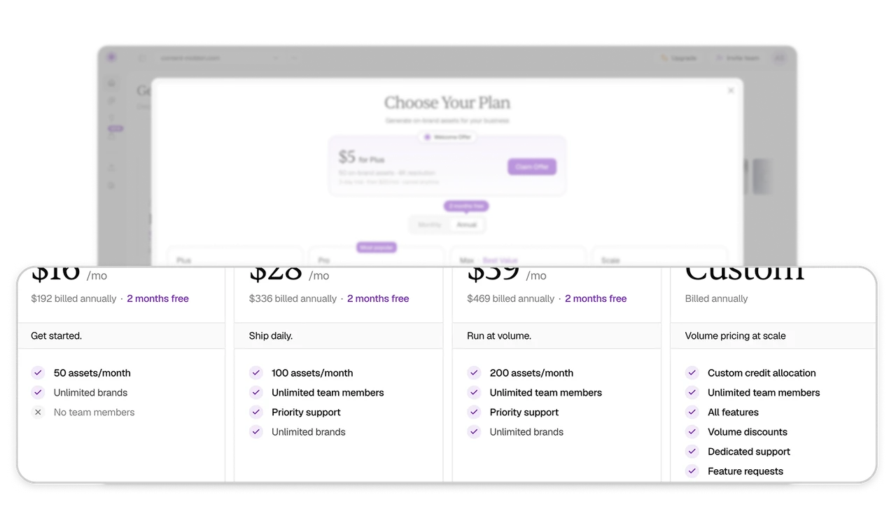
The Annual toggle carries a badge reading "2 months free," concrete free time instead of percent-off math, anchored at the exact control where the decision happens. Below, every tier shows both figures: "$28/mo" and "$336 billed annually." The free-months framing wins the switch, and the disclosed annual total prevents the invoice shock that kills renewals. Sell the annual plan honestly at both moments: the choice and the charge.
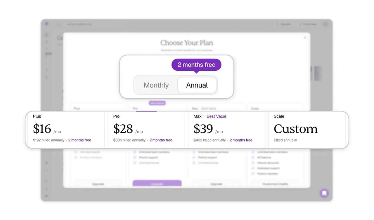
"Ship daily." names the user, not the feature list
Each tier carries a three-word identity line describing behavior: Get started. Ship daily. Run at volume. Buyers self-select by how they work, a far faster sort than comparing checkmark rows. The tagline is a mirror, users pick the plan that describes them, and recognition is quicker than evaluation. Writing the tier for the person rather than the package is the sharpest self-segmentation copy pattern a pricing page can use.
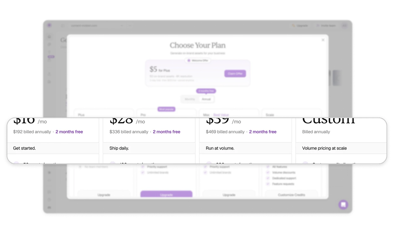
"Most popular" and "Best Value" run two persuasion engines
Pro carries "Most popular," selling through herd safety, others chose this. Max carries "Best Value," selling through math, this maximizes return. Two buyer psychologies steered toward two price points, and the solid-purple CTA on Pro alone confirms the house recommendation. Differentiate your badge logic instead of stamping "popular" everywhere. One badge type on every tier persuades no one, because a signal on everything is a signal on nothing.
Every tier's list leads with the same metric, so one axis compares all
Feature lists open with assets per month, 50, 100, 200, then layer differentiators beneath: team members, priority support, and at Scale, "Feature requests" and dedicated support. Leading every list with the primary unit lets buyers compare four tiers on one axis before weighing extras. And listing roadmap influence as a top-tier benefit is quietly brilliant: enterprise buyers purchase relationships, not just capacity, and the pricing page can say so.
Similar Breakdown Lessons