Pricing Page

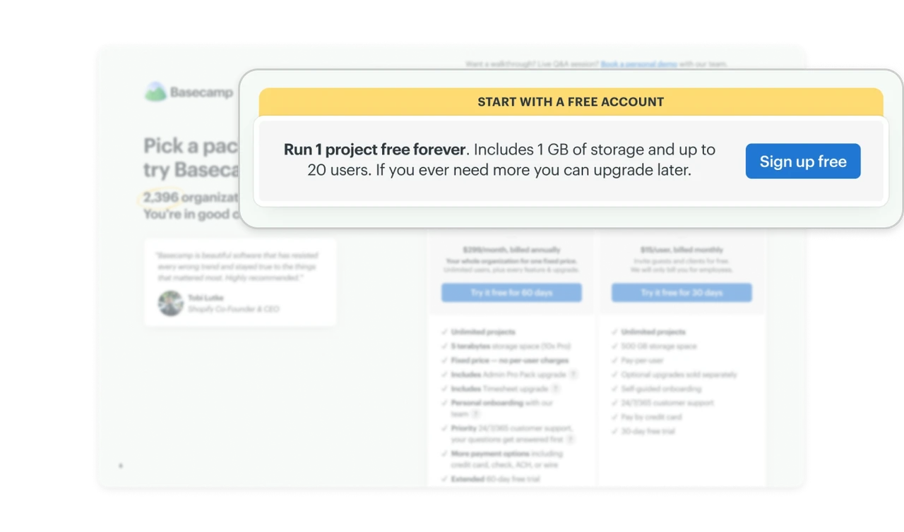
The free plan sits above the paid grid, stated in full
"Run 1 project free forever. Includes 1 GB of storage and up to 20 users. If you ever need more you can upgrade later" leads the page in its own banner, above both Pro packages. Most pricing pages bury or shrink the free option hoping you will not notice it. Leading with it, limits stated plainly, builds the trust that makes the paid pitch below credible. Confidence in your paid value shows by how visibly you offer the free version.
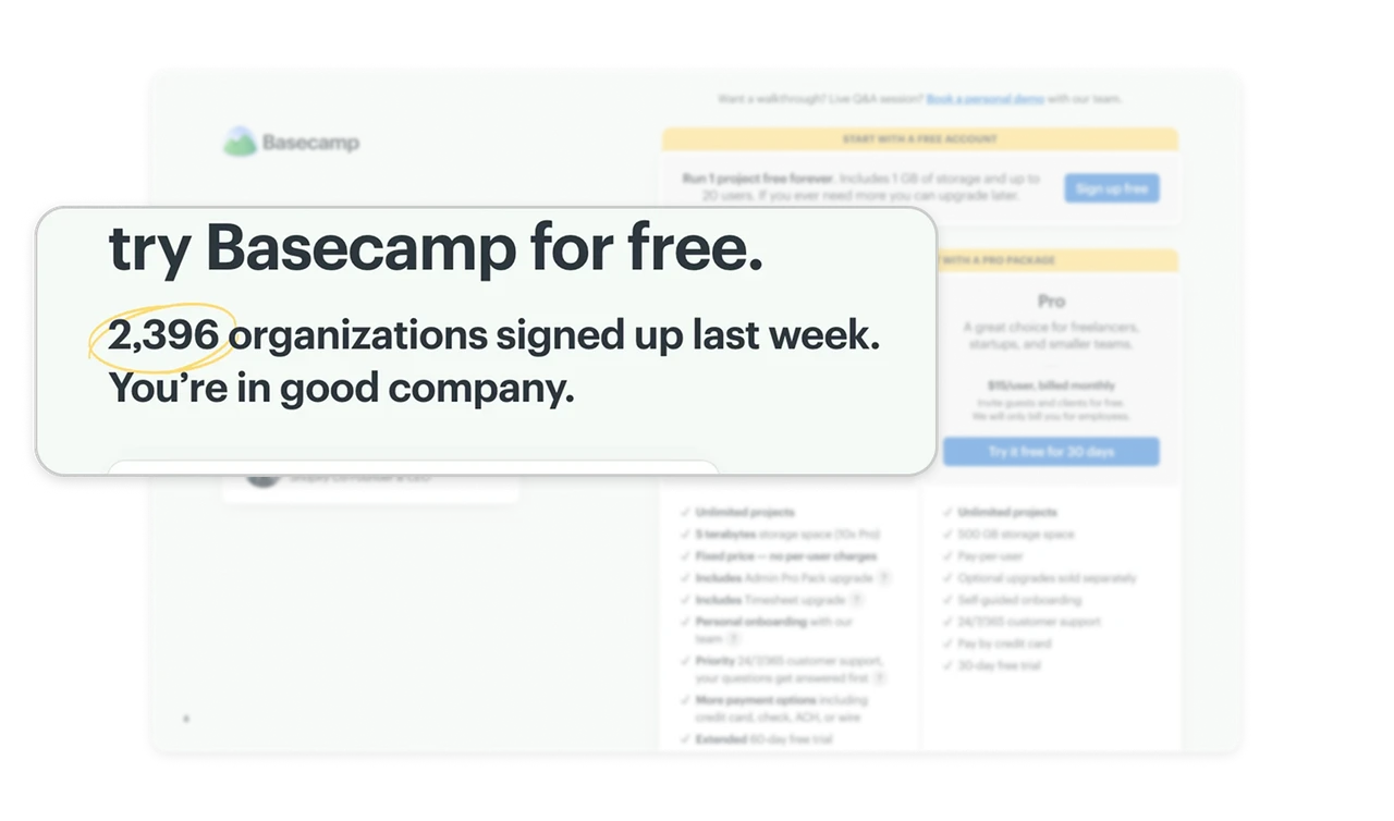
"2,396 signed up last week" beats a lifetime total
The subhead states a precise, recent number with a hand-drawn circle around it: 2,396 organizations last week, "You're in good company." A lifetime count ("millions of users") is unfalsifiable wallpaper, while a specific weekly figure implies the counter is live and the momentum is now. Recency plus specificity is what makes social proof believable, and the hand-drawn circle adds a human's excited emphasis to a machine's number.
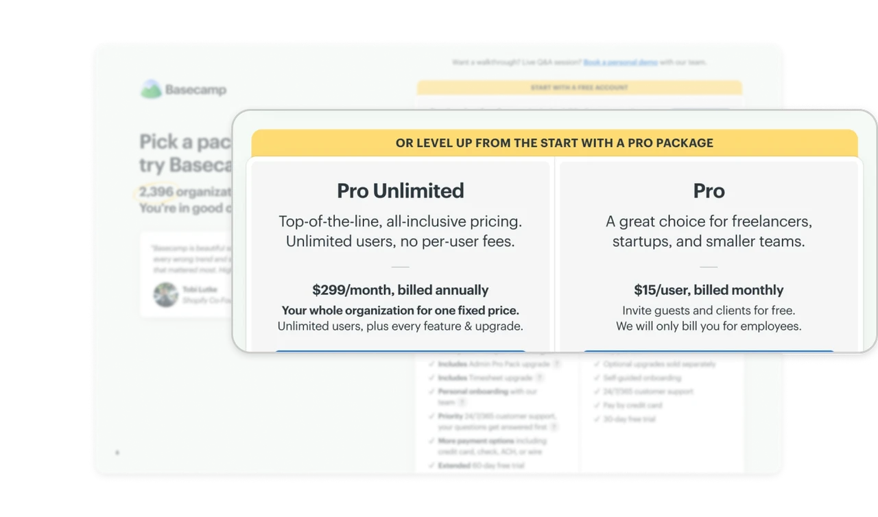
Two packages sell two pricing philosophies, not two sizes
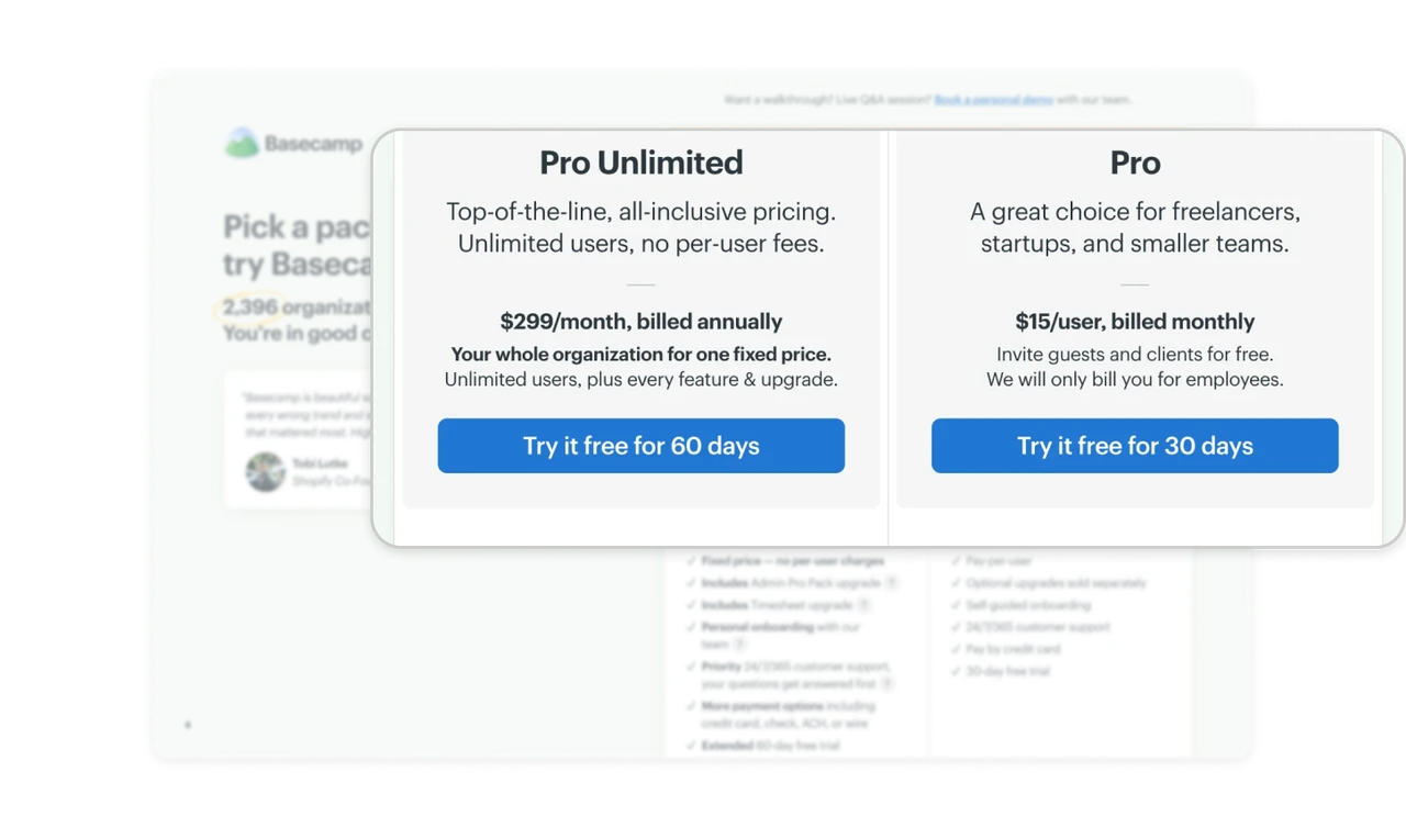
Pro Unlimited is $299/month flat, "your whole organization for one fixed price, no per-user fees." Pro is $15/user monthly, "we will only bill you for employees." The choice is not small versus large, it is a billing model: predictable flat rate versus pay-for-headcount. Growing teams fear per-seat creep, small teams fear overpaying, and each package answers one fear. Sometimes the real tier differentiator is how you charge, not what you include.
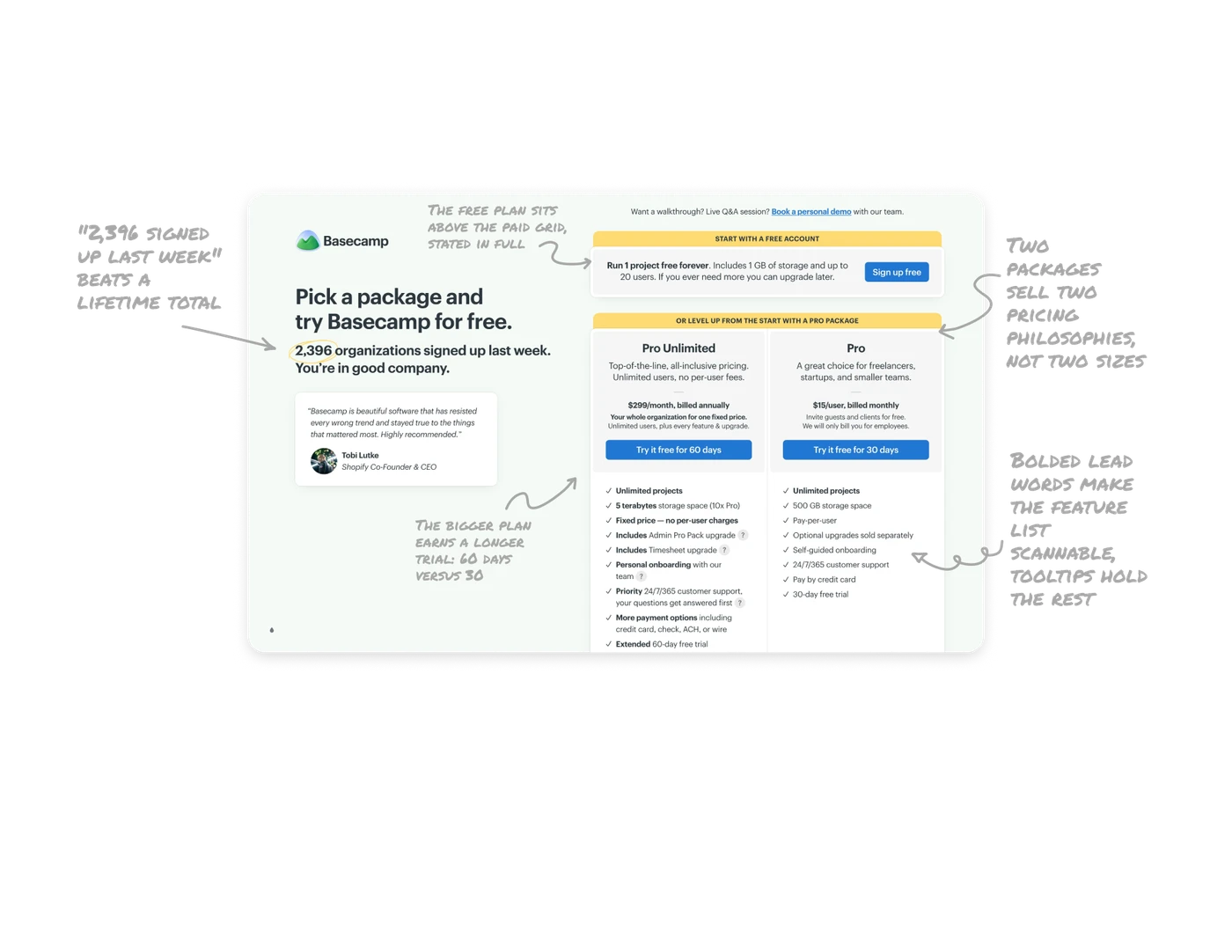
The bigger plan earns a longer trial: 60 days versus 30
Pro Unlimited's button reads "Try it free for 60 days," Pro's reads 30, and the feature list bolds "Extended 60-day free trial" as a perk. Trial length itself is tiered: the pricier commitment gets more time to prove itself, which respects that a whole-organization rollout needs longer to evaluate than a freelancer's setup. Treat trial duration as a design variable matched to decision weight, not a constant, the bigger the ask, the longer the runway.
Bolded lead words make the feature list scannable, tooltips hold the rest
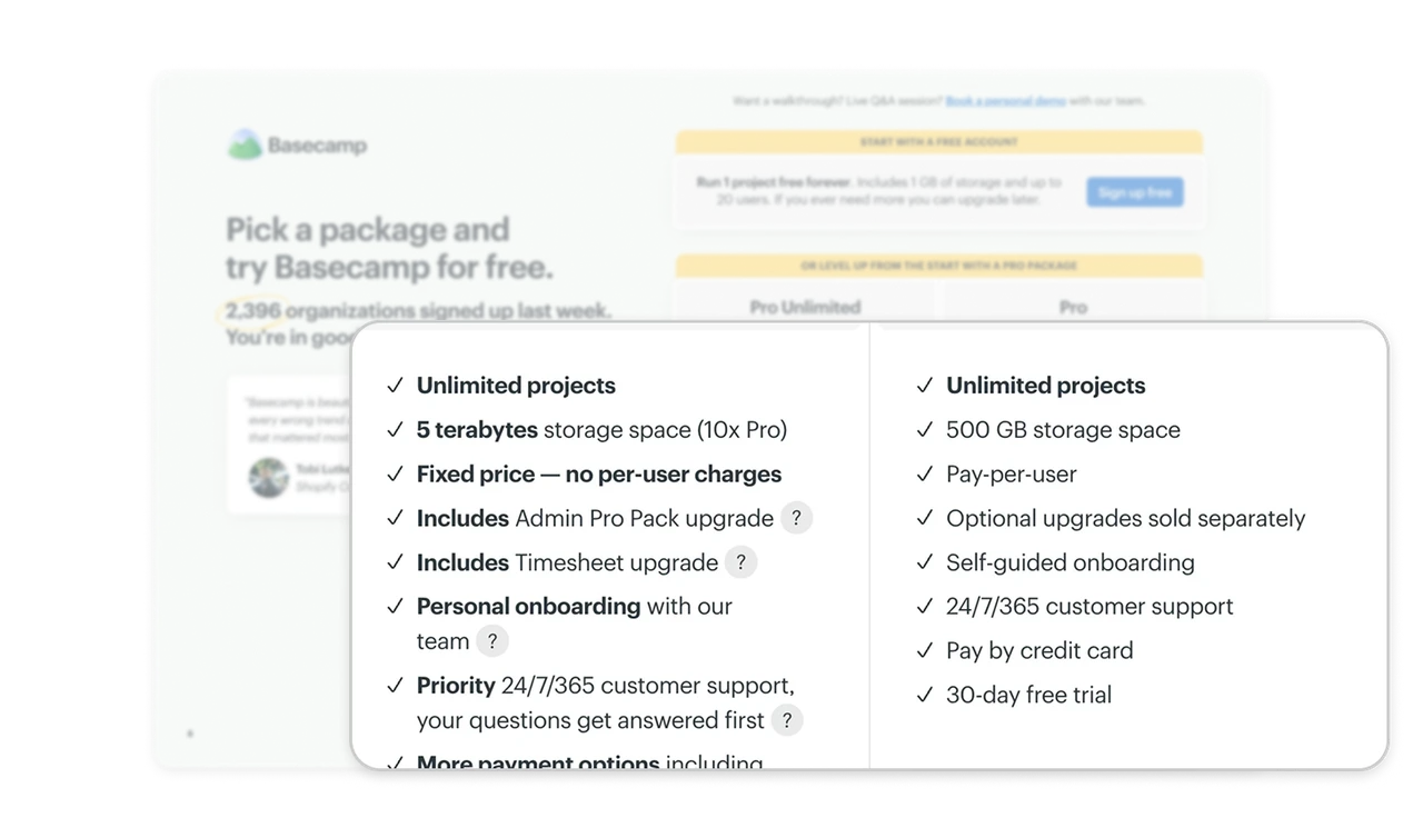
Every line bolds its keyword first: "Unlimited projects," "5 terabytes storage (10x Pro)," "Fixed price, no per-user charges," with small ? icons deferring explanations like Admin Pro Pack. Readers scan the bold column to compare tiers in seconds, and the parenthetical "(10x Pro)" does the cross-tier math inline. Front-load the differentiating word, push the education into on-demand tooltips, a pricing list is read in one vertical sweep or not at all.
Similar Breakdown Lessons