Product Listing

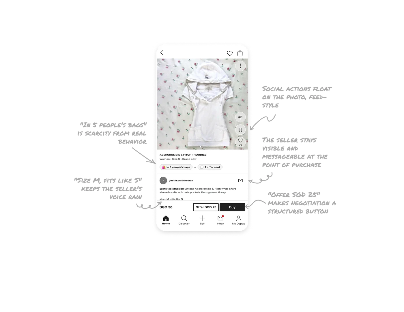
"In 5 people's bags" is scarcity from real behavior
A pill states the item sits in 5 other shoppers' bags, next to "1 offer sent." Unlike manufactured urgency, this is real demand data on a one-of-one item, if someone else checks out first, it is gone forever. In single-inventory marketplaces, surface actual competing demand. Behavioral proof beats manufactured urgency because it is verifiable and true, and on unique items it is the most honest scarcity signal possible.
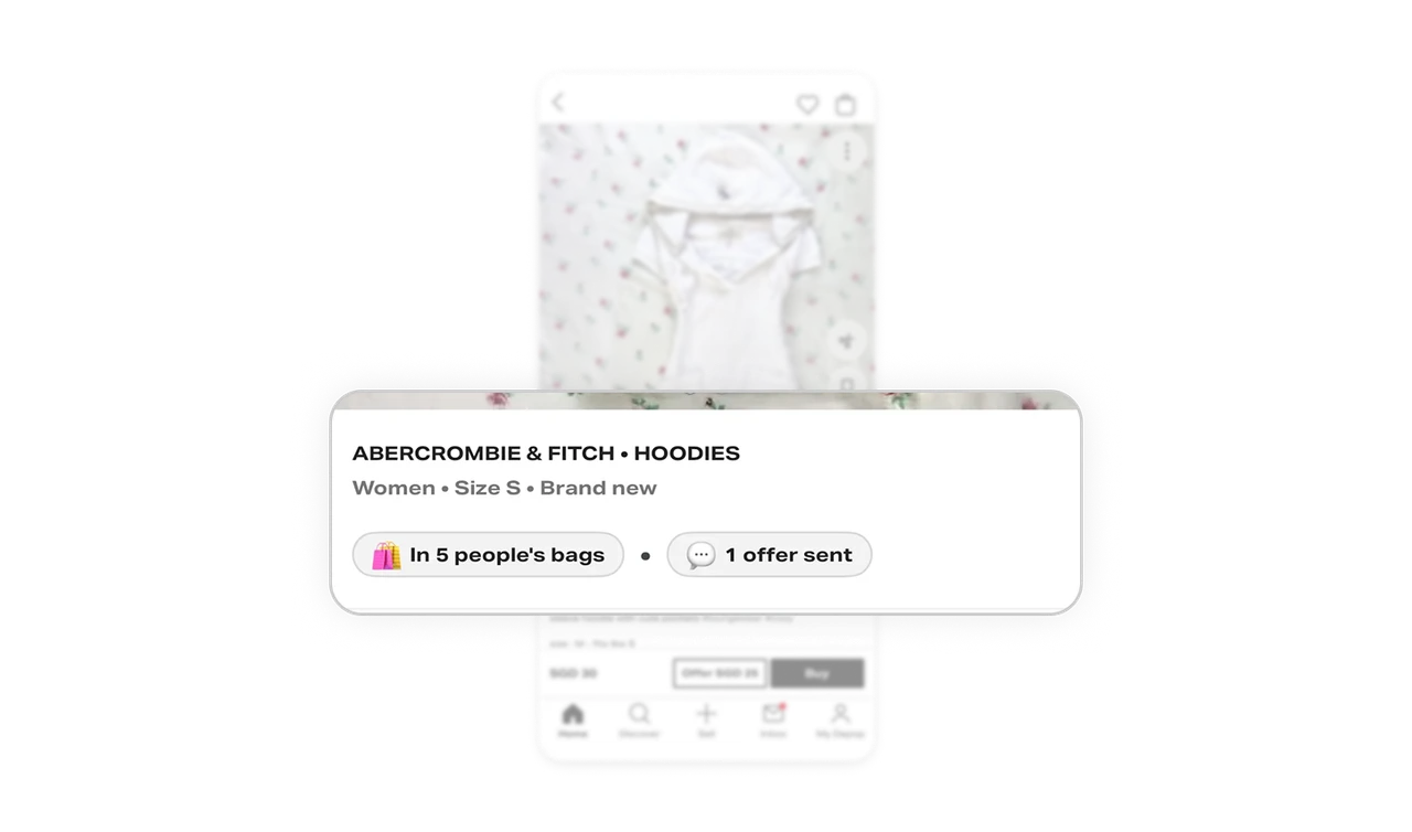
"Offer SGD 25" makes negotiation a structured button
The bottom bar shows the price (SGD 30), an outlined offer button pre-filled with a suggested counter (SGD 25), and a solid Buy. Negotiation is a first-class purchase path, not a free-text chat. Pre-filling a reasonable counter removes the social awkwardness of naming a number, the UI does the haggling etiquette for you. Where negotiation is part of the culture, structure it, because unstructured haggling scares off exactly the buyers most likely to pay.
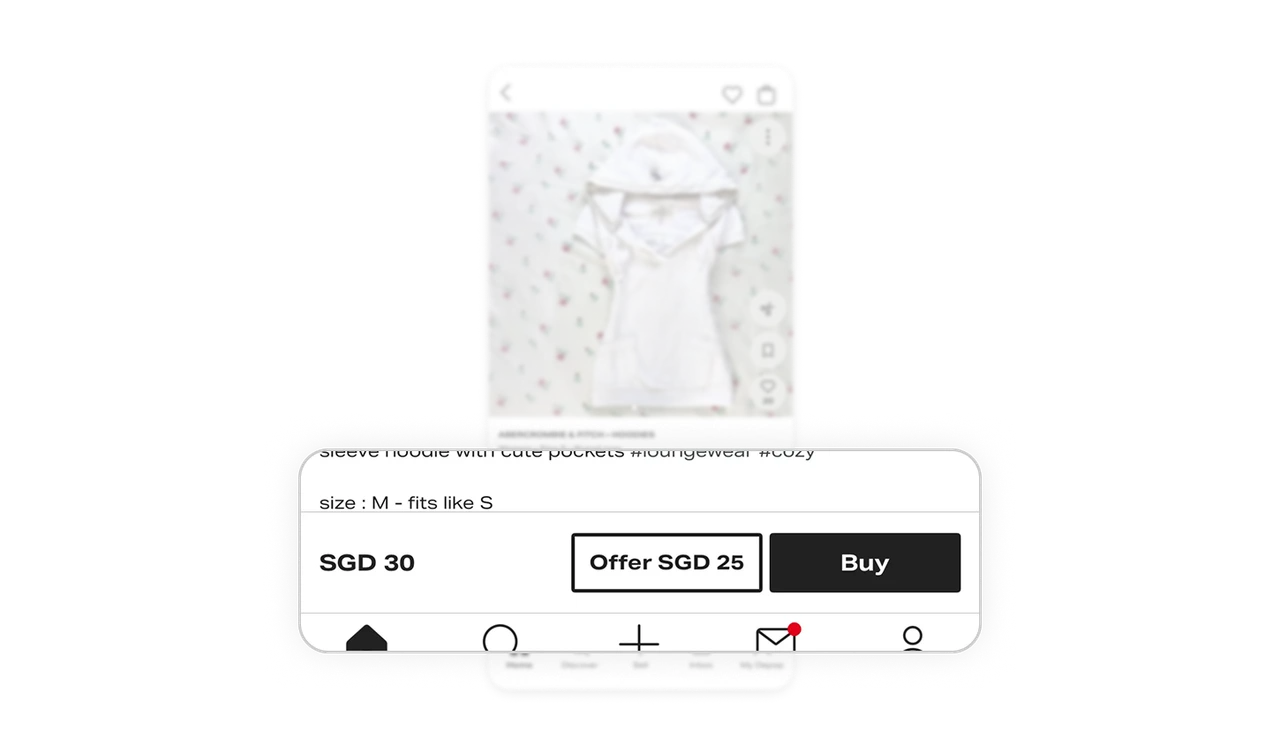
"Size M, fits like S" keeps the seller's voice raw
The description stays in the seller's own words: casual hashtags, lowercase quirks, and the honest fit note "size: M, fits like S." Depop does not sanitize listings into catalog copy. A human who owned the item telling you the truth beats any size chart, the informality IS the trust mechanism. In C2C marketplaces, over-standardizing descriptions kills exactly what makes peer commerce more credible than retail.
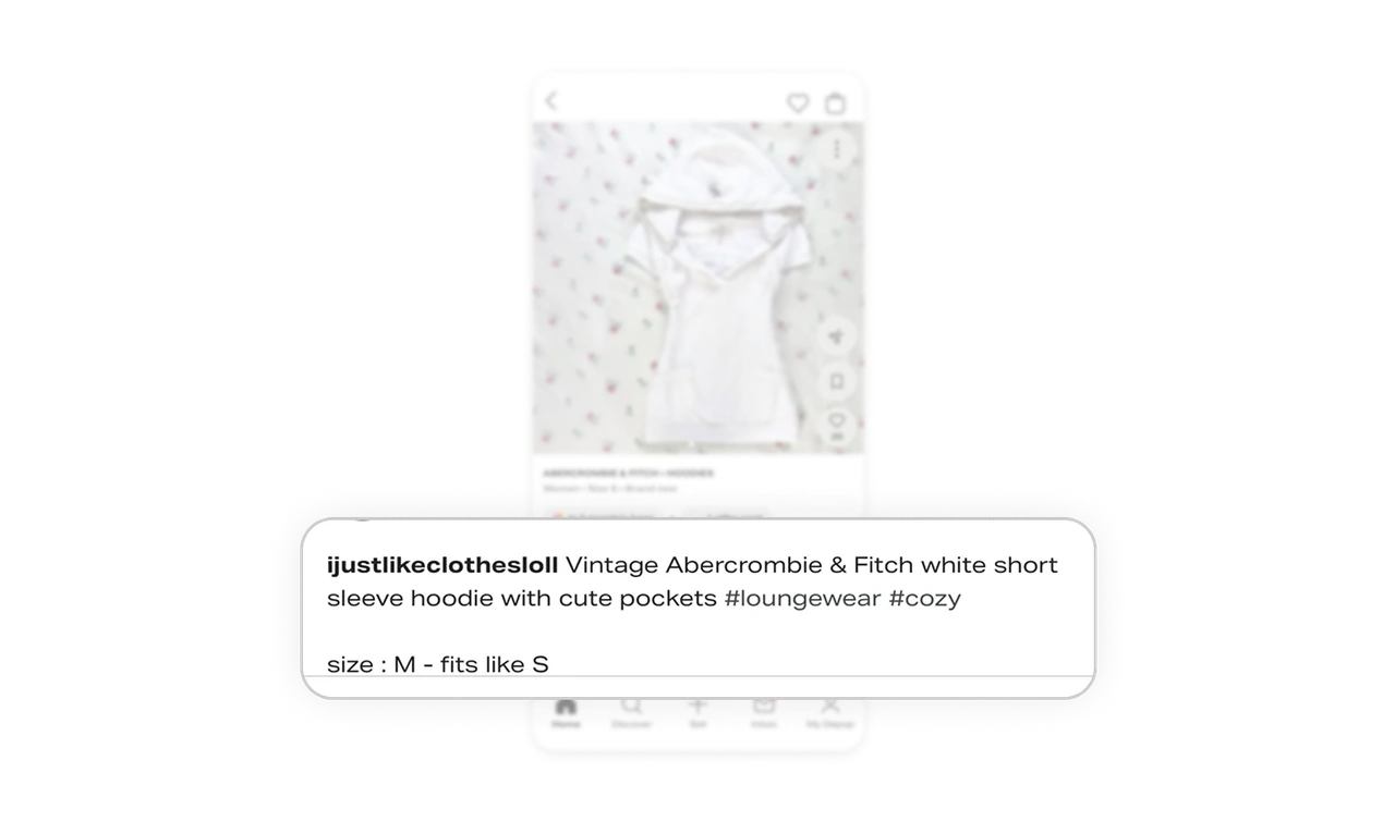
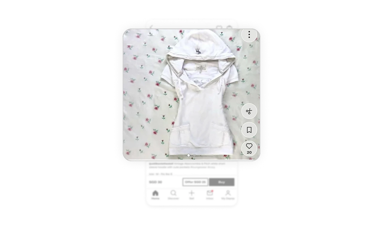
Social actions float on the photo, feed-style
Save, bookmark, and a like button with visible count (20) float along the image's right edge, Instagram-style, instead of sitting below the fold. Depop's audience scrolls listings like a social feed, and on-image actions match the muscle memory they already have. In shopping-as-browsing products, place engagement on the media itself. The visible like count doubles as social proof, quietly restating lesson one on every photo.
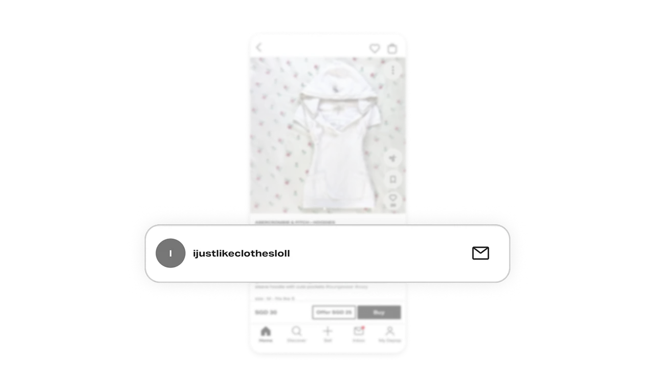
The seller stays visible and messageable at the point of purchase
The handle appears in the profile row and description byline, with an envelope icon for direct contact. You are buying from a person, not a faceless catalog, and you can ask them a question before paying. The ability to message a real human is the trust bridge catalogs cannot offer. Hiding seller contact behind menus removes peer commerce's core advantage at the exact moment it matters most.
Similar Breakdown Lessons